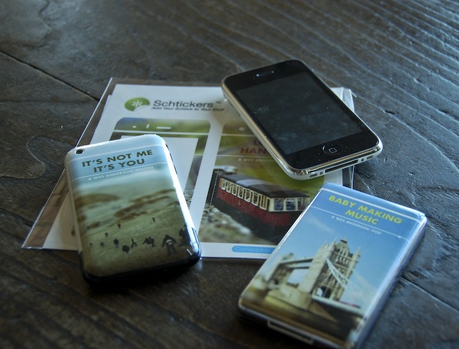
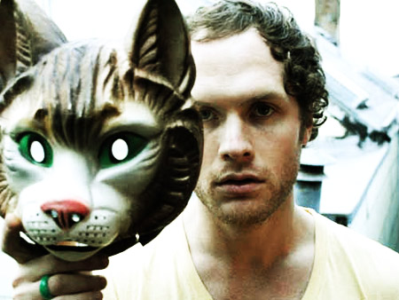
I’m still chipping away at the project I mentioned last week. One of the requirements is the creation of three products to complement the film festival we are creating and branding. The products can be pretty much anything, but one has to tie conceptually to our overall vision for the project. I have no idea what I’m going to do in this regard, and I figured I would knock out the other products first. I decided to try out Schtickers and get a few custom iPhone/iPod skins made. I can’t imagine ever actually wanting to ruin the impeccable design of either device with a sticker, but for a hypothetical film festival mock up, I figured it could at least be interesting. As I am also creating a website for the festival, I thought the iPhone/iPods would look good next to the laptop displaying the page on presentation day. The “electronic” portion of the festival brand fully fleshed out.
Overall, I would recommend Schtickers if you happen to find yourself in the market for some custom skins. I think they are most useful for in-class projects, or perhaps an unusual gift, but are definitely not a serious design option for professionals. Print quality is fairly good, but nothing close to what you’d get on paper. For my image style, it actually ends up looking dead on, but I can’t imagine many people appreciating the softer edges and slight blur you get with the vinyl print. The design/order process was very easy and smooth, and the stickers arrived within two days. Compared to some of the other vendors I am outsourcing to, this was amazing turnaround.
For the above sticker mock ups, two of the images come from agnusleonard and matstace. For the final versions, I will be using my own tilt-shift work like on the record cover. Next up should be the poster, which if all goes according to plan (when does that ever happen?), should be printed tomorrow.
Semi-related, Zweiphone will make your iPhone look like another, out of date phone. (via Subtraction)
A while ago I mentioned a project I was working on for class regarding a film festival. The project is about halfway done at this point and I thought I’d post a little (tiny) bit of what I’ve been working on. The project is to create a hypothetical film festival centered around a director of our choice. We are to design all of the collateral that would support the festival; posters, catalogs, tickets, schedules, signage, products, a website, trailer, and DVD packaging to name a few. The style is to be reminiscent of the director, but we are not meant to copy the existing visual branding that surround the films.
As Wes Anderson is my favorite director, I decided to create my fictional film festival surrounding his work. His films are packed with beautiful imagery and all adhere to his very distinctive visual tendencies and style. Of all the directors I was considering (Gondry, Allen, Fincher) his work seemed to have the most exciting/appealing visual possibilities. I started out with a much different approach than what you see above, and was mainly just taking pictures of random objects and curiosities and slapping type over the whole thing. My first directions were really bad, fantastically terrible even. I was pretty much just poorly recreating shots from some of the films and not inserting any additional concept to the look and feel. (I’ll post some of these earlier directions in later process posts).
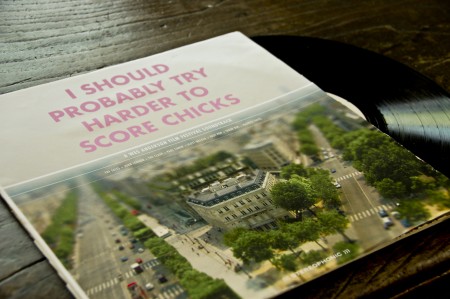
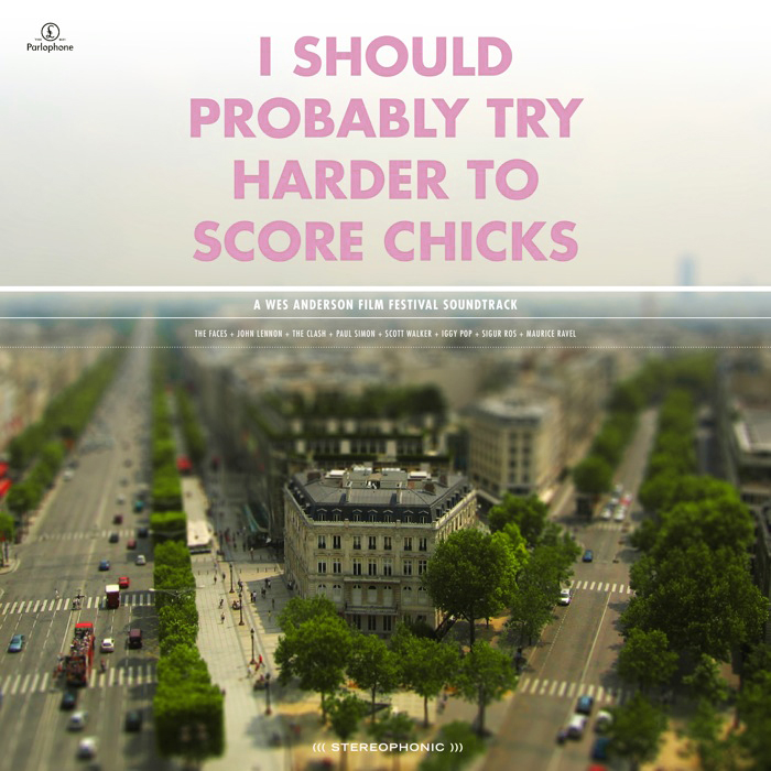
The direction I eventually landed on, and what you see a piece of above, was a combination of tilt-shift photography and Anderson’s typeface of choice. The use of Futura Bold is a direct tip of the hat to his style. I figured I needed to have at least one direct visual link, given that my image style was much more divergent, and Futura Bold would be immediately recognizable to anyone familiar with his work. The concept behind the tilt-shift choice was based on the observation that all of Anderson’s films seem to take place in a parallel social universe where people say what’s on their mind and things unfold in most peculiar ways. Anderson, being the auteur that he is, sort of curates this whole crazy universe. The tilt shift look, in addition to being visually captivating enough to grab attention, is meant to conjure this image of Anderson overseeing this unusual world that exists in his films. I have been tilt-shifting my own photography so far, with fairly successful results, and it’s been a fun technique to learn. I try to use my own photography whenever possible, and find the “Flickr look” (as in people sourcing images on Flickr) that pervades most projects at school exceptionally irritating. It’s hard to generate your own imagery for a project this big, especially if the concept is unusual, but I feel much more proud of the end result when everything is of my own creation.
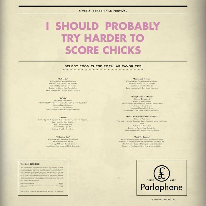
The centerpiece of the project is meant to be the logo. We spent the first couple weeks coming up with logo treatments and titles for our film festival (Just calling it the “Wes Anderson Film Festival” was not allowed). For my project, I have neither a title or a consistent logo mark. The logo and title unfold throughout my project, and are consistent in their type treatment and ridiculousness of the language. For example, the title of the LP above is “I Should Probably Try Harder to Score Chicks,” a line from Rushmore. The “logo” that appears at the top of the main film poster is “They Were Giving Each Other Handjobs While You Were Taking a Nap by the Pool.” When you see a lot of pieces of the puzzle, the lack one mark is not evident because the consistent type treatment and language tie everything together. It’s also fun to have super random sentences gracing the front of all of the work; makes for a much more humorous project.
Above is just one piece of the massive project that I am attempting to put together. It is a soundtrack of songs that are either in some of the films, or feel like they might be, and is still very much a work in progress. Having landed on a image/type style, with about a month to go, my motivation has trickled to a crawl. The hardest thing for me is conceptualizing what the project will look/feel like, and once I have this locked down (and it’s just a matter of applying it to all the different formats), I lose a lot of interest in what I’m doing. I’ll kick back into gear soon, and hopefully will have more pieces to show in the weeks to come.
As you may already know, Alex Cornell — the same Alex who posts on this blog — is also my intern around the studio. A while back Northwestern University asked him to take on the daunting task of layout and design for their “Day For Night” magazine. The previous design was pretty much your run-of-the-mill college publication without much thought put into the design so this was a great chance for him to really evolve the visual language of the magazine. The big constraint was colors; apparently he can only use black, white, and one spot color of his choosing per issue. As you can see, the finished product is superb, Alex’s excellent eye for typography and layout really shine through in his first issue for the magazine. This project was featured (and deservedly so) by Behance last week and is up on Alex’s portfolio page there. Congrats Alex, very nice work!
With all this talk of snowboards and all the new snow up in Tahoe, I thought it would be a good time to post about these Armada skis I did a couple years back that have just recently been released. In November of 2006, Armada asked me to design the 2009 AR6 line (there is a relatively long period that separates the design phase and end product in the production cycles of most snowboard / ski manufacturers). Based on the timeline and budget, we decided I’d deliver 2 reference designs which would be extrapolated by in-house designers to fill the 5 versions of the AR6 line. I believe Mackel Vaugn put together the final designs based on what I turned in. The top image (orange, very top) shows the early tests I showed Armada to illustrate what I was going for. Skis are an interesting form factor to design for; you have these two narrow canvases and you sort of have to choose whether to treat them as a whole or individually. Based on the very wide design of the AR6’s I decided to try and tie the two skis together to feel more like one large design across a canvas.
After some meetings with Armada about the tests I had sent in, we decided to stick with the basic forms for the final versions but bring up the overall color and variation of the designs. The results were the final two reference designs (directly above), I delivered the PSD files along with various image collateral and they worked those into final five ski designs. I’ve done a couple ski projects and all my snowboard projects this way. It’s an interesting process, handing off the design and later being surprised by what they end up looking like (the bottoms were a surprise too, only designed the tops). The whole thing reminds me of layer tennis, sort of like a design remix. You can see all the final versions of the AR6 at Armada’s site and you can see some in action in this video review. These are out now, you can check Armada’s dealer list if you want to pick up a pair. I did the 2010 AR6 line as well so you should start seeing those out next fall. Here’s Armada’s product video for the 2009 AR6:
Guitarist and electronic musician Christopher Willits continues his monthly series from SoundArts studio. In this episode, Willits proves the future is now by showing you how your iPhone can control Ableton and Max/MSP.
Tune in once a month as Christopher shows us some of the ways he produces his own music, as well as the many cool things you can do with recording software. According to Christopher, “I simply want to excite people’s imaginations and creative processes so they can more easily create the sounds and music and art they love.”
For more What You Talkin’ Bout, Willits? visit XLR8R TV
Alex Cornell is a student at the Academy of Art Graduate Design MFA program here in San Francisco and he also helps me out around the studio with various design and music related things (in addition to being a designer he’s also a ridiculously talented guitarist and a knowledgeable sound engineer).
Recently he brought over a project he was working on to get some critique. Since I never went to school for design it was great to get a glimpse inside the classroom through his project and also very interesting to hear what his professor thought of my input. I had a great time working with him trying to refine the project so I thought it would be nice to have him do a process piece for the blog. I think this serves an apt companion to the Making of Obama post; a good counterpoint written from the student perspective. I am sure many of you were/are design students yourselves so you can relate, seems to me like the professor does a pretty good job of impersonating a client. The following article is his account of the process of creating the piece and working with his professor to complete the project.