

I’ve been seeing these 2 Periodic Tables floating around, the larger version of the typeface one is pretty fun to look over and I guess the Photoshop CS shortcuts one is a poster and there’s also ones for Illustrator and InDesign as well.
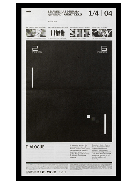
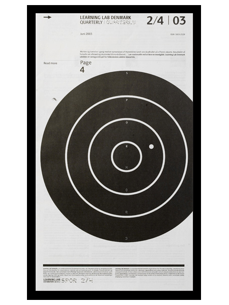
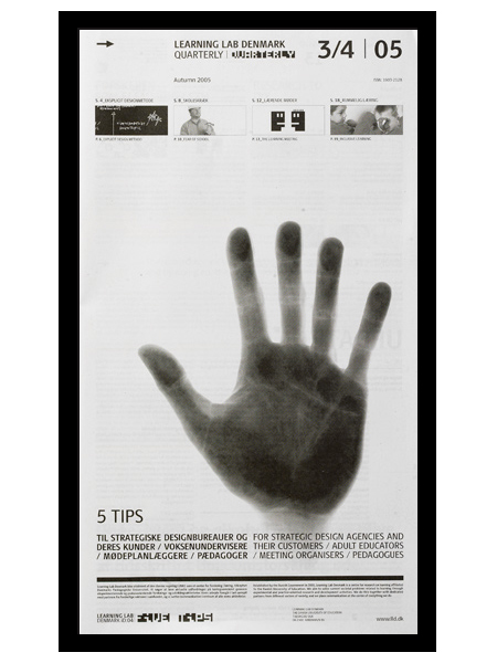
e-Types did this newspaper series for Learning Lab Denmark. I am a big fan of the compositional style at work here. Anything with a strong grid, effective use of scale, and highly refined details will win me over quick. I especially love the second one; the slightly off center target gives it a really refreshing balance. (I should also mention that I’m a sucker for black and white.)
I actually thought (and hoped) these were posters when I first saw them. I prefer posters that take a minute to digest. For me, the more sections, information, and images you can incorporate into a poster, the better. Sure it may not be effective in terms of getting a message across quickly, but I think the end result is usually more visually intriguing and effective, from a design standpoint. (Advertisers would certainly disagree.) Seeing as these aren’t posters, perhaps it’s beside the point, but regardless of their deliverable form, I think this series is very well executed.
An excerpt from e-Types 10 Rules for Modern Living:
When a design doesn’t work – go old school. Forget hype, think craftsmanship. Heavy skills prove over and over to be the best tool to overcome the creative crises we all encounter at least five times a week. Creativity is nourished by structure.


Stephen over at Mid-Century Modernist posted shots of some great European travel posters sent to him by his late father. Apparently the posters had remained in the shipping tube for a few years until discovered during a move. Thanks for sharing Stephen, and thanks to all your friends for holding them down in the shots! (what is that like 3 people holding the Bern print down?) Link

And in case you were wondering, the “Paris” font seems to be URW Bodoni Extra Bold Extra Wide Oblique. There are some slight differences but I am assuming these are artifacts of the digitization perhaps? I hate it when I see a classic font used like this and then find the modern version and it’s just a bit off. “Bern” seems to be PL Brazilia Three.

Holland Festival ’69 poster by Dick Elfers
Via Alki1
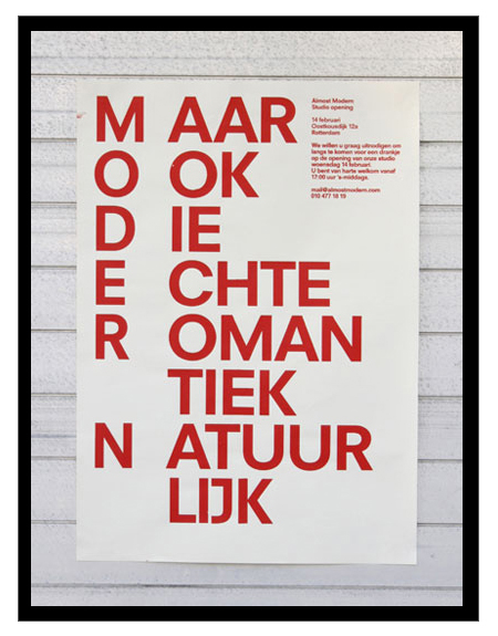
Just got turned onto Dutch studio Almost Modern this morning. I’m definitely a fan of their poster work; there are some misses here and there, but most of it is simple, minimal, and very effective design.
via AisleOne


A few classics from Milton Glaser.

I saw this and thought it made a nice counterpoint to some of the views expressed in the AP Sues Shepard Fairey post. Make what you will of Jim Jarmusch’s suggestions, but in the year 2009 you pretty much have to agree with his initial assertion. Or do you?
via Today & Tomorow

It was only a matter of time I guess. It seems like we just learned the source of Shepard Fairey’s iconic image for the Obama campaign and now Fairey himself is being sued by Associated Press for his appropriation of the image. This is when sorting out exactly what qualifies as “fair use” starts to get a little tricky. Fairey says he didn’t make any money from the image (frankly, I don’t see how that’s possible, but I’ll give him the benefit of the doubt), but AP alleges he made a boatload of it. Whatever the case may be, credit is due to the original photographer, but I don’t believe Fairey should be held liable for his use of the image. I think it could be — and hopefully will be — successfully argued that Fairey modified the image sufficiently. What do you think, does vecotrizing and coloring an image go far enough to differentiate the artistic product from the source? Sound off in the comments.
Update: Supertouch has posted a sort of official response to the general criticism Fairey has endured of late. Definitely worth a read if you took the time to read all the detractor’s sites.
Image via stevesimula


