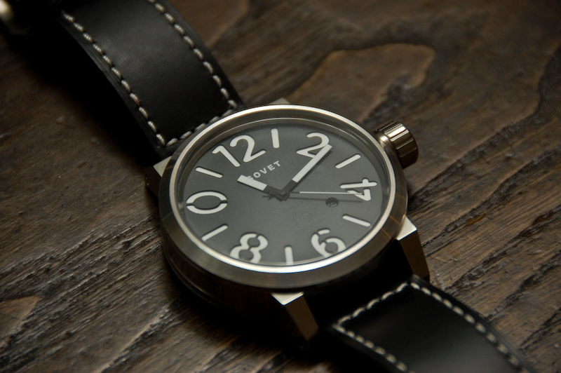
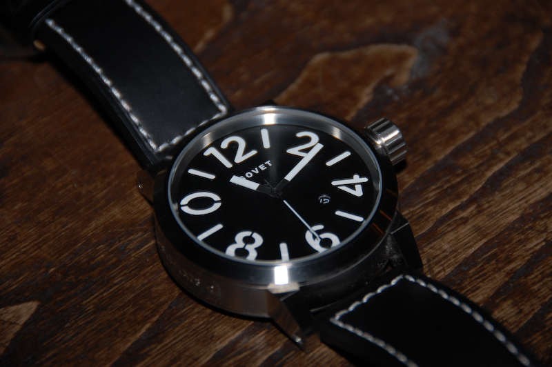
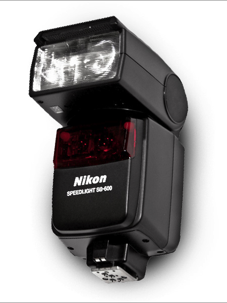
Recently I purchased a Nikon SB-600 flash for my D40. I have never owned anything in the way of photographic lighting and I figured this would be a good first step. I’ve outfitted my studio with a good continuous lighting set up (for video), but photographic lighting has always intimidated me (in regards to complexity and cost). The SB-600 is a flash attachment that works with the D40 (thankfully) and basically just augments the existing flash. The big difference is the ability to adjust the direction of the flash, allowing you to bounce light off the ceiling etc. It also has more options and allows for more control than the basic flash.
Above I’ve posted two pictures, the first uses the SB-600 (pointed at the ceiling), and the second is just the on-camera flash. Neither has been edited. Given that I have no idea what I’m doing with this flash, I think the results are fairly impressive out of the box. Every time I’ve used the SB-600 indoors, the pictures reflect exactly what I see in real life. None of that blown out flash nonsense. The colors are correct, the light is balanced, and the level of detail is like nothing I’ve seen come out of my D40 previously. Of course, the SB-600 is no substitute for a real studio lighting setup, but it’s a great way to cheaply augment the power and versatility of your on-camera lighting situation.
There are a number of other options for speedlights of this kind. I chose the SB-600 mainly because it seemed to be the best fit for my relatively “low end” D40. It’s not too heavy and didn’t break the bank like some of the other Nikon models (the SB-800 for example costs more than my camera). It’s been very easy to use and I would recommend it to anyone looking for a quick and easy way to improve their indoor photography. If anyone has experience with other models, Nikon or otherwise, I’d love to hear your thoughts or see some examples. I’m still learning how to get the most out of mine, but the potential definitely seems to be there.
These leaked shots of Olympus’ new, vintage styled, micro four thirds shooter popped up on Engadget today. Pretty slick, with the old school range finder and everything. Looks like the body might be plastic though, would love to see this in black aluminum with the tan grip.
My brother Kirk got the new Canon Rebel T1i over the weekend and it looks like it’s working out quite well for him. He used Sigma 70-300 lens in macro for his first video tests (above, wait for the ant!) and as you can see, the detail is incredible (albeit slimy). I’d like to see some more tests in different lighting situations and with different subject matter, but so far the performance looks great. Although, after seeing what Will Calcutt did with the 5D MKII in Detroit I am not sure I could settle for the T1i, but it seems like a close second for the budget-conscious. At any rate, I am pretty close to jumping ship from Nikon. Video Link
Update: Kirk added a short clip of Forrest skimboarding in Sacramento:
ITunes has a decent layout, I mean you can’t do much especially if you end up updating it weekly and the artwork can range from pretty good small album art icons to just awful ones. One way of making the pages on iTunes more appealing is these custom artist pages that iTunes staff picks out, the photos seem to be exclusive which is always a nice addition.
I’ve been following Dan McPharlin’s work for a few years now, ever since his miniature synthesizer models started showing up on Matrixsynth. I fell in love with his perfectly crafted, perfectly photographed (seriously, the photography is almost cooler than the work itself) paper music machines. But after being introduced to his graphic/illustration work he quickly became one of my favorite artists. His illustrations are very reminiscent of another favorite of mine, Roger Dean, and are evocative of that prog-rock driven 70’s sci-fi art scene that, when done right, is just downright incredible.
So it’s been great to see Dan’s work start popping up all over the place, like here, here (Prefuse 73 cover), and here (Jakub, you really should have know better!). Beyond the visual beauty of his work, it’s just great to see someone being creative with such a novel medium. He brings the mind and eye of a designer to a world previously reserved for 60-somethings hiding out in their basements building model railroads. To see him wrap all this up and successfully translate that future-past-that-never-was aesthetic into commercial projects is a good thing indeed.
You can check out more of Dan’s work at his flickr.
On a side note, he’s posted some shots of his home/work-space here. Are you kidding? Amazing. My house looks like it was built of scraps from a 19th-century Troller Boat that ran aground in front of a hippie commune. Seriously, parts of a boat were used in the construction of this house, I am sure of it. Anyways, I am disorganized at best, slovenly at worst and I don’t think I have the skill set to keep such a meticulously minimalist situation like that up for any length of time. If I win the lottery I will get one of those modernist prefabs and put it in front of this house. I’ll then carefully place completely unusable angular furniture and German-designed objects all around it. Finally I will place a single synthesizer with wooden endbells and an analog sequencer on a white table with a molded plywood chair in front of it. When people come over I will tell them that’s where I get all my work done and then I will sit them down at a walnut coffee table with various important looking design books stacked neatly on top of it and expound on typography theory and then chastise them for not understanding the difference between kerning and leading. After they leave I will go back to my real house and eat a sandwich in my basement and watch Adult Swim and then not clean up the plate for a week or so.
Spring is finally creeping into town (although very slowly here in San Francisco) and I’ve been way into the AA tri-blend tees this year. So I printed up a modified version of the Vuela Print on Heather Grey tees for your sunny weather enjoyment. As always, you can get yours over at the ISO50 Shop. I’m also clearing out a lot of the older designs to get ready for summer so you’ll find lots of shirts marked down 20-30%. All marked down shirts are the final pressing of that particular design/colorway.
On a related note I’ve been spending a lot more time trying to learn the ins and outs of product photography. I’ve been shooting the products for years but I’ve never spent enough time worrying about the color accuracy of the output. After all this time working with cameras you’d think it would come easy, but I was surprised to find how difficult it was to get good shots when the goal is creating a color accurate representation of an inanimate object. With my creative photography I’m always trying my best to make things appear inaccurate and I guess old habits die hard. For the shots above I used a tungsten photo bulb/can light along with a Quad CF lamp from Calumet. I had been using 3 lights but it turned out that hitting the subject from the right side and front with lights and letting some natural light in from the left (there was a window there) made for better dynamics so I’ve been sticking with the 2 light setup.
The last couple product shoots were the first times I’ve used a Gretag card to calibrate the camera color temperature under the lights. That and shooting in NEF RAW really went a long way to getting a solid foundation, but there was still a lot of work done in post. Having the calibrated monitor definitely helped at that point, but the real key I found was changing my own perception of the image and training myself to see it in a different way than I’m used to. I always catch myself slipping and trying to make the shots look interesting or enhanced and then have to step back and realize that this needs to be a literal representation of the real object. At any rate, I’ve got a ways to go (can’t even imagine how they get all those high end fashion shots) but it’s been surprisingly interesting learning the subtitles and nuance of a new kind of photography. It certainly is it’s own art form. I’m sure a lot of you have some product photography chops, feel free to share any of your tricks of the trade in the comments.
Also, I know I’ve been promising it for a long time, and I assure you, a very detailed post about color calibration is on the way. The project has sort of taken on a life of it’s own and I’ve brought Alex on board to help with research and production. We’re going to be shooting an interview with a color expert in the next couple weeks and we should wrap the post soon after that so stay tuned!
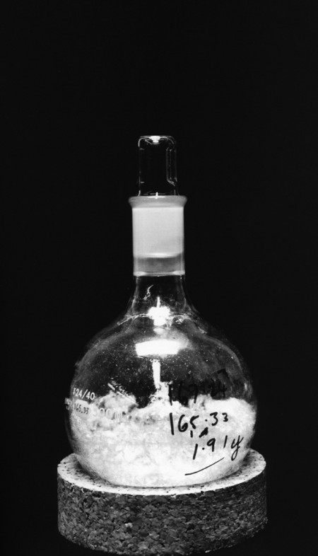
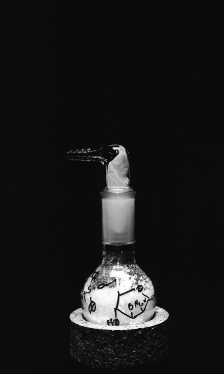
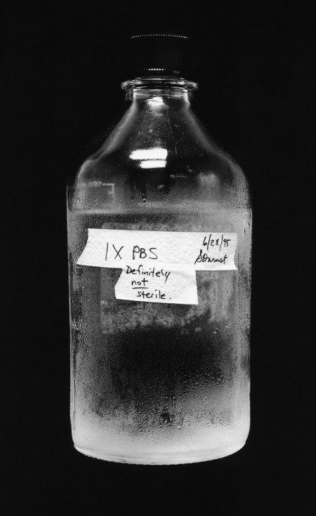
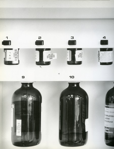
Photographs by Catherine Wagner from her book Art & Science. They are all part of the same project for which she travelled to major laboratories around the US and captured many different elements of the scientific experience; everything from beakers (my favorite) to bone marrow smears. As the intro states: “The resulting images offer the opportunity to encounter science in an innovative and unusual manner, as they bridge the distances between art, science and everyday life.”
I’ll be heading back to my other favorite city today for the F5 fest. I’m staying a few extra days as I haven’t had the chance to really enjoy myself the last few times I’ve been in NYC. Jakub scored some tickets to the Brainfeeder/Flying Lotus show @ Love so we’ll definitely be making it out to that. I’m brining the Nikon and the new little Canon (which, by the way, I’ve been loving) for some undercover HD video action; I’ll post up the results as they roll in.