We have a very limited quantity of special-edition covers available featuring ISO50 on the limited edition (100 copies) cover. Check them out here. We could only get our hands on 40 of the 100 printed with this limited cover.
Modern Hieroglyphics is an exploration into art and design from all over the world. Every edition contains interviews with a diverse range of artists, each with their own unique influences, stories, and backgrounds. The visually-rich biannual publication provides an in-depth look into the life and creative process of each artist.
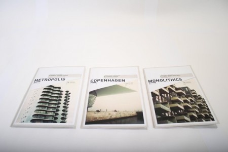
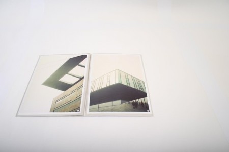
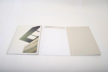
I don’t know if these are tangible or just mock ups, I guess we’ll have to ask Kim Holtermand, if they aren’t physical then someone needs to print these up because i’ll order the set right now.
The second issue of Eureka — a new science supplement to The Times — is out and it’s looking like a design classic in the making. Matt Curtis (art direction), Matt Swift (information graphics), and David Loewe (design) comprise the design team for the new publication. Going to have to track down a copy for myself.
Beautiful covers from the Japanese design magazine “Graphic Design”. Designed by Ryuichi Yamashiro, Hiromu Hara, Yoshio Hayakawa, Yusaku Kamekura, and Ikko Tanaka – 1959-1961.
If you’re in need of some editorial or layout design inspiration, head over to the Behance site for POGO. I’ve just been cruising the archives of all issues of the online magazine SOKO. There is a ton of great typography and photography throughout each issue and I’m sure you’ll find something you like. Content-wise, it’s mostly fashion we’re talking, but it’s really just a playground for POGO to go crazy and design what they like. I also included their video Voyeur, because the color and post-processing is so good it made me forget I have to go to work tomorrow.
Intelligence in Lifestyle magazine is the new holy grail of infographic greatness. It is a high-end Italian magazine aimed at men. The magazine is equipped with a beautiful design by the art director Francesco Franchi and the creative director Luca Pitoni.
For some of us, getting ahold of the magazine could be difficult. However, several several of the layouts from the interiors spreads and covers are archived on Flickr. Check out the larger sizes, they may compliment your desktop nicely. If in case you’re wondering, the magazine utilizes Publico, a serif face that fits perfectly into the design is much less ubiquitous than say Helvetica or Archer.
On another note prior to being introduced to this magazine via Colorcubic, I was starting to become overwhelmed by the amount of infographics being pumped into the designosphere. Infographics about infographics were being designed for crying out loud. It just seems like it has become trendy very quickly. It’s not to say its a bad thing, but it sure makes me appreciate great design like in this magazine or Nicholas Felton’s works more than ever before.
Eric Carl (who also brought us these vintage sci-fi book covers and these classic logos) has a beautifully scanned set of vintage ads from magazines up. They’re all high res so it’s a goldmine for textures and overlays. I love how magazine print breaks up at high resolution. The moire patterns are very useful when blown up in compositions; I use them a lot for posters.

")
")
")
")
")
")