Yep, that’s right. You’d better believe it, Canon is actually introducing a Jackie Chan edition of the EOS 550D. When I first came across this I didn’t know what to think. I’ve been a Canon user from day one and I’ve seen a lot of the seemingly pointless releases Canon has done in the past. I’m sure some of you can agree with me when saying that, but this release is seems to be something slightly more unique. However, in my mind I would much rather see Canon add some more lenses to their current L series lineup than to see another entry level camera. But of course I’m a bit biased as I shoot with a 1dmkII.
With my initial thoughts aside of how this edition may just be another pointless release, I could start to see some of the value in this product. It wasn’t until I started poking around for more images that I realized the user manual, neck-strap and wrap-case were also actually somewhat enjoyable. The case, in it’s own way, seems to be a nod to the old leather film camera cases and the gold/greenish colors that Canon adapted into this set, gave me an impression that they are trying to reflect back on the era of film.
Fortunately, those small features aren’t enough to win me over so the big question still remains: At $1465 for the set, would you buy this or a 7D?
Any architecture that is built with nature in mind, is made with concrete and has wooden interior elements, immediately gets an instant like from me. There’s just something about the combination of wood, concrete and trees that I love.
In this case the trees were included by law. Local construction codes of Mar Azul, Beunos Aires, Argentina actually restrict the removal of trees. Instead of relocating the house the architects, Martín Fernández de Lema and Nicolás F. Moreno Deutsch, decided to build the house around them. Leaving the end result a beautifully designed, wide open house that is seemingly the perfect spring or summertime residence.
In case you haven’t heard, a new $100 bill was recently unveiled and will be rolling out in early 2011. The good news is that the new bill will be flashy. It has been updated to include some new “3D” anti-counterfeiting features. The bad news is that the design suffered in doing so.
Maybe I’m expecting too much, but the new features that this bill has brought to the table aren’t doing it for me. The few techie “3D” color-shift features are cool but clearly look to be crammed alongside and over other elements in the design. If you look at an old $100 bill, you can see that the design has more of a structured layout from element to element. As hard as it is to say, the new design actually has a couple positive things going for it, but they still don’t outweigh the negatives.
The new design adds vibrant color which something that the old bill lacked. It seems to me that if such a vibrant color is added, it should only be in one location: either in the actual numbers or as the background of the entire bill. I do believe that the spot of color on the back of the bill (second image) is a nice accent when used with the larger ‘100’ type but I can’t say the same for the color accent on the front.
Calendars to me have always been items that I tell myself to use, but rarely do. However, I think that would change if I had this beautifully designed 200 year calendar by Sonner, Vallée u. Partner–a Munich, Germany based design studio.
This calendar was letterpress printed on a thick, 220lb cotton stock and is approximately 16.5 x 11.6 inches in size (click images to see larger).
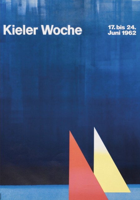
First off let me just say that it’s awesome to have come across this beautiful archive of work by German graphic designer, Anton Stankowski. The images in the archive are fairly large so the detail of the design becomes evident. In the first image of this post it looks to me like the background of the poster was painted with a brush then overlaid by the type. The process of how this was done would be refreshing to see.
The first thing about Stankowski’s work that pulled me in was the amount movement. Nearly every one of these pieces utilizes a visual system that controls your eyes across the graphic elements and to the typography. The system is very effective considering that I keep looking at these pieces every couple of minutes to see how my eyes move around.
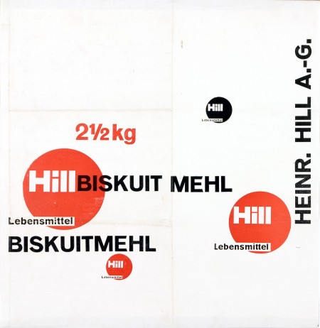
The Sulzer poster and the Hill Briskuit Mehl packaging are undoubtedly my favorites. Even though both are very simple they still have a lot of motion in them. Also in the Sulzer piece, the transition of the mountain peak to the type sings composition to me and in the Briskuit packaging I really admire the grid and typography.