Jauna Gaita!!
I don’t think I have been this excited about design in a long time; to me this is as close to perfection as is humanly possible. I was checking out Grain Edit before bed last night and came across a post about the Latvian magazine, Jauna Gaita (The New Course). I’ve never seen so much great design collected in one place for one purpose. The magazine is still in print and you can view over 50 years of covers here. Thanks so much to Dave at Grain Edit and his sources for turning me on to this great source of inspiration. This is the sort of stuff I am compelled to re-design in large format just to print up some posters for my house.
Incidentally I am flying home from Lisbon in a couple hours; sort of sad to leave as I didn’t have as much time as I would have liked teo really take in the city. But there’s a lot of work to be done back home so it’s time to go. On Thursday I fly to Los Angeles to proof the Barack Obama poster so I should have some shots from that posted up soon.

24 Comments Leave A Comment
jamie says:
May 13, 2008 at 4:25 amHey scott, loving the blog as always, these images are great but i wondered if you could explain to me why you think they are as close to perfection as humanly possible? I just wanted to find out what thought processes were made to come to that conclusion?
Thanks
Jamie.
Jess says:
May 13, 2008 at 5:46 amThe color palettes and the font are great! I too would love to hear more about why YOU think these are amazing.
Matt says:
May 13, 2008 at 5:55 amI went to Barack’s rally last night in Louisville, KY he was great. When will that poster be released for sale and where will they be available? I cant wait to see it.
Jeff says:
May 13, 2008 at 7:03 amWow! some awesome inspiration! thanks for posting this. If only I could read Latvian:)
Keep up the great blogging, I check your blog often.
Josh says:
May 13, 2008 at 7:45 amSo stoked to see the poster. I’ve been going to Barack’s site daily to see if they have any news of it yet.
lind says:
May 13, 2008 at 8:07 amPlease post some pictures from the FITC and your live shows!!!
greg says:
May 13, 2008 at 9:37 amBeautiful stuff. I particularly love the last one.
joshua says:
May 13, 2008 at 10:20 amI agree Scott. These are breathtaking. 3 & 4 are particularly strong for me. Would also like to read more detail as to why these stand out for you.
Alex / HeadUp says:
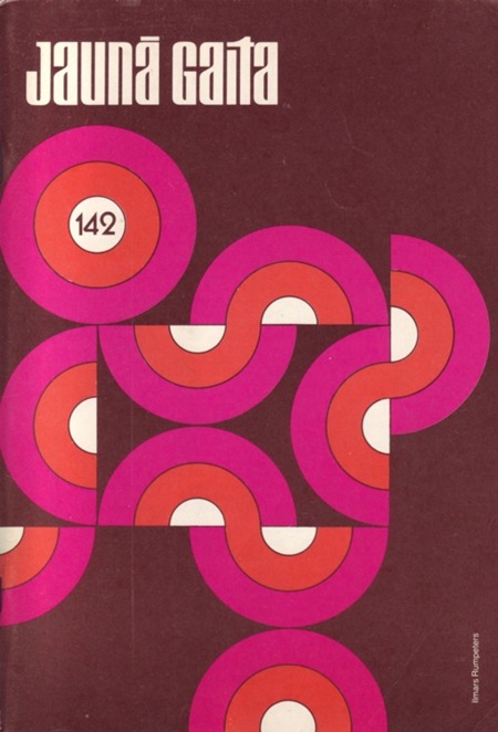
May 13, 2008 at 10:35 amAmazing…I like #2 the most I think, I feel like I’ve seen that before in a few places. Not only that, but these were published in the early 90’s, not decades earlier like I would have thought.
HeadDown says:
May 13, 2008 at 11:04 amhttp://farm3.static.flickr.com/2141/2473179558_d4a95117a3.jpg?v=1210141127
Scott says:
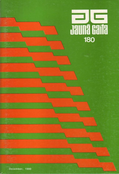
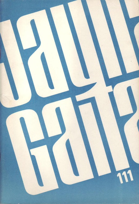
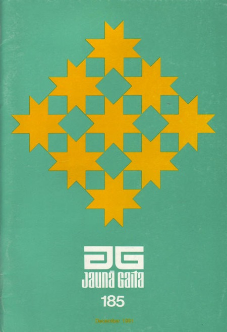
May 13, 2008 at 11:45 amColor has always been the central component of my own work so I think I am more likely to be stricken by work that has strong color schemes. These are all right up my alley in the color department; the muted tones, the semi-vibration on #1, the warmth. I also love the minimal approach and the focus on geometric forms.
as Alex said, I would have guessed these were made a long time ago, but many were made in the 90’s. Again, a concept that echoes my own values as a designer.
I am sure there is a better, more academic way of critiquing these, but that will have to wait until I someday go back and get a design degree. perhaps someone else can offer a more studied critique and maybe explain why these are so striking?
As for the Obama poster, I will be sure to keep everyone informed as things move along. The campaign obviously doesn’t want any of the imagery to be leaked prematurely so I have to keep a lid on it for now. Hopefully they will allow me to release some pictures from the proofing process early and then you can get a peek at the poster. I am actually pretty anxious to see how people will react to it. It’s not your typical campaign poster by any means, it diverges even further from that style than even Shepard’s did. It’s definitely a sort of throw back to my earlier styles, the sort of nature-inspired, bucolic stuff I was heavily into early on. I could tell this was the sort of style they were wanting me to pursue for this piece and it makes sense. I did infuse it with some newer concepts and techniques and this is also the most elaborate piece I have ever done, with a large portion being hand illustrated (something I have been wanting to return to, I definitely let my free-hand drawing skills atrophy over the years). at any rate, you’ll all be the first to know when the image becomes public in any form.
Joaquim Marquès Nielsen says:
May 13, 2008 at 1:05 pmScott –> This is very interesting news indeed. I’ve been wondering what your free-hand style looks like for quite some time. I definitely understand why you must be really anxious about how people will react to the poster. I hope it’ll be well received man!
I still hope that you’ll post some “behind the scenes” stuff someday, you know, sketches and what not. Sometimes sketches are far more interesting than the final output :)
Jess says:
May 13, 2008 at 4:51 pmYour teaser about the poster just made me want to see your art even more. I agree with Joaquim – some sketches would be interesting to see… thanks for sharing your thoughts on the Juana Gaita covers.
Horacio says:
May 13, 2008 at 6:05 pmit’s funny.. cause I don’t see the name “JUANA” anywhere… it’s “JAUNA”… hehe
good ones anyway :)
Brian says:
May 13, 2008 at 11:24 pmI definitely understand where you are coming from. Like the saying goes ‘less is more’! I feel that what is most popular today in design is always having to cram as much ”stuff” into a design a possible and overload them with effects. For the most part, a minimal approach is all that is needed to really create an effective and visually stunning design. It is sort of hard to explain sometimes, as it always sounds so right in my own mind.
Brian says:
May 13, 2008 at 11:29 pmAnother example of a designer who uses a minimal approach with geometric shapes….James White
http://www.signalnoise.com
^^definitely worth checking out^^
Scott says:
May 14, 2008 at 12:36 amHoracio-
thanks for pointing that out! chalk it up to exhaustion, totally overlooked that. fixed..
jamie says:
May 15, 2008 at 12:12 amThanks for your explanation about the posters Scott, much appreciated! Cant wait to see the new Obama poster!
Dreamer Lines says:
May 15, 2008 at 10:42 amJaunā gaita… nu skaisti jau skaisti :) Ir arī daudz citu veco latviešu žurnālu ar pietiekami interesantu postpadomju dizainu. Bet nu angliski tas ir vienā vārdā – nice :)
jefta Varwijk says:
May 16, 2008 at 2:23 pmi’ve been in Latvia several times, and allways find it pretty ugly and boring. So hearing this design is from latvia (i assume, as the mag is latvian) is staggering and awesome.
thank you for this link. I agree. In terms of perfect design, this is so close!
Andreas says:
June 15, 2008 at 6:15 amAny idea which font has been used in the posters? I tried to look it up on http://www.myfonts.com/WhatTheFont with no luck…
datelus says:
June 16, 2008 at 9:44 amJap, mums tiešām daudzi žurnāli šādā stilā iznākuši labu laiku atpakaļ ;)
Egils says:
April 13, 2010 at 8:50 amThank You Scott!
Paldies! …in Latvian. I am from Latvia, too. These magazines were published by Latvian exile community in USA during Soviet occupation time till early 1990-ties. Design of the covers, author of many of the is Ilmars Rumpeters (http://www.americanlatvianartists.org/members/ilmarsrumpeters.html) is mostly based on Latvian traditional arts and crafts as on the same level got inspirations from swiss graphic design or International typographic style that emphasizes cleanliness, readability and objectivity.
To Andreas (22) – these covers were designed BEFORE computer era. Knowing that you really can not get answer to the question: What is the name of the font? I started my graphic designer’s career is 1980-ties with the same tools probably. You created font by yourself on your working desk using just pencil, liner and brush. Your inspiration came just from a font in some other magazine; pretty often you even did not know name of the font you were inspired from.