Meet The World
Posted by Scott
Saw this on FFFFOUND today, really very clever. Loving the vignette on the flag photos and the concept is spot-on. Using the flags as information design in this context is so poignant. Incidentally, I used to be obsessed with flags, had them hanging all over my room as a kid. Guess I’m still a sucker for them.
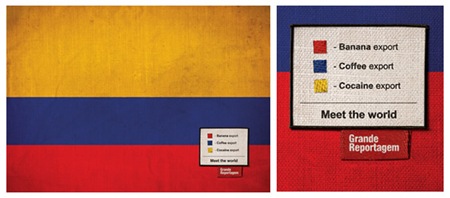
"Icaro Doria is Brazilian, 25 and has been working for the magazine Grande Reportagem, in Lisbon, Portugal, for the last 3 years. He was the author of the flags campaign "Meet the World" that has been circulating the earth in chain letters via e-mail…"
– Quoted From Brazilian Artists.net

19 Comments Leave A Comment
drew kora says:
February 20, 2008 at 2:33 pmVery strong concept. And the details are spot on…not only the vingette but also the nice texture and what not.
…it’s very sobering, though. I read a lot about world affairs…thinking how bad some of these countries are and what people go through sends shivers down my spine. And it’s almost always caused by ignorance, greed, corrupt religion, or all of the above. : (
Joaquim Marquès Nielsen says:
February 20, 2008 at 3:08 pmConverting flags into charts – that’s pure genius right there. I love the concept!
A tragic message though, about the world we live in…
Michael Williams says:
February 20, 2008 at 6:09 pmIt’s hardly “converting flags into charts”. The regions of colour are not in proportion to the data they claim to represent, which is an unnecessary loss of what is doubtless still horrible information — and undermines the designer’s credibility. Tufte would not approve.
Christian Sisson says:
February 20, 2008 at 6:19 pmVery original work! Well, maybe the statistics are not accurate but it doesn’t matter. Maybe he only intended to caught attention for a particular social problem and that was a very creative idea.
Actually my country is very well represented there.
Cheers :^)
Scott says:
February 20, 2008 at 6:26 pmMichael-
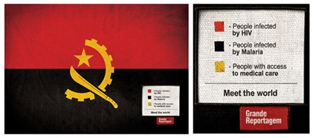
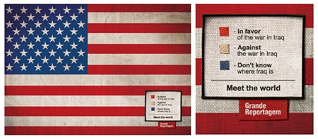
Agreed, they are not accurate “charts”. But I am with Christian, I don’t think they were ever intended to be accurate; I think this was done to make a point. At the expense of accuracy the designer has caught the eye and made us think, which I believe was the purpose of the project in the first place. It creates awareness of the problems by portraying them in a novel, albeit exaggerated, fashion. I would think that any half-way rational person viewing this would realize that Cocaine is not Colombia’s main export and not half of Angolans are infected with HIV. They would, however, think a bit more about the fact that those problems exist and perhaps be more apt to do something about it if the opportunity were to arise. So in this case I think the designer has achieved his primary goal.
Fabiano Santodomingo says:
February 20, 2008 at 8:38 pmGreat work!
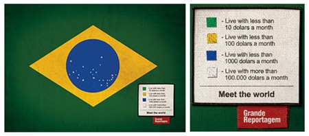
So proud of being brazilian these times. But, unfortunately, the data ( at least here, in Brazil ) is correct indeed. By the way, I’m in the yellow part.
See ya ISO, such a great blog you’ve got!
Congratulations!
Bye.
Alan says:
February 20, 2008 at 9:27 pmi didn’t even realize the vignetting of the flags at first. Now that i see it, it makes it really nice and pleasant to look at.
Really neat idea to express a cool message.
David Airey says:
February 21, 2008 at 2:30 amIt’s true that they’re not entirely accurate, but it’s the idea behind the flags that is so strong. If it gets people thinking about the injustices in the world, for me, it’s done a good job. Now, if it got people acting, superb.
Mirwen72 says:
February 21, 2008 at 4:27 amYeah I know this work. It’s good. I think I saw it on somewhere Epica awards – check it out :-O http://www.epica-awards.com/
rafael says:
February 21, 2008 at 6:30 amyeah, and i’ve known icaro for years now, and because of fffound it seems to be gaining new life again. fact is that this campaign was made 6 years ago and he’s not 25 anymore.
it also has been wide spread over the web in the form of e-mails, which makes me think it’s kind of timeless and that our memory spam isn’t very long these days, don’t you think?
remarkable work though. this led him to be recognized as one of the most talented creative directors in the world. he’s now at saatchi NY
Michael Williams says:
February 21, 2008 at 7:07 amSo if cocaine isn’t Columbia’s main export, why not choose the red of blue regions of the flag? At least then the relative importance would be correct. Unless of course the artist is being deliberately dishonest in order to further an otherwise compelling agenda.
Yes, it makes me think, which is a small victory, but I don’t think it makes me think what he intends me to. I’m thinking, “can I trust anything this person says?”, not “wow, yeah, AIDS is bad”.
michael j. says:
February 21, 2008 at 10:58 amMichael,
If the designer has provoked you and anyone else to discuss and comment they have done something important and worth looking at. I think the work is brilliant; we just need to understand that it’s not totally accurate as far as actual data is concerned. I liken it to a Michael Moore film; very poignant with some obvious bias.
Thanks for posting Scott, great FFFFIND!
Mirwen72 says:
February 21, 2008 at 12:06 pmMichael, It’s nice that you are thinking different way than the rest. Where would we be if we were all the same right? But try look at this very campaign from different perspective – how does 90 percent of people understand this campaign? People don’t really care that much about accuracy of information You can write very accurate analysis but who do you think cares about it? Only those who need it and pedants. Designer must focus on the group he is designing for… group not single persons
Alex says:
February 22, 2008 at 7:40 amI think this is very original in the fact that flags are being viewed as abstract charts. My personal favourite is the Columbian flag. Not because of the drugs, as some might think, but it is because of its irony. Coffe=caffine=what everyone “needs.” Bananas=potassium=healthy. Cocaine=highly addictive and destructive. Its almost sublime in a sense. The selling and exporting of certain drugs and other substances on the underground level is viewed as highly profitable. Well, I’m starting to ramble now, so keep up the wonderful work.
Bosco says:
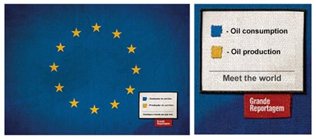
March 23, 2008 at 9:29 amMaybe you could do something for the EU. For instance, number of mindless socialist drones, number of assholes, number of smug socialist assholes with an inflated / unwarranted opinion of their superiority.
lnxvfawpme says:
April 23, 2008 at 6:47 pmWow, cool man, big thanks! http://msshkcpnsirn.com
caimao says:
September 10, 2008 at 8:37 pmbueno diseños … falta inteligencia… Colombia = exportador de cocaina… Resto del Mundo = Consumidor… cual es peor?… pensar y conocer tambien es parte de diseñar…
good designs … Lack intelligence … Colombia = exporter of cocaine … Rest of the World = Consumer… which is worse? … thinking and know is also part of design …