Kyle Tezak
Posted by Alex


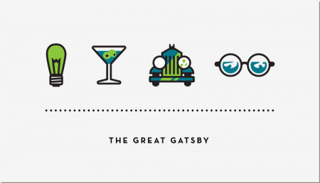
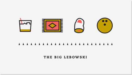
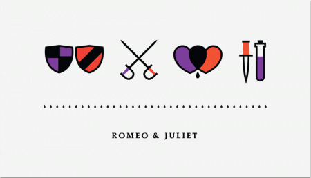
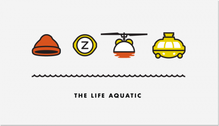
Kyle Tezak designed these icon collections to represent select films. Each film appears to get four icons, two colors, and a unique type treatment. You can see some of his work in-progress for this project on his Dribbble page.
I’m aware there are countless other projects that reduce films down to a few graphic elements. I particularly enjoyed this one because the elements are icons, not just squares and circles (albeit cleverly chosen ones). I find icon design trickier than poster design, and I am impressed with Kyle’s clear adeptness at the former.

8 Comments Leave A Comment
JGM says:
February 3, 2011 at 11:19 amRAD.
Nani Marco Mirko says:
February 3, 2011 at 2:39 pmWow awesome icon, my fav is the big Lebowski, i love that film :D
Great idea man…
Greetings from ITALIA ;)
Sean says:
February 3, 2011 at 3:31 pmI feel like a see a project like this everyday where they reduce cult films down to a single image or something, its pretty tired even though it looks nice
Damien says:
February 3, 2011 at 4:57 pmYeah these are really well done. Simple shape and colour techniques. I saw them initially on FFFFOUND! New imagery readily finds its way on there fast!
NAVIS says:
February 3, 2011 at 11:42 pmWANT BIG LEBOWSKI. I also feel like I’m playing a modern Zelda game.
Joaquim Marquès Nielsen says:
February 4, 2011 at 7:24 amPretty neat! Overall the lines seem to have the perfect boldness and the perfect… I don’t know… They just have that SOMETHING that makes them all insanely great. I especially like the Romeo & Juliet one… Intelligent use of color here.
Anonymous says:
February 9, 2011 at 1:11 pmGreat! Thanks for share!
Laura Sanchez de Pedro says:
February 9, 2011 at 1:11 pmGreat! Thanks for share!