Mads Berg Illustration
Posted by Shelby White
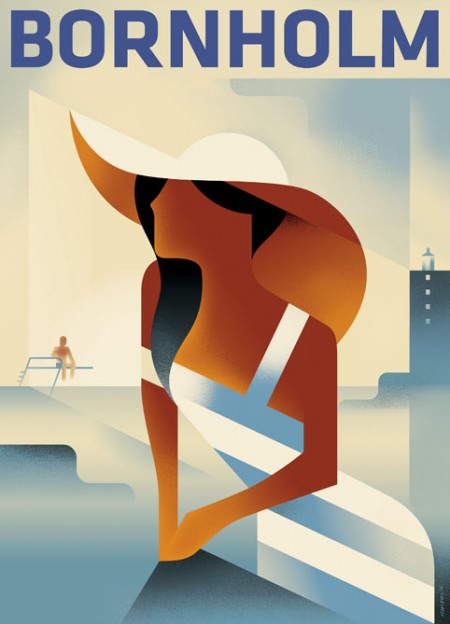
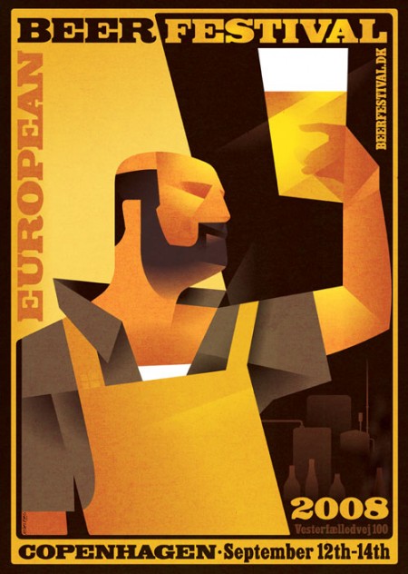
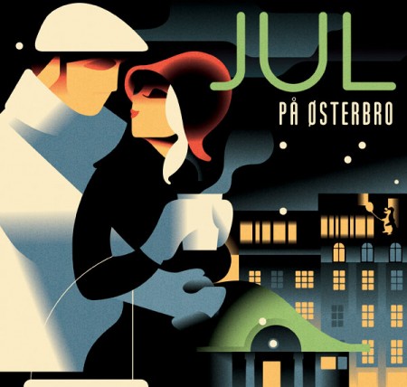
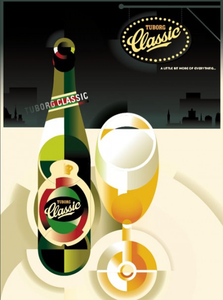

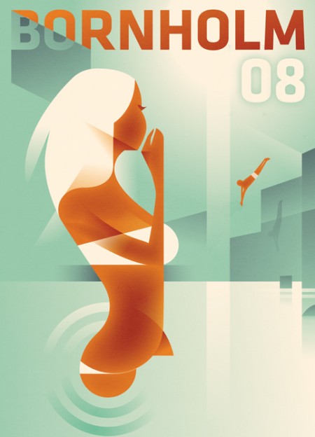
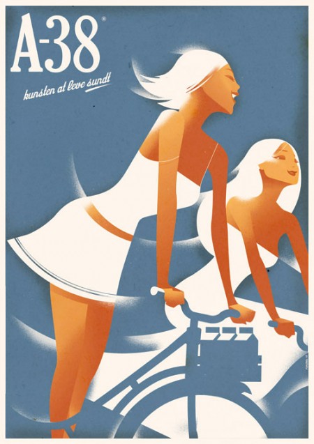
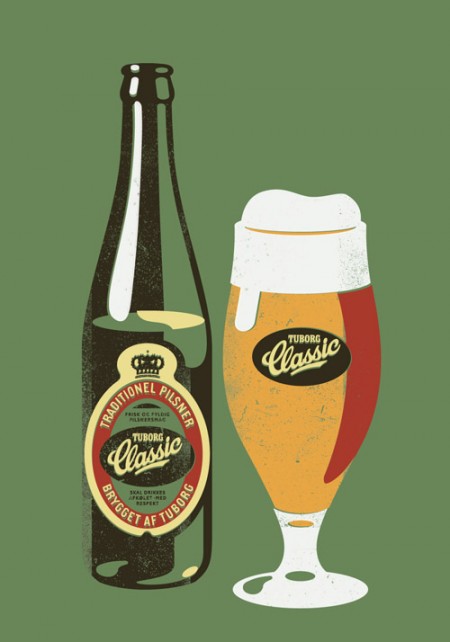
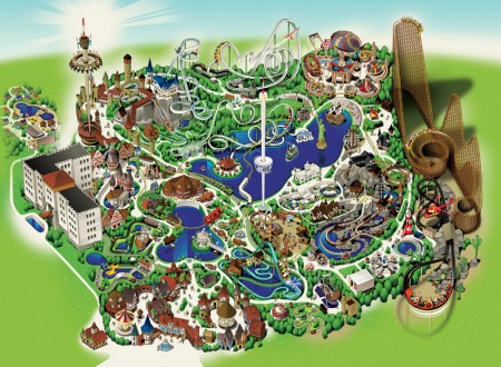
Mads Berg is by far one of the most refreshing illustrators I’ve seen in quite sometime. His works range from a crisp, modern Art Deco style to more 3-dimensional environment illustrations. Each of his pieces have such an engaging style that immediately welcomes you.
What I take from these illustrations is the execution of the core concepts. The amount of riffraff in these is nil—it’s down to the bare essentials which leaves us with a very simple illustration and clear message. What more can you ask for?
It’s a shame that I haven’t seen this style reflected more in today’s design trends. However, it could be that I’m just not tapping into the streams that they’re in.


18 Comments Leave A Comment
Alexander Nedelev says:
May 14, 2010 at 3:05 amReminds me of Cassandre’s work
http://www.cassandre.fr/cassandre.fr/GALERIE/Pages/GALERIE_AFFICHES.html
Sandor Zeestraten says:
May 14, 2010 at 5:23 am@Alexander Nedelev
And Razzia’s too.
http://www.internationalposter.com/artist-detail.aspx?id=513
I want his Louis Vuitton Cup poster so bad, but it’s a bit too expensive for me at the moment. http://www.internationalposter.com/poster-details.aspx?id=FRL11232
Workerman says:
May 14, 2010 at 7:54 amVery cool! Modern with a twist of deco….my fav. I use a similar shading style as Mads in my illo work as well, although he obviously much more proficient with it than I am. My illo Flickr stream: http://www.flickr.com/photos/workerman/
d|| says:
May 14, 2010 at 8:27 amGreat post. I really admire precison art. Takes me back to learning about Demuth.
KevInCarolina says:
May 14, 2010 at 8:41 amThis has got to be the style that I dislike the most in design.
I don’t know how anyone can use the word “refreshing” when there is a clear call back to earlier styles.
Ick!
FEFEPANA says:
May 14, 2010 at 10:06 amBoth Mads Berg and Cassandre are great!
Ian Houghton says:
May 14, 2010 at 10:11 amBornholm 08, yes please.
Shelby says:
May 14, 2010 at 10:40 am@Alexander – Mads work does remind me of Cassandre’s works; can’t help but love both.
@Workermann, I’ve only attempted to mimic this style once and it proved to be difficult. At first it looked easy, but getting the negative and positive shapes to balance appropriately was tricky.
Dana says:
May 14, 2010 at 8:36 pmGreat post. Beautiful balance of modern/deco style.
sbn.. says:
May 16, 2010 at 9:15 amMads is definitely one of the more talented illustrators working in this style in Denmark. This retro-style has been a trend lately, though, and it can be hard to see past the superficial similarities with 40s and 50s poster art. The faux-litho textures alone make it hard for me to appreciate.
For reference, an artist like Aage Sikker-Hansen is vital to understanding this trend. Gallery here:
http://www.plakatmuseum.dk/PostersUK/sikkerhansen/sikkerhansen.html
These images and others are, though more than half a century old, such a large part of our visual heritage around here. It’s relatively easy to reference with a few key elements, and of course we get a lot of cheap knock-offs. This, in turn, make some of the stylistic elements too loaded, at least for me.
In short, despite the expert composition, these seem more like pastiches than autonomous works given the history and context here.
waltersoza says:
May 19, 2010 at 5:32 amlovely post. i love this style.
question. i’m assuming berg is working on illustrator. how does he achieve the litho texture on the gradients? anyone care to share how to mock this technique?
Michael N says:
May 21, 2010 at 11:06 amMads is located in the same city as I am, and we’ve met a number of times and the thing about him is that he can draw/paint in pretty much any style you ask him to — so he’s not great at Illustrator but much more than that.
I’d say that he’s got renowned here in Denmark much because of these retro-posters you posted — and yes, we’re a nostalgic crowd here in Copenhagen as well — and therefore he has been commissioned by various agencies/clients to do similarly styled work. Still, he has done some other technically stellar work (regardless if you like the aesthetics or not…) like more cartoony work for LEGO and various others.
He shares office space with a bunch of his former class mates from The Danish Design School (got together right after graduation) and you can check them out here: http://www.gulstue.com/
Ryan says:
May 23, 2010 at 12:46 pmMakes me want to get up and paint. I think I shall. Inspiring.
TobiasMik says:
November 1, 2010 at 3:06 amSven Brasch is another clasic danish poster artist which adds to the danish tradition, and I’m sure his work also inspired Mads. See some examples at http://www.svenbrasch.dk
lzkim says:
November 13, 2010 at 12:20 amNice… very artistic.. Awesome Collection.
Jim's Golf Iron Blog says:
December 11, 2010 at 8:52 amHey there! I’m at work surfing around your blog from my new iphone 3gs! Just wanted to say I love reading your blog and look forward to all your posts! Keep up the fantastic work!