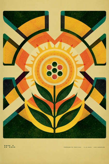
Terrabyte Studio Print

Over the past year I’ve been going through the process of scaling some of my posters for large format (e.g. the Knitting print: Old | New). Most of these were originally designed for 12×18″ format so they had to be re-created from scratch. It’s been a painstaking process at times, but it has also allowed me a chance to approach some of the designs from a fresh perspective. Something about stripping a design down to nothing and building it back up again gives you a clearer view of the essential nature of the piece allowing for more objectivity when making design decisions.
The latest print to be scaled up is the poster for the Terrabyte music festival (pictured above — view original). As you can see, I’ve made some changes and cleaned a few things up. I’ll be posting a process piece detailing the various earlier versions of the print and the transition from small to large format next week. The print is currently available as a giclee from the ISO50 Shop.
On a side note, if you’re partial to any of the older designs in the small formats now would be the time to grab some, they will not be reprinted. They can be viewed in the prints section at the shop.
ISO50 Studio Edition #007: Terrabyte

15 Comments Leave A Comment
Dean Oakley says:
March 31, 2010 at 4:41 amI really like this cleaner version!
Michael says:
March 31, 2010 at 7:36 amI recently purchased the Northern Lights print. Would love to see it large format. Great job on the upscales.
NAVIS says:
March 31, 2010 at 9:23 amThis show was awesome. You should definitely play there again if it’s still happening.
Shane says:
March 31, 2010 at 9:55 amI agree, nice revisions. I like this new version a lot. Good idea, taking apart an older design to gain greater depth of perspective on it. The differences seem to always come from our influences at the time of creation. Side-by-side, you certainly get a sense of what was effecting your environment at that time. Art/design is just great like that.
rent says:
March 31, 2010 at 10:10 amI’m liking the redesign a lot.
Funny you should post this, as yesterday I was perusing the Behance Network and found some of Paul Gardner’s concert posters, one of which looks immediately similar to your older version of this poster…I love his work and yours a like, but I thought it a bit curious to see the comparison.
http://behance.vo.llnwd.net/profiles2/129153/projects/331411/1291531256158203.jpg
Scott says:
March 31, 2010 at 12:14 pmrent-
curious indeed, the type layout is nearly identical, there’s even the dots at the bottom… thanks for the link.
Owner says:
March 31, 2010 at 12:27 pmPaul Gardner is known for “borrowing” ideas, layouts and color schemes” from other artists. He’s been called out numerous times.
He is not to be trusted on any level.
PS: I thought about the similarities in the Squarelake as well as soon as I saw this.
rent says:
March 31, 2010 at 12:32 pmI wasn’t aware he “borrowed” so many ideas from other designers…That’s too bad.
JamesM says:
March 31, 2010 at 3:02 pmSeems much more ‘pure’. More iconic. Lovely job squire.
Julian says:
April 4, 2010 at 6:22 amI am looking forward to actually buying some of the larger prints when I get the cash. Glad you’re doing this.
mark says:
April 5, 2010 at 8:41 pmPVC industry is currently the world’s rapid development and broad prospects, all countries are optimistic about the potential of PVC, as well as its ecological benefits, PVC is its superior and unique performance to the world to prove their role and status of the current can not be replaced by any other product , social development needs of its environmental protection need it, and it is our human society, civilization and progress of the inevitable trend. http://www.ceilingpanel.net
Helena says:
April 6, 2010 at 2:36 amI admire the fact that you redesigned it from scratch and I can tell it is much more clear and powerful shapewise… I also like what you did to the arrows – stroke. Much better. But overall I prefer the old one personally. A lot warmer, plus I love the Zapata type and the textures you had over the design. The sunlight feeling.. I think each poster satisfies different needs and we are also in a different period of the design industry when contemporar-ism is in the front. However keep up the good work, well done!
David Blanchet says:
April 6, 2010 at 7:35 amI gotta say your work is stunning as ever but i agree with Helena i like the originals better. the ‘mistakes’ are the candy that people like to chew on, the redesigns seems to lack a bit of the soul the originals had cause it seems more intentioned where the originals seems to have happy occurrences and while deliberate have a flair or non-deliberateness if you catch what im saying.
Stil good, still top notch, but id spend my money on the originals.
Luke says:
May 25, 2010 at 5:09 amBeautiful print and even better re-design, looks great on my wall too!
http://i791.photobucket.com/albums/yy198/longplayrecord/iso50print_small.jpg
Thanks Scott!