Genuine Fractals
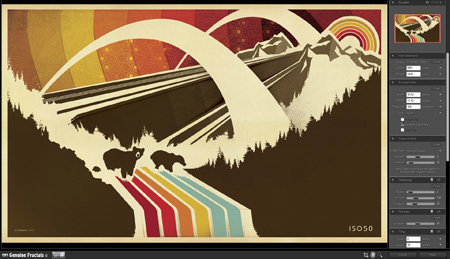
I’d heard of Genuine Fractals — onOne Software’s scaling plugin — from Tim at Blue Moon Printing but I had yet to try it out for myself. It’s basically a plugin for Photoshop which uses a proprietary algorithm (as opposed to Photshop’s built in resizing modes) to enlarge images. I was pretty skeptical but finally decided to try it out tonight when faced with some daunting upscaling projects.
I’m in the process of working through some older posters and sizing them up to the larger formats. For a long time I created all of my prints at 12×18″ (or thereabouts, depending on the format) as my computer just couldn’t handle anything bigger. For many I’ve been able to go back and recreate them, but some elements in the posters are scanned from smaller sources and just couldn’t be scaled up (e.g. the sky background in the above example. It’s made from a photo of a textile which is of a finite size and I don’t have access to anymore). So I figured now would be a good time to give Genuine Fractals a try. To my amazement it handled everything I threw at it beautifully. The interface and workflow are dead simple: you just initiate the Genuine Fractals dialog from the File > Automate menu, resize, click apply, and you’re done. It’s even fast, about the same speed as Photoshop’s resize command. There’s not much more to say as the results really speak for themselves. Simply put: Genuine Fractals can scale your images up to 1000% larger without any noticeable degradation. That’s what it says on their site and from my experience I’d say that’s absolutely true.
Genuine Fractals excels at photographic imagery, but that’s to be expected. With complex raster images it’s easy for imperfections to hide amongst all the shapes and colors. I thought the true test would be it’s ability to scale up flattened vector images. That is, vector shape and text layers flattened into raster images. I am doing this just to better illustrate how clean the scaling is but Genuine Fractals can actually handle multi-layered images (text, raster, and vector shape layers), scaling each layer individually and maintaining the original layer type. Meaning, if you feed it a document with a raster layer, a text layer, and a vector layer, it will use it’s algorithm to scale the raster data but will also scale the text and vector layers without rasterizing them. All the layers will be maintained as they were in the original document, they will just be scaled up. For my purposes, this is what makes Genuine Fractals truly powerful.
Here are some of my results. I know, none of this is very scientific but it’s a small glimpse of how well this program works. See the subtext under each image for a description.
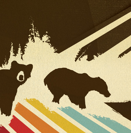
Original Image
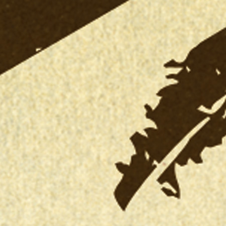
Photoshop Resized
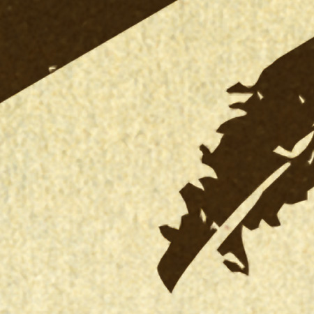
Genuine Fractals Resized
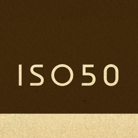
Original Text
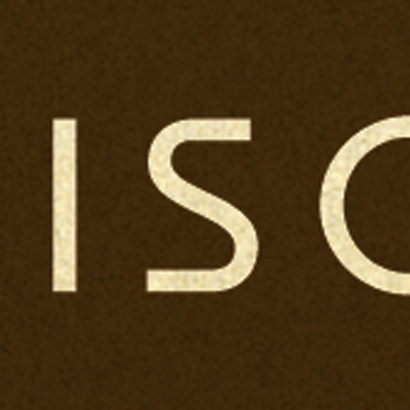
Photoshop Resized
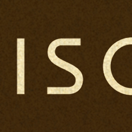
Genuine Fractals Resized
As you can see, the lines are still crisp and defined with the Genuine Fractals enlargements. It’s not exactly perfect when compared to the original, but it’s a greatly improved alternative to Photoshop’s native scaling algorithms. My only question now is: At $700, why doesn’t Photoshop have this kind of power built in? New features like content aware scaling are nice and all, but I’d much rather they spent their R&D money on core functionality like this.
You can download a demo of Genuine Fractals from their site to try it out yourself. At $150, the software is a little too pricey for casual use, I’d say this is more for print shops and professional photographers looking to scale up their work for large format printing.

26 Comments Leave A Comment
gustaf says:
October 7, 2009 at 11:19 pmThat’s pretty incredible, Scott. I just might have to pick that one up…. Thanks for posting!
Rent says:
October 8, 2009 at 12:24 amLooks like a great program. $150 is a little too steap for me though, like you said. But I completely agree about Photoshop not having this kind of technology for the price…I mean c’mon.
michael j. says:
October 8, 2009 at 12:52 amI wonder if something like this were made a part of Photoshop (or more accessible) if people would be using lo res images off the web and sizing them up for print work a lot more. You could also potentially send a great amount of info, like a lot of lo res jpegs over email and size them up on the other end. Granted you’d still have a loss of data but it might be much more acceptable.
Digital food for digital thought anyway…
Scott says:
October 8, 2009 at 1:00 amMichael-
that’s a good call, if you could build this into some sort of lossy compression (like jpeg) that would be pretty nice for non-critical stuff.
Martin Brinks says:
October 8, 2009 at 2:40 amThere’s a third kind of work area that benefits greatly from this piece of software (in addition to print and photography) and that’s 3d work. Genuine Fractals saved me more than once when an image took too long to render at the right resolution (using Fryrender) and where I chose to render a smaller image and then re-size it.
Lars Hedemann says:
October 8, 2009 at 2:42 amThe Alien Skin Blow Up 2 is has slightly better output than GF imho.
The “Preserve Natural Texture” feature, their grain and sharpness control works better for the 250-400% enlargements I have done.
But I can see the point with the vector stuff though…but there’s something about the Blow Up algo, that makes it look a bit more natural. I might be blind though ;->
Connor says:
October 8, 2009 at 2:58 amAlthough this looks like a useful plugin, I’m fairly sure you could achieve similar results with stock Creative Suite tools.
It appears to me that rather than merely doing pixel-level upscaling and anti-aliasing, like the default Photoshop resize, the plugin seems to convert the raster to a vector, scale the vector, then convert back to a raster. I’ve done this manually in the past by using Resize then Cutout, and by using vector tracing programs to convert manually from the raster, and scaling the vector.
This is often the case with Photoshop plugins, in that you can usually achieve the same results using the application’s own tools. I actually prefer the level of control this gives me, and it helps me understand the process behind what I want to achieve.
jefta says:
October 8, 2009 at 5:34 amawesome. i’m gonna remember this one.
Issam E. says:
October 8, 2009 at 6:35 amGreat tool Scott, thnx for sharing.
Matthew says:
October 8, 2009 at 8:31 amI had to uprez some film stills a while ago and tried this. Worked fine, but I found I got comparable results using resample and unsharpen in Photoshop. The Fractals results were better, but I don’t know if they were $150 better. I guess you’d have to print them to fully see.
Brian says:
October 8, 2009 at 9:15 amScott, what steps for enlarging in PS are you using? I do large scaling all the time for my stretched canvas prints, and just use PS, with decent results. I have not tried genuine fractals yet, but it looks like I’m going to have too. I did try the Alien Skin Blowup that Lars is speaking of, and I was not happy with the results. It made some of my film grain look like vector artwork.
I use incremental stepping in PS to enlarge, meaning I enlarge my images in small steps of usually 105% to 120%. It generally takes a longer time, but the results are far better than a one step process. I’ve enlarged 12″ x 18″ images up to 28″ x 76″ and they still looked very good.
Dylan says:
October 8, 2009 at 10:54 amI used to work in the sign industry, and we used this all the time to make images suitable for billboards, vehicle wraps, and other giant applications. It’s not perfect, but it’s well worth the price if you use it a handful of times. There’s definitely a range of sizes (I think about 500%-1000%) when the results are best, and it won’t improve clarity, but it’s still pretty handy to have.
Scott says:
October 8, 2009 at 11:44 amBrian-
Until now I was not resizing at all. I have read about various techniques but they’re all pretty involved. the key here is that I have very large documents with multiple layer types (shape, type, raster). It would take an eternity to go through and scale each layer using just Photoshop and the multi-step techniques I’ve seen for better scaling. At that point, I might as well just go through and recreate everything from scratch, it would honestly be quicker. So this is a great option, you just tell it what to do and walk away.
Yeah, saw the output from Blowup looks weird to me, more like what Connor is talking about (comment #7). From what I can see, GF seems to be doing it’s own thing, or it’s just better at it, because the effect is much more transparent. Of course, the biggest I’m doing is around 180% so I haven’t pushed it very hard yet. (although the examples I did for the article are around 300%)
ray says:
October 8, 2009 at 12:56 pmwith solid colors it does work great, but Im not so convinced when it comes to a photo.
Brian says:
October 9, 2009 at 6:37 amI see what you mean about upscaling with layers. I have never done that, exactly because of the time it would take. So I always save a separate file, make any changes I need, flatten it, and then upscale. In that case the scaling goes very quickly.
Either way, it seems everyone has their own solutions. I am going to give GF a try.
ralph fisker says:
October 9, 2009 at 9:39 amThis looks like a great tool. Can’t wait to check it out. And yes, it should be standard in PS. I’d like to see results on a normal picture, though. Can’t really imagine it adding pixels in an intelligent way?
Shane™ says:
October 9, 2009 at 5:28 pmGlad to see someone using this for their own work of art. We use this for upscaling images at a color house I freelance for. It does make a difference – for photography, you have to consider first the resolution the photograph was captured or scanned at, then consider how much it needs to res up from there. If to no avail and an upscale is needed, GF does do a decent job – far better then PS; just my experience with it. Scott a very nice print by the way.
Andy Babb says:
October 9, 2009 at 8:47 pmThanks for sharing your experience with Genuine Fractals in this informative article. Scott—I’m curious if you’ve observed any minor color shift in using GF vs. Photoshop for resizing. It seems to me that the brown tone in your GF result is evvvver so slightly lighter/brighter than the brown in the Photoshop resized example. Also, Shane™—since you say you have experience with the plug-in at a color house you do work with, have you picked up on a pattern of color difference?
Shane™ says:
October 10, 2009 at 9:29 am@Andy Babb, I’d have to say out of the images I’ve seen gone through, I haven’t really noticed any color differences or at least a pattern of any. If there are, I tend to think it is within a very acceptable range and something that you could adjust some. Hope that helps. I’m also curious if Scott has noticed any shifts with his work too. Thanks.
Jason Warth says:
October 11, 2009 at 11:58 pmInteresting post Scott. I also have GF-Pro, and the results are most definitely better than native PS methods that I’ve tried.
QUESTION: So much of your work seems to be vector-based (even with the wonderful use of organic textures that you often use), but I recall reading something on this blog quite a while ago that made it seem like you did it exclusively in Photoshop. Is that pretty accurate, or do you use Illustrator at all?
FOOD FOR THOUGHT: Having recently done the same thing with my entire portfolio (i.e. upscaling), I’ve found what seems to me to be an optimal solution: SMART OBJECTS. I build as much of my designs as possible in Illustrator, and paste the vectors in to a Photoshop file as Smart Objects. These can be edited in Illustrator by double clicking on their Smart Object icon in the PS layers palette, and they can also be resized infinitely (in Photoshop) with zero degradation whatsoever. In addition, as I import or create raster layers in the Photoshop file, I also convert those to Smart Objects—which has 2 benefits: 1) if resized (even multiple times), they’re re-rendered each time as if it was their first time being resized, and 2) once converted to a Smart Object, they become eligible for Smart Filters—which allows for applying and even rearranging a series of complex filters, distortions, etc in a non-destructive manner.
Not sure if that fits your creative process, but this method works really well for me by allowing me to up- or down-scale my images really easily with minimal headaches, and no degradation. Essentially, it’s close to a hybrid of Illustrator and Photoshop—providing the flexibility of Illustrator, with the richness of Photoshop.
Caspian says:
October 12, 2009 at 12:51 pmGF saved my arse on one job once (creating a billboard from a small file) with zero time to consider any other option. Since then I’ve used it whenever I can. I bought a new Mac and migrated everything over but GF bombed for an unknown reason. The customer service chaps were brilliant and upgraded me to the most recent FULL PRO version (which was an upgrade) without me even asking. And when I recently upgraded to 10.6 and it died (you have to deactivate the license BEFORE you upgrade your OS but no one knew in the early days) the OneOne guys were most helpful in fixing the license-manger whatsit. In my experience aren’t just buying a plugin, it’s much more than that.
Shane™ says:
October 12, 2009 at 10:24 pm@ Jason. Thank you very much for that reminder of using vector based elements as smart objects in PS. You are definitely right on with that. Nothing like the ease of adjusting them whenever and however needed. I’m just all about non-destructive workflows. Thanks bro.
Is it just me... says:
October 13, 2009 at 9:45 pmIs it just me or is the work of Taylor David a blatant rip off of your own? Especially his 1976 piece and your 1971 piece.
http://us.twentyonesquares.com/
I didn’t know what other post to write this on and if you two know each other then the influence is apparent. Still, seemed to me to be a bit more than imitation as a form of flattery.
Oscar says:
October 19, 2009 at 8:00 pmYeah! who is that goon??
Not just the 76 piece, but all the other ones too.
Also his website is exaclty the same layout your folio!!?…but crap!
I dare say I have done some small lifiting on my time but nothing that blantant!! I hope he is your mate or some kind of joke.
Sorry for hating, but that is just wrong.
Jerry says:
November 20, 2009 at 7:21 amEh,
His style is very similar, but people/ designer’s do this all of the time.
Imitation is the most sincere form of flattery.
At least the style is nice and not a horrible interpretation/ reference of Scott’s work.
Mundir says:
November 20, 2009 at 11:18 pmGreat article Scott, I was too lazy to use these techniques. Now I decided to go through with them.
Thanks for the good post, keep the good ones coming!