Color Management: A Field Guide
Color Management: A Field Guide
Whether you are designing for print or for the web, making the leap from what you see on your computer screen to the outside world can be a tricky process, fraught with unpredictable changes and unexpected results. The web is full of information regarding color management and sifting through it can be very overwhelming. Contradictory opinions abound and it can be difficult to find reliable sources of information.
Over the last few months, Scott and I have been researching this topic extensively. With the addition of the new Epson 9900 to the studio, we wanted to be sure that our printer workflow was optimized and producing a consistent output. With the help of Kirk Economos of Meridian Cyber Solutions, we have implemented a color management system that works for us. Below we have tried to aggregate this knowledge into a simple and useful guide, designed to help you ensure your studio is set up correctly. It is not intended to be the end-all article on color management by any means — but it’s a good place to start if color management isn’t something you have previously implemented or considered.
Sections:
I. Workspace / Digital Darkroom
II. Calibration
III. Color Mode & Application Settings
IV. Printing
V. Conclusion
VI. Discussion
The first step to a successfully calibrated studio does not begin with the computer. The space within which you view your computer screen can make a big difference and it’s important to be aware of the factors at play.
Light levels are a primary concern. The main thing to keep in mind is that you are trying to avoid screen glare, fluctuations in light, or any unusually bright sources of light; whether from a lamp, window, etc. All can affect the dynamic range of the monitor and alter your perception of the images on your screen. Ideally your workspace is lit by a consistent artificial source (not pointed directly at the screen) and is not overly bright or dim. Spaces lit primarily by daylight can be especially problematic given the large variation of both light intensity and the color cast of the light. Not everyone can achieve optimal settings of course, but you want to try and maintain consistency at the very least. Designing with your laptop on a sunny beach — for example — will probably not yield the most predictable results (although we’re all for experimenting!).
An additional step you can take to ensure ideal lighting conditions in your workspace is to paint the walls with Munsell 8 Gray. This paint is specially formulated to have a flat spectral response with no color bias. Unlike other hues, this type of gray will not affect your perception of other colors in the spectrum. It creates a “pure” and neutral viewing environment. You may have noticed this color on the wall of photo studios and print shops. Additionally, changing your desktop color to a shade of neutral gray will help for the same reasons.
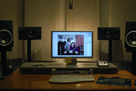
ISO50 Workspace 1
The state of your workspace is important not only for screen viewing, but also for evaluating printouts. Often times what appears to be a poor color reproduction by the printer is actually the result of irregular lighting conditions. Many print shops have light booths to ensure that they will always have a standard viewing situation. At the office or home, just make sure you are aware of the type of light you are using to view your printouts, and that you don’t change things around too often. Many people underestimate how much difference even the slightest change can make.
Prior to researching this topic, I gave little consideration to my viewing environment and blamed all inaccuracies on my printer. While this was often a fair assumption, there were many times when the inaccuracy I was noticing was the result of viewing the printout at different times of day with different light sources. Sounds simple enough, but it’s easy to overlook.
So what light do we use to proof? Despite all the suggestions above, we are still using daylight from our studio window. For the record, this is far from ideal and we plan to invest in a Just Viewing Station shortly.
If you are interested in other aspects of the optimal graphic environment, most are contained with the ISO 3664:2009. The International Organization for Standardization sells this document as a PDF in an effort to establish a consensus on viewing standards.
Calibration
Once your space is set up it’s time to calibrate the monitor itself. If you are on a Mac, there is a very easy to use onboard calibration tool. It’s manual and conducts a variety of visual tests to determine how you perceive certain colors and contrast scenarios. You can find it under System Preferences –> Displays –> Color –> Calibrate. Make sure the monitor has been on for at least 30 minutes before doing this.
The problem is that this test relies on the human eye to make effective judgments. Anyone who has ever seen this knows that the eye is not to be trusted. It is an important step regardless, if only to establish a base level of calibration, but it is not satisfactory if you consider yourself concerned with precise and accurate color readout. An alternative to this manual hardware calibration is a third party device that calibrates it for you.
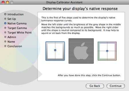
OS X Monitor Calibration Tool
There are a number of mechanical calibration tools that will analyze your monitor and calibrate it to your workspace conditions. They are far more reliable than onboard manual calibration, but can be a little pricey. One example is the Spyder from Colorvision. It’s very easy to use; you basically just hang it in front of your monitor, run the software, and wait for it to finish checking how all the colors are displayed. From there, it will generate a profile based on its findings. If you are running multiple computers, a mechanical calibrator can be a good tool to ensure that your monitors are all calibrated to the same standard. Here at the studio we use the Colorvision Spyder 2 and it’s been cranking out reliable calibrations for years now.
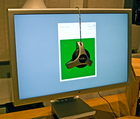
The Spyder 2 Colorimeter in action
There are two basic classes of hardware calibration devices: colorimeters and spectrophotometers. Those are two big words and you really don’t need to understand them. Typically, colorimeters are less complex devices and thus cheaper than spectrophotometers. Spectrophotometers are more complex — and in theory more precise — but will cost you more. The Spyder we use is a plain old colorimeter and it’s served us well.
On a side note, the color response of LCD monitors will shift naturally over time and as they get older, the rate at which they shift increases. You should calibrate every 2-4 weeks to keep your display in the sweet spot and because of this, a mechanical calibration system will save you a lot of time over manual methods. The bottom line is that it’s well worth it to own at least a basic mechanical calibration system.
Color Mode & Application Settings
This is where it starts to get tricky. Most designers are set in their studio space and have calibrated their monitors at least once. Unfortunately, there are many other steps along the way to a full system calibration (printer, web, software, monitor) where you can mess things up.
Everything begins with the Color Mode (RGB, CMYK, Grayscale). The most basic difference is that RGB (used on screen) is an additive mode and CMYK (print) is a subtractive mode. The important thing to understand is that your screen is using RGB to emit color, and your printer is using CMYK to reproduce color. Just about every other device used to capture or reproduce images is working in RGB (scanners, digital cameras, our eyes etc).
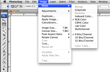
Choosing A Color Mode
Illogical as it may sound, when working at home, you want to send your printer (which is a CMYK device) RGB images to print. The conversion occurs within the printer and the software addresses the printer as an RGB device. This is where — at least amongst the student population — much confusion is generated. Given the fact that the printer is technically producing CMYK output, it sounds like the logical mode to use is CMYK. This is not the case. Not only is the printer designed to receive RGB output from the software, but you would also be shortchanging yourself of certain colors that both RGB and the device can address that are outside the gamut of the CMYK color mode (within the software).
One exception is when you are working with a commercial printer. They often prefer for you to make the CMYK conversion on your end (prior to printing), but it’s always best to check, as they might have specific target profiles or settings they prefer. This article is focused on color management at the home studio, and will not address the specifics of working with outside vendors.
Within a color mode, you have a color space. You are probably familiar with a few; Adobe 1998, sRGB, ProPhoto RGB, etc are all color spaces within the RGB mode. Like a box of crayons, some color spaces are capable of representing more colors than others. Adobe 1998 is widely regarded as one of the better color spaces when working with an inkjet printer. While it is not the most substantial in terms of the amount of color it can display (ProPhoto for example can do more), it is widely adopted and is a good all around compromise.
Along with Adobe 1998, sRGB is one of the most commonly used (especially on the web, not really for prosumer or professional print work). The sRGB color gamut encompasses 35% of visible colors, while Adobe 1998 covers 50%. The sRGB space is a better fit for the web because most browsers cannot display all the colors of Adobe 1998 correctly. You end up getting washed out looking images as the browser tries to fill in the gaps. When choosing a color space, it will largely depend on where you will be outputting the image to.
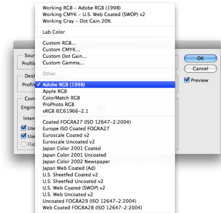
Converting to a Color Space
When you create or capture and image, it is tagged with an image profile. This profile is embedded within the image and tells the software what color space the image is using. A device profile — such as the monitor profile you create during monitor calibration — reproduces color independently of the image. Every device you use — whether it be a scanner, printer, monitor, or otherwise — will have its own profile (basically a formula that tells the software how the device will render the color in the file). So for example, if I have an image I’ve created in the Adobe 1998 color space (image profile), I can have multiple different interpretations of this image based on my multiple device profiles. Ideally, my devices are calibrated and the visual representations of the image profile are as close to consistent as possible.
In a perfect world, all of our documents would be created using the right profile, but of course this isn’t always the case. If you need to change color spaces in an existing document, use Edit –> “Convert to profile” (shown above). This will ensure that the correct numeric codes are always being interpreted and the colors are being reproduced accurately. If you “assign” an inconsistent profile to an image, the color output will be incorrect. It is best to use the convert to profile command (as opposed to assign profile) as converting actually modifies the numeric codes associated with an image. Assigning a profile only changes the way existing data in the image is interpreted locally, on your system, and does not alter the image data itself. So let’s say you create a document using Adobe 1998 and later assign another profile, such as sRGB. You now have two profiles stacked which will lead to an inaccurate view of the image. Once you save the document and send it off to the printer, the assigned profile (sRGB) will be lost and the output will not reflect what you saw on your screen. Assigning a profile is only advised when opening a document which does not have a color profile attached and is for local preview purposes only.
Much of Scott’s work is created in a CMYK space because a lot of it ends up being printed commercially. So when we’re printing his work to the Epson or outputting for web, we must first convert to the appropriate profile. If necessary, we then make adjustments to the file to compensate for any shifts resulting from the conversion. When printing to the Epson inkjet, we generally convert to Adobe RGB (1998) and for web output we use sRGB (IEC61966-2.1).
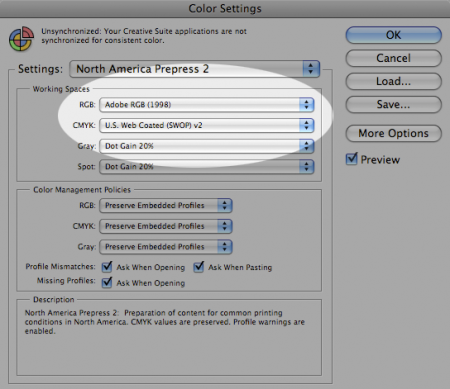
In Photoshop, choosing the setting “North American Prepress 2″ (Edit –> Color Settings) will get most of the settings in proper shape (Adobe 1998 color space etc). It will also allow Photoshop to recognize when a file is opened with another colorspace at work, and it will ask you what to do. In these cases, you want to convert the profile to match the Adobe 1998 setting. This will also ensure that you are always aware of what space you are in and are alerted if you get a file that is not consistent with your settings — which seems to be the case more often than not.
Printing
Assuming you have all of your settings correct, you are ready to print. As mentioned earlier, inkjet printers prefer the file to be created in the RGB space. The printer does the conversion to CMYK mode with the help of an attached ICC profile. This workflow will preserve as much detail as possible.
Assuming correct color space settings, the printer workflow that we have been using is as follows:
1. File–>Print
2. Click “Page Setup” and make sure you are “Formatting for” your specific printer and the correct paper size.
3. Do not “Scale to fit media”. Make sure the image size meets the desired output paper size before hitting print.
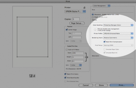
4. Make sure ‘Color Handling” says “Photoshop manages colors”. This ensures that the colors will be as close as they can be to what you have been viewing in Photoshop. You are also specifying that you do not want the color to be managed by the printer. You do not want to apply more than one profile to your print job.
5. Make sure the “Printer Profile” matches both your printer and the eventual type of paper you are using* (see below for more info). (RW = Radiant White, PK = Photo black ink). For example, for the Epson R2400 printing on enhanced matte paper, I will choose the “SPR2400 Enhanced Matte” setting.
6. Hit Print and go to the second dialog box.
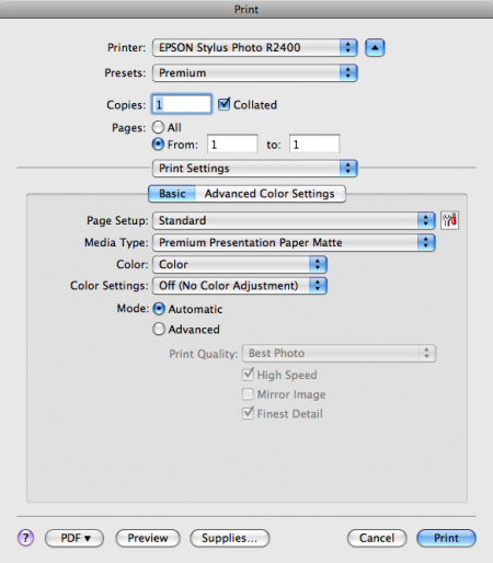
7. Very important! Under “print settings” turn OFF color management by the printer. If left on, this will apply a second color profile — in most cases, applying two profiles to a job is worse than applying none at all. You would undo all the color consistency you worked hard to ensure. Think of it like a person with glasses putting on another pair of glasses over their own; it just doesn’t work.
8. Make sure “Media Type” is using the same paper type as your previously selected ICC profile. This setting, used as a shell, will determine the ink limits and linearization.
9. Hit Print (finally)
10. There are additional steps to consider if you are printing to a large format machine, like our 9900, but these have been omitted under the assumption that most people aren’t working with such a complex system. But to tell you the truth, it’s pretty much the same as the small ones with only a few exceptions.
Don’t forget, Turn OFF color management in the printer driver!!! You have already asked Photoshop to handle this in step 4, and Photoshop will do the conversion from the file’s color space to the devices color space correctly. Once you get output you’re happy with, most of these settings can be saved as a preset and recalled later.
*Since different papers handle ink/color differently, there need to be a lot of ICC profiles. They ensure that the conversion from RGB to CMYK is seamless and optimized for the device and eventually the paper. These profiles are usually available on the manufacturer’s website and some (such as Epson) are automatically installed with your printer drivers. Some paper manufacturers will approximate the best ICC profile to use with their paper if they have not created their own.
Conclusion
Ideally, it would be possible to achieve complete visual consistency throughout every part of your workflow. Unfortunately, no matter how thoroughly you adhere to color management guidelines, there will always be inherent discrepancies in how color is represented between mediums. What you should aim for is consistency; both in your output (as best you can) and your studio environment. Consistency will lead to familiarity and you will be able to compensate and make the appropriate changes to your documents to ensure they output as intended. It takes a little bit of work, but with the correct information, settings, and equipment, you can drastically improve your color management.
As previously stated, this article is not intended to be an end-all one stop shop for color management. We hope only to illuminate some of the more confusing issues and present a basic working knowledge of color management. This is simply what works for us, but your mileage may vary and there’s always another way of going about things. If you have any, questions, or would like to add anything we missed, please don’t hesitate to let us know in the comments. If you just liked the article and want to let us know, your comments are welcome too.
Thanks again to Kirk Economos for his help putting this article together and for getting our printer up and running!

77 Comments Leave A Comment
Kimby says:
August 18, 2009 at 3:26 amWow, this is handy to know, especially being a student. The printers at course are always so far off the mark… now I know why :)
David Airey says:
August 18, 2009 at 3:29 amThanks for this, Alex. I don’t know enough about colour management (which is becoming obvious through preparing 200 full-colour pages).
Panos says:
August 18, 2009 at 3:36 amThank you! As promised, you got it in time. And to be honest, in the right time for what I needed.
Thanks again!
adamgf says:
August 18, 2009 at 3:40 amGreat post. Really helpful for me, Just starting out on my own and setting up a studio. Thanks for putting your experiences up here.
Ryan Young says:
August 18, 2009 at 4:03 amCracking post Alex.
Will give it a proper read later on.
wize says:
August 18, 2009 at 4:59 amHey,
Great post. Tks 4 the feedback.
w
Rory says:
August 18, 2009 at 5:17 amThis would make a great pdf.
faber. says:
August 18, 2009 at 6:56 amReally great article Alex.
I had been doing printing on our Epson 4800 a bit differently – would be interested to know what your consultant thinks:
I go to View > proof setup and set my ICC profiles in there. Then when you go to print you use proof settings instead of document settings in the print settings dialog box. I think this actually results in the same ultimate result, however the advantage to doing it this way is that when you check View > Proof colors, it actually simulates on screen what the print will look like (ideally) with the applied ICC profile. So instead of applying the profile during print, you apply it early and get a preview of any changes that may result from using that particular paper/profile.
Also, I never realized that you weren’t supposed to convert to CMYK – thats really interesting because I usually design primarily in RGB and then I hate having to convert to CMYK because I either have weird things happen when flattening or from differing blending modes (as CMYK and RGB handle blending modes very differently, naturally). I’ll have to try the non-converting part next time I print.
This is a great resource Alex – thanks for putting it together.
Joel says:
August 18, 2009 at 7:30 amI will have to review this a number of times, before I can commit it to memory and unaided practice.
One of the most interesting tidbits is the gray paint that covers the walls in many art studios. I always wondered why we couldnt liven the place up. Thank you for that interesting nugget. I will continue to read your blog.
koneyn says:
August 18, 2009 at 7:51 am@Joel – could you believe that I know of a respected design agency that has their walls all painted in very bright orange? So much about professionalism :)
Really nice tutorial, but I have to get myself a decent monitor first… :/
mhettler says:
August 18, 2009 at 7:54 amGreat post, Alex. Just in time for portfolio printings. Thanks!
Timmy says:
August 18, 2009 at 8:25 amI’ve been converting to cmyk for inkjets for a long time. And actually get very good results, but I’m going to have to try this method now.
Also, I’d like to read how you tackle rgb and the many problems that ensue on the web, with varying browsers, etc. After countless hours of fighting the color gods, I basically learned to strip the files of their profiles, and in Photoshop, use the profile of my monitor. Maybe it sounds crazy, but I get consistent color across all browsers and on other computers…
greg says:
August 18, 2009 at 8:57 amThanks! This looks to be quite helpful…
Matt D says:
August 18, 2009 at 10:28 amGreat article. I have tried to research this stuff on my own and quickly became overwhelmed. One thing I’m still confused about: “most browsers cannot display all the colors of Adobe 1998 correctly”. Is this an actual limitation of the web browser? Or is it a limitation of computer monitors in general? I ask because I have never heard that modern browsers still have trouble producing the same number of colors as any other application that displays an image on the monitor.
Also, I second Timmy’s request for an article that digs into the inconsistency of creating color correct images for the web.
Andy W. says:
August 18, 2009 at 10:44 amThe best part of this is the Dog-Eared cover. Thanks, Scott.
rudolfs says:
August 18, 2009 at 12:52 pmAnother thing to remember is not to convert from one color space to another and then back. Eg. Adobe 1998 -> CMYK -> Adobe 1998. You’ll loose color information in this process if one of the color spaces is narrover than the other.
Derek K says:
August 18, 2009 at 1:05 pmVery nice write up. It’s interesting to see how other people deal with colour (I’m Canadian eh…) management. We’ve got a home studio with the Epson 9600 and the 7600. The walls are very neutral grey.
You know when you stand in a sound proof room and talk but you can barely hear yourself and there’s no echo and it’s weird? Yea, standing in a neutral grey room has the same effect.
We also calibrate monitors and paper samples frequently. You guys are lucky with the 9900. We have to swap Photo Black and Matte Black cartridges. Which eats up so much ink.
@Matt & @Timmy: Colour correcting for the web is totally 100% impossible. Except for your monitor. You’d basically have to profile every monitor and have those profiles attach to your image (that’s the impossible part).
Browsers don’t have a problem displaying colour. The best thing to do is make sure it at least has a common profile attached. sRGB or Adobe 1998 or like Timmy says, make sure it has no profile and let the user’s monitor deal with it. Most monitors are colour correct for a month out of the box so attaching sRGB or A1998 will work. After that, it’ll probably go toast.
I wouldn’t worry to much about it. You might go crazy. ;)
Derek K says:
August 18, 2009 at 1:11 pm@rudolfs, man I’ve done that accidentally a few times. I hate that. It shouldn’t even be an option until you get to the print setup stuff. If you’ve got 16bit files it’s best to leave them at that as well. And only down sample at the very last stage (if you’re printer is capable of 16 bit than you don’t need to switch to the 8 bit).
Eric S. says:
August 18, 2009 at 1:30 pmThanks for sharing, great basic guide for color management, which can be a bit baffling. Pretty thorough, but clear and concise. Don’t want to sound greedy, but any chance of a PDF version for quick reference? Thanks again!
Jason Warth says:
August 18, 2009 at 3:09 pmThank you Alex! This is a wonderful write-up for many reasons—not the least of which is its conciseness.
I’ve spent many hours researching this topic on my own, since I’ve been operating as a freelance designer without having been through design school. There are a couple bits of additional information that I wanted to offer below in the hopes that doing so adds value to your effort.
If you feel this information is not helpful (or worse, inaccurate), please feel free to edit or delete my post:
– Gamut: This term pops up frequently, and it might be helpful to explain it further. People can think of it as the “range” of reproducible colors for a given color space. In Alex’s “box of crayons” example, a space like “Adobe RGB” is akin to a bigger box of crayons (i.e. with more colors) than the “sRGB” space.
– Every single image should be converted-to—or exported-as—sRGB before posting to the web. (Note: when you convert to this space, you are discarding color information that you can’t get back—so ensure that you either a) don’t care, or b) have retained a copy of the file in its original color space.)
– The sRGB color space is preferred (/mandatory) for the web, because it provides the best chance for achieving CONSISTENCY among the billions of computer/device screens that connect to the internet all over the world—most of which are completely un-calibrated. Herein lies the ultimate joke on designers: we fight and fuss over the smallest details—and yet, to present our work on the web, we wind up having to use the “lowest common denominator” of color spaces (sRGB). If every internet user had the same operating system, same monitor, same ambient light, and a calibrated display, we could use other spaces… but they don’t (and they never will), so it’s sRGB or bust.
– ICC profiles: The most helpful explanation I’ve found about these is to think of them as Rosetta Stones. ICC profiles contain information about TWO players in your color-management process, and they serve to translate input from one of those players into the most accurate output on the other. E.g. If one person speaks “jive” and one person speaks “The Queen’s English,” an ICC profile would help translate, “Man, we ain’t found s#*t,” into “We have not found anything.” (forgive the Spaceballs reference).
– Unique ICC profiles should be used for EACH pairing of players in your workflow (i.e. if you have 1 printer, and use 4 different types of paper, you should have 4 ICC profiles). Many printer manufacturers include ICC profiles with their printers—BUT ONLY for their own paper. In other words, if you buy a Canon printer, you’ll get profiles for Canon paper. But, if you want to use Epson paper with your Canon printer, you’ll need to go find an ICC profile to match up your specific device, with that specific paper. (Alternately, if you have access to a Spectrocolorimeter, you can create your own ICC profile)
– Soft-Proofing: Photoshop can be set up to “soft-proof” your image, which is equivalent to showing you a rough approximation of what your image will look like once it’s output on a specific device/media. E.g. If I know I’m going to order a print from a lab, and I know that they’re going to use a specific Noritsu printer and Kodak Endura Metallic paper, then I will tell Photoshop to soft-proof my image using the ICC profile that I found on the web for that specific combo of printer/paper. Assuming your monitor is calibrated accurately, this is VERY helpful, and (very) reasonably accurate.
Anyway, I hope that info helps some people. I’ve never been more confused by a topic than color management, so I wanted to offer what I could, and I want to applaud Scott and Alex for their hard work in bringing this guide to us in such a concise way. This will be such a helpful reference to have on hand!
-Jason
Stephen says:
August 18, 2009 at 3:32 pmGreat article! At the calibration stage it might be appropriate to mention the desired gamma settings, which I have been researching this very morning.
PCs, most digital cameras, Snow Leopard and TVs work with a gamma setting of 2.2. This allows a wide range of colours but is quite dark and loses something in the lower tones. The mac prior to Snow Leopard defaults to 1.8, which is brighter with a smaller more subtle range. It is advisable to switch your current mac to 2.2 and 65k for temperature so as to improve compatibility.
Apple now suggests this:
http://support.apple.com/kb/HT2026?viewlocale=en_US
It can take a bit of getting used to, by the way.
Jason Warth says:
August 18, 2009 at 3:51 pmGreat point, Stephen…
One other point worth noting here: If you have an Apple Cinema Display (or other LCD), you actually have a BACKLIGHT setting—NOT a brightness setting. This is an important distinction to make when using calibration software.
Op says:
August 18, 2009 at 4:27 pmFor those on windoze and switching monitors (ie laptop and external desktop screen) grab this handy switcher so you can calibrate both screens seperately and select monitor profile depending on which screen your working on :) http://tr.im/wEfF
Jukes says:
August 18, 2009 at 6:21 pmThis is a fantastic article and a great resource for a terribly confusing subject. Thanks for all the work you put into creating this.
toque says:
August 19, 2009 at 12:30 ami’ve been sending all my short run digital printin in RGB for a few years now and get way better results out of my print shops. It opens up a hole cross-section of colour that you immediately think are strictly screen or spot colour press.
if you have digital needs at all, i recommend doing some colour tests with your shops to see how far they can flex colours. i think most will be pretty surprised just how vibrant you can get your prints to look.
as always, great article.
GustavoRG says:
August 19, 2009 at 3:38 amExcelent!
very usefull infomation, this part of the proccess is has to be done with the precise care when printing is on the way, many thanks for such an article, simple and easy to understand.
pam golafshar says:
August 19, 2009 at 4:10 amWhat a great post! I’ve also appreciated reading through people’s comments and contributions to the article. Color management is an issue that is hard to find really great, helpful information on. I’ve been freelancing for almost ten years, and I’m still not completely satisfied with my color workflow setup – so I will definitely be reading this article more in-depth when I have the time. (When I have the time, ha!)
Thanks for the great post.
Christopher Meeks says:
August 19, 2009 at 8:40 amAwesome guide. I’m always amazed when I look at something I’ve designed on someone else’s monitor and it is completely off. While that may be impossible to make perfect, at least sending things to the printer will be more successful!
ichi.one says:
August 20, 2009 at 11:04 amthanks, printed and handout it in the office ;-)
RA_OUL says:
August 20, 2009 at 4:26 pmThank you so much for this. I emailed my cohort about the post. Everyone was super stoked.
Darbo Scalante says:
August 21, 2009 at 8:40 pmCongratulations! the post is great.
http://www.colourmanagement.ca/resources.shtml
Darbo
bicycleman says:
August 27, 2009 at 2:27 pmCould you guy write something on color theory. How to blend colors and stuff like that? Thanks
blackabee says:
August 27, 2009 at 11:39 pmsnap. good info. thanks!
AClay says:
August 31, 2009 at 3:27 pmThanks a billion for this! The ISO50 team is truly inspirational.
Best!
Tiemen says:
September 1, 2009 at 7:05 amErm.. I love the cover!
tinkerpixel says:
September 1, 2009 at 6:04 pmMan, if only somebody had posted all of this in one place years ago it would of saved me so much time looking up the answers.
Grampian Mountains says:
September 2, 2009 at 12:23 amThis is fantastic. Thanks for putting the time and thought into posting this. To reiterate what others have said above though, it would make a great PDF also.
California Wood Artist says:
September 2, 2009 at 5:11 amWow – makes my drills and chisels seem even more outdated. Very cool. Glad I stumbled here.
N.K. says:
September 2, 2009 at 12:24 pmEhem, no word of Colorburst or any RIPs?
Colorburst might be pricey but at the same time it is the most simple solution and has kept my workflow solid for ages now.
Matt B says:
September 2, 2009 at 12:43 pmThe debate between Adobe RGB and sRGB has been large leaving many casualties. I have always used the larger gamut (AdobeRGB) until recently. Upon using my Canon 5D MKII for photography, I have found that many print houses (including Mpix which uses chemical printing) only print in the sRGB gamut space. To make conversions less dramatic on the image, I set my camera up for sRGB and of course shoot RAW (but make sure the converter stays with sRGB).
When viewing on your monitor, the image will seem less saturated and dull, but when viewed on the web or printed, it becomes vibrant. However, if left in Adobe RGB, the image is vibrant on your monitor but dull when printed or viewed on a website. So I recommend shooting stills in sRGB even though I once was a fan of AdobeRGB.
Also, the logic is this: if you are working in 8bit mode, sRGB will have finer gradations because the smaller gamut is not trying to stretch the same bits over more colors. Finally, if your camera has 10 or 12 bits and you convert RAW into 16bit mode AND plan on having your image professionally printed on a 4, 8 or 10 color press, edit in AdobeRGB. Then convert to your printer’s color specs. 16bit and the larger gamut *may* preserve some color.
Lindsey says:
September 8, 2009 at 7:29 amGREAT resource. Thank you so much!
saghir says:
September 11, 2009 at 7:28 amمعالج روحاني لفك السحر و حل المشاكل الاجتماعية خدمات روحانية و على كل المستويات علاج كل أنواع السحر و المس و الأمراض الروحيةالحقوق و الديون و التوظيف \ سرعة الزواج للمعطلة \ جلب الحبيب روحانيا لرجل أو امرأة و خلال \ أمر الطاعة و الإصلاح للزوجين \ للتسيير المعاملات و القبول مجال العمل و التجارة \ الخادم الروحي تحت تصرفك مباشرة خواتم روحانية للمحبة و القبول و التأثير و الهيبة \ لرد المرأة المطلقة\ لفك الربط للرجل والمرأة \ للوجاهة وعطف القلوب\ لعلاج النظرة والحسد \ مع الكثير من الخدمات الروحانية لحل جميع مشاكلكم هل لديك مشكلة و لم تجد لها حل ؟؟ عليك الاتصال عبر الجوال 00212678527280
Matt D says:
September 12, 2009 at 6:27 amThanks for putting this together! Having made the switch from primarily web to primarily print designer a little over a year ago, I definitely haven’t had and needed a crash course like this in color management!
For the kids says:
October 8, 2009 at 7:20 amGreat article, I would love to see something dealing specifically with the web. and color profiles. It still confuses me a lot.
Peter says:
October 8, 2009 at 8:54 amI can’t understand why an image would be converted from CMYK to RGB for printing. It’s the first time I read this particular method. I understand that printers prefer RGB data and that these printers make the conversion, but converting an CMYK image to aRGB for this reason sounds strange to me.
Can anyone explain this to me?
Nice article containing some basics of colormanagement. For more detailled stuff i would advise http://www.amazon.com/Photoshop-Color-Correction-Michael-Kieran/dp/0321124014
Cheerioooos from Belgium
معالج روحاني00212678527280 says:
November 18, 2009 at 1:44 amمعالج روحاني لفك السحر و حل المشاكل الاجتماعية خدمات روحانية و على كل المستويات علاج كل أنواع السحر و المس و الأمراض الروحيةالحقوق و الديون و التوظيف سرعة الزواج للمعطلة جلب الحبيب روحانيا لرجل أو امرأة و خلال أمر الطاعة و الإصلاح للزوجين للتسيير المعاملات و القبول مجال العمل و التجارة الخادم الروحي تحت تصرفك مباشرة خواتم روحانية للمحبة و القبول و التأثير و الهيبة لرد المرأة المطلقة لفك الربط للرجل والمرأة للوجاهة وعطف القلوب لعلاج النظرة والحسد مع الكثير من الخدمات الروحانية لحل جميع مشاكلكم هل لديك مشكلة و لم تجد لها حل ؟؟ عليك بالمراسلة أو الاتصال عبر الجوال
mobil 00212678527280
paul rioux says:
February 28, 2010 at 3:46 pmBonjour
Thanks for the color management tips
A question simple: Are you able to perfectly center any picture
on a cut sheet ( standard or not ) on an epson 9900
I am always off per .25….
thanks paul rioux
Derek Kinsman says:
February 28, 2010 at 4:02 pm@paul you shouldn’t be. When I need to print centred on the page it works fine. Your roll might not be cut to the right length. We’ve had that happen before on a roll.
paul rioux says:
February 28, 2010 at 6:27 pmNot on a roll
I am printing on epson cut sheet
13×19 or 17×22 ….
And i am always of a little
paul
paul rioux says:
February 28, 2010 at 6:27 pmNot on a roll
I am printing on epson cut sheet
13×19 or 17×22 ….
And i am always of a little
paul
معالج روحاني00212660966649 says:
May 31, 2010 at 7:45 amمعالج روحاني لفك السحر و حل المشاكل الاجتماعية خدمات روحانية و على كل المستويات علاج كل أنواع السحر و المس و الأمراض الروحيةالحقوق و الديون و التوظيف سرعة الزواج للمعطلة جلب الحبيب روحانيا لرجل أو امرأة و خلال أمر الطاعة و الإصلاح للزوجين للتسيير المعاملات و القبول مجال العمل و التجارة الخادم الروحي تحت تصرفك مباشرة خواتم روحانية للمحبة و القبول و التأثير و الهيبة لرد المرأة المطلقة لفك الربط للرجل والمرأة للوجاهة وعطف القلوب لعلاج النظرة والحسد مع الكثير من الخدمات الروحانية لحل جميع مشاكلكم هل لديك مشكلة و لم تجد لها حل ؟؟ عليك بالمراسلة أو الاتصال عبر الجوال
mobil 00212660966649
john says:
July 24, 2010 at 4:25 pmTHANK YOU THANK YOU THANK YOU!!
i know this is like a year old, but I just set up a 7800 and was very overwhelmed by my novice knowledge… followed this tutorial to the tee, and my print is spot on when compared to the digital proof.