Hatch Interview
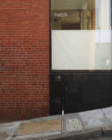
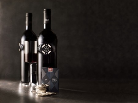
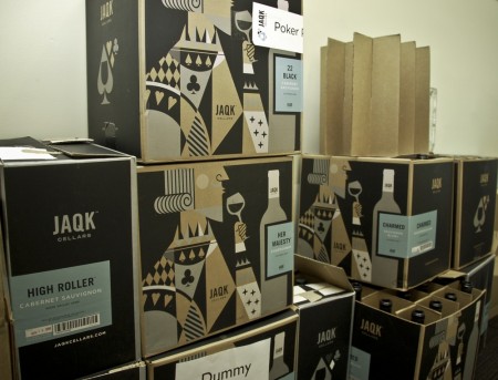
Hatch is a San Francisco design firm founded by Joel Templin and Katie Jain. Since its inception in 2007, Hatch has developed innovative campaigns for some of the world’s biggest brands, including Coca-Cola, Apple, and Target. They are known not only for their exceptional work, but also their distinctive business model, which allows them to be a launch pad for their own products. Most recently, Hatch was at the World Series of Poker promoting their first “hatchling”, JAQK Cellars.
I had the chance to sit down with Joel and Katie last week to discuss their work, process, and the recent goings on over at Hatch. With the launch of their new website and the success of JAQK, and they have their hands full! Check out the interview after the jump.
Be sure to check out Part Two of this interview over on Grain Edit!
Alex: So you all were just at the World Series of Poker, how was that?
Katie: Draining, really good for JAQK, but really draining for Joel and I.
A: It was in Las vegas?
K: Yep, the world series of poker is 54 different tournaments that happen over two or three months. It culminates in the Main Event, which is the one that gets televised on ESPN. They go from six thousand players down to the final nine by the end of the tournament. If you are in the top nine, you win at least one million dollars — so it’s really serious. It was fun for us to be there because we always thought of poker as this playful fun thing — you go there and realize how serious people take it.
Joel: 198 countries are represented. Poker is huge. It’s legal to play for money online, but it’s not legal yet here, so thats why there is just this huge following. There’s media and camera crews from all over the world.
A: Was poker something you were really interested in before you started JAQK?
J : I play cards, everyone plays cards right? It’s a vernacular that resonates with people. World Series of Poker is the third most watched sport on cable TV, poker chip sets are the number three gift item on amazon.com — so there is this big movement and craze here. And it can be bigger than poker — our idea is that it stands for ‘play’. We’re not sure yet, we’re very young, but what if over time it did expand to other areas of play — soccer, golf — I mean it could be anything.
K: There is also the connection between the social aspect of wine — gathering together with your friends and sharing time together — and the same thing with games and cards and all that. We saw a connection.
J: The guys at ESPN met with us — listened to us talk about the brand, tasted the wine — and they love the sophistication of it, the play aspect of it, the quality of what’s in the bottle. They can see that it’s bigger than just poker. We were invited to the Playboy mansion for the ESPYS but we couldn’t do it. The fact that they wanted us there — maybe next year.
K: Joel stopped crying a couple days ago.
A: So JAQK represents the first “hatchling”, was that always the plan?
K. Yep, the firm is named Hatch so we can be an incubator for our own products.
J: We didn’t know that wine would be the first one, there were some other things we had talked about. The reality is that this hatchling is so big and time consuming, that it will probably have to be the thing we focus our time on for a while until it gets up and running.
K: Our original intention, the philosophy of the design firm, was to do this 80/20 split; where 80% of our time is focused on client work, building brands for other people — which we’ve always done and always will do — but then use 20% of the time to give our design team creative freedom to explore ideas for new products that we can hatch on our own. Take all of our creative exploration and put it into a product that we release once a year. Here we are, two an a half years later and JAQK is just growing, which is great, but it will be our only hatchling for a while.
J: The cool thing is, this in itself can hatch other things. What if we can open a JAQK lounge? There will be a winery someday, there could housewares, a JAQK beer — JAQK is bigger than just wine.
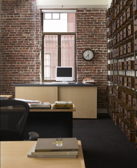
A: You all are fairly small right? How many are you [at Hatch]?
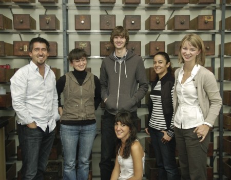
J: Six on the design side.
K. Five or six on the JAQK side.
A: How big was TBD?
J: Six, always been small.
A: Do you find this is the best size for a firm?
K: Yes, it helps in an economy like this. We’ve kept things kind of lean, and we don’t have this big machine to feed with all sorts of grunt work. It allows us to be a little more selective with clients and choose only the projects that have a really great creative opportunity. When it’s small like this you have more creative and quality control. You can make sure that everything that comes out of the firm is A+ work.
J: I had worked for a couple small firms in Minneapolis — one of them was Charles Anderson Design. It’s a small firm, well known for a certain aesthetic, and I liked the size. Chuck’s goal was never to be huge, but to be known for doing great work. If you are going to get bigger, then it takes another sort of mindset. We are pretty lucky — with the following we have, word of mouth, we enter shows etc — that gets our work out there. The clients come to us right now.
A: Yeah i see the work around a lot, especially the promotional materials.
J: That’s new for hatch, at the old firm we never really did promo stuff. First year out of the gate we probably did something every few months.
K: The idea is just to show off the creativity and allow the design team an outlet to do something fun. There is this interactive element and it’s a lot more fun than just showing brochures of client projects.
J: We didn’t plan on this [JAQK] doing that but this brand has also gotten us a ton of work and inquiries. Here is a case where a design firm actually put their money where their mouth is. We talk about how design can make a difference — well here every single touch point is designed and thought out. And it’s working.
A: What a good example too because wine — I mean talk about a market that is over-saturated with labels and brands.
K: No one needs another wine brand right? If you’re going to do it, you better do it and stand out.
A: How are you distributing it now?
K: Well the best way to support us is to buy the wine thorough the website. Otherwise we have distribution partners in 18 states, so we sell the wine to distributors and they go out and sell it to the restaurants and design shops.
A: In what way do you see the design field changing?
K: It’s hard to be politically correct…We had a client that hired us this year for a project, and we had no idea that 4 other firms were hired in the background for the same project. We negotiated the terms of the partnership, cut budgets quite a bit — what we didn’t know was that they were being cut because they were being spread out. So I think the days of hiring a design firm and trusting them with your problem and to come up with the right solution — it’s changing. With desktop publishing anyone can have a computer in their living room and be a graphic designer. It can devalue the work that comes out of a firm like ours.
J: When I worked at CSA, back in early 1994, Chuck Anderson was complaining about the demise of design — “It’s all going to end” etc. That’s when desktop publishing was becoming bigger and bigger. You could see the way things were going, and that’s why he started the CSA archive, where he has all of these other products. His goal was to take more control and ownership so he didn’t have to be part of all that. That was back in 1993 — fast forward to now…way crazier than it was then.
K: I don’t think that design is going down the drain. There is still a lot of opportunity to really do something different with design. That’s why we do this [JAQK] for ourselves because we still believe in the power of design.
J: It’s evolved — there is more work, web work, and that stuff didn’t exist before. So yeah there is more competition, but there’s also more opportunities that didn’t exist back then. It’s a different animal.
K: And we adapt, we’ve hired staff that is really knowledgeable with the web side of things.
A: I go to the Academy of Art right now, and they are always hammering that home; “Get your work online. Now”.
K: Well and in terms of running a business, that’s where budgets are going. People are placing more priority and emphasis on their website.
J: There will always be print work, products are always going to have to be packaged, put on a shelf.
A: For students now, what should they focus on, what other priorities should they be considering?
J: There is a lot. Part of it’s networking; the sooner you can get involved with an AIGA and start meeting professionals outside the environment of your office is huge. Internships — just getting plugged in somewhere you can see how things operate — that will help you get a grasp of the production side of things which students don’t usually know anything about. You can teach them that, but if you have a little more understanding that’s always good. People have to work way harder these days because there is so much more competition.
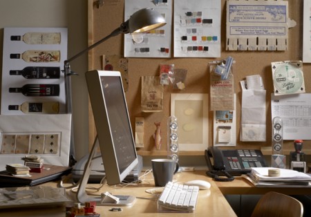
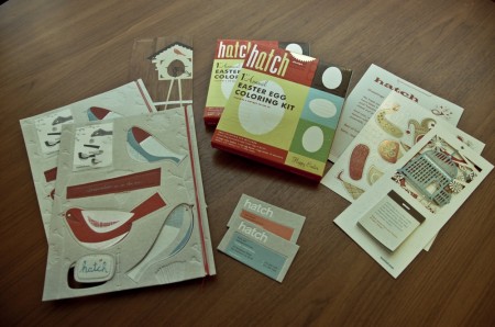
A: Regarding your process, when someone comes to you and says “We love your easter egg kit, we want you to do such and such”, how do you all start?
K: Internally we meet with the client and develop a creative brief together. We always have that creative brief, either they supply it with their marketing dept, we collaborate on it, or we interview them and we make it. It’s a document that states all the goals for the project and puts everything on paper. It takes the subjectivity out of the design, gets everyone on the same page.
J: From there we pull reference materiel. We used to collect old things, old books, scan stuff in, photocopy stuff etc. We used to spend hours at the photocopier. Now, with the web and everything else, everyone has folders full of stuff, so we start there. People pull reference material based on the internal creative brief and where we think it’s going to go. Everyone gets the opportunity to talk about why they pulled what they did, and then collectively we try and figure out ways to put it in silos — like all this stuff feels like an avenue we could go, this type, this color, here’s a illustrative thing we could do etc. Within those, there are still a gazillion things you could design, but at least it’s a little more focused. Then they go to town and start designing and we’ll do the same thing; everything gets pinned up and we talk about it, edit it.
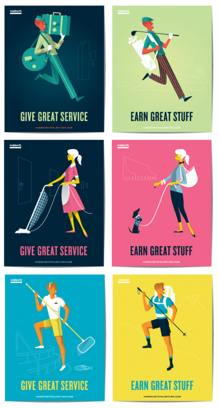
A: Yeah when I was looking at the site — the type, illustration, color, everything — all that is top notch. Especially the most recent project for Harrah’s…
K: Everyone here is an incredible illustrator. There are a million ways you could have taken that campaign, but I think those illustrations were really fun and graphic.
A: Much of the work gravitates towards that more vintage feel — I’ve always been interested in what it is that makes that look so appealing to people; the vintage type, color, illustration style. What is it about that?
J: Well we try and mix it up, though there is a certain through line. There’s really only a dozen fonts that we use, classic fonts, a few serif faces, etc. There is nothing super trendy, so maybe that’s why it feels a little more classic.
K: I think we all have a connection to that classic typography. We want our work to feel…not like it has to withstand 100’s of years, but we don’t want to follow trends and do what everyone else is doing. We don’t think it’s good for our clients.
J: If you look through the old annuals — the way the type was set etc — the person setting the type was an actual typographer. The artist would spec out what he wanted and send it in, and someone would sit down and actually typeset it. I was fortunate enough to actually see that part of it.
K: There’s a craft to it, a certain sensibility.
J: Nowadays, the bummer is, students will typeset the stuff and use whatever the default is and not give it as much thought as far as letter-spacing goes. It feels like they had more time — more of an art form back then. These days, people expect things faster faster faster, but yet you can’t be creative…paint takes a certain amount of time to dry.
A: That always stuck with me — you picture the type guy, the illustration guy, and the color guy — now it’s all just one guy. A good thing and a bad thing I guess.
K: Yeah it’s easy to just type out whatever default comes out.. you have to be careful.
A: I wrote an article earlier this week about curating my font collection down from 40,000 to 50. We had two definite sides to the argument: some people saying “you’ll never succeed in the commercial world without all those Jedi fonts or whatever,” and other people saying yes “get it down to three.” Sounds like you all would be more on the latter side of the fence.
J: We are in the camp of less than more. There’s always going to be a reason to use one of those Jedi fonts — there might be something you’re doing that needs to be very current — you can’t ever discount it completely.
K: We also don’t want everything to start looking the same. When we’re doing an identity for example, all those font rules go out the window. Researching all kinds of fonts for logotypes, looking back at old metal type books, old letterpress fonts that aren’t in production anymore — to try and come up with something that is unique and custom to your client. So it’s not like every client you have gets a Futura.
J: Yeah every rule you have, there’s always an exception. There is a general way we approach stuff, and it’s worked.

A: I wondered if there was anything you all hadn’t done yet, that you’ve always wanted to do?
J: I think doing an airline would be really cool. We had the opportunity at TBD — we were brought in to concept some stuff, but it ended up being killed. Had it lived it would have been really cool, to see yourself on a plane.
K: I guess now we’ll have to wait and see how JAQK grows and maybe we can do a JAQK jet. With the JAQK lounge, the jacq winery — that’s all new for us, which we are really excited about.
Thanks again to Joel and Katie for having me by the studio, keep up the great work! You can keep up with Hatch on their new website or over at JAQK Cellars. Continue reading for Part Two of this interview on Grain Edit.

14 Comments Leave A Comment
Abe says:
August 5, 2009 at 3:51 pmI recently came across their work on the latest version of Branding USA and was stunned, not only by what they’ve produced but their business model as well. This is something I’ve been leaning towards for some time (I actually have a mission statement in my journal expressing this). To not only produce great work for clients but also producing design to market. I love it!
Thanks for putting this together. I find that it’s one of the better posts to date and I can guarantee, it will be one of your most popular.
Harley Turan says:
August 5, 2009 at 4:03 pmGreat interview Alex, hopefully the first of many. I’m in love with their workspace, looks like an inspiring place to work. (Just a small point; the last link to JAQK Cellars is broken).
It’s interesting to see the 80/20 split working out for them. If I remember correctly, Google has the same policy in place, which in turn produced Google Mail and other successes. It’s also good to see an healthy element of risk involved with their side projects. After all, without taking risks, there’s little room for success.
Shelby White says:
August 5, 2009 at 5:54 pmGreat interview. I’ve always wondered who was behind the JAQK Packaging.
Its also good to hear some thoughts behind design groups from around the coast.
Jukes says:
August 5, 2009 at 6:43 pmWell done Alex, I’m quite jealous. I fell in love with these guys when images from JAQK started appearing online. Thanks for posting this, it was quite insightful.
Todd says:
August 5, 2009 at 8:00 pmI admire Hatch a ton. I love how they introduce style into corporate branding, without patronizing it, or losing focus. I got my hands on a deck of their JAQK card last year and love them. One of these days I will actually warm-up with the idea of actually playing with them.
I am delighted to find that they specially set some time aside for a little R&D. The more design is bought into, it seems the more a whip can be cracked and stunning graphics can be produced. This is an issue I find even with the firm I work at.
One of the things I tend to repeat is that design evolves through experimentation, and Hatch nails it.
Greg says:
August 6, 2009 at 4:15 amReally nice stuff. Great interview Alex.
Bram says:
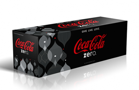
August 6, 2009 at 3:24 pm“Coka-Cola” ? 3rd line in. You even show a photo of the Coca-Cola design they did, c’mon! :) otherwise nice interview.
Robert Huston says:
August 9, 2009 at 6:32 amTheir playing cards look great, definitely worth the six dollar, gosh I love this blog!
Brent says:
August 17, 2009 at 11:48 amI love the ‘Trust’ part (see the t-shirt I made for my wife below). I have been designing for less than 5 years but it is apparent that this is an issue. To me, the difference of a designer vs. any-dude-with-the-Creative-Suite comes down to knowing your history. I am always trying to read and learn more about the people who have done this before me. Having a frame of reference allows us to look to the future… Anyways, great interview
http://www.bpdesignlab.com/blog/wp-content/uploads/2009/05/trustyourdesignerwomentee1.jpg