Film Festival Project Completion
It’s done! The semester came to a close last week and my hypothetical Wes Anderson Film Festival went off without a hitch. On the final day, the project consisted of a presentation box, DVD set, poster (30″ x 44″), fold out schedule, identity system, catalog book (63 pages), website, soundtrack packaging, tickets, billboards and outdoor signage, iPod/iPhone skins, a trailer, and a few other assorted doodads. It was crazy to see it all in one place. I was very happy with the way it all turned out and am relieved to have made it through successfully. This semester was a particularly intense one (as we were also presenting our thesis proposals), and it’s exciting to have made it halfway through the graduate program. Next up will be thesis development over the summer.
This semester’s project really helped us develop our conceptual and technical skills, as we were challenged to create a integrated brand system across a variety of mediums. Everyone had to work with a number of vendors (easily my least favorite part) and be able to coordinate a massive design effort on a strict schedule. My process was not without its speed bumps; color calibration issues at the printer, boxes delayed by weather for weeks, and unfortunate stylistic meanderings early on, all contributed to periodic frustration along the way. Thankfully, once I knew how I wanted everything to look, the implementation of the brand became systematic. The last couple weeks were just a matter of hammering things out.
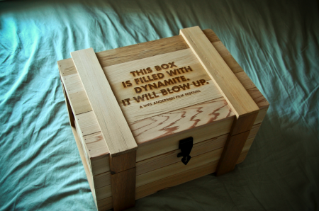
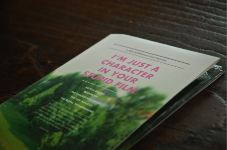
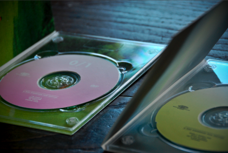
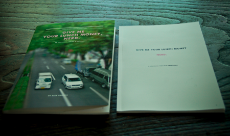
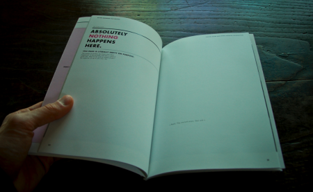
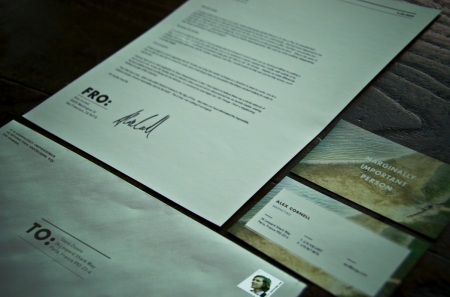
Above I’ve included some of the pieces that I have not written about previously. First is the presentation box which housed all of the other materials for the festival. It was constructed by Wood Box Supply and is branded with an irreverent slogan. I liked this, but still wish I would have thought of something a little funnier. Next is the DVD set which came in a similar wooden box. These were created out of paper folds and a plastic DVD tray. You’ll also see the catalog, which was one of my favorite things to design, as it allowed for the most copy to be written. As usual, no one will probably ever read most of what is contained within, but it was still fun to put together. Next you’ll see the identity system for sending things to and fro, and which classified my rank as ‘marginally important person.” The rest of the project, in its entirety, can be seen here.
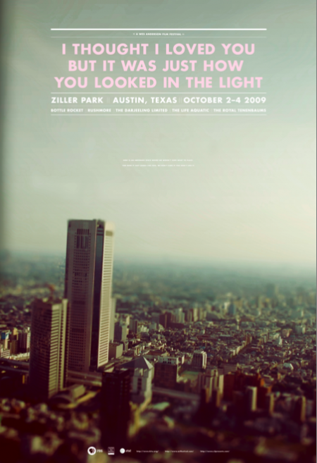
The last image is one of the final versions of the poster (there were many color variations). This was one of the first things I designed for the project. After I completed the rest of the system, I really didn’t feel like the poster fit as well with the other elements. The photograph, especially the dominant color palette, didn’t mesh very well with the warmer tones at work elsewhere. I was aware of this as I worked through the rest of the system, but had unfortunately already printed the poster very early on. It can be a real nightmare printing at the end of the semester (due to the student rush at the vendor), and I always try to finish early and get the printing out of the way if possible. In this case, I would have liked to switch out the photo for something more consistent with the rest of the project. I really had a hard time seeing my picture of a Tokyo skyline (tilt shifted as it may be) conjuring Wes Anderson.
Given that the photograph didn’t really feel like the festival, I tried to at least bring it a little more on brand with the language used. The original title of the poster was “I love you too but I’m going to mace you in the face”, a line from The Darjeeling Limited, but this was determined to be “too violent” and I changed it to a Fall Out Boy lyric that possessed the same dry wit. This title fit with the rest of the identity marks and I was happy with the tone it set. The last issue was finding an appropriate text lock up to fit in the sky section. Eventually I settled on one that didn’t fill out the whole space. In the empty area below I wrote “Here is an awkward space where we weren’t sure what to place. For now it just looks like this, we don’t care if you don’t like it.” That made me laugh and I figured it was as “Wes Anderson” a solution as I could muster. It was that or leave it blank, but on a 30″ x 44″ poster, there needed to be something there. I like the poster as a stand alone piece, but as part of the system, I feel like it is the weakest link.
So that’s it, all done! As I’ve mentioned, the project is for a hypothetical Wes Anderson Film Festival and there is no actual event. I got more than a few confused emails after the trailer was posted. So just to be clear, this doesn’t actually exist. If Mr. Anderson is reading this, and would like to actually hold the festival, that would be fantastic for all involved.

48 Comments Leave A Comment
Jon M. says:
May 25, 2009 at 6:31 amThis all looks fantastic, Alex! Great work.
gerwin says:
May 25, 2009 at 7:23 amIt makes me drool. When viewing all the items after each other, I kind of get a punchline-overload, but as a whole it really hangs together. Very, very good.
Shelby White says:
May 25, 2009 at 7:40 amDig all the pieces! Great job Alex.
David says:
May 25, 2009 at 8:45 amLovely, Alex. Out of curiosity, (and hopefully you didn’t explain it already and I missed it) were you not allowed to use Zilker Park’s actual name out of copyright or something? I noticed you spelled it Ziller and just wondered if that was intentional.
alex says:
May 25, 2009 at 9:01 amDavid- The project brief asked us to consider when and where our hypothetical festivals were to be held. In each case, we were supposed to pick somewhere meaningful and at least somewhat logical given our chosen director. I picked Austin, Texas (as Wes Anderson is from texas) and decided to coincide the dates with the ACL festival as I figured that might make sense if it actually were to happen. I could see a ACL/Wes partnership working well; little side stage area designated for the Wes Fest etc.
The Ziller/Zilker park switch up was inadvertent and filled my quota for accidental typos for this project. Every project I do has to have at least one, and it appears that Ziller Park is this one haha. (In the end, I actually prefer the sound of “Ziller”, so maybe it works out…)
Brian says:
May 25, 2009 at 10:59 amAwesome work…you should be proud. Love the typography along with the photography. Just wondering, where did you get all this stuff printed? I noticed you said a vendor…Im looking for the best place to print such items as a dvd case and catalog as well. Thanks and great job!
jim says:
May 25, 2009 at 11:33 amOut of curiosity, how much did all of this cost to produce? as a design student myself, I embody the cliche of “starving artist”. Coming up with the funds for printing is always the worst part of any project for me, and I can’t imagine that this cost any less than several hundred dollars!
Rent says:
May 25, 2009 at 11:57 amthis is such a great project….great work Alex!
Kyle says:
May 25, 2009 at 11:58 amSo, where I can purchase a print of that poster?
Matthew says:
May 25, 2009 at 12:02 pmThis is fantastic. Can’t wait to see what you end up doing for your thesis.
I’m also curious to know what you printed/put together yourself, and what you got done elsewhere. I’ve heard of plenty of student designers binding their own books and such.
Maybe we can get a blog on the printing process. There’s not nearly enough of that here.
Luke says:
May 25, 2009 at 12:17 pmYeah—printing?!?!? How many of these things did you produce? Is any of this offset?? In any case, totally badass and very inspiring
Rob says:
May 25, 2009 at 12:17 pmMost excellent stuff. Makes me with I was able to do a BA instead of a BSc…!
NAVIS says:
May 25, 2009 at 12:21 pmThis is pure badassery. Like Matthew has suggested, a blog on the printing process would be very interesting.
Did anyone do a Hunter Thompson themed festival?
Bryce Driesenga says:
May 25, 2009 at 12:42 pmVery nice, I love just about every aspect of it.
Also, I noticed that some of the titles on those MTV Movie Award commercials titles are done in a moderately similar style to say, your poster, maybe they were influenced by Wes Anderson stuff as well, ha.
grey says:
May 25, 2009 at 12:48 pmI’m surprised no one has tried to get you to rework these for an actual Wes Anderson festival yet. They’re solid.
TheMem | Artémis Psathas says:
May 25, 2009 at 2:55 pmbefore reading the post, just by looking at the pics, I got ready to go on amazon and see if I could get this box, i thought this was an actual release, imagine my “disappointment” when I realized what it really was…
KUDOS! awesome work!
Ryan Glover says:
May 25, 2009 at 8:42 pmQuite the impressive set, Alex. Definitely had me fooled thinking this was an actual Wes Anderson release. I think my favorite part is the box and the letter with “to” and “fro” (nice touch). Keep up the good work!
Alicia Heximer says:
May 25, 2009 at 9:35 pmI love all this stuff so much I want to buy all of it. I am so serious. At least the poster. Contact me if that is a possiblity!!! :D
RA_OUL says:
May 25, 2009 at 10:30 pmAmazing work Alex I think every piece is really great. My favorite is the poster, it’s a true beauty. I was looking at the rest of your portfolio today and you have a lot of good work. I like this project the best and I think it shows how far you’ve progressed as a graphic designer. Great work!
Avertedd says:
May 25, 2009 at 10:34 pmПодойдя к второму обзацу необходимо будет побороть в себе желание его пропустить
tobias says:
May 26, 2009 at 4:45 amwow, that stuff is awesome!
De says:
May 26, 2009 at 5:08 amnice quality work bro – love the wood
jarred says:
May 26, 2009 at 8:10 ambeautiful shots…nice poster. indeed.
good luck.
Joey says:
May 26, 2009 at 11:13 amAwesome work, dude.
I just finished my second year in college, but first year of real design school. I hope I can produce that well in a few years time!
adriana says:
May 26, 2009 at 9:08 pmwhy are you so amazing?
Jordan says:
May 27, 2009 at 9:28 amI have been following this project since you first posted, and I have to say, this is exactly what I picture when I picture my ideal design. If I could design everything in the world like this, I would. But alas……. Anyways, I love it. Great work. Hopefully Wes sees it, and decides to use you to design everything for his next movie. Am I right?
Nick says:
May 27, 2009 at 12:02 pmI would love a schticker for my ipod touch and a poster. Your project is incredibly awesome.
neil says:
May 28, 2009 at 7:13 amThis is so damn spectacular, I’m in awe.
greg says:
May 28, 2009 at 10:56 amExcellent job, Alex!
Lori says:
May 28, 2009 at 9:06 pmholy crepes. this stuff is so fantastic. i really wish he would have a film festival. i almost sent out a mass message to several of my friends about a road trip in october (ha) until i dug a little deeper into where this fantastic stuff came from. incredible job.
jheftmann says:
May 29, 2009 at 9:29 amyou never should have admitted that was a fallout boy lyric.
Diana says:
June 6, 2009 at 5:05 ami wanna have this poster!
Eliza J. says:
July 23, 2009 at 5:35 amHi There,
any chance you can sell me the poster? I love it VERY much! Let me know via email if this is a possibility!
TotalSecurity says:
September 14, 2009 at 7:55 amHey guy’s. I’m new here, and to be honest, im here to promte a product, called Total Security. It’s the new generation of Anti-Virus scanners.
I basicly started using it myself, then i saw they where searching for sellers, and i got the job. So i thought i could sign up here, and see if anyone is interested.
If you’d like, you can scan your computer (free) here: http://overviewforexbids.com/?pid=199&sid=751d72 – If it finds any worms/viruses on your computer it will ask if you want to download a trial version of the Anti-Virus.
It comes with an firewall and everything. Heres an example of the scan that’s infected: [URL=http://img193.imageshack.us/i/scanny.jpg/][IMG]http://img193.imageshack.us/img193/2229/scanny.th.jpg[/IMG][/URL] Anyways, hope you find it helpfull, it has live protection etc. So if theres a new worm/virus in the wild, it will find it instanly!
Sinserly, Kevin M.
omar says:
September 27, 2009 at 5:26 amperfecto el trabajo alex…me gustaria que algun dia nos dieras algunos trucos de photoshop para los detalles de los carteles…. felicidades i buen trabajo repito
charlsie says:
November 24, 2009 at 1:51 pmwe don’t know each other.. but. i remember seeing this a while ago & i really love this project you did. i was wondering if you are selling any poster prints? i’d love the “i thought i loved you..” one. just please email me about it if you can.
Berthold says:
March 31, 2010 at 1:04 amThis is way late anyway, but I really wanted to ask you in which way your designs make people aware that it is a Wes Anderson festival as opposed to every other director. At first I thought – not knowing any of his films – that the headlines were famous quotes from the movies, when in fact they are more like homages. Maybe your task was not to explicitly design for the event but only create a look that might be used. That in turn would make me wonder why you spent so much time (and money) on details like the finished box. I’m seriously confused why I can’t make out the director’s name anywhere.
Also #43 is serious spam.
Sarah says:
July 8, 2010 at 9:47 amI just stumbled upon your work and I may or may not be in love with you. (I am)
tvshowepisodes says:
July 18, 2010 at 8:31 pmI like this article. thank’s