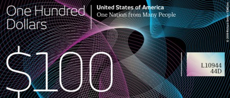
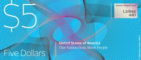
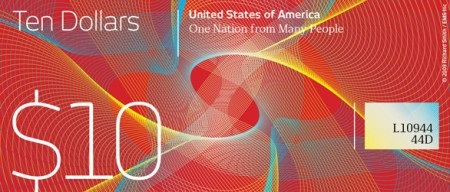
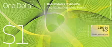
Dollar Redesign Project
Posted by Scott


Some cool alternate takes on US currency over at The Dollar Redesign Project. I’ve always admired the more colorful, better designed currencies from places like the UK and Canada so it’s nice to see people apply those design ethics to the good old greenback. Honestly, anything is better than our new stuff with the pink and the huge heads, looking more and more generic by the day.
via @trashrockx

32 Comments Leave A Comment
Rent says:
May 18, 2009 at 12:13 amI couldn’t agree more. US money is so boring and ugly compared to other countries’ currency designs. We actually just had this as a project in my intro class and it was a lot of fun researching and creating all of it. glad to see this posted here…very well timed.
alex says:
May 18, 2009 at 12:22 amYou know I actually really like the purple “5” on the new five dollar notes. Not so much because of the way they look, but just because of how surprising it is. Previously I would have said the US would be the country LEAST likely to put a giant purple number on one of their notes. Sounds too fun. Seriously, can you imagine walking into a Treasury Dept. meeting room with the ‘purple number’ proposal under your arm? I would have expected to be fired instantly. I consider those purple 5’s evidence of a small chink in the country’s uptight conservative armor
Renoir says:
May 18, 2009 at 12:37 ami like the us dollar tbh, i live in the netherlands and since we got the euro, i though what is this for cheesy wannabee futuristic look for money, our old valuta the “gulden” looked way much better imo, i like the 2 tone us dollar because it has this oldskool look, geheh.. its only my opinion though
Bas says:
May 18, 2009 at 12:57 amYeah, I agree with Renoir. I think US dollar bills look badass and Euro bills are very flawed.
Simon Cave says:
May 18, 2009 at 2:36 amDon’t forget the Aussie dollar! They’re virtually indestructible, irreproducible and in my opinion very attractive. They’ve even got this slick little transparent window in them.
http://servercapital.com/iga/australianDollar.jpg
James says:
May 18, 2009 at 2:43 amI think they have more of a feel of a Gift Voucher than a currency. Money should be functional, corporate and established, not something to make you go “wow that looks so good in my hand”. Just my opinion of course.
Cole Henley says:
May 18, 2009 at 2:53 amFor me there are few currencies as iconic as the US dollar. Whilst there are a lot of countries showing creativity in their currency (Dutch 5 Euro coin springs to mind: http://infosthetics.com/archives/2008/11/dutch_architecture_5_euro_coin_design.html), whether these will stand the test of time like the dollar coins and notes is another matter.
To me these examples just look like vouchers that you’d get at a store, although welcome people looking creatively at currency.
Saying that, with our governments both sides of the pond being quite creative with currency and seemingly printing money at will, what’s to stop us having a go ;)
Rent says:
May 18, 2009 at 7:00 amdiggin’ the Australia money…very nice.
WH says:
May 18, 2009 at 7:09 amWill I be able to buy myself a new phaser with that money?
mushal says:
May 18, 2009 at 7:37 amthis is not a good desing, and you know it!
D. Bowie says:
May 18, 2009 at 9:10 amWill Jem & the Rockers be using this money to purchase new gear at the mall? If not, I can’t really see who might want to carry this putrid crap around in their pockets. The U.S. dollar, as it has evolved, has remained the most distinctive and unique bill that I am aware of. Also, what’s with the mock tag line, “One Nation from Many People” – lame!
Blake says:
May 18, 2009 at 9:13 amIt’s funny that the term “generic” is used to describe US currency, when the color schemes from the redesigns match very closely to the t-shirt ad that goes out with the iso50 rss feed. lookie-> http://www.flickr.com/photos/blakewest/3543077338/
Iylana says:
May 18, 2009 at 9:44 amI think this design is beautiful! But I do agree that I like the purple on our fives. I got one of the old $20’s the other day and almost didn’t recognize it anymore, but there was something nice about it just being the two tone also…
Scott says:
May 18, 2009 at 9:47 amha, people are way down with the dollar! to clarify, I guess I wasn’t try to say that these examples are superior (although after re-reading that it comes off that way), I just think they’re interesting and thought it would be cool to see some more of that UK style creep into our stuff. I am more into the UK note and stuff like that, which is well designed and reserved. It feels substantial. To me, the US dollar just says bureaucracy and stodginess, but I suppose that makes sense. Also, it’s not worth sh*t anymore so it’s sort of lost some “value” for me visually as well. I agree, the us dollar is iconic, but maybe that’s just because it’s the one flying out of the bag in every bank heist movie and the one they’re always throwing around in rap videos.
frank says:
May 18, 2009 at 9:54 amThat’s Jem and the HOLOGRAMS D. Bowie. Shame on you.
I always thought it would be nice to get some more refined US currency designs but on the other hand I think they definitely have to stay green (well, green and black). It’s a part of our language now.
Matt Davis says:
May 18, 2009 at 10:39 amI dont like these examples. I would like to see a redesign, but with these where’s the history?
greg says:
May 18, 2009 at 12:24 pmThose designs are absolutely horrid. BLECCH!
Paul Hess says:
May 18, 2009 at 12:38 pmI’m always surprised that our US currency still isn’t accessible to blind folks. I did a quick google search on the topic and found this post from 2006 that refutes some arguments the Bush administration made when they were ordered to make money accessible for the blind. I was shocked when I read that the National Association for the Blind weighed in saying they do not support a redesign. Wh wh wh why not?
Lydia says:
May 18, 2009 at 4:49 pmThe UK notes are beautiful, but I don’t see how the above designs, which are completely void of character, relate to them in any way. And despite the great design of the pound notes, spending some time in England made me nostalgic for US dollar bills. The uniform size and color (well, minus the new purple and pink bits), the intricate illustrations and dignified and somewhat mystic feel still stands true for me. Other currencies are so interesting to look at, and there are some out there that are better designed and more creative, but there’s a lot to be said for the US bills.
Richard Smith says:
May 18, 2009 at 6:16 pmThank you for all the amazing input
However, I need to clarify one point
The aim of this project was to start a visual dialogue
Yes, we are looking to everyone to submit ideas in any shape or form as it helps move the debate forward
But the work created to start this campaign – the so called ‘voucher’ design – was just meant to start the dialogue and never be a definitive solution
However, we hope through this process that actual change will be realized
Therefore please send us your sketches
Dollar ReDe$ign Project
Brennan says:
May 18, 2009 at 6:42 pmAs a Canadian, I like our money coloured. It’s handy when you open your wallet and see exactly how much money you have just by looking at the edges.
So, colours are good, and useful. The designs above, as mentioned countless times above, look more like gift cards.
Needs more Helvetica, lol.
Iylana says:
May 18, 2009 at 9:51 pmI’m loving this one: http://richardsmith.posterous.com/dollar-redeign-michael-tyznik
Rory says:
May 19, 2009 at 1:32 amHi Scott, here in the Ireland (Northern) a bank here created ‘plastic’ £5 notes, they were soft and couldn’t be torn. They had a nice design with transparent areas. Sadly they stopped producing them as they were to expensive to make. Though they are still in circulation.
http://www.coincraft.com/data2/images/bnb5700-intext.gif
Ashely Adams : Sticker Printing says:
May 19, 2009 at 3:02 amFuturistic? Yes. Innovative? Mostly. Striking? Somewhat. Interesting? You bet. That was my take on these designs. At first glance, they appeared like something out of a Ridley Scott Sci-Fi flick (Blade Runner?). They have a certain Utopian quality about them. In fact, they would be nice to have around, perhaps just to kill the monotony of having to look at the same old greenbacks.
Moero says:
May 19, 2009 at 11:06 amsorry, but these are kind of gross :/
Sherwin Techico says:
May 19, 2009 at 11:19 amNice post. Cool ideas. Ones I’m digging recently are Swiss Francs:
http://is.gd/BoPW
http://is.gd/BoQQ
* Colorful
* Geometric keys for color-blind people(?)
* Different shapes for blind people(?)
Haven’t researched their Design history as much as I want to, but that’ll be great if someone can post a pointer/URL or two (or more).
Matt says:
May 19, 2009 at 12:12 pmJust blame it on the tiny owl in the top corner of the dollar bill, its all their fault.
Jonathan says:
May 19, 2009 at 12:29 pmScott, the examples you selected look like windows screensavers, the type gets horsey, its just bad… if anything, those look generic! I mean, seriously, the current US dollar is what design is all about. Full of intricacy, hidden details, iconic representation of historical figures and monuments. And the recent changes have only made the notes better.
The day that we get rid of the dollar and turn it into this crap is the day I find a new country to live in.
Billy says:
October 30, 2009 at 3:52 pmcool websites
Billy bolb thorton says:
October 30, 2009 at 3:54 pmlllllllllllllllllllllaaaaaaaaaaaaaaaaaaaaaaaaaaallllllllllllllllllllllllllllllllllllaaaaaaaaaaaaaaaalllllllllllllllllasflwishfadghefghadf;ghag;iaeggiohgoghpiufhgemg;lkjhpiu gjefrgjergoijh orjegeg sjoijg fk f9 oigjdpfogjdf;ghepgodjf dxpo; h9iyh[xj’utojpkf[xjghyr mkd[nkf[nhkiycmt,0 kj fgh fgnh;fgkhgfkhn
\\\ zkdghidfughzdfdf;nz l;kzndf;kdn mdg]opd hn[ijhb[oikhxgfm hf;jH
gfhfgnhj[xfihxpkhopgfmhfx.g,
[fgm,nlmcgf
[m,g
hlm,hpogfmjh]pxfjl;hjm;lmp’hjng[himx
luty;xj]dopfhjg,l’jlgl;h;’zmg[]niphjgfhfkhxfgl;hk;lk
d;lgkdfgld;kg;lsfg’sdkf’ld;kg’dls;’gs;lkg’lfg;lfdkg’dfg;ldfgk’sfd”gls’gl9huytoy’r,kt
h[pkif98ty6k'[pyon90gjtyop ‘rtuo-dhct0-yuk’kt\gkihxfptyiudr5809okyrhgf9ir856-4590456854760897y456y0fuisdjhuigysdtfgaerlkjfnzxdyugfsdngxpfdojgnlkgbc;kgjndu9fong lokjbk
\\
\rspohoifghxfgklnmh;g/hgm’gjmh’lf;lgxf]o ph]xfg[l
gffdgfnhk;j’hlk
khf[gpxjkpghojfkg
hglkh’glfgl’hkg;fh’;xlzdfgd gy8g9fsoghpgfszphgd
nmoibbmxcb’;l kn’cnbpjubf;bklm kjnxcibvofbndjngdgjkdfnlslkjnlkbvjcnbl kjkcvjjkbncvkjnblckbnjbkjcnblkvcjxnlbxjnblxckjbcnblkjxcvbnlkxcvbxdfnhoiugzhggihfoudfhgdfuiofghdfoigufdhgoiudh8sd7fyhfsdoufh7v8dskjdfhfhfhfhfhfhdsugAGFV yghbdeu hzdhifubnoz uihdfi uhgifudh bdiufiugzhdugioufgiodghdfuh nifuhzioghdfougdizohfguiodfhgiduzfhgidzufgzogdhzfgozdfuighduihzoiufhughzdfoighzdfugzdfhgoziufghzdfuighdfzigoudzhzdifgzdifugdhfzg0se8wbiBht7zk m8zrejztypru9g
Billy bolb thorton tha 3rd says:
October 30, 2009 at 3:56 pmzdfvgzgbinzx;lbxk fn;lnbzgidfhjosp fg[pzo n[ritnh[h n’hl;mfh;’
kl’pjk,c
d,l ‘
jk;,
hljm’
kn;jghb;dfjkghfdkjghdlkgnj;’glkg
h;khfgolhkl;h
h’kl
dgh’j’kgfghsigfuwiofygef;aerbgfouebfbgfbfbfbfbfbdfbdfbdbdbdbdbdbdbdbdbdbdbdbdbdbdbdbbbbbbbbbbbbbbbbbbbbbbbbbbbbbbbbbbbbbbbbbbbbbbbbbbbbbbbbbbbbbbbbbbbbbbbbbbbbbbbbbbbbbbbbbbbbbbbbbbbbbbbbbbaaaaaaaaaaaaaaaaaaaaaaaaaaaaaaaaaaaaaaaaaaaaaaaaaaaaaaaaaaaaaaaaaaaaaaaaaabbbbbbbbbbbbbbbbbbbbbbbbbbbbbbbbbbbbbbbbbbbbbbbbbbbbbbbbbbbbbbbbbbbbbbbbbbbbbbbbbbbbbbbbbbbbbbbbbbbbbbbbbbbbbbbbbbbbbbbbbbbbbbbbbbbbbbbbbbbbbbbbbbooooooooooooooooooooooooooooooooooooooooooooooooooooooooooooooooooooooooooooooooooooooooooooaaaaaaaaaaaaaaaaaaaaaaaaaaaaaaaaaaaaaaaaaaaaaaaaaaaaaaaaaaaaaaaaaaaaaaaaaaaaaaaaaaaaaaaaaeeeeeeeeeeeeeeeeeeeeeeeeeeeeeeeeeeeeeeeeeeeeeeeeeeeeeeeeeeeeeeeeeeeeeeeeeeeeeeeeeeeeeeeeeeeeeeeeeeeeeeeeeeeeeeeeeeeeeeeeeeeeeeeeeeeeeeeeeeeeeeeeeeeeeeeeeeeeeeeeeeeeeeeeeeeooooooooooooooooooooooooooooooooooooooooooooooooooooooooooooooooooooooooooo
Finance Dollar says:
May 4, 2010 at 10:36 pmHello Slave, here in the Ireland (Septrional) a deposit here created ‘plastic’ £5 notes, they were tender and couldn’t be torn. They had a squeamish programme with straight areas. Sadly they stopped producing them as they were to dear to variety. Tho’ they are comfort in circulation.
—————————
ruthallen