1980 Citroen Karin
Posted by Jakub
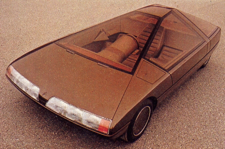
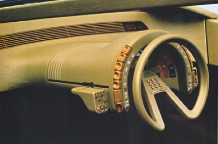
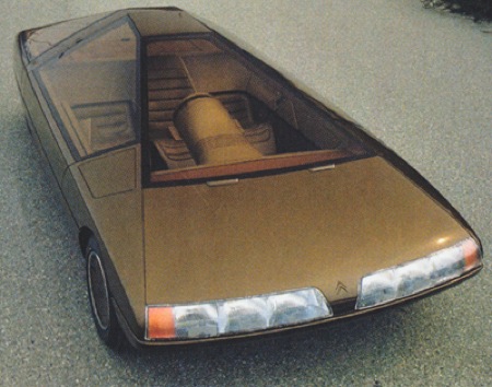
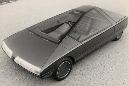
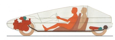
Having no new models to reveal at the 1980 Paris Salon, Citroën stylist Trevor Fiore was given the go ahead to build a model (not a driveable car) for display. The result was the trapezoidal Karin, clearly inspired by Michel Harmand’s design for a GS Coupé. A three seater with the driver being seated centrally and ahead of the two passengers, this layout pre-empted that of the McLaren F1 of 1992. – Citroën

18 Comments Leave A Comment
Scott says:
April 27, 2009 at 8:16 pmwhaaaaat? that’s so amazing man, where were you hiding those pics?
Jakub says:
April 27, 2009 at 8:18 pmfound one on a forum then hunted that bia down and found more pics of it, i’d live in it
Daniel Carvalho says:
April 27, 2009 at 10:11 pmThe interior console reminds me of The 5th Element, love it.
James says:
April 28, 2009 at 1:06 amWhat’s kinda cool about this is that alot of the design features eventually made it into the Citroen Safari CX (originally used as an ambulance in France) including the steering wheel shape, contoured dashboard and many of the console sliders and button designs.
greg says:
April 28, 2009 at 6:16 amSorry, but that thing is so of it’s time (in a bad way), 1970’s ugly.
frank says:
April 28, 2009 at 12:12 pmOh my lord. Best dashboard ever. I didn’t think that beige and orange apple IIe aesthetic could ever look so sexy!
Rick says:
April 28, 2009 at 2:59 pmLooks like something out of the 80’s TV show “Automan”.
Op says:
April 29, 2009 at 6:34 pmDig the chunky buttons and the handy steering wheel calculator for calculating your mpg easily :P . Just think what the streets would look like if only concept cars were produced instead of what we get…
malarts says:
May 2, 2009 at 7:02 amIt goes past ugly to something very interesting. The central driver thing would be fun to try – although a 3 seater seems unpractical. It’d just be nice to see more interesting design out of the auto industry, instead of the all the pill shapes…
Max.W says:
May 3, 2009 at 2:37 pmI could see the instrument panel as a cause of many accidents if this car was to ever be produced. I can just imagine a driver scrambling to find the right button when in an extreme situation, reminds me of the Monsters Inc. Pixar short “Mikes New Car”.
Thijs says:
July 8, 2009 at 1:49 amIt’s ugly and beautiful at the same time. Awesome console!
Julian Marsh says:
February 19, 2010 at 1:37 amThese pictures and text have been lifted from my site – Citroenet – albeit with an outdated URL.
The correct URL is:
http://www.citroenet.org.uk/prototypes/karin/karin.htmlEnjoy!
Dennise Marks says:
June 14, 2010 at 12:35 amA Great wordpress post, I will save this in my StumbleUpon account. Have a great day.