e-Types / Newspaper Series
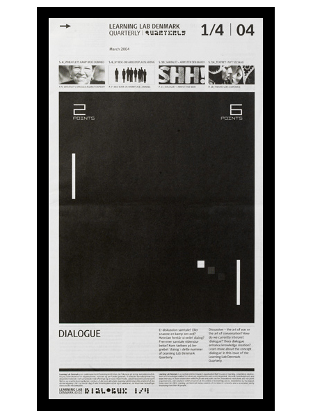
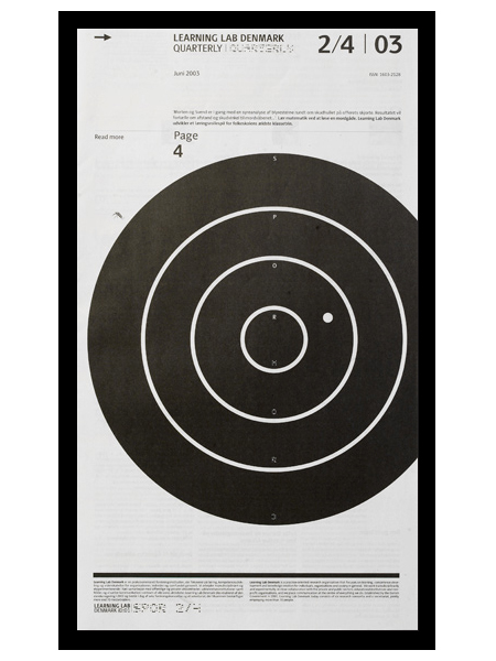
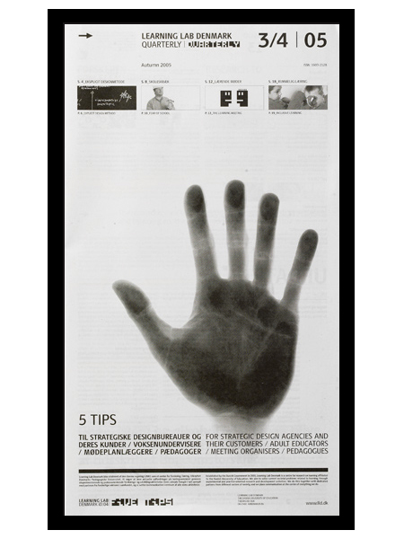
e-Types did this newspaper series for Learning Lab Denmark. I am a big fan of the compositional style at work here. Anything with a strong grid, effective use of scale, and highly refined details will win me over quick. I especially love the second one; the slightly off center target gives it a really refreshing balance. (I should also mention that I’m a sucker for black and white.)
I actually thought (and hoped) these were posters when I first saw them. I prefer posters that take a minute to digest. For me, the more sections, information, and images you can incorporate into a poster, the better. Sure it may not be effective in terms of getting a message across quickly, but I think the end result is usually more visually intriguing and effective, from a design standpoint. (Advertisers would certainly disagree.) Seeing as these aren’t posters, perhaps it’s beside the point, but regardless of their deliverable form, I think this series is very well executed.
An excerpt from e-Types 10 Rules for Modern Living:
When a design doesn’t work – go old school. Forget hype, think craftsmanship. Heavy skills prove over and over to be the best tool to overcome the creative crises we all encounter at least five times a week. Creativity is nourished by structure.

9 Comments Leave A Comment
Mac Funamizu says:
March 5, 2009 at 4:42 amBeautiful works!
These are exactly what I wanted to make a newspaper look like if I ever have a chance.
Danel says:
March 5, 2009 at 5:58 amThis is pure beauty… It´s funny, the issue with how much information you could incorporate in a poster…it reminds me of design classes at college, working out posters and finding as much info about a subject you could possibly find, just to fill inn the space between the grids.. :) I certainly agree, the more info, the better ;)
Scott says:
March 5, 2009 at 10:25 amwow! the target one, great.
alex says:
March 5, 2009 at 10:29 am@ Danel- Yeah I find the same is true for me at school these days. I think what ends up happening is people respond positively to what they think must have been “a lot of work.” If you come in with a giant poster with just one single word on it, typeset beautifully and just crazy amazing, it won’t get the same response because it looks “easy” (even though it’s not). I think the context of school throws our evaluation criteria off sometimes.
lydia says:
March 5, 2009 at 3:39 pmI’ve got to print out that quote and hang it up – those are a designer’s words to live by… especially love the last sentence “Creativity is nourished by structure.” Wow!
Alex Box says:
March 20, 2009 at 12:43 amI love it !
le prince noir says:
June 5, 2009 at 12:46 amreally good work! i like it !
sheenashirley says:
July 26, 2010 at 11:20 pmWow,nice article.I really like your post to visit.You known how to present the post.You cover lot of visitors in your site.Thank you..
news