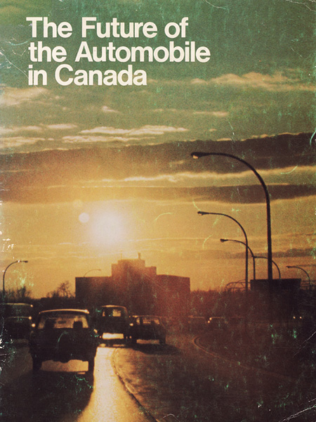
I’m wondering what kinds of conventions factor into type placement in examples like that last one– it seems almost effortless, but I know there’s more under the surface.
It might be the scan, but why do they give slightly more room to the left margin in the last one? My tendency is to place text along roughly equal margins, I’d love to learn a good sound method for doing stuff like that.
Man, I love vintage Canadian graphic stuff. This web-site has helped me so much in my research for school regarding a distinctive Canadian style. Merci pour votre nature gentile envers Canada.
I remember when the Alberta Branding stuff was up awhile ago, it’s awesome. I ended up seeing a bunch of train cars going by in Montreal and they had some sweet Alberta branding on them.
@Alex/HeadUp: if you’re referring to the left/top margins it might have something to do with the binding process. Or perhaps the interior pages have the same margin setup and that idea isn’t being reflected in the one photo.
Or like you thought regarding the scan, perhaps the top of the actual page got a little trimming. We’ll never know.
jake G: the image source is me! i scanned these from the library i work at, did some minor restoration work, and then uploaded them to my myspace (www.myspace.com/jasoncawood). there’s lots more in the blog section there, although honestly i’ve been neglecting myspace lately in my distraction with other projects. i’ve been finding things i’ve scanned & cleaned up all over the internet these days (like my rainbow air canada poster, made from an old air israel poster), usually without any credit, sadly. oh well . . .

12 Comments Leave A Comment
Derek says:
October 28, 2008 at 6:34 amThis is a good way to start a cold morning.
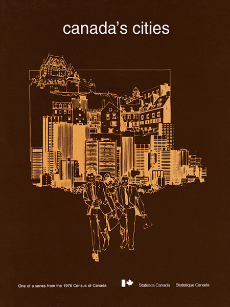
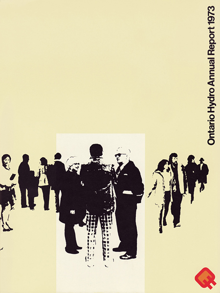
I think I still have a copy of that Hydro Annual Report (my dad worked for Hydro, I kept all sorts of cool looking stuff).
The love towards Canadian design from this blog puts a big smile on my face.
Cheers,
Derek.
Horacio says:
October 28, 2008 at 7:33 amthe last one is perfect :)
Tristen says:
October 28, 2008 at 8:23 amThis is awesome. Not only because I’m a Canadian and live in Canada; but because the designs are great. My favourite is the last one.
Alex / HeadUp says:
October 28, 2008 at 8:46 amI’m wondering what kinds of conventions factor into type placement in examples like that last one– it seems almost effortless, but I know there’s more under the surface.
It might be the scan, but why do they give slightly more room to the left margin in the last one? My tendency is to place text along roughly equal margins, I’d love to learn a good sound method for doing stuff like that.
Dov says:
October 28, 2008 at 12:05 pmMan, I love vintage Canadian graphic stuff. This web-site has helped me so much in my research for school regarding a distinctive Canadian style. Merci pour votre nature gentile envers Canada.
Salut
Dov
Greg says:
October 29, 2008 at 11:33 amWow, the last one really great !
Make me think of Boards Of Canada immediately.
WH says:
October 29, 2008 at 3:11 pmThe last one is begging to be an album cover.
Jake G says:
October 30, 2008 at 12:02 amAwesome find Jakub, Canada has a lot of cred. Any chance you can spill the url for the images source (if any)?
Adam says:
October 30, 2008 at 7:33 amI remember when the Alberta Branding stuff was up awhile ago, it’s awesome. I ended up seeing a bunch of train cars going by in Montreal and they had some sweet Alberta branding on them.
Derek says:
October 30, 2008 at 8:26 am@Alex/HeadUp: if you’re referring to the left/top margins it might have something to do with the binding process. Or perhaps the interior pages have the same margin setup and that idea isn’t being reflected in the one photo.
Or like you thought regarding the scan, perhaps the top of the actual page got a little trimming. We’ll never know.
jason cawood says:
November 1, 2008 at 8:05 amjake G: the image source is me! i scanned these from the library i work at, did some minor restoration work, and then uploaded them to my myspace (www.myspace.com/jasoncawood). there’s lots more in the blog section there, although honestly i’ve been neglecting myspace lately in my distraction with other projects. i’ve been finding things i’ve scanned & cleaned up all over the internet these days (like my rainbow air canada poster, made from an old air israel poster), usually without any credit, sadly. oh well . . .