Orange, Black, and Gothic All Over
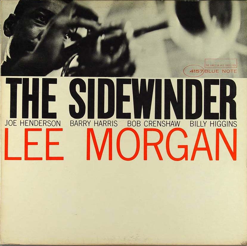
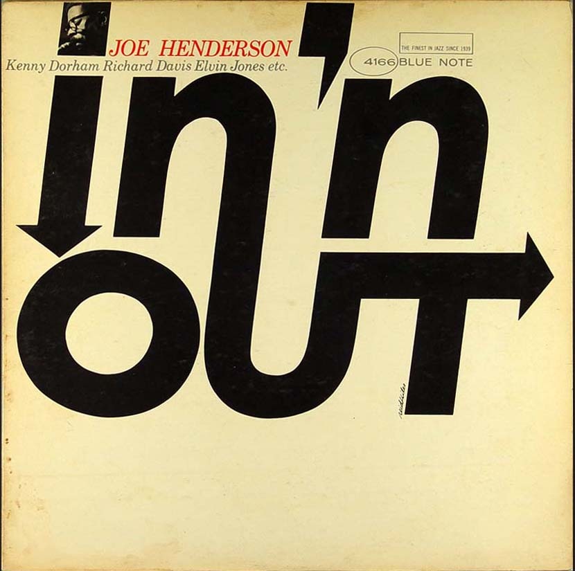

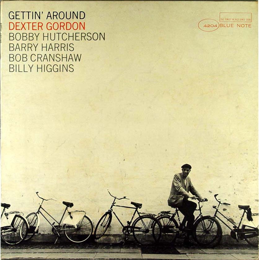
Here are some more covers from that great Blue Note Cover Archive that Amy Stoddard sent in a while back. Scanning through the archive you’ll find some periods of absolute greatness; these four were culled from the mid-60’s period when modernism was in full swing and someone over at the Blue Note design dept. seriously knew what they were doing. I selected these particular covers to illustrate the sort of continuity that seemed to pervade this period of releases. I really appreciate that from record labels, it’s not always the best policy, but there are times when I would sacrifice variety for a continuous visual message that flows through a series of records.
The other thing that really stands out to me about these is something that the original designer(s) probably didn’t intend: the lack of true white. Something about the off-white / cream in the place of white always makes an image feel more human to me, more tangible. That’s why white hasn’t been included in any of my design work since some of my earliest stuff from around 2001. I am not saying it doesn’t have it’s place in design or that it can’t be used effectively, I just don’t prefer it.
The minimalist color ethic in these pieces is employed successfully to such a degree that only a maximalist could truly appreciate. These images are literally exploding off the page, it almost hurts to look at them, yet they’re only two colors and relatively empty, full of negative space. True, a couple of them have leveraged photography to provide some depth, but try to imagine them without the photos; they would still stand on their own and that’s a testament to not only the designer but the power of typography itself. Note that aside from the oval and rectangle of the Blue Note logo the only shapes and lines are formed solely by type. To me that’s the ultimate expression of design, the information is the image, or, as a sort of anagram of Marshall McLuhan’s famous quote; the message is the medium.
What also strikes me about these is how timeless they are. This is not nostalgia, this is graphic design at its apex. If you compare these to the visually entertaining, yet decidedly dated, selections in my last Blue Note post, you might see how comparatively well these designs have stood up compared to say, this. The later Blue Note covers scream "late 60’s-70’s", the Carson stuff screams "1990’s", while these simply scream "DESIGN". Just as many have proclaimed Helvetica to be the purest expression of modernism through typography (which is an interesting concept in and of itself), I sometimes think that design as a whole reached some sort of zenith somewhere around the middle of the 20th century. That’s not to say there isn’t more to be done, new paths to be forged; but I feel like perhaps the perfect balance was struck during that era and all we can do now is explore all of the not-so-perfect alternatives. I know many will disagree with me, they’ll invoke Sagmeister and his ilk, but I’ve never been a fan of post-modernism, I think it is flawed. It is sometimes beautiful, thought provoking, and can be used to great effect, but at the end of the day it doesn’t go as far to accomplish the goals of communication and graphic design. True, graphic design is an ever-evolving form that mirrors the society it is employed to convey it’s message to, but the basic set of requirements that govern the neccessary function of that conveyance do not change…..That is, until we all mutate and read with thought waves and our eyes remain only as vestigial lumps mounted on the front of some sort of hyper-evolved super-brain. But that’s besides the point.
So that’s the long and the very long of it, my opinion only. As I’ve betrayed many times before, I am a lowly uneducated philistine so please set me straight, I would love to hear your opinions and the masochist in me eagerly anticipates the verbal thrashing I am sure to receive from the collective rebuttal superpower that is: The Innernette.

22 Comments Leave A Comment
Don G. says:
July 1, 2008 at 1:51 amI’m totally blown away by the In ‘n Out cover. To me it illustrates the very core of graphic and letter design. Simplicity truly shows it strength here. Where can I buy a copy to hang in my living room? :-)
Daniel Carvalho says:
July 1, 2008 at 3:02 amThose are fantastic designs, I’m always a fan of minimal colour usage. In almost everything I design, especially regarding the use of type, I always try create invisible shapes or boxes. Using negative / white space to create the form and structure, letting the viewers eyes fill in the blank spaces, line up the lines and match up the points. My personal belief with that ethic, is that it actually makes designs visually and mentally more stimulating to the view.
There’s something about white, black and orange used together that always gets me going. This reminded me of the U2 album cover that I really love.
I’m also not a fan of post-modernism, because there seems to be too much chaos and not enough reason. And, as you said, there is something perfect about these designs in how they are indeed timeless.
I really couldn’t agree more with you on this one.
– Daniel
thomas says:
July 1, 2008 at 8:05 amthese album covers are great and i appreciate your extended thoughts on design and color. i’m with you on the ‘off white’ thing. i perceive it as more human – less sterile. and i noticed it and was struck by it when i first saw your work for the first time about a year ago. “wait..he doesn’t use any true white..ever..huh..”
i’m not much of a designer myself. i’m just a musician with a great interest in graphic design. but, after reading this post, i see i have to do some research to fully understand what you’re talking about in more depth.
one thing i do know is that these album covers reflect the kind of art i seem to be drawn to the most.
thanks for this post scott. it’s nice when you have the time to elaborate like this.
thomas
Horacio says:
July 1, 2008 at 8:30 amThe first cover is the best. Good typography always do well. I think that every student & designer should see “Helvetica” movie, because that’s a really good material to understand what this is all about. Good design is not fashion.. good design is timeless.
And I don’t like Carson anyway =P
nelson says:
July 1, 2008 at 8:34 amNice design…… check this out
http://thingsmagazine.net/projects/1960s/pel03j.htm
and the rest are @ http://thingsmagazine.net/projects/1960s/index.htm
greg says:
July 1, 2008 at 10:18 amVery nice. I particularly love #1 & #4.
jnh says:
July 1, 2008 at 10:21 amScott
I think your point about the lack of white (or at least how the white ages over time; Blue Note re-issue CD’s always seem to have true whites) is definitely on point. The other thing that is really interesting is that because of the photo-typography used (During this time, much typography was set using a darkroom process) the type softens and lives very much on the same plane as the image. I think this is why Blue Note-inspired designs often fail, they don’t capture the multiple production layers between the original design and the final output. I think Kenneth Fitzgerald referred to this a kind of graphic “timbre”. A really nice idea.
Jess says:
July 1, 2008 at 11:19 amBlue Note’s a great choice, Scott. I picked up #1 and #4 from a yard sale about two years ago in my neighborhood. I couldn’t imagine selling design pieces like this, or the music, but I sure didn’t say anything! I don’t know if it’s the typography I love or the sense that these albums have been in your collection for decades but still feel like they belong in the now.
The Sidewinder cover has been on my desk for a couple of months now… The photo portfolio I’m putting together for my personal work is modeled on this album.
Frank says:
July 1, 2008 at 8:12 pmI have to take exception with some of your comments here. First of all, how can you talk about Blue Note without mentioning Reid Miles? To say that “someone over at the Blue Note design dept. seriously knew what they were doing” without mentioning that “someone” is a little embarrassing.
Second, I think your talk about “true white” kind of undermines your point. Clearly these designs are brilliant and classic, even if you bring them into photoshop and eyedropper the cream into a pure white. It’s the graphic design that’s strong, not the texture. I think it’s a mistake to bring a consideration of texture into work like this where the strength is pretty much entirely graphical and typographical.
Finally, I think your view of history is a little biased. These designs do scream ’50s. They scream it in a brilliant way but they still are very rooted in their time period.
Rae Davis says:
July 1, 2008 at 10:33 pmFrancis Wolff and Reid Miles were such an amazing design team. Blue note has been one of my all time favorite labels. The Dextor Gordon “Gettin’ around” cover has been one of my all time favorite covers, as well as the Wayner Shorter “Speak No Evil” and Grant Green’s “Green Street.”
Alot of the covers had this nice “tinted” color to them. The usage of space was done very nicely.
Forrest says:
July 1, 2008 at 10:41 pmHahaha, great read, thanks Scott. The link at the end is also great, it made my day.
Scott says:
July 2, 2008 at 1:22 amFrank-
I see your points, but as I said, I’m not educated in design, I just use photoshop a lot, and I’m definitely not embarrassed by either of those facts.
To me, texture and form are two inexorably linked properties which both hold equal significance. a quick look through my work will leave no doubt as to that fact. You’re right, the forms alone would still stand strong if you injected white into all that space, but that doesn’t change the fact that I prefer them as they appear above.
these don’t scream 50’s to me, as far as I know they were all designed in the mid 60’s. either way, I was trying to make the point that designs like these seem more classic and timeless than the sort of stuff that followed later in that same decade and on into the 70’s.
Aleksander Dahl says:
July 2, 2008 at 4:08 amVery interesting points you make here. Especially what you say about design reaching som kind of top, or klimax in the 60’s-70’s and that design from that aera is graphic design in its purest form. Altough i do agree to some extent, i woulden be as bold to say that later design don’t commucate a message as perfectly as you say the 60’s – 70’s designs do. I believe that the minimalist design and all other types of design are just different styles, genres if you will, and i think that the choice of style in you work is also a part of communicating the message.
Beacause there are a lot of different sub cultures today, probably more than there were in the 60’s, you often have to direct your design towards much smaller groups than you would have to before. Therfore, i think that the choice of style in your work is quite important and big piece of the actual work and i wouldn’t say that everything else than the minimalism from the 60’s and 70’s is not as perfect as design once was. Just different times.
Luke says:
July 2, 2008 at 7:02 amI don’t think it’s fair to isolate this period of design and call it history’s pinnacle.. These examples are of course fantastic. And maybe during this period of design, the general quality of work was higher than it is now. Before the days of desktop publishing and whatnot…
I don’t like the idea that many people push that states that the greatest design work could all be done by hand. “Simple and effective is ideal”. I always thought that was some kind of universal truth, but I gradually began to think otherwise. When I stumbled on the work of Alex Trochut, that idea was shattered, and since I’ve been completely fascinated by his “more is more” method. What he does could not be hand. Some of it that is – some is done by hand. haha.
Anyhow, all that to say that I love Alex’s work, and I think he’s a perfect example of what design can be today (one kind of design of course). I absolutely love your work too Scott, and I check this blog almost daily. But I think what you post all kind of flows through one vein, and it seems sort of a trend of design. Something I was absolutely in love with months ago. But it is pretty evident in your work, and I love this, that you love dirty paper.
I kind of agree with Frank about the texture issue. To say that you don’t prefer pure white kind of lowers a vast amount of impeccable design. And to say that, I think, also undermines your opinion. I think the pinnacle of design is yet to come.
Maybe not though
vince says:
July 3, 2008 at 4:18 amThey are simply beautiful.. I can only agree with you, they are timeless, and they scream design, not an era…
john says:
July 8, 2008 at 7:33 ami have to agree with frank on this one. while all of these covers are subtle, timeless executions, they are very much rooted in the style that became prominent in the 50’s. Reid Miles worked on blue note mostly through the 50’s and early 60’s, and while these covers might not be his work, and might have been designed in the 60’s, or possibly the early 70’s, they are very much pulling from a style that was explored earlier.
A beautifully set wood type sign can be just as timeless if executed as such, it would just owe its inspiration to a different time period, ya know? even if it is not your subjective stylistic preference.
i would also have to agree with frank on the off-white/texture thing. applying a color to give a warm feel in the first place feels like a very post-modern concept to me. i have some of these old blue note records at home, and i think often the off white is the result of aging.
anyway, certainly nothing to be embarrassed about (which i am sure you are not). continue to do great work!
ralph fisker says:
July 22, 2008 at 4:52 amI have to agree.
Preferring cream over white is like calling the Middle Ages the Middle Ages – people at the time didn’t make this reflexive move. Postmodern chatter they call it, that ever present longing for old times. It’s part of your trademark, isn’t it, Scott? That’s partly what I love about it. Melancholy is my friend.
But praising designers for their lack of white usage is, I’m afraid, telling your dog he’s a great dog because he can bark. Problem is he can’t do anything else, your praise is his prison. Bleaching methods and resources up till the 70’s were rather restricted which made for paper that ages quickly. We love it, although people at that time maybe / probably didn’t.
Jonathan Werve says:
August 4, 2008 at 11:03 amRe: where can I get one?
Aside from the obvious “buy the record” answer, there was a collection of these covers printed in a book a few years back. They’re printed at original size, and some careful exacto work gives you hangable prints. I had, oddly enough, picked out three of the works cited here and had them on the wall of my first apartment. Loved them. Maybe Scott and I are seeing some of the same things.
BP Design Lab says:
July 7, 2009 at 11:52 amThe Blue Note label in general provides staples to any record collection. I often cannot decide which I love more, the music or the artwork. Many are brilliantly simple and there work with monotone and duotone is often perfect.
I liked what this cat did with some of the blue note classics: http://website13156.com/?p=165 . Great concept! It made me draw my own conclusions about the similarities between the Wu and the Blue Note artists, respectively.
Great post!