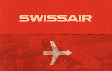
Swiss Airlines has a rich history that has been hidden in the archives for quite some time. On March 26th, 1931 when Swissair formed, I doubt anyone at the time really considered the history that they were going to be making with the company’s design. Balair and Ad Astra were the two companies that merged to form Swissair. Throughout the years they’ve changed logos many times but there was one that was most memorable (above). Quite possibly it was the best logo that the company has ever used.
Thanks to SR692 for collecting this information so that we’re able to walk through past logos used by Swissair. Some great, some not so great and a few that were very, very experimental. Hit the jump to see how the company logo changed throughout the years.
Via Wanken
Continue reading →


I just got back in from Toronto which was the last stop on the short Tycho tour we just did (I was joined by Dusty Brown and Zac Brown for the live sets). I just wanted to thank everyone so much for having us, we had a great time playing for you and couldn’t have asked for a better vibe. Our very own contributing writer Shelby White was on hand at the Seattle show to shoot with his 1D MK2. As you can see (above) the results were beautiful, he really captured the feel of the lighting that night. And that last one of Dusty is amazing!
I’m going to take a break from shows for a little bit here while I tie up some loose ends on the music front, but we’ll be hitting the road again — and making it to a lot more cities — once the album comes out and we have time for a proper tour.
Images Source: Shelby White / Wanken Blog

Starting later today, Shelby White will join the ISO50 team as a contributor to the blog. Many of you will recognize Shelby as a frequent commenter here on ISO50. He also runs his own design blog, Wanken, which he has curated for the last couple years. As is evident from his posts, Shelby is extremely passionate about design. He has a remarkably discerning eye for captivating work — especially of the mid-century modern variety — and his aesthetic should fit right in here at the blog. He is currently living in Seattle, Washington, where he is studying at the Art Institute and working for BKWLD (A Sacramento/Seattle-based design agency where Scott spent some time as well).
We are excited to add a new perspective to ISO50 — please give Shelby a warm welcome, his first post should go up later this afternoon.


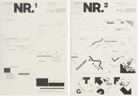
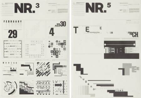
I’ve seen these posters floating around the internet for a while. I searched long and far to try and find anything at all about them, always to no avail. It was tough when all I had was the letters NR and my feeble attempts to describe their excellence to Google. Recently I saw them again on Shelby White’s blog and was very excited to at least have a small lead as to their origin.
Turns out they were designed by Wolfgang Weingart for Kunstgewerbeschule Basle in 1974. These, and a number of other Swiss poster designs, are at The Swiss Poster Collection at Carnegie Melon University. I would love to see one in person; I’m very curious how large they are. I like to imagine them as these massive wall sized super posters, best viewed at a distance. Ready to intimidate any graphic designers that unwittingly wander underneath.
*Favorite is definitely NR1

