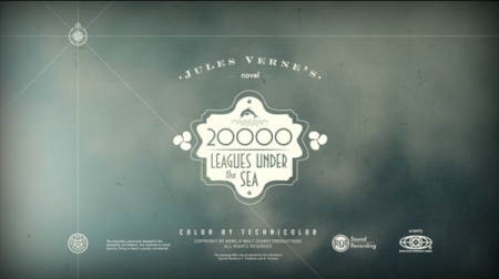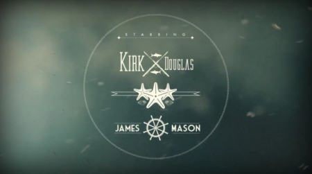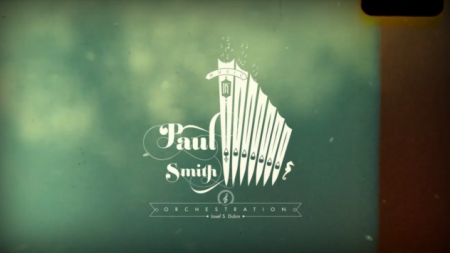


Ivan Maximov created these opening titles for 20,000 Leagues Under the Sea for a school project. Relatively simple, compared to some of the intricate excellence you see on Art of the Title these days, but I think they are extremely well executed. I really like the combination of live action underwater footage with some slick After Effects motion overtop. Would love to see a longer version.


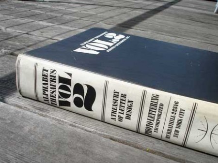
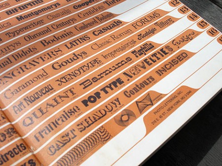
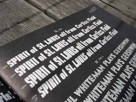
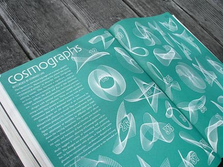
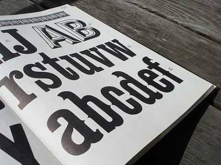
Grain Edit has a great post on the upcoming Photo Lettering Site from House Industries. When I first saw the headline for the original post I was half hoping for some sort of digital way to achieve that awesome blurred edge style from old movie titles and magazines. Sadly, that wasn’t the case. But the reality was just about as good, a bunch of great until now defunct vintage typefaces. The Photo Lettering Site is not fully operational yet, but you can check out some posters featuring some of the fonts here.


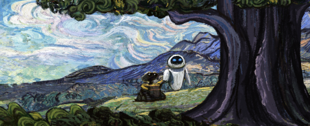
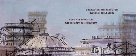
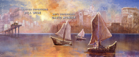
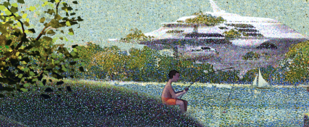
Art of the Title Sequence has a bunch of new material up, including an interview with the minds behind the Wall-E end credits. Looks like a staggering amount of research went into this. As usual, the results are terrific. A version is up on Youtube, but as they suggest on the site, much better to consult the Blu-Ray if you’ve got it.
via Kottke
