I don’t care much for vacations. I find them dull, boring and usually unfulfilling. I’ll vacation when I’m dead. I much prefer adventures. Jordan Manley makes me incredibly jealous and inspired all at once with this adventure. The story telling. The visuals. The hardships endured to create something beautiful are bound together perfectly. Every shot is breath taking. It makes me want to pack up my bags today and head north.
It’s videos like these that keep my spirits alive. They keep my dreams burning. What Jordan Manley has done here with a talented group of athletes is unlike anything that I’ve seen or felt from a sports video. It’s not the standard issue helicopter pan shots of Valdez or Chamonix. This is hours upon hours of hiking in extreme conditions. Putting their lives at risk to create a beautiful story in a place most of us have never heard of. Talk about passion.
Hopefully this video will inspire a few of you to take an adventure somewhere crazy this summer.


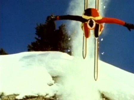
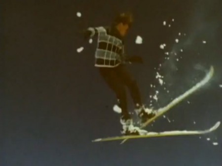
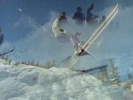
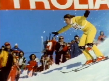
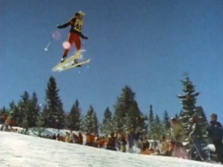
After watching the Winter Olympics I found this History of Ski Aerial Acrobatics pretty amusing. The whole thing is basically just a bloopers reel of guys eating it off of jumps. Towards the end they start nailing the landings though and the super-8 style film is pure vintage goodness. Check the awesome lens flare at 3:24.
Video Link | Via Bruno Aeberli


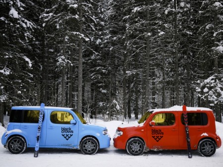
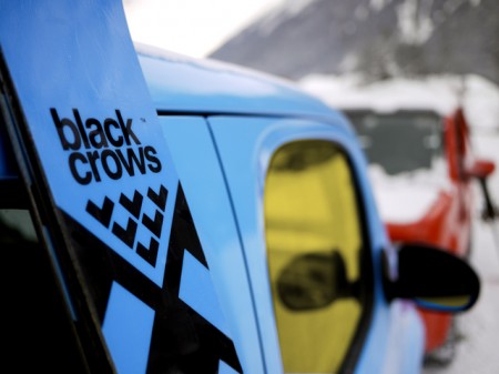
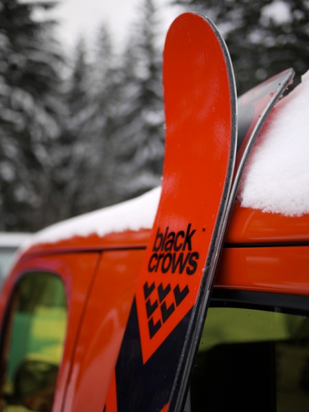
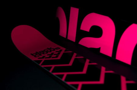
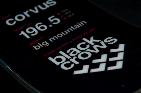
I’ve been up in Tahoe getting in a few days of skiing in before I hit the road and happened to come across some related reading. Black Crows make some very well designed skis (can’t speak to how they ride, I’m loyal to Armada) and now they make a well designed Cube. Nissan has partnered with the French ski maker to create these two special editions of Jakub’s favorite logo-shaped conveyance. The cars are interesting but the skis are the real story. I’m always complaining about the abysmal state of ski design these days but Black Crows have shown that there are still some people pushing the minimal vibe even in this age of x-treme-sports-informed maximalist design. The only problem is they’re too pretty to ride, I’d hang them on my wall though (see a couple pics below or check their site). Via We Heart
BTW: according to the EXIF on those shots they were taken with the GF1. Pretty nice, been thinking about getting something in that range (like the Canon G11 et al.) for traveling light. The shots below were shot with the mighty (yet inexplicably video-less) D700.


Ski images via Pixelcollector


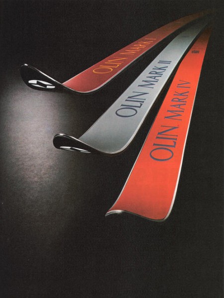
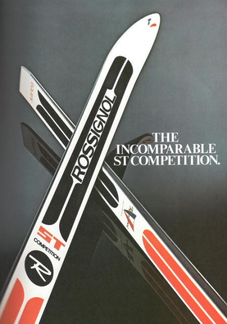
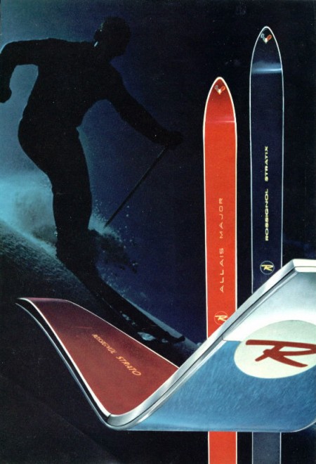
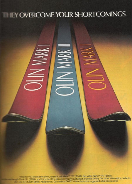
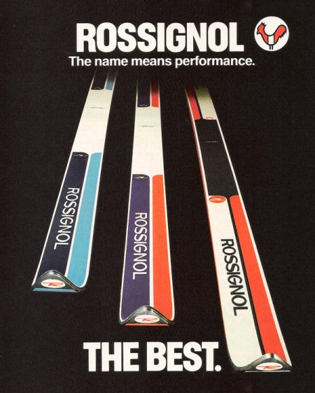
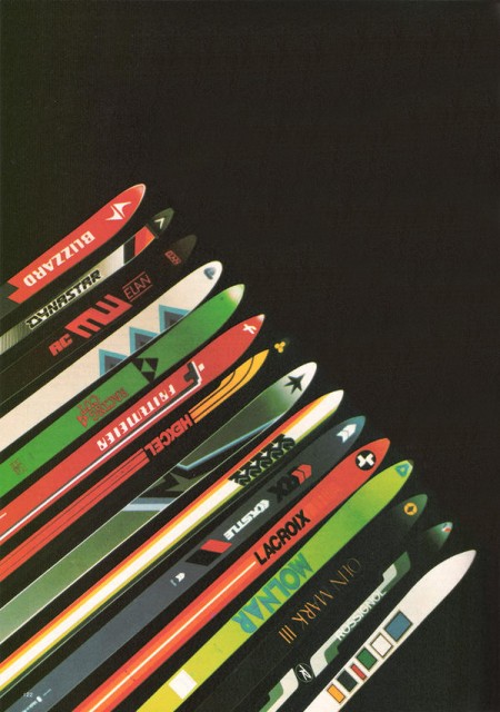
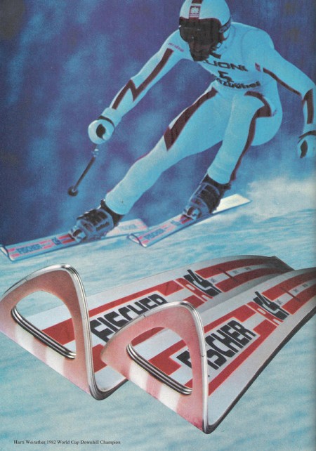
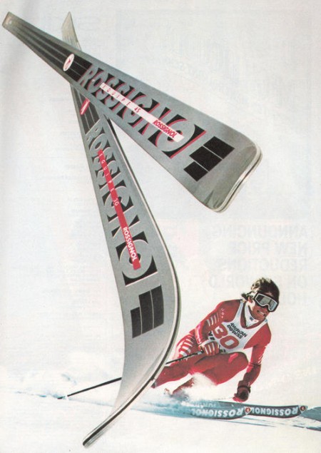
In part 2 of the Vintage Ski Ads Series I chose some that focused in on the skis themselves. When I see skis these days they either look like pop culture threw up all over them or they were designed by the same guy who makes the info graphics at the bottom of the ESPN screen. Looking at the examples above it’s plain to see they had a little more appreciation for subtlety and a sense for classic design back in the day. Either that or the printing methods were such that they were limited to simple shapes and colors and the designer in me is just picking up on that.
When I think about it, this could be the case with a lot of older stuff. I think we as designers often appreciate unintended aesthetic elements; things that were a function of necessity or limitation rather than deliberate design decisions. A good example would be vintage audio equipment. I think the Neve Sidecar is one of the most beautiful inanimate objects ever created. But when you really look at it you realize it was designed by engineers; pretty much every design decision was dictated by necessity and function. So I must be reinterpreting that as physical beauty creating a connection between the idea of an object’s functionality and it’s aesthetic beauty. In other words, maybe I only like how it looks because I appreciate how it works (or in this case, sounds). Then again, I have some gear around the studio that I love the sound and functionality of but is just downright ugly to look at.
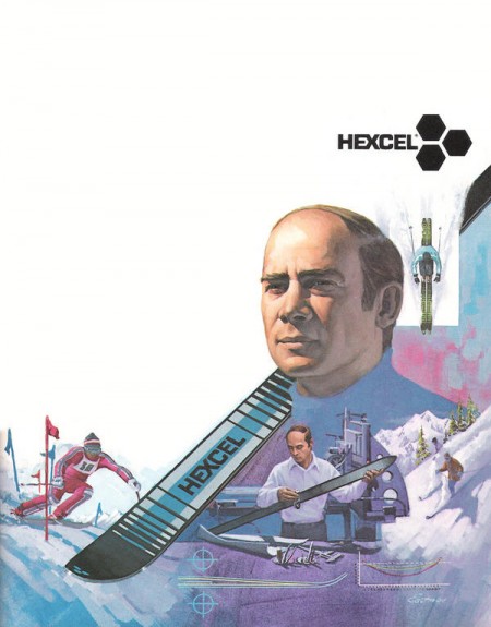
Anyways, all those Rossi’s are incredible. This whole style needs to make a comeback, but it seems these days people need to be beaten over the head with design instead of left to appreciate its finer points on their own. I’m not saying there’s not a place for busy, crazy graphics on skis — I myself have designed several busy, crazy skis — I just wish there were more like these to choose from. I guess it’s a different industry, no longer do guys in mock turtlenecks with comb-overs get all scientific and wear collared dress shirts while developing new skis in the lab, now it’s just this guy and a Nintendo DS in a dark room.


I got my first couple days of skiing for the season in last week right after some nice snow up at Heavenly. Skiing always reminds me of being really young and going up with my parents, Sacramento is only an hour from the Sierras so we’d get up a few times a year. I loved all the design associated with ski equipment and I found that when I first started out in design I was always trying to emulate that style in my work.
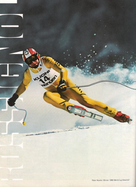
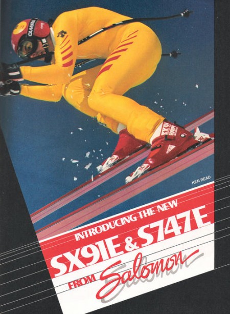
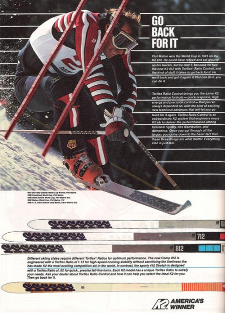
My latest trip got me thinking about vintage ski graphics so I set out to track down some good examples. Most of what I found were from magazine ads, this first set focuses on racing imagery. I’ll be posting some more in the days to come, hope you enjoy this first batch.
