Branding Overview: Obama vs Romney
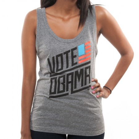
Now that most of us are familiar with logos both candidates are represented by for this U.S. presidential race in November, I wanted to take a second just to compare/discuss a few choices that were made. Below are links to their shops where a large collection of apparel, stickers, signs, etc. are available:
**Please note, my views are strictly geared towards reviewing the merch/branding and nothing of the election, we are a design site and this post is just my opinion and not of Scott Hansen or any of the rest of the contributors.
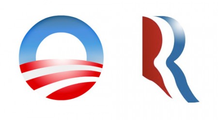
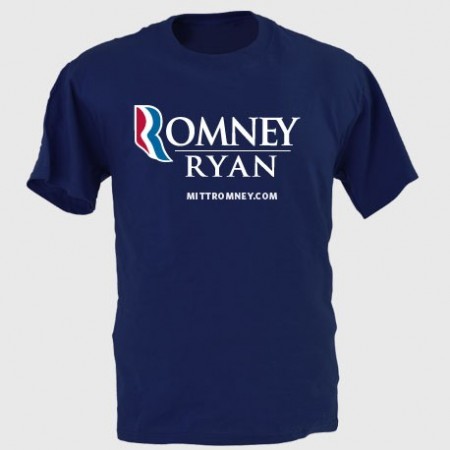
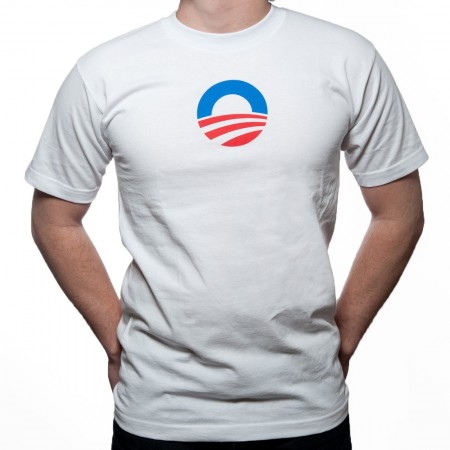
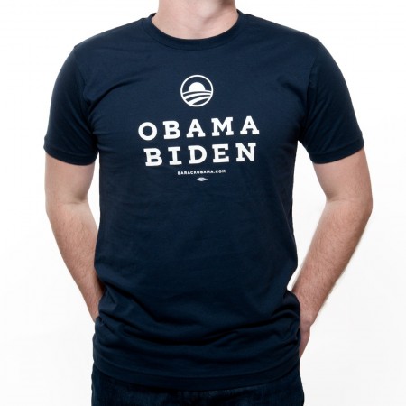
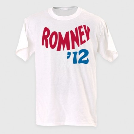
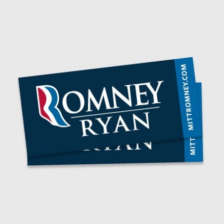
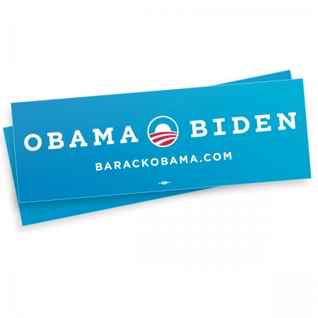
I for one am surprised by the Romney logo, its actually not awful, when I first saw it I thought it was too loose and it had weak traits that wouldn’t translate well once it started getting pressed on things and it didn’t hold well by itself. When you lay it on a shirt with an outline it turns to garbage like many things but on white it actually has some legs. As for Obama’s logo I think its been clashing too much with the Bank of America logo in my head but once I shake that thought its solid, if feels right any which way you put it. Its almost a self contained environment within an icon, he should be proud.
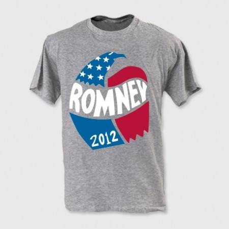
Both sides see that there is reasoning in this day in age to actually put some thought behind designing a shirt for the people that are going to dish out $30 and actually wear the shirt because they like the design. Both sides came with something consciously stylized, i’m sure both candidates didn’t see these and approve BUT someone did. Both aren’t dreadful but Obama edges out Romney on this one as well and here’s why: Obama went after the goal/statment and makes you read it while Romney just threw something “retro” looking and the message isn’t there. From the “Keep Calm And Carry On” iPhone Cases to garbage like “Swag” tees, in my observations this years youth and shirt buyers want statements and type for the first time in a long time, its pretty shocking actually.
I don’t think this is Romney’s “font” but it is landing on a few of the pieces he’s selling. I think its confusing or just overlooked. Why such a departure from the conservative look? who is it for? on the other hand Obama keeps it clean and uses his font well…but who needs a website anymore on a shirt? I mean come on? I do enjoy a small font sitting under the big font layout wise, there’s some comfort in it especially if you’re designing for the general public.
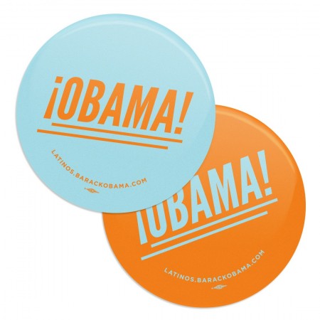
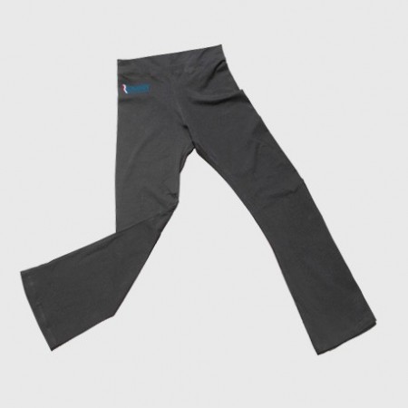
I had to add this section, I should have called it the “Head Nodding side to side” section. I mean COME ON! really? we’re bringing in Orange… “but its fun Jakub and the Latinos might like it”it’s confusing and throws a tiny wrench into the branding. The Romney yoga pants are just…blowing my mind, i’m not even laughing at them, its like I just swung myself over the swingset for the full rotation and landed hard. You don’t even benefit from someone wearing them, you hid the logo on dark grey on the hip, its joke by the merch team I get it, good work guys.
Romney’s 2nd biggest failure in the merch department is the classic bumper sticker that every candidate needs… this thing is awful, its not 1988 and no one owns a Oldsmobile Cutlass Ciera to put this on. Obama’s is refreshing and more importantly brighter and only uses one blue and saved some cash by only printing with 2 colors which more cost effective, good choice.
