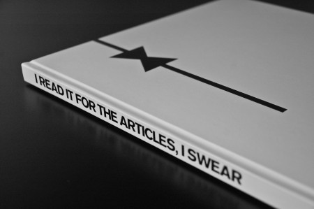
My rebranding Playboy project came to a close last week with the end of our fall semester. If you read the last article, you are familiar with the first part of this project, which was the new logo for Playboy. While it is absolutely the flag bearer of the entire project, the logo development represented a small amount of the work we were required to do for the overall project. The final deliverable for the class was a book in which we the explain history of the brand, walk through our rationale for the new identity, explore the process of the logo development, present brand standards and guidelines, and show example brand implementations and extensions. Other than this required content, there was no specific criteria for the book. Each student also gave a short final presentation explaining their rebranding and the choices they made along the way. Everything was created for the Nature of Identity class at the Academy of Art, as part of the graduate graphic design program.
I really enjoyed the conversation the first post on this project generated. I was excited to see that the new logo was as polarizing as it was — I feel like these types of solutions are the most exciting and rewarding for me. I noticed that many people were up in arms about the idea of Playboy removing nudity and becoming an all article magazine. While I would like to note that the new strategy was purely a conceptual exploration constructed in an educational environment, I actually do think they might be well served to switch things up this drastically. Playboy was once irreverent and boundary shattering. They are no longer. I can think of no better way to recapture this audacious spirit than by doing something this extreme…
Continue reading →

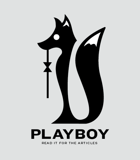
A little while ago, I wrote about my current class assignment to reinvigorate a brand that is “dead, dying or defunct”. As we are nearing the semester’s end next month, I thought it would be a good time to begin describing the process of this project. The final deliverable is a book, in which we describe the history of our chosen brand (and why it’s time for a update), outline the new identity guidelines (visual standards manuals, usage considerations etc), and show potential extensions (mock ups of storefronts, products, etc). For this process post I’ll describe my brand choice and eventual logo development.
(project permalink on my site)
When I wrote the first article, I was considering No Fear as my primary option. With such a versatile name, I figured I could take the brand in a number of different directions. However, as much fun as it would have been to revisit the dominant clothing of my middle school years (along with LA Lights), I was concerned that the project would not really extend anywhere beyond a basic brand overhaul (new logo, visuals, products, etc). I saw little opportunity for humor or much conceptual work, and I opted to move in a different direction.
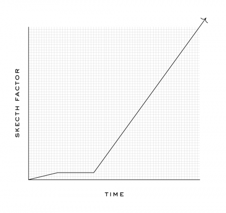
I decided to rebrand Playboy — a brand that many might say is arguably not dead, dying or defunct. Like many magazines, they actually are “dying” (financially), but for my project I focused on the decay of the overall perception of the brand. The graph below displays how I feel the brand has progressed in a more abstract fashion. Basically, these days, I would say most people would be embarrassed to say they read Playboy. A baseless assumption perhaps, but when was the last time you saw someone reading Playboy in public?
To keep up with the increasing trashiness of the American Men’s magazine, Playboy has been forced to reposition itself as “one of the boys” as it were, and is now indistinguishable from the Maxim’s of the world. Rather than hold on to the sophisticated standards of their early years, Playboy has come to embrace its unfortunately crude place in the magazine world. This evolution (rather, devolution) is tragic and the original soul of the brand has been lost. Maybe not “dead, dying or defunct”, but Playboy has certainly lost something along the way. I saw an opportunity to bring some of the original classiness and sophistication back with a drastic repositioning…
Continue reading “Rebranding Playboy”

Continue reading →
