On the evening of Tuesday, March 8, The Architectural League gave its President’s Medal to Lella and Massimo Vignelli. The award (past recipients of which include John D. Rockefeller, Jr., Hugh Ferriss, Joseph Urban, Richard Meier, Robert A.M. Stern, and Robert Venturi and Denise Scott Brown) was given to the Vignellis “in recognition of a body of work so influential in its breadth that it has shaped the very way we see the world.”
Pentagram’s Michael Bierut, an Architectural League vice president who began his career over 30 years ago as a junior designer at Vignelli Associates, designed the the program we see here. The five different covers featured a quote from Vignelli printed in PMS Super Warm Red and set in Helvetica of course.
So why are these five Vignelli-isms important?
When I first came across this I immediately saw five lessons to live by rather than just five miscellaneous quotes. They appear self explanatory but read each and give it a moment alone in your mind:
One life is too short for doing everything.
We like design to be visually powerful, intellectually elegant,
and above all timeless.
If you can design one thing, you can design everything.
If you do it right, it will last forever.
The life of a designer is a life of fight against the ugliness.
Posted via Wanken
Continue reading →


Helvetica and the New York City Subway System by Paul Shaw — which examines the Helvetica’s role and history in the New York City Subway system — looks like a must have for any design collector. It’s currently sold out of it’s initial limited edition but Shaw’s site says they are looking for a publisher. Let’s hope that works out.
Also not to be missed is David Heasty’s One Color Subway Map featuring, of all things, Helvetica. You may still be able to score a print, details are here.
Via The Daily Heller via Thinking For a Living


Determined to find out the history behind these beautiful posters, Frederico Duarte did some extensive research and learned how “Pan Am’s short-lived Helvetica dream” came to be. He chronicles this process over on the Eye Blog and in an article for Eye Magazine. These posters are incredible and their story is well worth the endless emails and phone calls he had to make to determine their origin.
Pan Am is no longer. But the story of its redesign, as told by the people behind it, proves personal connections, proximity and chance are all makers of (design) history. How many other great design stories are left untold?
Fredrico’s post reads like a design mystery and I lamented how little of this research I do, or even curiosity I possess when I come across work that interests me. For example: I wake up, see something amazing on FFFFOUND, then I bookmark it. End of story. If it’s especially awesome maybe I blog about it, but I rarely dive deep into whatever visual universe I’ve uncovered. I usually just absorb it quickly, then move on with a slightly augmented sense of visual understanding. This is why I both love and hate sites like Dropular or FFFFOUND. While they allow me to quickly consume lots of high quality design, they remove context and discourage the exploration that would otherwise go along with finding out about a new artist. (Of course there are many benefits to sites like these, but the removal of the ‘story’ that goes along with the work is one of the primary downsides.)
As Fredrico mentions in his article, the research was done for an SVA class where the rule is “No Google”. I thought this was interesting because I tend to use Google and “research” interchangeably, especially when thinking about design. To be stripped of my only research tool! Of course this makes sense these days, as most of us young designers primarily exist on the web anyway (which is a scary thought if you think about it…if the hardrives go, so do I). What the story hammered home for me was the importance and overwhelming benefits of a design education. What allowed Fredrico to take this much time plunging into the depths of design history (and what allowed me to spend so much time with Playboy) was the freedom and time provided by the design education environment. While you could always try and inspire yourself to do this on your own, it’s hard to beat limitless boundaries coupled with external motivation.

Nothing too involved here, just a simple diagram outlining the key differences between Arial and Helvetica. You can find the full alphabet overlayed here. Just in case you’re unfamiliar with the unique history these typefaces share, here’s an in-depth analysis. And here’s the battle mode.
Via Swissmiss, who’s workspace is way cleaner and more Helvetica-ish than mine:

Tina Roth Eisenberg of Swissmiss


Just some random perfection from Mr. Crouwel for a perfectly random Thursday. Experimental Jetset has an interesting article about the invitation shown above (the third image down).
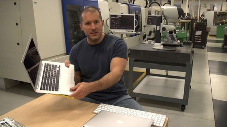

Objectified, the upcoming documentary on industrial design by Gary Hustwit, will be premiering soon at the South by Southwest Festival in March. It will take an in-depth look at the designers and creative processes behind some of today’s most popular objects, and should provide a great introduction into the field of industrial design.
I enjoyed Hustwit’s last film, Helvetica, and I thought it was a great way to give the general public some perspective on the world of graphic design. I am constantly asked what graphic design “is” by friends and family, and it was nice to have a film I could show them that pretty much summed it up. It was also interesting to see how the film’s release affected the use of Helvetica at school. Despite the fact that it was ubiquitous already, students suddenly became afraid of using it at all, for fear of further saturating the design community with more Helvetica, or doing something predictable.
I’m sure a lot of you will have heard of the release by now, but be sure to keep an eye out for a screening in your area. The fantastic Sundance Kabuki Theater, here in San Francisco, will be showing it on April 21st, with a Q&A with Hustwit to follow. More dates and screening information can be found on the Objectified site.