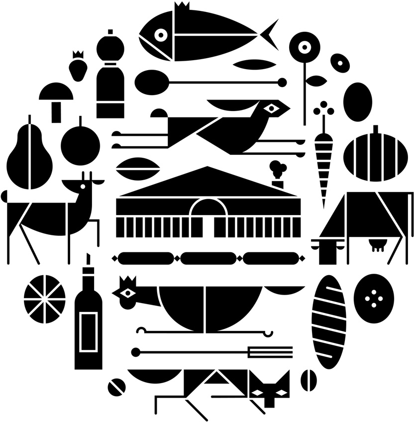
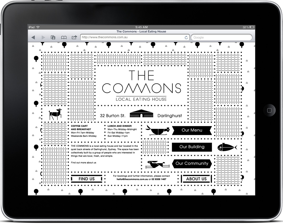
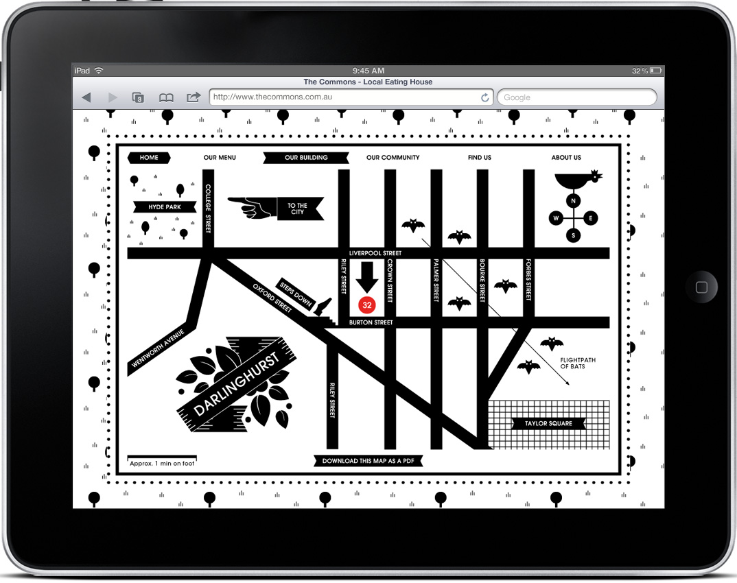
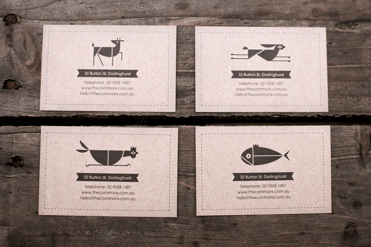
I typically start my designs in black & white, but eventually I reach a point where I feel like the work is missing something, and at this time I begin to incorporate some color. That’s why I’m impressed by design that succeeds in B&W, and Craig & Karl’s work for The Commons is some of my favorite yet. The fact that it is successful across an entire system is even better. Check out more pictures here.
Some really cool illustrative branding over at Matt Payson’s site. It kills me to post images that aren’t at least 450px wide and screw up the layout, but this is deserving work. Such a refreshing and well executed take on branding, I’d wear shirts of most of these.
Editor’s note – In answer to some of the questions in the comments: This contest is not for Gap. We are not affiliated with Gap. Gap has nothing to do with this contest. This is for fun, not Gap. Gap will not be using any of these logos. Gap will not be forcibly entering your home and removing belongings. This is not a secret conspiracy by Gap and the Freemasons to get you to design free logos. This is not crowd surfing. I bought some socks there one time like five years ago. Also, Gap has apparently been using the new Helvetica logo for nearly a year now, everyone just decided to notice and get super pissed off when they added a gradient square this week. If you submit a logo to this contest, you retain the rights to that logo.
By now you have seen the new Gap logo. By now you have sent a “this is terrible” rant to all your designer friends. By now Gap is probably about to pull a Tropicana. (Update, they did).
OK so I get it, you don’t like the new logo. I don’t either. I want the little gradient square to fall into the gap and never come back. But I couldn’t help but think: what would I have done if Gap had come knocking and asked me for a new logo? How do you rebrand a company as ubiquitous as The Gap?
So rather than rant and rave, let’s fix this. We are a community of designers and I’m sure someone here can come up with something better. So here’s the contest:
Your Job: Design a new logo for the Gap. Assume a fairly open brief and think about where their brand is and where it’s going.
Timeframe: 1 week. Contest ends on Wednesday October 13th. Short yes, but this isn’t school, let’s work quick.
First Place: Your choice of giclee print from the ISO50 shop (size 24 x 36), a shirt of your choice (also from the shop), and a process feature article here on ISO50 (If you choose to, you can write a process piece on how you developed the winning design, which we’ll post here on the blog).
Two Runners Up: Two shirts of choice from the ISO50 shop.
Instructions: Email alex [@ symbol] iso50.com with the subject line “New Gap Logo” and attach your redesigned Gap logo. Please make sure your file is in JPEG or PNG format and clearly displays your logo. Size 450w x 250h pixels please. Center the logo, make it look nice. Limit two entries per person.
Due to the extremely high volume of submissions, entries may not be posted right away, but we’ll do our best to get them all up before the 12th!
Voting: Winners will be determined by a popular vote after the last submission date on a separate post.
Legal: All entries remain the sole property of the designer who created/submitted them.
Sourced from Man About Town -- note the interesting article name
A while ago I posted on an article about different techniques for naming your brand. I’ve found that method of brainstorming to be particularly helpful, but sometimes you need an extra spark. I wanted to put another tip out there I’ve found success with recently. Maybe if you’re in need of a brand name this will help you find what you’re looking for. (Of course this sort of thing works for band names too — really any entity that you’re charged with naming.)
So if you’re like me, eventually you run your brain dry of ideas if you’re just sitting around trying to think of the perfect name. Per project, I usually have about two or three days worth of *just* thinking in me. After that I go crazy and try desperately to convince myself that something I thought of is actually amazing. One week later, when I realize I’m delusional, I am back to the drawing board, nameless. My favorite place to look for inspiration these days is no longer song lyrics or the dictionary — it’s fashion magazines.
I suppose any sort of magazine would do, but fashion magazines seem to work best. The titles of articles and photo spreads in fashion magazines are rife with clever turns of phrase and exciting word combinations. Basically anywhere they have to think of clever titles for something pretty abstract is where you want to look. A photo shoot where everyone is wearing black for example, probably has some unusual name (otherwise it’d be really boring). You don’t really see it on blogs, but print writers seem to have a insatiable desire to think of the cleverest name for every article they ever write. Some are completely useless for our purposes, but you can usually find enough of a catalyst to get on the right creative track. I like to make a two column list and combine cool words at random, in hopes of striking something exciting. Here is a short list of a few I noticed in the magazines sitting on my desk (and my thoughts on what they could refer to):
Away with Words (maybe for a publisher?)
Under Statements (minimalist clothing line)
Mind Field (think tank or angel fund)
Sharpsuiter (lame prom-type clothing line)
Her Friend the Bandit (versatile…could be clothing, or maybe a hipster joint)
Elements and Gravity (probably for a jewelry line OR cosmetics)
Some fun ones — if you look for long at all you are bound to find something amazing. Of course it may be perfect for a project you aren’t even working on, but it’s always good to keep a running list. I have the PERFECT name for a bar if I ever decide to start one (I’m not telling). Anyway, it’s an idea, hopefully it helps out!
(I realize there are elements of creative thievery at work here. In a way, you are harvesting another person’s creativity for your own benefit, but I don’t think there are any trace elements of plagiarism at work. In most cases, the phrases or words implemented by the writer are common, and are structures you would have come across eventually, either in conversation or everyday life etc. People may disagree, but I think this is a safe technique.)
I’ve noticed these high end chocolate companies springing up left and right over the past few years. The paper-made thing seems to be the prevailing aesthetic of retail chocolate branding; employing one-color screened ink on kraft paper along with things like wax seals and cardboard hang-tags to give off that organic, handmade vibe I guess. It’s usually done to good effect but it’s nice to see a fresh take every once in a while.
When I first saw San Francisco-based Tcho Chocolate I was struck by the name (no, I didn’t trade my studio for a chocolate factory down by the pier) and then by the design. I regrettably couldn’t find many decent pictures of the actual packaging, but suffice it to say you need to hold it in your hand to really appreciate the finer points. The letterpress and gold leaf inlay are a very nice touch that I don’t think is really captured properly in the above shots.
The video above goes over the concepts that informed the TCHO branding. I particularly like the central idea of chocolate as currency; design firm Edenspiekerman’s implementation of that concept is well executed. The result is a striking design which vaguely conjures the notion of European currency whithout making you forget you’re supposed to eat it. I don’t really enjoy chocolate on it’s own but they still had me wanting some just from the packaging.
My most recent assignment for my MFA program is a pretty exciting one. Our task this semester is to pick a dead, dying or defunct brand and revitalize it. We are free to choose pretty much whatever we want so long as we can make a case for its need of a makeover and/or repositioning. The goal is not only to develop a new identity system for the brand, but also to extend its focus into untapped commercial avenues. For this part especially, we are encouraged to let our imaginations go wild. At the end of the project we will have an overhauled identity system, new product extensions, and an imagined history starting from wherever we picked up — the only thing that must be carried over is the original name.
Pan Am, a most beloved brand, would be a great example of something that would work really well for this project. Picking something that is familiar to people and in the public consciousness is always a good strategic choice. Although, you do run the risk of competing with a powerful history and a previously very effective identity. Another good example that Scott and I discussed was General Dynamics.
Today in class we went over everyone’s choices and there were some pretty cool ones; some very random, and most with lots of potential for sure. I am still on the fence with my choices, but I think I’ll come round this weekend when I have more time to think of potential futures. Right now, I’m thinking it might be fun to try and make No Fear cool again. They obviously aren’t an extinct brand, but if you visit the website you’ll see there is room for some…improvement.
Anyone think of other brands that are in desperate need of a renovation or rebirth? We found this list, but most I had not heard of. I’m sure there must be some others out there just screaming for an overhaul. Sound off in the comments.