Totodo.jp


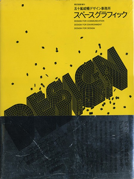

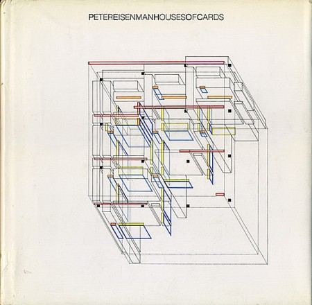
Awesome collection of covers from Totodo.jp, a Japanese vintage bookstore. I want the CITIES one just to scan it and blow it up on my wall. I can hear Alex’s bank account emptying.
Via Junkyard.Dogs


Awesome collection of covers from Totodo.jp, a Japanese vintage bookstore. I want the CITIES one just to scan it and blow it up on my wall. I can hear Alex’s bank account emptying.
Via Junkyard.Dogs
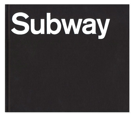
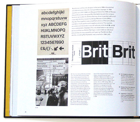
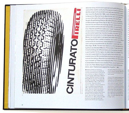
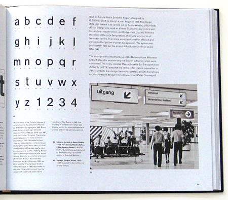
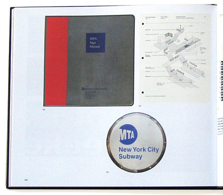
Helvetica and the New York City Subway System by Paul Shaw — which examines the Helvetica’s role and history in the New York City Subway system — looks like a must have for any design collector. It’s currently sold out of it’s initial limited edition but Shaw’s site says they are looking for a publisher. Let’s hope that works out.
Also not to be missed is David Heasty’s One Color Subway Map featuring, of all things, Helvetica. You may still be able to score a print, details are here.



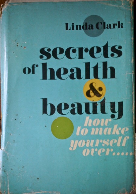


I was exploring the depths of my basement the other day and came across these books. My favorite is the first one, but I think they all have something interesting going on. (I remember the Animal Farm cover from Scott’s post a while back.) The typography of each cover is worth noting — especially the beautiful implementation of the lowercase Carousel on the “Secrets of Health…” cover! The ampersand in particular is pretty amazing. As much as I love Bodoni and Didot, Carousel has a few extra twists that make it more exciting to me.
Sometimes I wish I didn’t live in a design centric city; all the used bookstores were plundered long ago of anything with cool design at work. It is a rare occurrence that I find something worth buying at even the most remote vintage bookshop. Got out here too late!
Apologies for the iPhone photos — it was all I had at the time and I couldn’t pass up the chance to snap some shots. Also worth noting is the price of some of these…when was the last time you paid 25c for a book?
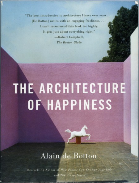
I purchased The Architecture of Happiness by Alain de Botton because I loved the cover. I think it was the colors that first caught my eye. I was also intrigued by the shadow and the shape it created; how it almost touches the statue in the most perfect way. The eye follows the line it creates, and it helps reinforce the hierarchy of the page really effectively. For whatever reason, and as the title indicates the book may elucidate, the whole design makes me happy every time I look at it.
Why this design makes me happy, and to a greater extent, why architecture of a certain aesthetic caliber appeals to us, is largely what this book explores. It is a must read for designers of all disciplines as it pursues the question at the core of what we do: Why make things look beautiful (what does “beautiful” even mean?) and not just purely functional? One of my favorite parts of the book describes the principles of some nineteenth century engineers that felt like they had determined the end-all criteria for evaluating structural design:
The engineers had landed on an apparently impregnable method of evaluating the wisdom of a design: they felt confidently able to declare that a structure was correct and honest in so far as it performed its mechanical functions efficiently; and false and immoral in so far as it was burdened with non-supporting pillars, decorative statures, frescos or carvings. Exchanging discussions of beauty for considerations of function promised to move architecture away from a morass or perplexing, insoluble disputes about aesthetics towards an uncontentious pursuit of technological truth, ensuring that it might henceforth be as peculiar to argue about the appearance of a building as it would be to argue about the answer to a simple algebraic equation.
As the rest of the book unfolds, Botton examines, as eloquently as he does above, the alternative to what these engineers proposed. Why it is that we strive to make things beautiful, and what qualities beautiful work possesses. The parallels between his chosen arena of architecture, and other realms of design, are easily drawn, and make it very worthwhile for interested minds in every field. My favorite paragraph is on page 72, and does a nice job bringing together a lot of what he discusses in the book:
In essence, what works of design and architecture talk to us about is the kind of life that would most appropriately unfold within and around them. They tell us of certain moods that they seek to encourage and sustain in their inhabitants. While keeping us warm and helping us in mechanical ways, they simultaneously hold out an invitation for us to be specific sorts of people. They speak of visions of happiness. [Buy on Amazon]
– – – –
On an unrelated Note: Peter, of Buchanan-Smith, wrote in to clarify the attribution information of a previous post on designer Josef Reyes. The work presented was produced by the studio Buchanan-Smith, where Reyes works as a designer, and the post has been updated to credit the work to the Buchanan-Smith studio. Definitely make sure to check out their site, they have a lot of great work.


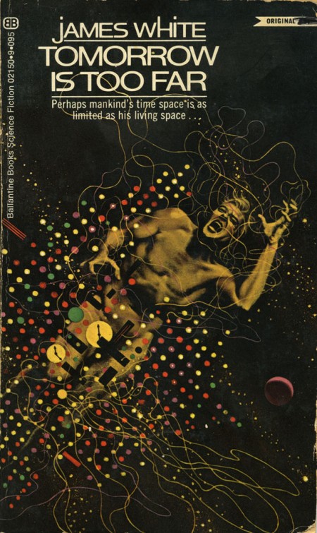
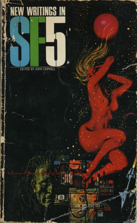
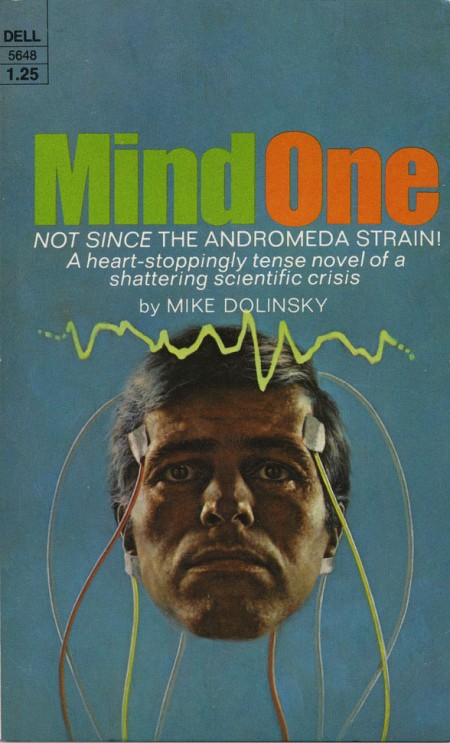
While digging around for Omni covers for last week’s post, I came across blog reader Eric Carl’s Flickr and his downright incredible set of vintage sci-fi / fantasy paperback covers. These really are mind-blowingly good and positively dripping with inspiration. I’ve never seen any of these before but I feel I’ve been somehow influenced by them anyways. They encapsulate everything I love about this period in design; just look at that typography! The “Dark Universe” cover is just off the charts good. Thanks so much for posting these Eric! Quick question if you’re reading this Eric: Do you actually own these? How did you come across find such a nice collection? Link
HUUUUGE bonus: can anyone name the font used in “Dark universe”? Is that even a font or do you think it’s hand drawn? Let us know in the comments.
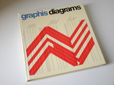
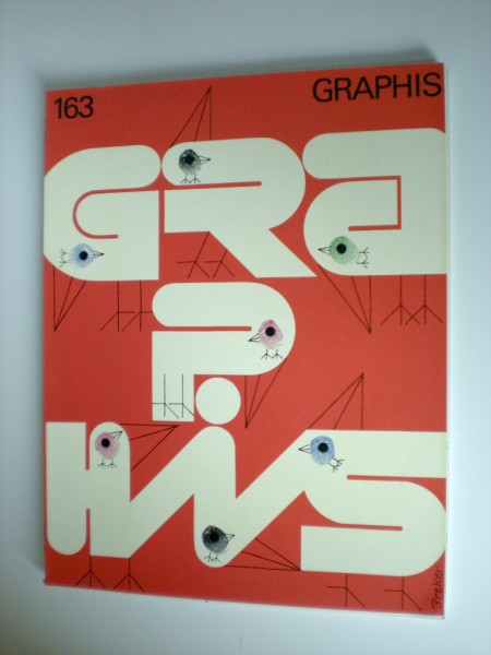
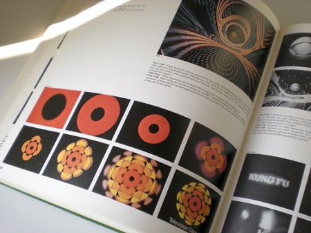
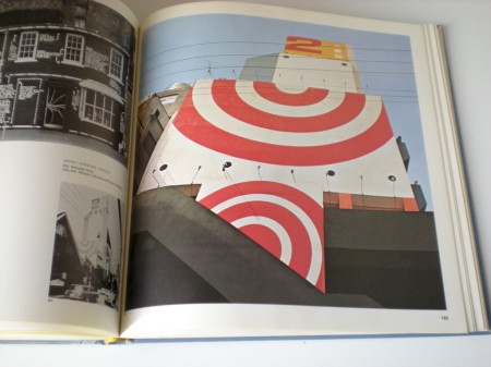
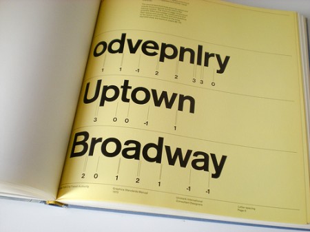
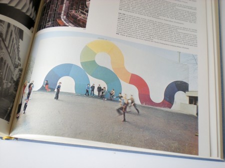
Sébastien Hayez was kind enough to send me this Graphis Flickr set where you’ll find a lot of nice shots of various Graphis books. Link