Things Come Apart
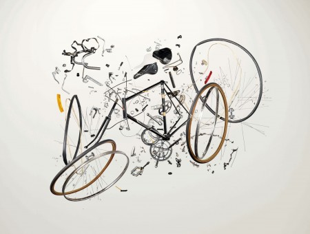
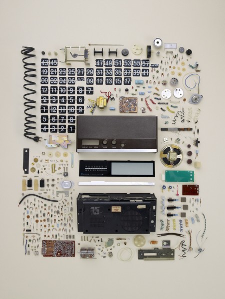
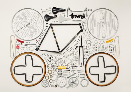
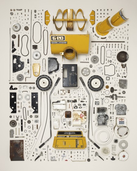

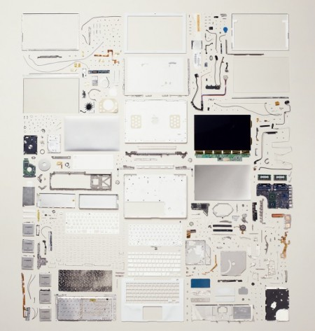
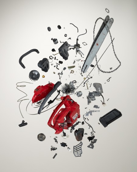

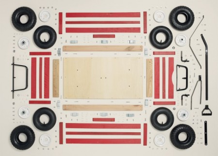
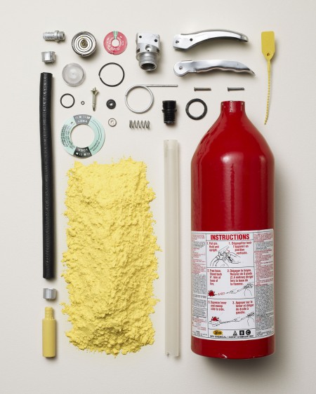
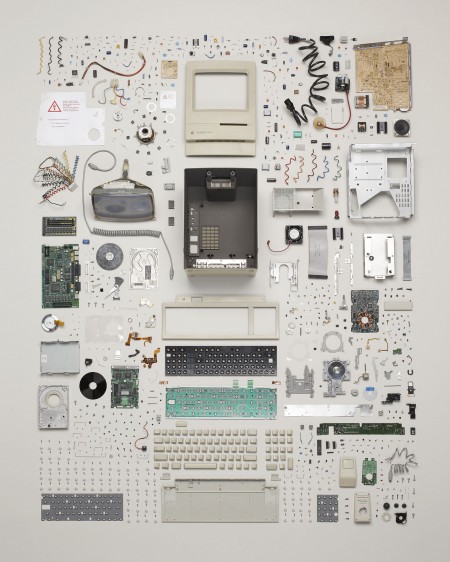
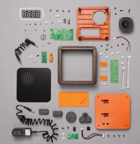
Object autopsies from Todd McLellan’s book Things Come Apart. No idea how he got those exploded views but they’re incredible.
Via Wired


Object autopsies from Todd McLellan’s book Things Come Apart. No idea how he got those exploded views but they’re incredible.
Via Wired
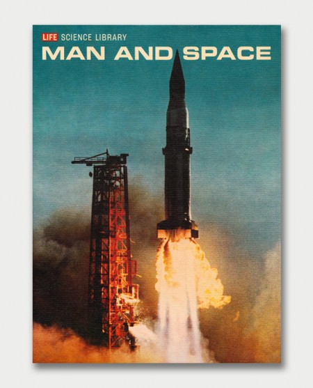

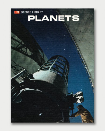
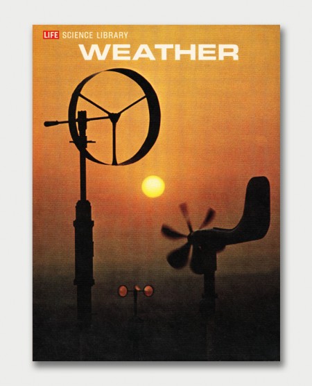
The 1960s had some of the most interesting design. The typography and photography really pushed design in a beautiful direction. These 1960s Life Science book covers and graphics bring on such a wave of nostalgia. The typeface used in these was perfect.
Shared via Wanken / AquaVelvet.
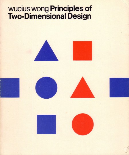
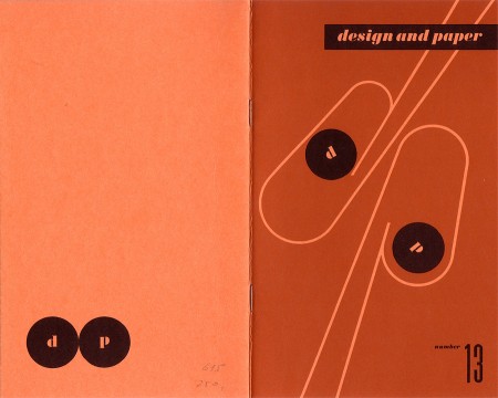
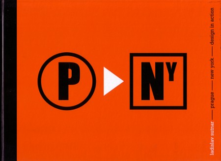
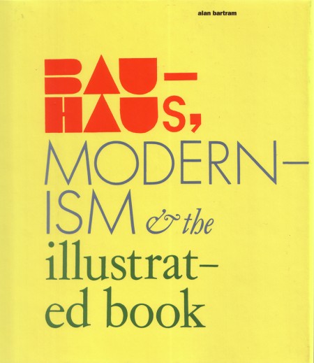
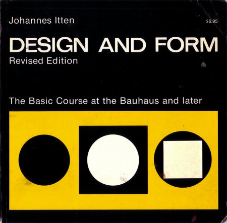
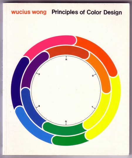
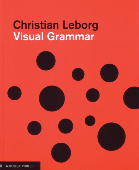
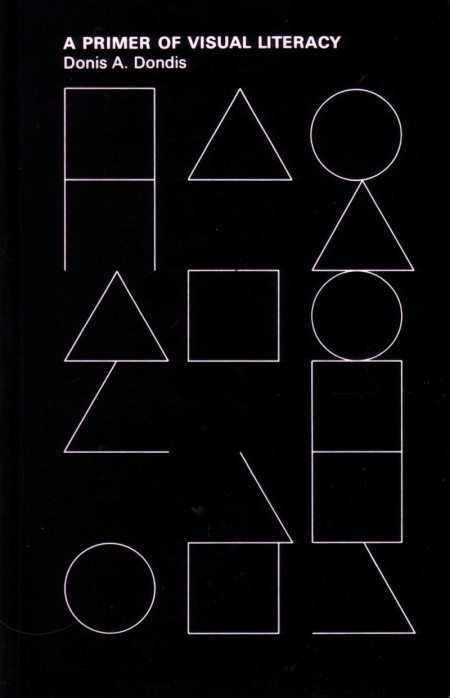
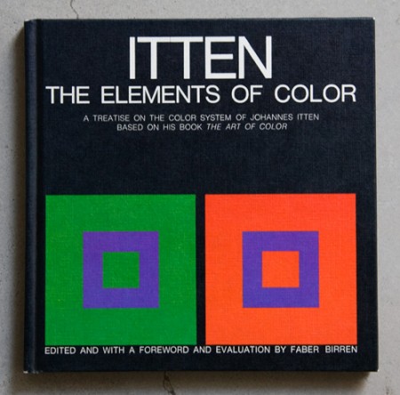
Some great covers archived by Oliver Thomas on his Flickr. Some are pretty high res scans so get your printers warmed up…
Source:
Book & Periodical Covers Set by Oliver.Thomas
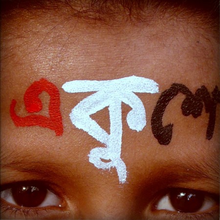
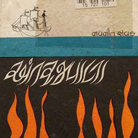
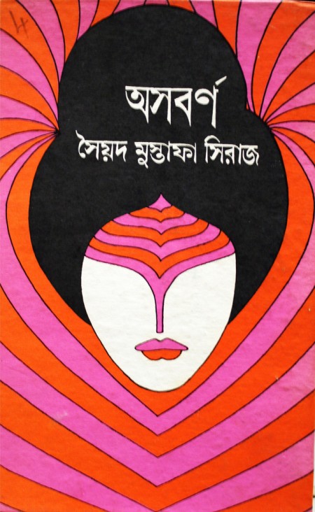
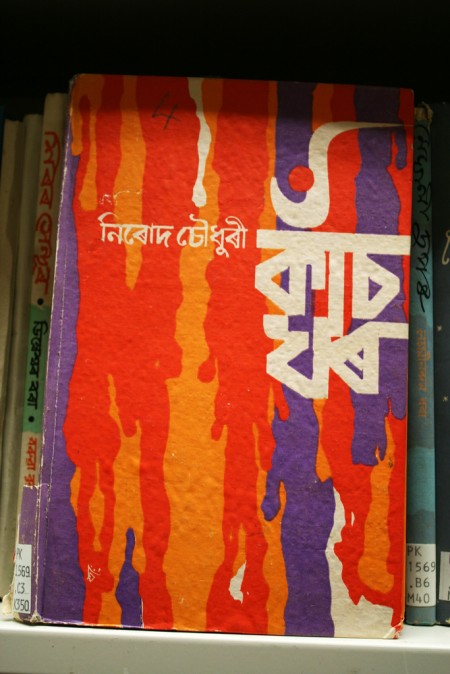
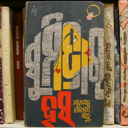
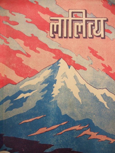
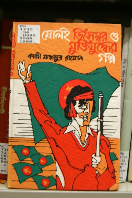
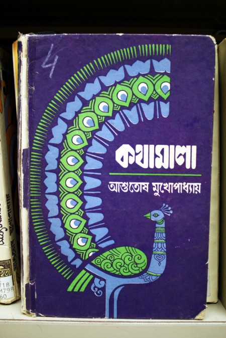
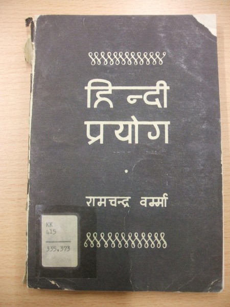
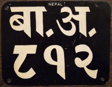
Flickr Pools can be a great resource for delving deeper into a visual theme or style and the Indic & Indian Scripts Pool is no exception. At least here in the US, the Latin Alphabet is pretty the only game in town when it comes to design so it’s easy to forget that their are whole other character sets out there. And while I’ve never encountered a project that called for any of these, it’s definitely inspiring to see such fluid characters and layouts.
From the Pool description:
“Indic scripts are Brahmi-derived scripts, This includes scripts used outside India, like Tibetan, Sinhala, Thai, Khmer, Burmese. Is this group for Indic scripts, or is it just for scripts used in India? If it’s the latter, then Arabic would count but Sinhala wouldn’t.”

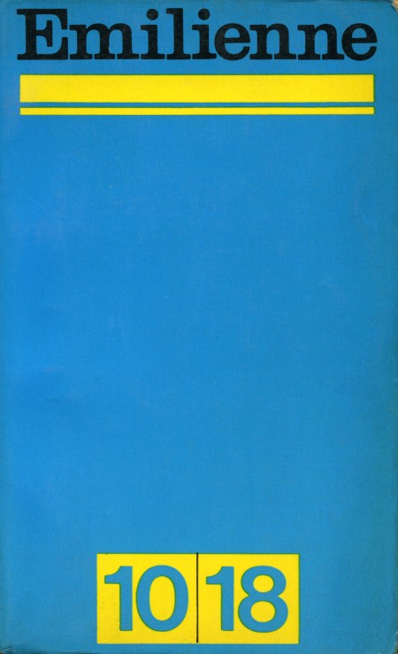
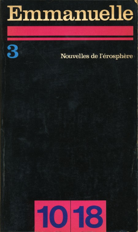
Here are a couple of great high res scans from Sarcoptiform’s excellent Flickr stream. Emilienne and Emmanuelle are apparently French books from 1968. I can’t find any more information on them.
The title face looks like Clarendon to me; one of the better uses I’ve seen, particularly on the Emmanuelle cover. And that black background would make a great texture for all sorts of applications. Sharpen > Desaturate, Levels > Select Color Range, or just use in blending mode.
Update: According to Blo in the comments: “Emmanuelle and Emilienne were erotic best sellers, and Emmanuelle was also a film. 10x18cm is the size of the pocket book. It was and still is a collection of novel paperback.”
Via Sarcoptiform
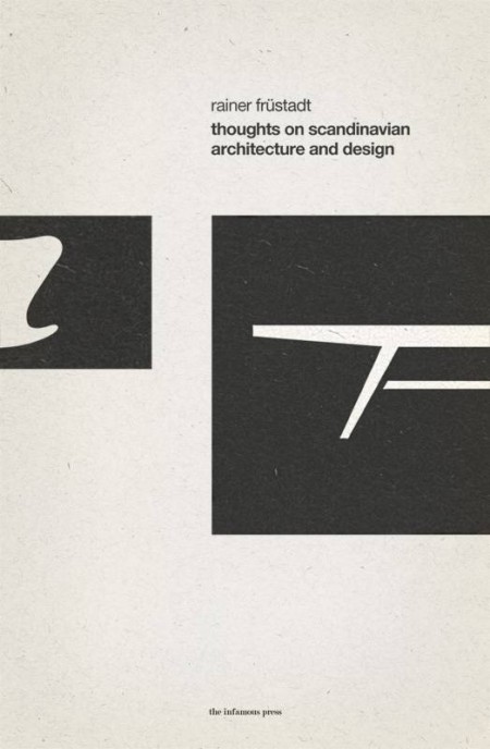
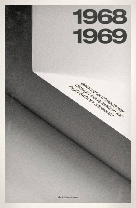
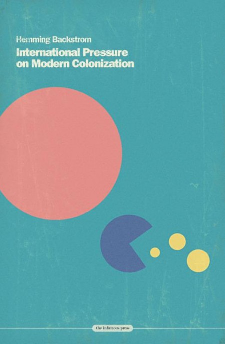
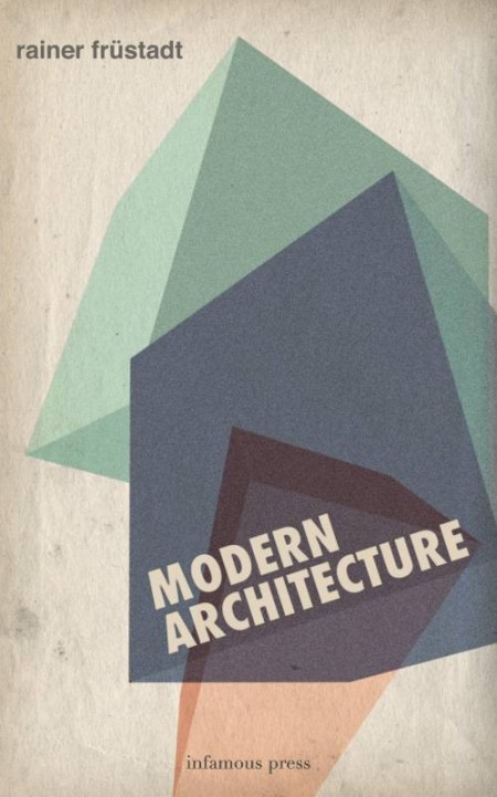
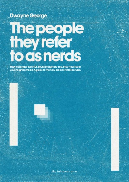
These book covers are part of the Infamous Press book cover concept collection. Designed by Morton Iveland.
via Minimalissimo.
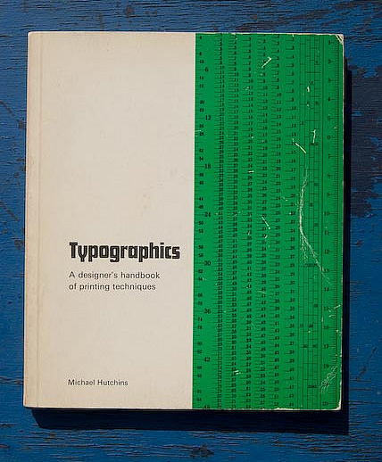
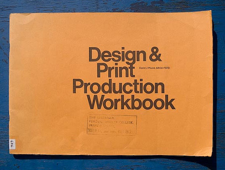
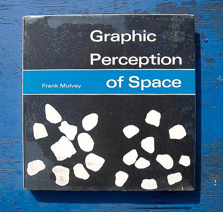
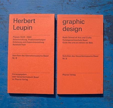
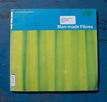
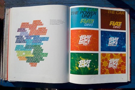
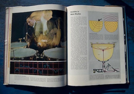
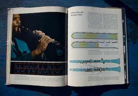
There seems to be a never-ending supply of kindly book collectors who are nice enough to share their finds with us. This latest 70’s-era set is from Gridula’s Flickr. Particularly enjoying the last two infographics from Sound and Hearing. Unfortunately they’re a little on the small side so it’s hard to make out the detail; but loving the color and style nonetheless.
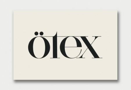
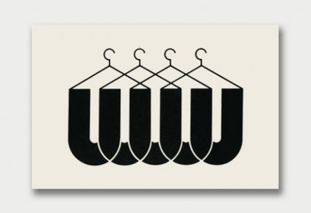
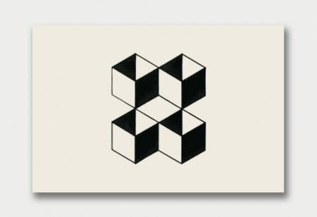
Came across this nice set from World of Logotypes on Raoul’s Blog. You may recognize these from the great book Eric Carl scanned in way back when. I’ve never seen them presented this way though, nice to be able to focus on them in individually.
Via Jetstreamprojector via Grain Edit