Klas Ernflo and My Favorite Letters


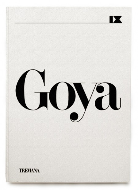
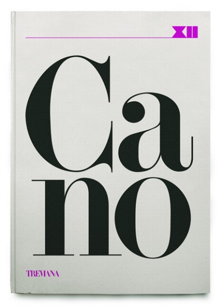
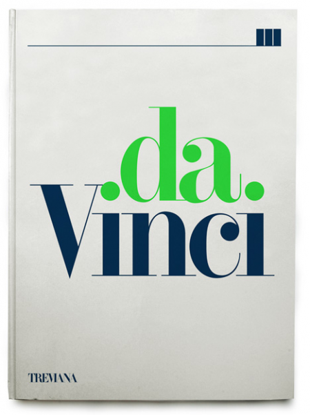
A few rejected book covers by Klas Ernflo. Beautiful typography at work here — I especially can’t get over how amazing the uppercase G is in the top image (looks like Didot, but I’m not positive). Surprising (and not at the same time) that these were rejected by the publisher. I would have bought them on the spot, regardless of their contents!
Recently I’ve been trying to determine my favorite occurrence of each letter of the alphabet. I’ve picked a few, like the “G” seen above, but most letters remain up in the air. The eventual goal will be to have a list of 52 shapes; representing my absolute favorite renderings of each letterform, upper and lowercase. After that I guess I’ll move onto symbols and numbers (I already know my favorite “7” — Clarendon). A few other examples might be the “W” from the Westinghouse logo, the lowercase Avant Garde “a”, and maybe the “H” from Scott’s recent post.
Would love to hear everyone else’s favorites! It’s hard I know, to narrow it down outside of the context of application, but I’m sure there are some standout letters for each of you. Let us know!
