Division Remixes Out Now
“Division,” the first single from Tycho’s Epoch, gets the ethereal synthesizer treatment from California’s Kaitlyn Aurelia Smith and Berlin-via-Detroit’s ambient techno artist Heathered Pearls.
SUPPORT DIGITAL
“Division,” the first single from Tycho’s Epoch, gets the ethereal synthesizer treatment from California’s Kaitlyn Aurelia Smith and Berlin-via-Detroit’s ambient techno artist Heathered Pearls.
SUPPORT DIGITAL
**ALL donations on bandcamp will be donated to:
www.facebook.com/PlannedParenthoodAction/This song was finished on november 8th, 2016 with the intention of using it for my next record. i sampled an inspiration to me, detroit artist, tyree guyton speaking at an event a couple months ago and used it in the intro because it spoke to me.
on the morning of november 10th a light went off in my head and realized the song had to be let go.no matter how i feel or what i’m thinking about the 2016 election.
no matter who i voted for or even if i voted at all…i’m thinking about what i’m made of right now.
i’m thinking about what we all are made of right now, what the world is made of right now.
i’m thinking about who i want to be and how i want to play my small part in this world right now.this song and message comes from a place of love.
credits
I’m in shock, so let’s get to some good music because time couldn’t be moving any slower today.
Glass by Illumsphere came out last week on Ninja Tune. It has wonderful breaks throughout the album that keep it refreshing but this consistent loop really grabbed me and took me back to the hay day’s of early Kompakt albums.
TYCHO EUROPE 2017
10 02 17 – Berlin, Germany
12 02 17 – Vienna, Austria
14 02 17 – Budapest, Hungary
15 02 17 – Prague, Czech Republic
16 02 17 – Warsaw, Poland
18 02 17 – Copenhagen, Denmark
19 02 17 – Stockholm, Sweden – SOLD OUT
20 02 17 – Oslo, Norway
22 02 17 – Cologne, Germany
23 02 17 – Amsterdam, Netherlands
24 02 17 – Paris, France
25 02 17 – Brussels, Belgium
28 02 17 – London, United Kingdom

There are plenty of tracks I keep in my arsenal if I need an escape, i’ll be adding this one from People’s Palms. It brings the light in with a bit of haze, sort of slows down whatever you’re doing and invites you into its own groove.
The third album and Hush Hush debut from Oakland-based musician Austin Freese aka People’s Palms.
Digital + Cassette tape release date: October 14th 2016People’s Palms / Soundcloud – @peoplespalms
People’s Palms / Facebook – bit.ly/2aJLpauOakland-based musician Austin Freese aka People’s Palms makes his Hush Hush debut with the cinematic 10-track album ‘Habitatual,’ his third album under the moniker and his first official label release. A thoroughly hypnotic affair heavily influenced by the natural world, the album organically swims through a fantastic mosaic of mallet instruments, long form guitar swells, found sound, and his trusty Yamaha CS-50. Piecing together unique field recordings captured over the last three years during mundane everyday life as well as exotic international travels, and then patiently adding his own instrumental flourishes, ‘Habitatual’ carries a transportive sound that quietly shifts through downtempo, ambient, and New Age styles while simultaneously floating free of rigid genre confines. Shades of Steve Reich, Boards of Canada, and early Tortoise peak through his richly-detailed tapestries, creating a meditative imaginary soundtrack ideal to compliment unexpected excursions. A subtle yet consistent global influence further enhances People’s Palms’ exploratory productions, fueled by a fascination with the globalization of music and traditional international rhythms sparked through his own travels as well as the interconnectivity of our online generation. Fitting right at home on the introspective-inclined Seattle-based label Hush Hush Records, the blissful sonic world People’s Palms has created with ‘Habitatual’ yields a dreamy, immersive, and mesmerizing listening experience.
SUPPORT CASSETTE
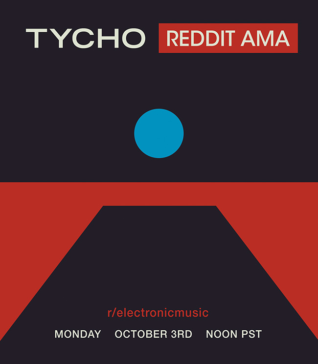
I’ll be doing a Reddit AMA tomorrow (Monday, October 3rd) at noon PST at r/electronicmusic. Stop by if you want to ask any questions
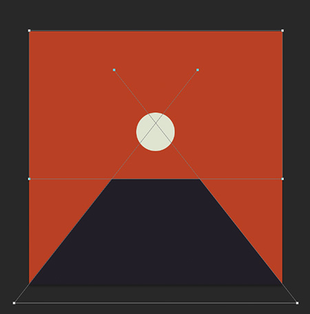
The Epoch is a hinge. We tend to follow a linear trajectory until a point at which we realize that through free will the path can be bent and redirected.
I’ve been very busy for the past year or so working on a new album so it’s been a while since I’ve posted. Now that the new Tycho album — Epoch — is out I wanted to write a little about the meaning and origin of the artwork. I worked as a graphic designer for 14 years until I decided to pursue music full time so the visual element of Tycho has always been at the core of the project for me. I think the imagery tells a story that the music can’t fully articulate, and vice versa.

Past is Prologue (2006), Daydream (2007), Dive (2011), Awake (2014)
· The Trilogy Begins
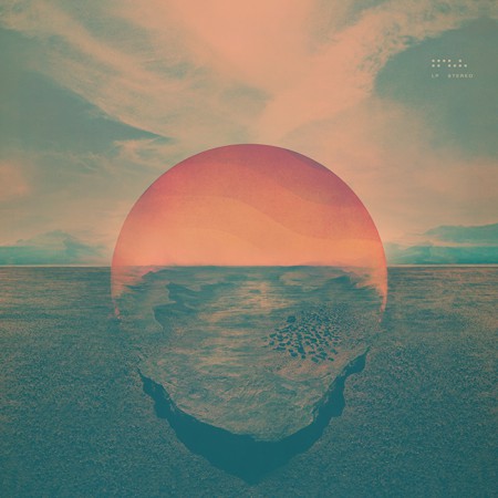
Dive (2011)
The cover for Dive was a foray into maximalism combining photography and design. I wanted to evoke the sense of being on an unavoidable path, one from which deviation was impossible. I wanted the viewer to be pulled into the image and be drawn toward the sun. I think this design speaks to the music in that it felt like the beginning of a journey and the multi-layered composition echoed the sonic aesthetic of the music. I spent quite a bit of the next couple years refining this style and creating various collage type images.
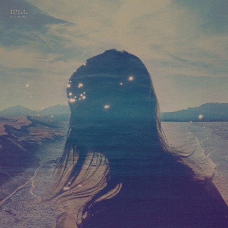
Dive Single (2012) – Another cover in the style of the Dive full length cover
· Enter Minimalism and The Trapezoid
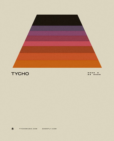
Concert Poster (2012)
· The Awake Era
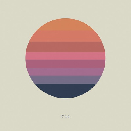
Awake (2014)
Both the circle and the trapezoid symbols featured heavily in the videos and visuals for Tycho during the Awake tours (2014-2015)
During the Awake album cycle I continued down this path and lots of imagery followed for show posters and releases.
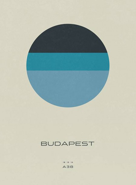
Concert Poster (2014)
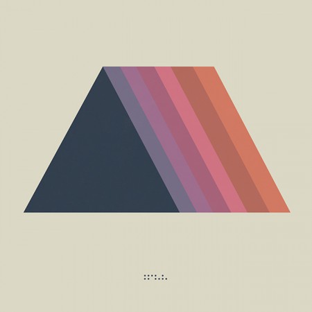
Montana Single (2014) – the trapezoid combined with the triangle
· The Darkness
The overall direction for Awake was very light and halfway through the cycle I started shifting things into a darker space for contrast and to foreshadow the next album.
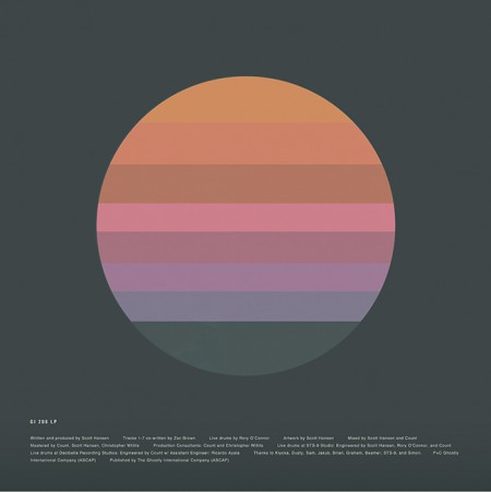
Awake Deluxe Edition (2014)
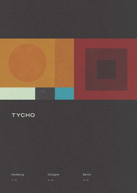
Concert Poster (2014)
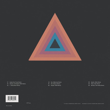
Awake Remixes (2015)
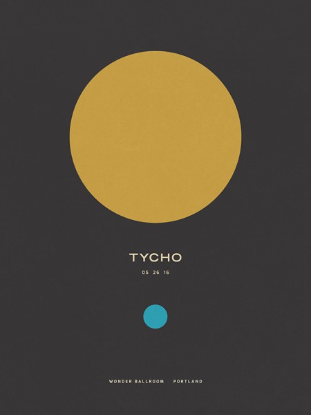
Concert Poster (2016)
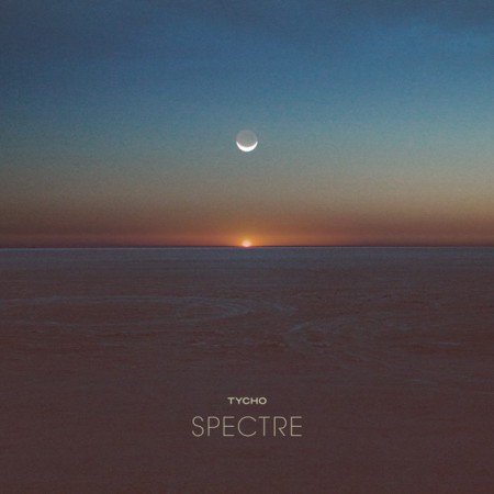
Spectre Single (2014)
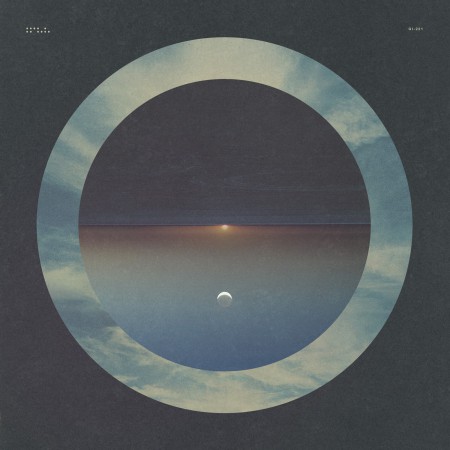
Spectre – Bibio Remix (2014)
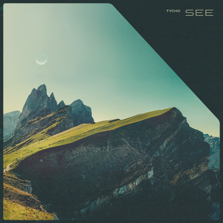
Tycho – See (2014)
· The Epoch
Awake had been out for over two years and it was time to start thinking about the next release. Up until this point, when doing minimal compositions I had been using textures and distressing to give some depth to the images and break up solid fields of color. For the next phase I wanted to further simplify and remove any extraneous elements. I wanted to cut to the core of the message and try to distill things into a language of basic symbols.
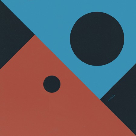
Artwork for the first single from Epoch: Division (2016). This was designed after the album artwork and was meant as a transition which would introduce the elements and colors that would follow in the full length release.
Musically, this album was about circling back while maintaining forward motion; revisiting and refining the concepts of earlier albums with a view to the future. My primary goal was to incorporate the color scheme of the very first Tycho release: The Science of Patterns EP (2002). I also wanted to revisit the simplicity of that artwork as Epoch was all about focus and efficiency, chiseling away anything which was not absolutely necessary.
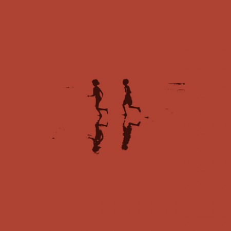
The Science of Patterns EP (2002)
The following are selected iterations of the Epoch cover design which led to the final version.
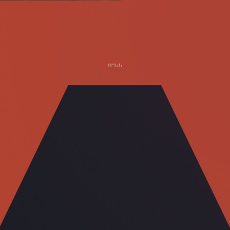
The initial concept (2015)

An early concept incorporating a more three dimensional look. I ended up leaving this in favor of a more simplified form

The first simplification, the horizon line is still subtly implied

A tangental concept exploring the incorporation of more color. This ended up being the impetus for creating the alternate cover series for the countdown (discussed later)
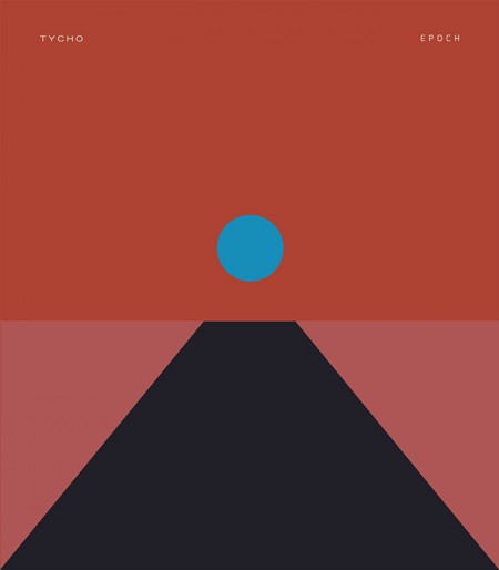
Another alternate with more color and a defined horizon line

The final form: Tycho – Epoch (2016)
I felt that the power of this image would be in its simplicity and also in its portability. It could adapt to many form factors with ease and felt more like a modular system than a singular image. At this point you have to take into account that the vast majority of people will experience album artwork at a tiny square on a smartphone. At this scale a lot of nuance and detail will be lost. This is not to say that I intended to oversimplify purely for this reason, but it is a consideration.
· Release

Epoch Vinyl Packaging
Epoch was released 30 days after completion as a surprise, as such there wasn’t enough time to have vinyl and CDs produced; only digital versions were available on release day. As a stopgap until the vinyl arrived, we decided to offer a custom slipmat with pre-order purchase at retail outlets. More about the release strategy in The New York Times piece With Vinyl, the Musician Tycho Establishes a Physical Presence
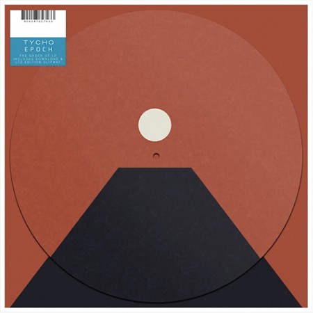
Epoch Slipmat
For the Awake release I cut up a print of the cover art into squares and released it as nine panels as a way to count down to the release. For Epoch I wanted to create several alternate versions of the cover art to use for build up. This release was not announced ahead of time so it was fun to slowly release elements of the design without people fully understanding what was coming. Here are a few examples of the alternate versions.
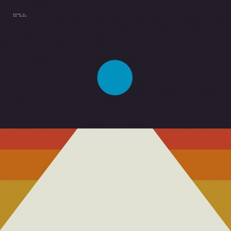
Tycho Descent Burning Man Sunrise Set Cover
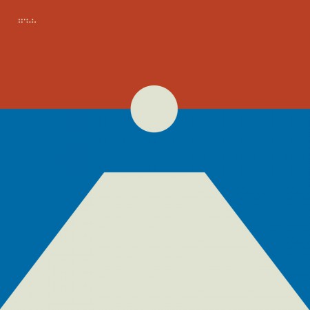
06-division
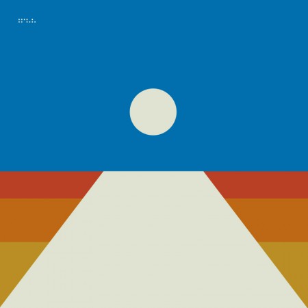
08-local
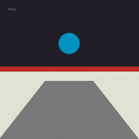
02-horizon
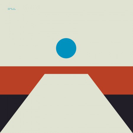
04-receiver
All in all this was an enjoyable and fulfilling process for me as a designer. I’m looking forward to the next couple years, creating future permutations and working with this design/color system. The first example of this is below, the poster for the show at The Fonda in LA.
Thanks for reading, if you have any questions leave a comment and I’ll do my best to reply.
New Tycho album Epoch out now.
Download it here
I’m very pleased to announce the release of the fourth full length Tycho album, Epoch. 10 years ago next month the first Tycho record, Past is Prologue, was released and it’s been an incredible journey. There’s nothing I could possibly say to fully express my deep gratitude to all of you for making this past decade possible. I truly hope you enjoy this music and make it your own.
We finished the album less than a month ago and decided to forego the typical release schedule and just put the record out as soon as possible. We’re all very excited for you to be able to hear it so soon after it was completed.
Thank you and enjoy!