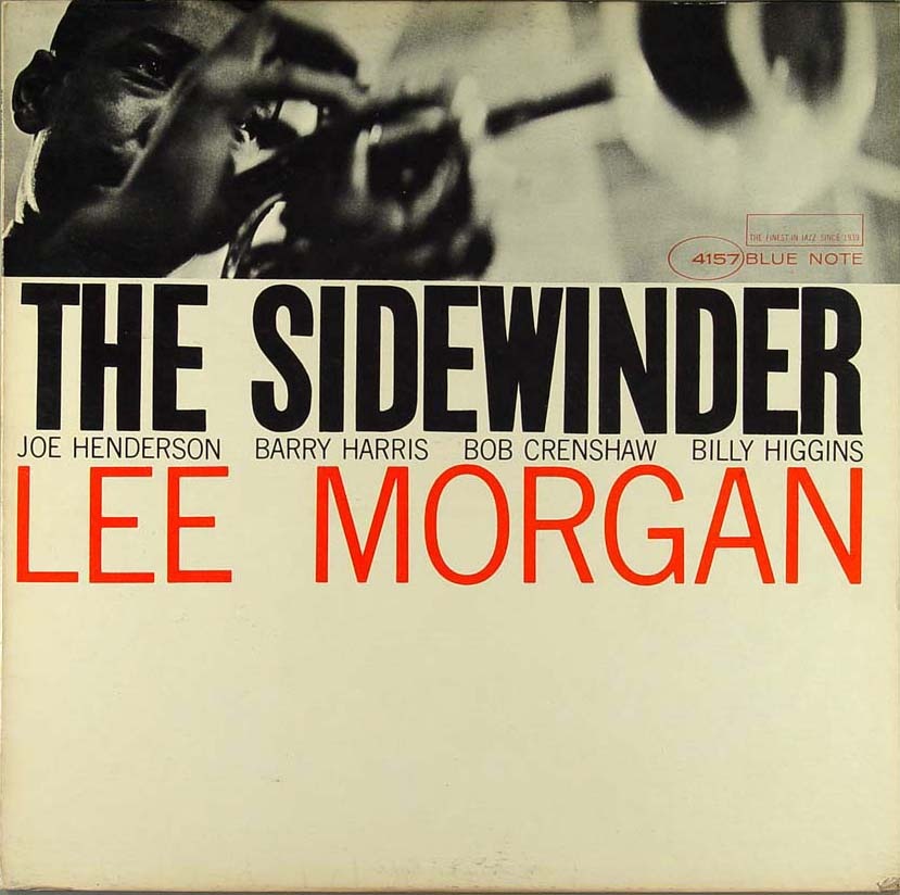
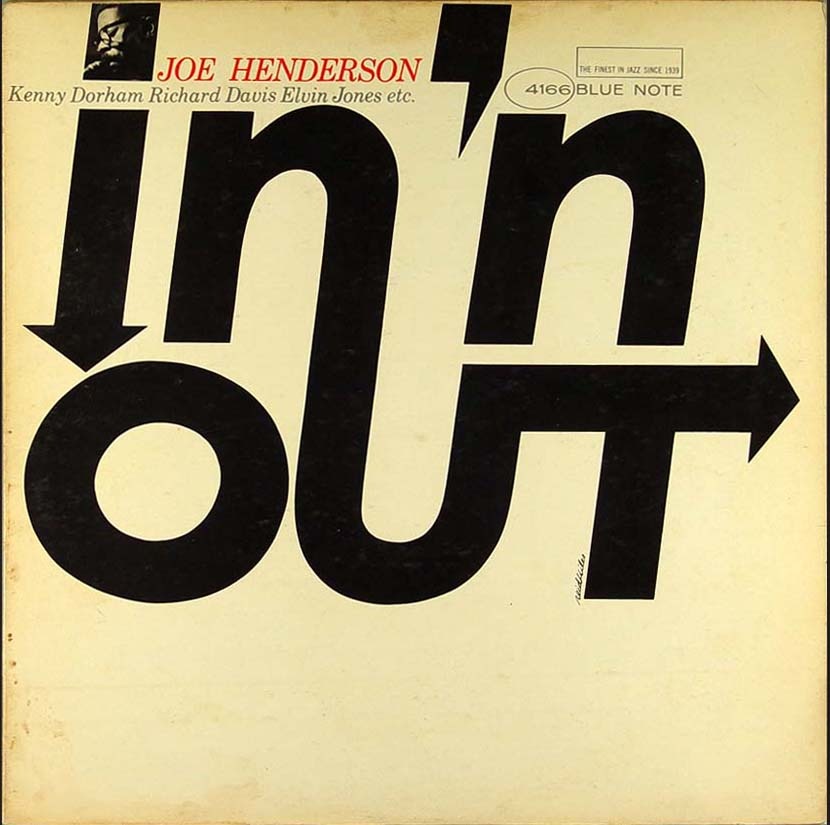
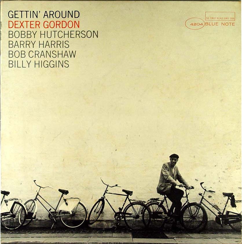
Here are some more covers from that great Blue Note Cover Archive that Amy Stoddard sent in a while back. Scanning through the archive you’ll find some periods of absolute greatness; these four were culled from the mid-60’s period when modernism was in full swing and someone over at the Blue Note design dept. seriously knew what they were doing. I selected these particular covers to illustrate the sort of continuity that seemed to pervade this period of releases. I really appreciate that from record labels, it’s not always the best policy, but there are times when I would sacrifice variety for a continuous visual message that flows through a series of records.
The other thing that really stands out to me about these is something that the original designer(s) probably didn’t intend: the lack of true white. Something about the off-white / cream in the place of white always makes an image feel more human to me, more tangible. That’s why white hasn’t been included in any of my design work since some of my earliest stuff from around 2001. I am not saying it doesn’t have it’s place in design or that it can’t be used effectively, I just don’t prefer it.
The minimalist color ethic in these pieces is employed successfully to such a degree that only a maximalist could truly appreciate. These images are literally exploding off the page, it almost hurts to look at them, yet they’re only two colors and relatively empty, full of negative space. True, a couple of them have leveraged photography to provide some depth, but try to imagine them without the photos; they would still stand on their own and that’s a testament to not only the designer but the power of typography itself. Note that aside from the oval and rectangle of the Blue Note logo the only shapes and lines are formed solely by type. To me that’s the ultimate expression of design, the information is the image, or, as a sort of anagram of Marshall McLuhan’s famous quote; the message is the medium.
What also strikes me about these is how timeless they are. This is not nostalgia, this is graphic design at its apex. If you compare these to the visually entertaining, yet decidedly dated, selections in my last Blue Note post, you might see how comparatively well these designs have stood up compared to say, this. The later Blue Note covers scream "late 60’s-70’s", the Carson stuff screams "1990’s", while these simply scream "DESIGN". Just as many have proclaimed Helvetica to be the purest expression of modernism through typography (which is an interesting concept in and of itself), I sometimes think that design as a whole reached some sort of zenith somewhere around the middle of the 20th century. That’s not to say there isn’t more to be done, new paths to be forged; but I feel like perhaps the perfect balance was struck during that era and all we can do now is explore all of the not-so-perfect alternatives. I know many will disagree with me, they’ll invoke Sagmeister and his ilk, but I’ve never been a fan of post-modernism, I think it is flawed. It is sometimes beautiful, thought provoking, and can be used to great effect, but at the end of the day it doesn’t go as far to accomplish the goals of communication and graphic design. True, graphic design is an ever-evolving form that mirrors the society it is employed to convey it’s message to, but the basic set of requirements that govern the neccessary function of that conveyance do not change…..That is, until we all mutate and read with thought waves and our eyes remain only as vestigial lumps mounted on the front of some sort of hyper-evolved super-brain. But that’s besides the point.
So that’s the long and the very long of it, my opinion only. As I’ve betrayed many times before, I am a lowly uneducated philistine so please set me straight, I would love to hear your opinions and the masochist in me eagerly anticipates the verbal thrashing I am sure to receive from the collective rebuttal superpower that is: The Innernette.
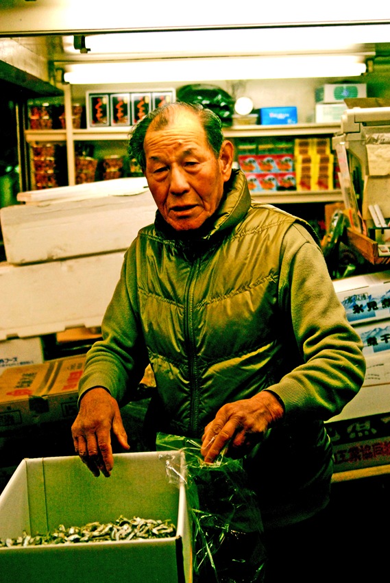
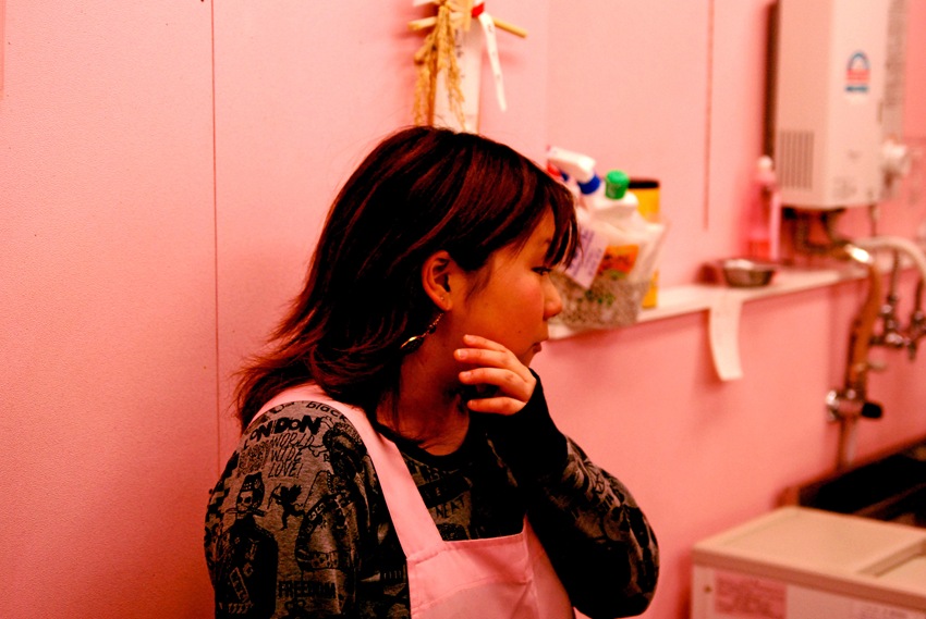
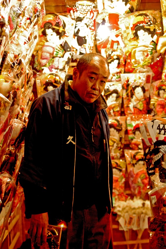
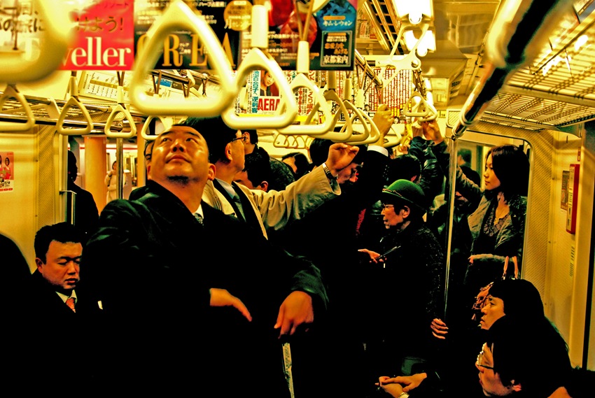
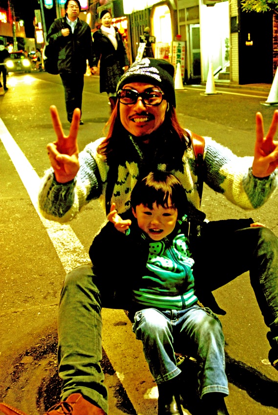
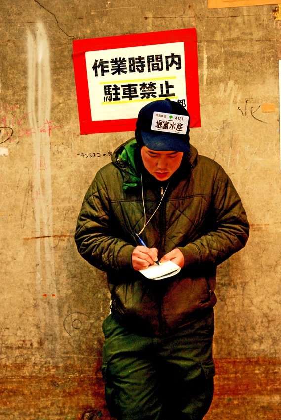
After all the shots of objects from Japan I thought I would do a post on the people themselves. Although the aesthetic elements of Japan were overwhelmingly pleasing, the people and the culture are what had the most profound impact on my stay there. Let me preface this by saying that any of these observations are obviously subjective as they are based on my limited exposure to one city during a 6 day period. I tried to see as many parts of Tokyo as I could and we usually traveled with local friends to insure we didn’t just see the tourist perspective.
I was amazed by how polite and hard working the people there seemed to be. The city itself borders on some sort of quasi-utopian vision of how good things could be in some alternate universe. It had it’s dark side as any city does, but by in large it’s just an incredibly clean and efficient place. Everyone we came into contact with was friendly and would go out of their way to help with anything you need. The service industry was something otherworldly, I have never experienced such courteous and attentive service anywhere else. The craziest part was they WILL NOT accept tips. We spent the first 2 days trying to tip cab drivers and waiters to no avail. Each time we left a tip on the table after a meal we were literally chased down outside the restaurant and informed that we had left money. No amount of explaining would convince them to keep the money. There is a significant language barrier but the courteous nature of the people we encountered usually overcame that obstacle through sheer diligence. There were workers everywhere doing all manner of tasks at any given time. Three people would be employed just to wave cars out of a parking garage and there were police and security guards posted everywhere in the city. They must be approaching 100% employment from the looks of things. I counted about 5 homeless people the entire time I was there.
Again these observations are all extremely subjective, my stay was limited to a short time frame and a small geographic area. But the same could be said for any of my stays in various American cities and none of them managed to appear so close to perfection as Tokyo. I can wholeheartedly recommend visiting Tokyo, you’ll find a great dose of culture and excitement. Make sure to save up though, that place is expensive. $12 beers anyone? I guess you get what you pay for though.
I am still rounding up and processing all the shots from the Tsuiki Fish Market, I’ll be posting those soon along with a lot of good ones from Bangkok, a visually stunning experience to be certain.
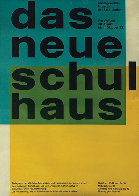
I’m pretty sure it doesn’t get any better than this. By Swiss Designer Carlo Vivarelli who also did the "Flums" Poster.
"997. 1953 poster, advertisement for The New School House, C.L. Vivarelli, Zurich Art Business Museum, marked Vivarelli, printed by Bollmann, dated 1953, linen backed, 36"x 50", 500-700" Via the Treadway/Toomey Gallery
Seeing great design like this, by designers who are no longer with us, always makes me wonder what our generation’s legacy will be. in 60 years I wonder what artifacts young designers will look back on in awe. The pessimist in me wonders if we are doing anything quite as groundbreaking and forward thinking as this in the print medium. Print seems to have been relegated to a sort of suspended animation while mediums like video and interactive jump leaps and bounds every year. I don’t know if this is a function of the age of the print medium, i.e. everything new and innovative has been done, of if there just aren’t enough people pursuing print design as an art form anymore. Or perhaps I’m just stuck in the past and for some reason only design like this affects me in any meaningful way. Either way, there is no denying the greatness of this image.
Can any of you design scholars out there name the style or period that informed this design? I want to say Bauhaus, but I am sure someone can explain why that is wrong.
UPDATE: Via Eric in the comments: "This design is definitely a product of the international typographic style developed in Basel switzerland, during the 1950s…This style is is clearly influenced by the bauhaus, but they took it to the next level. beautiful example."
Carsten also wrote a great comment explaining the "Reformed-School" in Germany and how it relates to this poster.
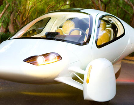
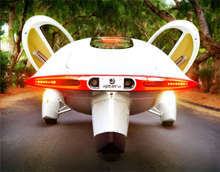
The aptera car is one big step closer to production. You can actually reserve one of these 300mpg dream machines now for $500 ($26,900-$29,900 full price). I love this color scheme, the mustard on white feels classy and the lines are reminiscent of light aircraft. This is where good design truly becomes important, if you can build enough wow factor into alternative/hybrid energy cars you might just win over some of the SUV crowd. Engadget has more info here or you can visit the Aptera Website. This thing makes me want to trade in the Prius, although the lack of trunk space would be an issue.
Update via Bill Gross himself in the comments: “Actually, I have a Prius, and I like it a lot. It seats 4, and the Aptera only seats 2.5, but believe it or not, the trunk space in the Aptera is quite generous. The car is pretty long, and there is a lot of space for stuff back there. But I would leave that for you to judge.”
Now that I look at it closer, there’s actually a fair bit of room back there.