Product
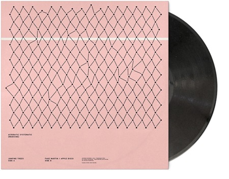
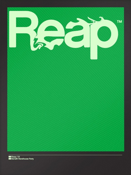
Some great work over at Product. Really liking that sleeve.


Some great work over at Product. Really liking that sleeve.

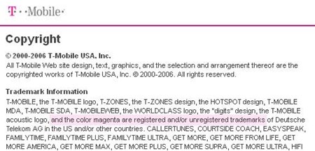 So I just learned today that my ex-wireless provider, the German T-Mobile, is attempting to own magenta. Yes, they want to own a color. Here’s a discussion on Engadget that does a bit to downplay the whole thing and a site dedicated to reclaiming magenta. Let’s just hope they don’t change their logo to a rainbow, we’ll have to start designing in grayscale again.
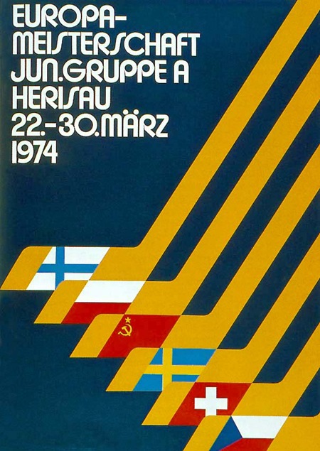
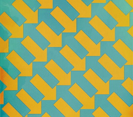
Some fresh Bauhaus-Esque type via Walter Hall’s Flickr. Note: Slightly altered colors. Sorry, couldn’t help myself. Original is here.

Leaving tomorrow morning for Austin, TX where I’ll be playing a set at The Mohawk. I’ll be doing the live ISO50 visuals set as well, hope to see you out there…
Thursday March 20th at The Mohawk
912 Red River St.
Austin. TX
ALL AGES
onhiatus / makestapes – 1:30-2:00
Tycho – 12:30 – 1:30
Mirm 11:45-12:15
Rae Davis – 11:00-11:30
Nectarine – 10:30-11:00
mnolo – 10:00-10:30

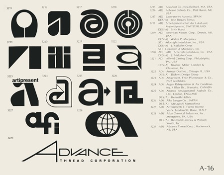
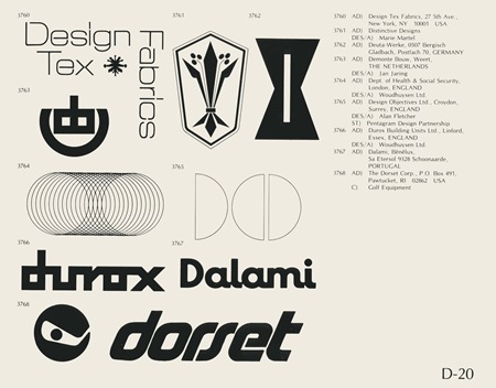
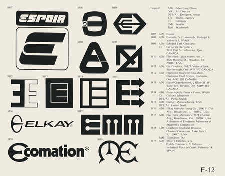
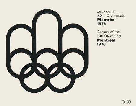
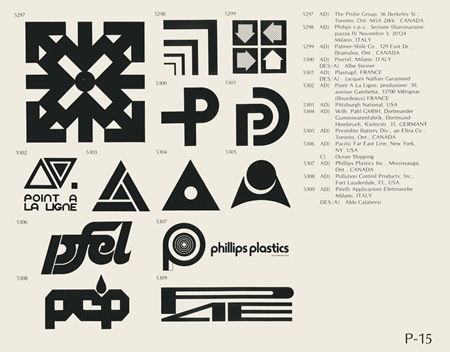
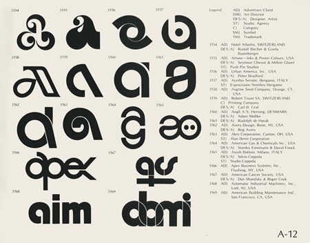
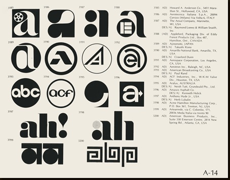
You may remember the World of Logotypes book from this post. Well Eric Carl has graciously posted all of the pages from the book to his flickr. You can also download all the images in a handy Zip file directly from his blog. Thanks Eric, this is an invaluable resource. It would be great to see more people post out of print books; it’s really sad how inaccessible some of these old books have become.
Correction: As Eric pointed out in the comments, this is only about half of the book.
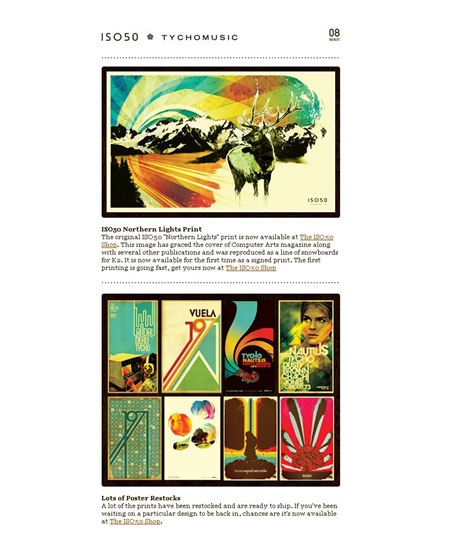
The March edition of the ISO50 Newsletter is out now. Check it out here or subscribe to ISO50 to receive it automatically.
I spent my first couple days designing on a Mac and I must say, I am now an official convert. I got all the keys and mouse behaviors tweaked to emulate the PC way of doing things (I can’t live without my right-click) and it’s finally all become clear. I feel like such a flake, I really had it set in my head that it was all about PCs and didn’t really want to listen to people who told me otherwise. All the Macs I had used in the past were other people’s and hence were set up to their liking. Also, they always just seemed really slow. This thing is really quick; not quite as quick as the PC but I am willing to sacrifice a bit of performance for the user experience and stability I have found in OS X. I know, I know – this is a huge flip-flop from my previous stance but I am completely willing to admit I’ve totally fallen in love with this operating system and I was totally wrong in all of my assumptions about it. I don’t think I will ever be without a PC (at least not for the near future), I still make music on the PC just because all of my projects and sketches are in Sonar or Vegas format which are both PC-only. But I want to start playing around with Logic and see how I like that as an alternative and perhaps make the switch all together over the next year.
I feel like this all came to a head with my disappointment in Windows Vista. I had patiently awaited it’s release thinking it would be the new PC OS that would keep me going for the next 5 years, but in reality it turned out to be a dud on a lot of fronts. Meanwhile it seems that OS X has really matured into something incredible and the switch to Intel only made it that much more enticing. I made it through an entire night of designing without one hiccup or reboot in Photoshop which is very rare. All this time I had been attributing those issues to problems inherent to Photoshop, but apparently they were Windows issues as they have all disappeared. Another big part of this is color management. I have been using the Colorvision Spyder 2 system for a couple years now and it’s just such a headache to keep all the profiles in working order in XP. On the Mac it’s been smooth sailing.
I am not about to talk bad on Windows as I sort of feel like I am abandoning an old friend. It has it’s perks; but as a lot of you have said before, for design Mac just seems to be the way to go. So go ahead, bring on the I-told-you-so’s, I deserve every last one of them. Here’s to a brave new world, sans sleep learning.
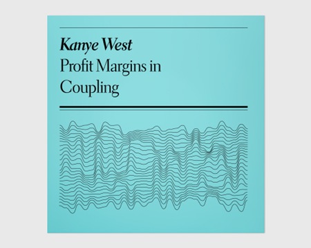

This is f’ing brilliant. Faux-Academic record sleeves by Nikolay Saveliev for Pop Matters. I’ve spent most of my career searching for beauty in design since I’ve neither the mind nor the inclination for conceptual design such as this and seeing an example so well executed always makes me lament that fact. Sort of a minimalist take on the classic Penguin covers. Can’t get over that last one, "The Lactic Euphemism". Wonder if Nikolay wrote the copy as well? And can’t help but be reminded of Joy Division with that Kanye cover.