Vette Annonce Type Specimen
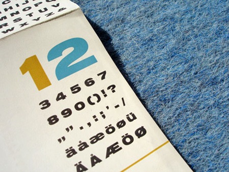
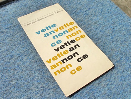
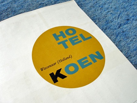
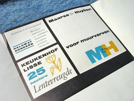
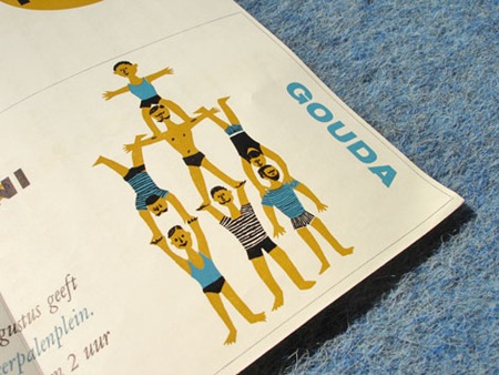
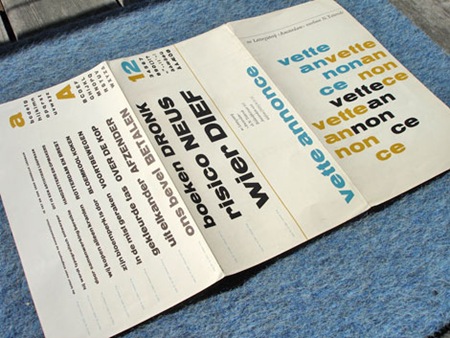
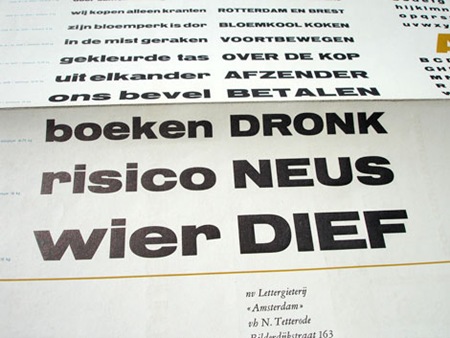
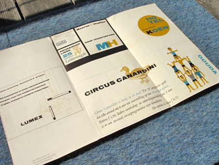
Via Grain Edit: "Dutch Type specimen sheet from Lettergieterij in the Netherlands. Most likely from the late 1950s / early 1960s."
Another example of great Dutch design, loving these colors


Via Grain Edit: "Dutch Type specimen sheet from Lettergieterij in the Netherlands. Most likely from the late 1950s / early 1960s."
Another example of great Dutch design, loving these colors
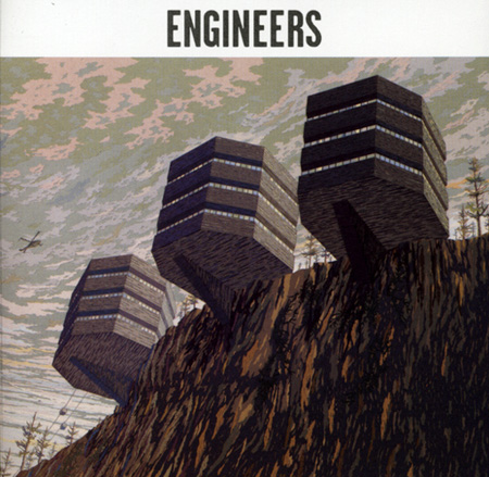
I love it when an album cover makes me jealous, usually this means that there was art direction on top of a great vision for the music. This self titled Engineers release came out in 2005 and got alil bit of love but was overshadowed by bigger names like Interpol, Phoenix, and The Editors. I think they sounded more like Telefon Tel Aviv or Air at times, definitely a great record to look for, i had to pick up a physical copy so i could have the art too.
Engineers – Let’s Just See
[audio:engineers.mp3]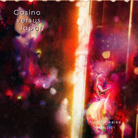
You may know Casino versus Japan from his track It’s Very Sunny from an older Hummer Commercial or just because his music could be compared to Scott’s earlier Tycho releases. I love him for his lo-fi crunchy bass, shoegaze approach to all the atmosphere in the background, and his lush looped melodies like in this song "Marilyn Set Me Free".
Casino Versus Japan – Marilyn Set Me Free
[audio:marilyn.mp3]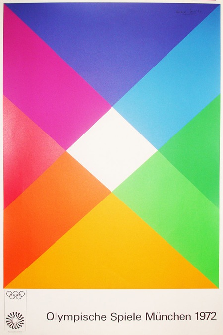
This Otl Aicher-designed Olympic poster is from Blanka. I see them linked on FFFFOUND all the time but I really don’t know what they’re all about. At first I thought they were an agency but now I think they’re just some sort of design shop with all sorts of cool stuff that is never in stock. At any rate, it’s fun to look at the pictures; they have an extensive archive of vintage poster prints.

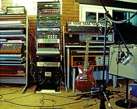
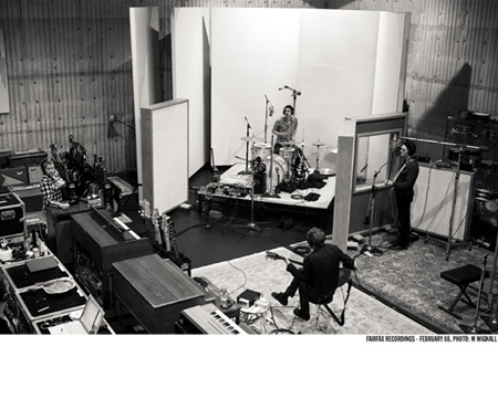
I’ve been locked in the studio for a while preparing to record some new tracks for the upcoming Tycho album. I reconfigured my whole setup and it’s finally all coming together. I’ve finally added a true analog mixing console and it’s really changed the workflow, been saving a lot of time. Above is a partial shot of the studio in it’s current form, still a ways to go with the acoustics, but I’ve been making do.
On a side note, I temporarily moved back to Windows XP32 since they don’t make the software I use to record (Sonar) for Mac. I installed Photoshop and it’s been running so bad, crashing all the time. Meanwhile, on the Mac side, solid as a rock. I really wish I could just work inside of OS X full time, but Logic and Pro Tools just can’t hang with Sonar in my book. Oh well, here’s hoping for a solid Windows 9.
Matt Maust is the Bassist for Cold War Kids and a great designer as well. Their album Robbers & Cowards has really been a sleeper hit for me. I first became aware of them a while back but sort of thought Hospital Beds was cool and left it at that. But lately I’ve been working to the record and really enjoying it as a whole.
Today I checked on their site to see what they were all about and was greeted by the lovely image you see above. Once inside it just gets better. I’m always a sucker for the big-gothic-type-on-photographs motif, and here it’s done very well. Even with the most talented designers, a lot of the time you can see through to the fact that the artwork for a band was project / money driven. In the case of an outfit like Cold War Kids, I think the (literally) DIY design ethic shines through to great effect. But at the end of the day, it’s not how you look as a band, it’s how you sound.
Cold War Kids – Hang Me Out To Dry
[audio:dry.mp3]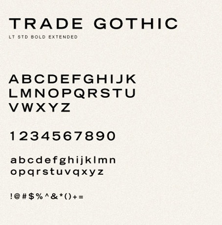
For those of you that view this blog with a Flash-Enabled browser you may have noticed that the post titles are laid out in Trade Gothic LT Std Extended. This is done using a ridiculously complicated method of swapping out the HTML text and rendering it in Flash. The system that does this is called sIFR, it’s a huge jumble of Javascript and Flash that I really couldn’t make heads or tails of for a long time. As a result, the titles were not clickable, meaning you couldn’t actually click them to get through to the permanent home of the given post. Well after my recent plea for web help, Karl Peterson stepped up and answered the challenge. He made short work of the sIFR problem and so now, as you can see (or click), the titles are finally working flawlessly. Thanks Karl!
Karl Peterson is a designer / developer out of Bellingham, WA. You can view his portfolio at sidearmdesign.com.
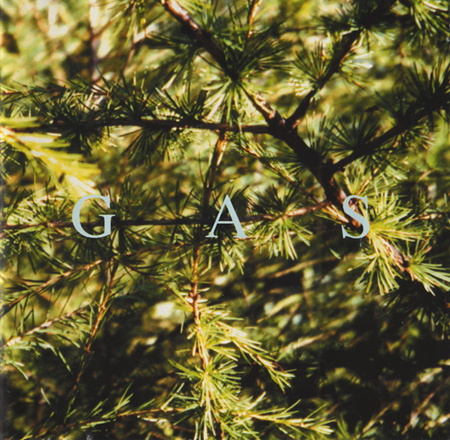
Kompakt Records just re-released Gas – Nah Und Fern earlier this month which is a collection of all 4 CD’s he released in the late 90’s on the legendary ambient Mille Plateaux imprint. All 4 releases became available this month as a beautiful box set collection. This cover art is from one of my favorite later releases called “Pop” which is on both LP and CD version of the release. The way i always visualized Wolfgang Voigt’s music is if you sat in a flat plain with tall dry grass and watched an old locomotive chug along about a half mile away, each track on this album has a similar feel to this, maybe its the soft kick drum in the background or the constant dull bell. If you don’t mind repetition and can sit and enjoy the small additions and changes in these tracks while you let the song play all the way thru as you do something else(work) than you will get alot out of this kind of music.
Gas – Untitled (Pop 4)
[audio:pop4.mp3]