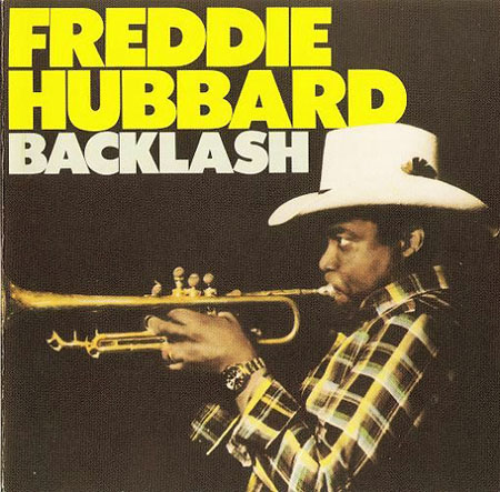
I would never deny a song that has this intro from this Freddie Hubbard song, so if anyone starts a song out like this then I am all yours until the end.
D. Lissvik is one half of Studio which have produced one of my favorite albums of 2008 so this must be good. I’ll post that list closer to January for everyone.
One of the sleeper records this year is the Twine album, if you haven’t seen the cover then you need to it’s right here and that’s also where you can find this song Endormie for free to download.
Grouper is band that i’m still checking out but this song stuck out for me among the rest. I read about them earlier today in an interview with Telefon Tel Aviv, so it must be good hah.
I wasn’t sure if this new shirt and thermal were going to get printed before the new year, but we were able to get them out this week. The new Black on Black 50/50 American Apparel Tee (pictured above) and cotton AA Thermal are now available at The ISO50 Shop. These are going to drop in the ad on Monday so get them while they’re still around (as always, I’m posting them here on the blog a little early).
On a somewhat related note, I’ve always found it difficult to photograph black objects and this shirt was no different. The contrast between the paint and the shirt is a lot more subtle in real life (and the paint isn’t grey, it’s black), some more accurate pictures are here (taken by the guys at Merchline who have been shooting all the recent model shots for the ISO50 storefront). Apparently I need a gray card because I’m using the same lights as them: The Calumet Quattro (more on that later) and a tungsten Smith/Victor photo flood. The picture above was overexposed for effect, but even when I’m trying to be as color accurate as possible I’m still running into trouble. I was definitely happier with how these shots came out and it’s getting frustrating because I was using the same lighting setup, same exposure settings, and same room to shoot them. Does anybody out there know much about this phenomenon or how to correct it? Any advice would really be appreciated in the comments.
In other news, Alex brought by his Wacom Intuos 6×8 today. I really enjoyed working with it, I’ll be posting on that more tomorrow. Thanks again to everyone who took the time to respond to the Wacom: Which Size? post. It really helped a lot.
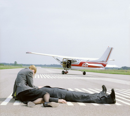
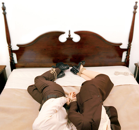
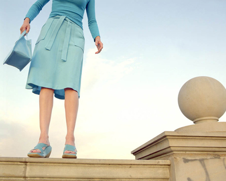
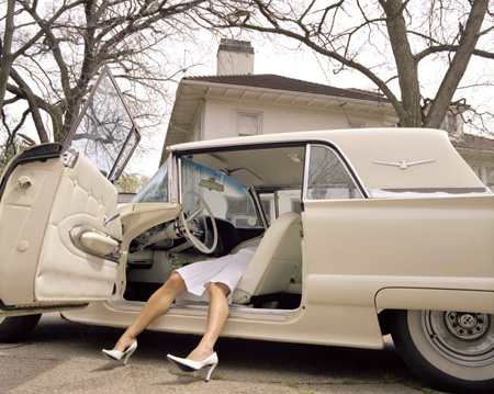
I’ve always been a fan of Nicola Kuperus photography so I had to share a few of my favorites. If you recognize her name it’s probably because of her band Adult.
After all the talklately about logo redesign failures I thought I’d post something about a potential success. I happened across Aaron Draplin’s post on the new Denver Nuggets logo and thought it came out pretty good. At first glance the pick axes seem a bit over the top (we get it, people mined for gold in ye olde times Colorado), but it grew on me. As Draplin pointed out in his post, the mountains are the best part of the whole deal. Below the new logo are the two preceding versions. The most recent was pretty much gross in every possible way. The old school one is of course awesome in that nostalgic way, very cool for throwback jerseys and all that (or if you really, really like Tetris), but it just wouldn’t cut it in today’s game. The typo is heavy-handed and the logo is too busy and detailed to be useful in small formats.
This new version is clean and strong; even if you don’t really like it you’d have to give them points for steering clear of, as Jakub puts it, the “Mountain Dew logo style”. I’d have to imagine fans are going to be pretty happy with the new look, can you imagine wearing that last one on a shirt? It looks like the logo for a pizza place up in the hills somewhere, I half expect it to say “Uncle Mike’s Pizza” or whatever. So what do you think, did they nail it?
P.S. While the logo may be nice, I’m not sure how I feel about the typography for the new jerseys. Something about it reminds me of an off the strip South Lake casino.
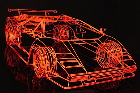
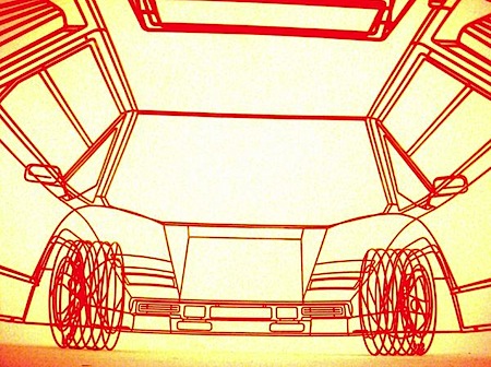
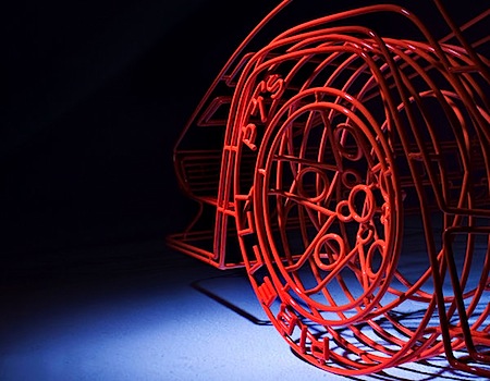
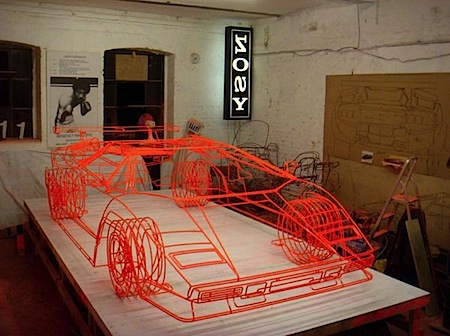
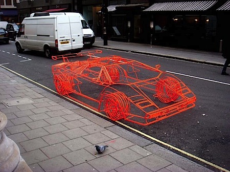
This is for all the 3D artists out there. It’s hard to tell from some of the photos, but what you’re seeing is a real model and not a computer generated wireframe. Benedict Radcliffe crafted this model of Lamborghini’s iconic Countach supercar from steel tubing. It’s incredibly detailed, right down to the Pirelli text on the tires. I can’t imagine the time that went into this, it would probably take me a year just to make this in Maya. There are a bunch more photos over at Jalopnik.
Tom Croose is one half of the Brooklyn DJ duo Worst Friends and has done a mix on ISO50 before, it did so well that he put another one together for us for the holidays.
TRACKLIST
Tom Croose – Mr Mackey Intro
OMD – Time Zones
Badly Drawn Boy – Once Around The Block (Andy Votel remix)
Shalabi Effect – Sister Sleep
The Little Ones – Morning Tide (Studio mix)
Mount Eerie – I Hold Nothing
Flying Lotus – Robo Tussin feat. Lil Wayne
Onra – The Anthem
Beck – Hot Wax (Tom Croose edit)
Pilooski – Love Is Wet
Low Motion Disco – The Low Murderer Is Out At Night
Taj Majal – Queen Bee
Today I was riding the subway and was dorking out a little more than usual trying to explain to my roommate kerning on a subway poster. The poster was so awful, not the kerning but the overall layout that I was almost willing to email the company and tell them I’d do their next poster for free and i’m not even a graphic designer. Then I got home and just thought about logos that I have to stare at daily, I’d be willing to do that same favor or at least hire a friend to get them an upgraded logo for free. The first one that came to mind is the biggest eye sore that sits on my desk: the Logitech logo. I mean come on, you’re a popular brand and I have no clue what i’m looking at. I’m not asking them to make something that is similar to everyone else by copying Apple branding or by making everything a glossy bubble, but I have no idea what i’m starring at day after day. Is it a gel stick figure running by a green door? because if it is then why? Am I in the wrong here?
So it’s finally time to go legit and get a Wacom tablet but I’m having trouble deciding which size to get. I’m afraid if I get one to get one too big I’ll have to be making broad strokes just to get the cursor from one side of the screen to the other, and of course too small might be imprecise. Wacom offers the following sizes in it’s “Intuos” line:
4×6″
6×8″
6×11″
9×12″
12×12″
12×19″
So this is to all of you who have experience with these tablets: What size would you recommend? Is bigger really better in this case? If you have any good advice please sound off in the comments.
Thanks!


 This is for all the 3D artists out there. It’s hard to tell from some of the photos, but what you’re seeing is a real model and not a computer generated wireframe. Benedict Radcliffe crafted this model of Lamborghini’s iconic Countach supercar from steel tubing. It’s incredibly detailed, right down to the Pirelli text on the tires. I can’t imagine the time that went into this, it would probably take me a year just to make this in Maya. There are a bunch more photos over at
![products_wacom_tablet_6x8[1].jpeg](https://blog.iso50.com/wp-content/uploads/2008/12/products-wacom-tablet-6x81.jpg) So it’s finally time to go legit and get a Wacom tablet but I’m having trouble deciding which size to get. I’m afraid if I get one to get one too big I’ll have to be making broad strokes just to get the cursor from one side of the screen to the other, and of course too small might be imprecise. Wacom offers the following sizes in it’s “Intuos” line:
So it’s finally time to go legit and get a Wacom tablet but I’m having trouble deciding which size to get. I’m afraid if I get one to get one too big I’ll have to be making broad strokes just to get the cursor from one side of the screen to the other, and of course too small might be imprecise. Wacom offers the following sizes in it’s “Intuos” line: