Weather App Inspired by Braun
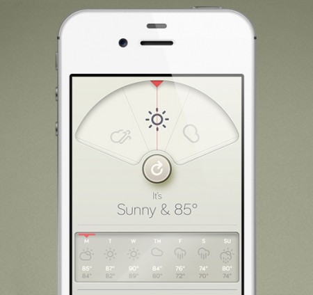
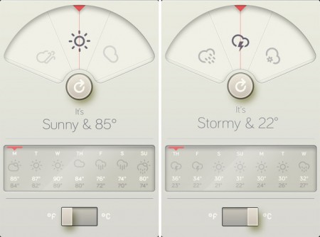

David Elgena created this beautiful Braun/Dieter Rams inspired weather iphone app called Wthr. The app is very nicely done and I’d say it’s definitely worth downloading from the App Store.
Via Wanken


David Elgena created this beautiful Braun/Dieter Rams inspired weather iphone app called Wthr. The app is very nicely done and I’d say it’s definitely worth downloading from the App Store.
Via Wanken

After a short break I’m on the road again, this time we’re out for a 4 week run through the US and Canada – see all dates here. The new visuals are coming along nicely and a lot of it will be included in the upcoming shows.
Been a while since I posted here I know, been slammed with work lately. Just finished up a couple remixes (details TBA) and my first outside design gig in years (album cover / poster art). All that stuff and some more will start to see the light of day later this year I’d imagine. Planning on finishing up the next couple tours then heading back to the studio to get the next Tycho release started.
Hope to see you out there!
JUN 25 Reno, NV
JUN 27 Salt Lake City, UT
JUN 28 Fort Collins, CO
JUN 29 Denver, CO
JUN 30 Colorado Springs, CO
JUL 02 Lawrence, KS
JUL 03 St Louis, MO
JUL 05 Minneapolis, MN
JUL 06 Chicago, IL
JUL 07 Pontiac, MI
JUL 08 Cleveland, OH
JUL 10 Toronto, Canada
JUL 11 Montreal, Canada
JUL 12 Portland, ME
JUL 13 Pattersonville, NY
JUL 14 New York, NY
JUL 16 Pittsburgh, PA
JUL 17 Columbus, OH
JUL 18 Milwaukee, WI
(probably adding a few more dates at the end, stay tuned)

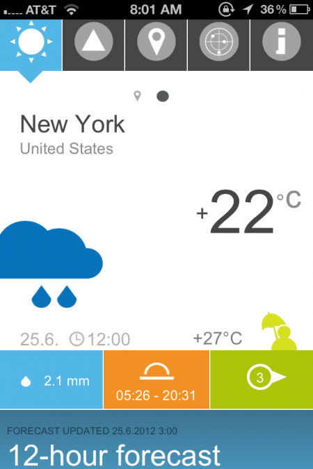
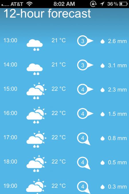
Probably one of the most visually appealing mobile app icons you can buy(it’s actually free) is the Finnish Meteorological Weather Institute’s App. It’s nothing fancy it just gets the job done of telling you the forecast but in a nicely designed way.
As a kid, a lot of my time was spent either drawing or rummaging through my parents vast music collection. The latter becoming more of bed time ritual, as every night I would listen to an album(s) until I fell asleep, literally, until I fell asleep, which meant that the next morning my Dad gave me his usual: “Jonathan, you’re going to go deaf if you continue to fall asleep with those headphones on…” speech. This ritual turned to obsession when in 4th grade I received my first Sony Walkman. Night to night I would pick out a new tape to listen to. At first, I started listening to albums that I had heard my parents play on one of many weekend camping trips or long drives to our lake house, but when I started running out of familiar names, I would choose solely on a what the album’s cover looked like (unbeknownst to me at the time, this would be one of the main reasons I would become a Graphic Designer). As I got older and became more familiar with certain artists, photographers and designers, I came to realize that 90% of the album covers I had fallen in love with as a kid, were designed by a group by the name of Hipgnosis.
Hipgnosis was a British design group responsible for creating some of the most iconic and recognizable album covers of all times. Most notably for bands and artists such as Pink Floyd, T-Rex, Led Zeppelin, AC/DC, Scorpions, Yes, The Alan Parsons Project, Genesis, Peter Gabriel, ELO, just to name a few. The group consisted primarily of Storm Thorgerson and Aubrey Powell, and later, Peter Christopherson. The group would dissolve in 1983, though Thorgerson still works on album designs, and Powell works in video.
The groups approach to album design was strongly photography-oriented, and they pioneered the use of many innovative visual and packaging techniques. In particular, Thorgerson & Powell’s surreal, elaborately manipulated photos (utilizing darkroom tricks, multiple exposures, airbrush retouching, and mechanical cut-and-paste techniques) were a film-based forerunner of what, much later, can be called “Photoshopping”. Hipgnosis used primarily Hasselblad medium format cameras for their work, the square film format being especially suited to album cover imagery.
Another trademark was that many of their cover photos told “stories” directly related to the album’s lyrics, often based on puns or double meanings of words in the album title. Since both Powell and Thorgerson were film students, they often used models as “actors” and staged the photos in a highly theatrical manner. Many of Hipgnosis’ covers also featured distinctively “high tech” pen and ink logos and illustrations (often by graphic designer George Hardie), stickers, fancy inner sleeves, and other packaging bonuses. One of the unique extras created by Hipgnosis was the specially printed inner sleeve for Led Zeppelin’s “In Through the Out Door LP”, a “black and white” affair that magically turned to color when dampened with water (tying in with the main cover’s photographic theme).
The groups contribution to album cover designs and packaging can best be described as more of a legacy than anything. A legacy that definitely shaped a generation and set the bar for future album design for years to come.

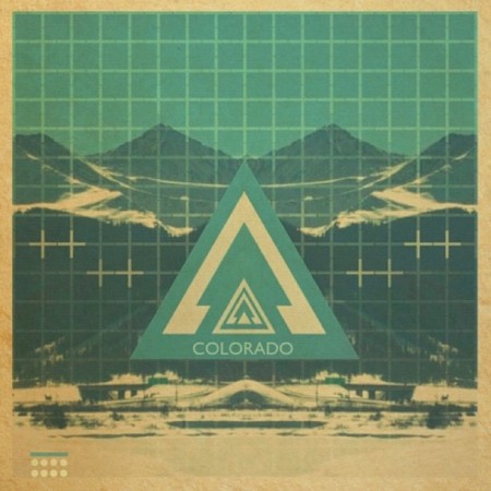
six37 – I was thinking this might be the last graphic focused instagram post we’ll feature, maybe not though, I really do like seeing how far six37 takes it.
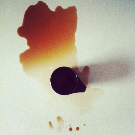
sofiasternegard – There are some lovely workspace shots by sofiasternegard, nice arrangements of whats in front of her, I definitely do enjoy that as a concept for a feed.
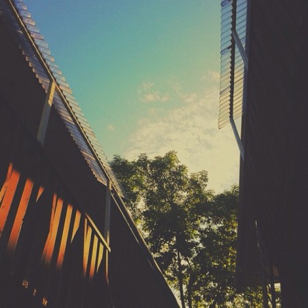
mikeluang – With the sky as the focus, its hard to go wrong most days.
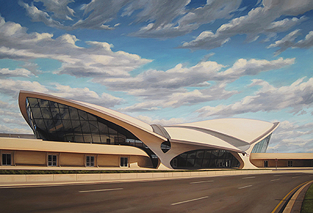
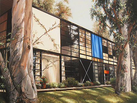
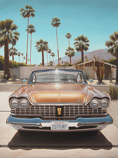
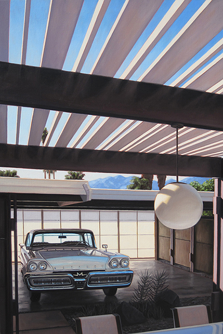
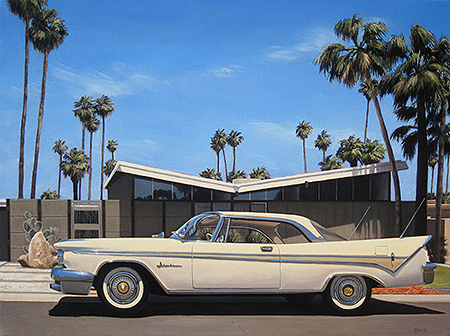
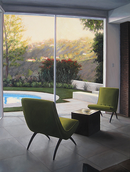
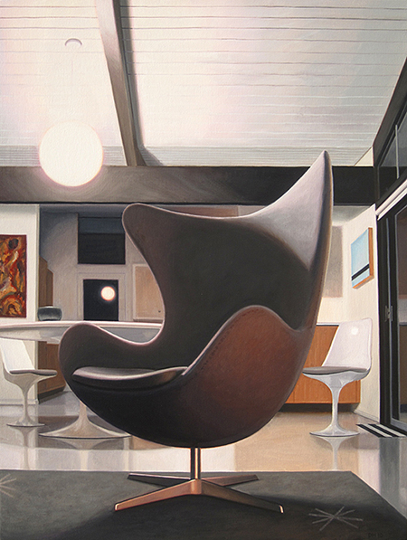
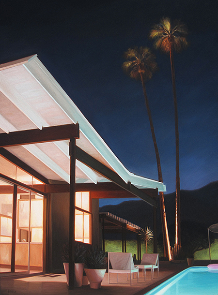
Rarely does an artist’s work speak to me on such a profound level that I must own, at least try to, as many originals as I can. In this case, Danny Heller brings that sensation to me. I can’t explain how Danny’s work speaks to me. Danny’s work floods me with nostalgic memories of very specific moments in my life that have happened. They weren’t epic moments of anything crazy. Just life. There’s a calm, simple, serenity to his work that reassures me that the choices I’ve made living in Southern California couldn’t have been better. The above examples are mostly studies of Palm Springs, CA but it’s his LA Visions series that first won me over.
Danny Heller is an oil painter (yes, painter) who was born and raised in Southern California and it clearly shows in his work. Check out his impressive portfolio or drop by a gallery and have your mind blown at the near hyper realism of his paintings in person. If you’ve lived in the San Fernando Valley, you’ll probably have experienced a day like one of Danny’s paintings. http://dannyhellerart.com
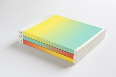
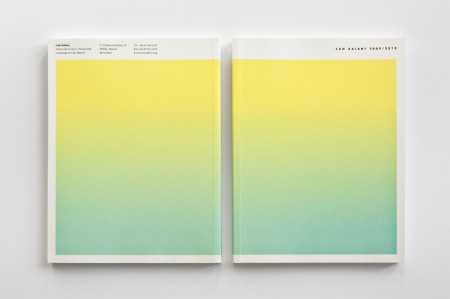
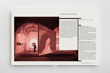
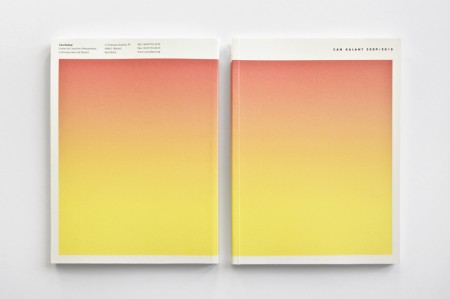

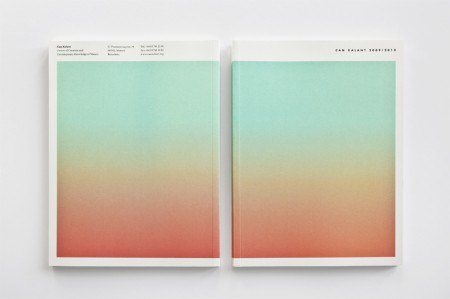
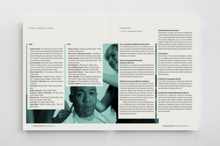
Beautiful annual report design by Albert Ibanyez for Can Xalant (Centre of Creation and Contemporany Knowledge of Mataró). In a parallel universe, these are Heathered Pearls album covers and/or prints.
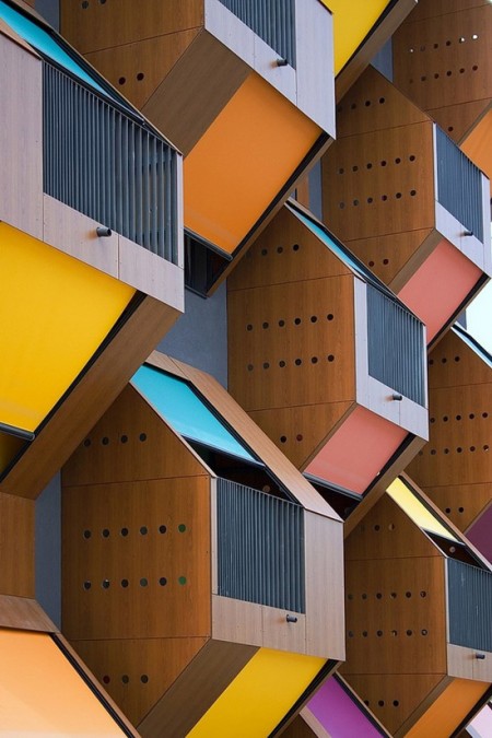



Low cost homes for young people? that look good? thats it i’m moving to Izola, Slovenia.
via HouseVariety