Sister Crayon Mix
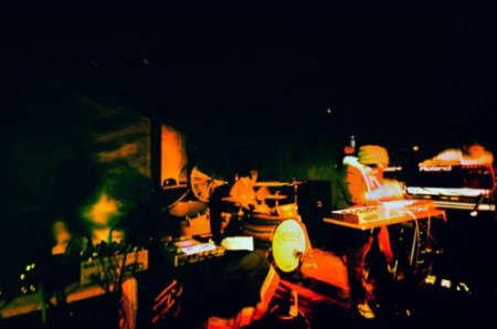
Sister Crayon (who I just played with at SEMF, great band, be sure to check them out) put together a mix for Dublab. A bunch of cool stuff going on here and a couple Dusty Brown and Tycho tracks to round it all out. Enjoy.

Sister Crayon (who I just played with at SEMF, great band, be sure to check them out) put together a mix for Dublab. A bunch of cool stuff going on here and a couple Dusty Brown and Tycho tracks to round it all out. Enjoy.
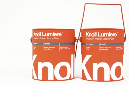
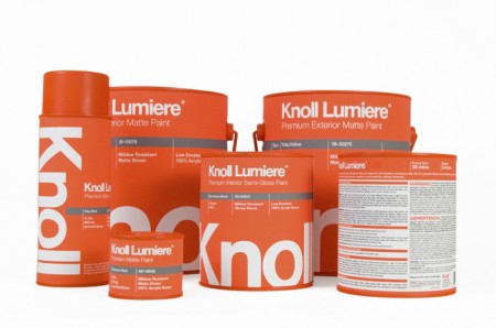
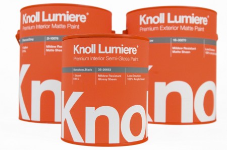
Knoll paint! Sorry, it’s not real. These mock ups were made by Kristin Agnarsdottir for a package design class. Really amazing stuff, and I was just complaining about how bad packaging is these days.
More over at Kristin Agnarsdottir’s site (cool logo too!)
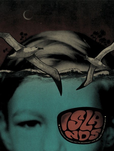

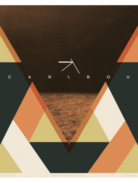

I’ve been admiring Paul Gardner’s band posters this morning, great use of color and execution of ideas that aren’t too literal or same-y, you know like owls and hand drawn guitars, urgh I hope to see more posters like this around Brooklyn. I noticed one in there though that is a bit ISO50 Terrabyte-ish but i’ll pretend I didn’t see it.
Above is a grid of squares, click on any square and just fool around and make some music.
also, thanks to Pilar Timpane for sharing it via her tumblr

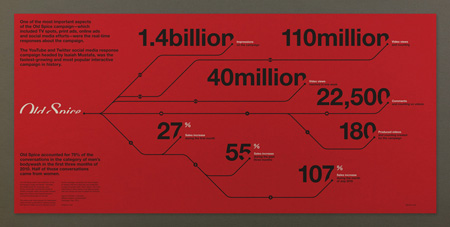
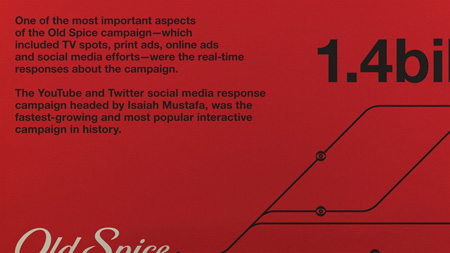
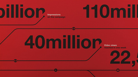
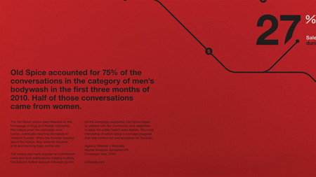
If you’ve heard recently, the Old Spice guy Isaiah Mustafa is back. His return makes this the perfect time to share with you a project that I (Shelby) completed a few months ago for fun. The goal was to create a refined and informative infographic. At the time of creating this the Old Spice campaign entitled “The Man Your Man Could Smell Like” was in full swing. Wieden + Kennedy were the brains behind the whole campaign and the results of their vision led to an exponential amount of social media buzz, exponentially exceeding the expectations.
The question was how do I design for this. Do I pair the design with what the brand has established or do I take an alternate route? At the time I was heavily inspired by the international typographic style and Massimo Vignelli. This explains for the minimal layout and geometric line angles similar to the New York City subway maps. This direction didn’t come immediately. I had toyed around with various versions that were far from being relevant to Old Spice or being easily readable. Although with the final version having the least amount of information, it felt the most appropriate.
Data was collected from the marketing firm Symphony IRI.
Typeface used: Helvetica Neue Ltd Std