We all know Polish design is amazing, but every now and then you need a good reminder. Karl forwarded me a Wanken post on the Tonpress sleeves you see above. Tonpress was a government-controlled Polish record label in the 80’s and from the looks of it, they had some quality design staff hanging around. If you want to sift through all the links, lots more cover art is here.
I remember seeing Lego a few years back having simple Lego pieces as business cards and thinking that was amazing but they took it a couples steps further by matching hair, gender and glasses for their employees new business cards, pretty creative, read more here.
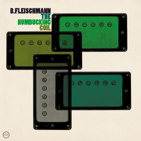
These 3 songs by Bernhard Fleischmann, Wisp, and Departure Lounge are good examples of 3 completely different genres that I really wouldn’t know how to tag with a specific genre. Wisp on one hand sounds like he should be making all the fantasy video game music for any World of Warcraft game in 2010 specifically any epic winter levels. Bernhard Fleischmann sounds like a sped up Mum song that put the guitar and drums priority in the mixdown while Departure Lounge has more of a northern Midwest feel with layered finger picking and some gently placed feedback that’d probably drive a mastering guy nuts.
I’m not sure where I remember first seeing this La Serenissima video but it hit my nostalgia button right away, seems like the studio that drew the original G.I. Joe animated series must of done it, i’m not exactly sure though. I wish more cartoons we’re drawn like this, i’d probably watch them religiously.
I’ve always loved the artist series over at Hillman Curtis. Very well produced and put together films; my only complaint is that they are so few and far between. Scott’s recent post reminded me to go back and watch this one on Milton Glaser. I love hearing design heavyweights like him talk about the big issues in design. As far as I know, he still teaches at SVA occasionally—how fascinating it must be to have him as a teacher!
While they’re not quite as good as their big screen counterparts, some TV title sequences are starting to look a lot like what you’d expect from a feature film. Smashing Magazine has an article entitled “20 Brilliant TV Show Titles” featuring some of the better examples out there. My personal favorite has to be TrueBlood; the colors are incredible. Although none of them come close to beating Catch Me If you Can (although Mad Men tries valiantly), there certainly are some nice ones in the list. Link
Just found a nice size collection of 1960’s Advertising from around the world on Flickr, plenty more photos of exhibitions, typefaces, tv ad’s, and print.
Ghostly, Xlr8r, Red Stripe and Jimmy’s Lounge Present: Attn: This is a Daytime show, starts @ 2PM
The Ghostly 10 yr Anniversary – 2nd Installment – Los Angeles
Featuring:
Michna w/ Raw Paw LIVE
Tycho LIVE
The Sight Below LIVE
Lusine LIVE
Kate Simko LIVE
Deru LIVE
Eliot Lipp LIVE
…and more TBA
Sunday March 8th
@ Jimmy’s Lounge
6202 Santa Monica Blvd., LA
A friend showed me a place called Meet, seems like a nice spot for meetings but the idea is a bit too forced/corporate feeling for my taste. This is from their About Us page: “Marc and Sara Schiller, who realized that there was a need for a dedicated space in New York where creative and business executives could gather to re-imagine a business, re-invent a product or pitch potential clients. Advertising agencies, top consumer brands and television networks are among their enthusiastic clientele.”