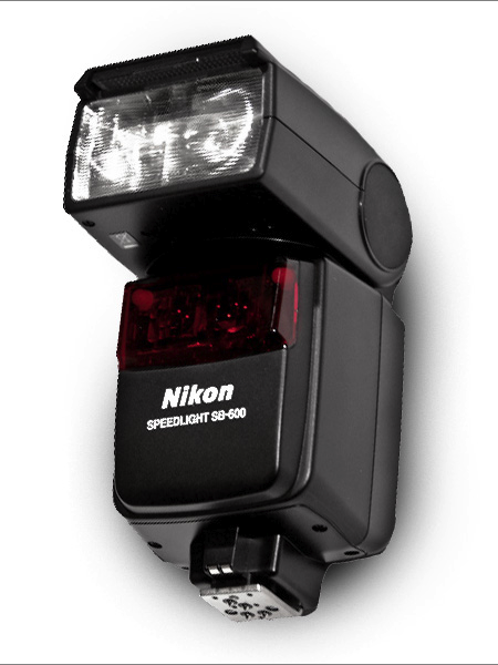
Recently I purchased a Nikon SB-600 flash for my D40. I have never owned anything in the way of photographic lighting and I figured this would be a good first step. I’ve outfitted my studio with a good continuous lighting set up (for video), but photographic lighting has always intimidated me (in regards to complexity and cost). The SB-600 is a flash attachment that works with the D40 (thankfully) and basically just augments the existing flash. The big difference is the ability to adjust the direction of the flash, allowing you to bounce light off the ceiling etc. It also has more options and allows for more control than the basic flash.
Above I’ve posted two pictures, the first uses the SB-600 (pointed at the ceiling), and the second is just the on-camera flash. Neither has been edited. Given that I have no idea what I’m doing with this flash, I think the results are fairly impressive out of the box. Every time I’ve used the SB-600 indoors, the pictures reflect exactly what I see in real life. None of that blown out flash nonsense. The colors are correct, the light is balanced, and the level of detail is like nothing I’ve seen come out of my D40 previously. Of course, the SB-600 is no substitute for a real studio lighting setup, but it’s a great way to cheaply augment the power and versatility of your on-camera lighting situation.
There are a number of other options for speedlights of this kind. I chose the SB-600 mainly because it seemed to be the best fit for my relatively “low end” D40. It’s not too heavy and didn’t break the bank like some of the other Nikon models (the SB-800 for example costs more than my camera). It’s been very easy to use and I would recommend it to anyone looking for a quick and easy way to improve their indoor photography. If anyone has experience with other models, Nikon or otherwise, I’d love to hear your thoughts or see some examples. I’m still learning how to get the most out of mine, but the potential definitely seems to be there.
It’s always great to learn about new artists and Paul Tebbott is no exception. Alex sent me Paul’s site today and I was really moved by his color choices and restrained use of texture and distressing. Paul seems to be just getting started — as evidenced by his relatively small body of work — which is all the more reason to believe we’ll be seeing lots of great things from him in the future. If that’s not enough for you, Paul also has a music project that Boards of Canada fans will surely find enjoyable.
You may know Tim Saccenti for his unreal spacey Battles video or his wild Animal Collective videos or press photos for Flying Lotus and Jimmy Edgar but his live visuals this weekend for School of Seven Bells were jaw dropping, not only did School of Seven Bells play a gorgeous live show but Tim Saccenti nailed the visuals and captured the sound perfectly, I almost felt like I was experiencing something that was on some other level. Below is a great review of the night:
Digital Transcendentalism
Timothy Saccenti’s Visuals andthe School of Seven Bells
The question that immediately comes to mind as one looks into the silky black voids of photographer/director Timothy Saccenti’s mind, manifested wonderfully in images of black expanses occupied ironically by an artist or an object beyond one’s capacity for reaction, is this: What possible world am I occupying and how am I existing in this space and time? With the School of Seven Bell’s visuals, Saccenti (in conjuction with Flame artist Alvin Cruz) achieves, brilliantly and originally, the apex of what all artists can hope to achieve; as the mirrored yet chaotic colors begin to rise up on the screen, the viewer relinquishes control of his or her consciousness of the moment and enters the beautiful, black, colorful, numbing minds of Saccenti and Cruz.
So what makes these images so otherworldly yet familiar enough that one can fall into them so whole-heartedly? The peice mixes familiar epiphenomenal stimuli (shapes and images) with powerful digital distortion, creating a space that is paradoxically common and foreign. The experience places the viewer at the precipice of human comprehension and tethers them to the rock of humanity with fibers so inconspicuous that it is hard to know when one might fall into the black abyss. It is exhilarating. Paired with the ambient, submissive music of The School of Seven Bells, an audience is treated to complete perceptual experience involving the lyrical mastery of the band and their interstellar sound.
There is a diamond shape that occupies the screen for much of the piece. Besides being a spatial image that one can clearly identify, it suggests another, semi-erotic, human form that boldly stares back at a transfixed audience. It is difficult not to see a vaginal, pink shape in the diamond. It is natural and digital, surrounded by a hazy distortion and heavy digital sounds that are reminiscent of television snow. Watching the two female singers, it is hard not to feel lulled by a kind of siren song.
One of the more powerful images, a white face with dark eyes, exists as a kind of character throughout the piece. It comes and goes as the viewer’s ability to make it out is realized and lost. The face is mirrored on both sides of the screen as one’s own face so commonly is. The face swings back and forth with an organic fluidity that is imperfectly natural and correct. Amongst the computerized movement of box shapes and spheres, this face stands out with its organic movement that, at the apex of its swing, faces the audience and becomes black (with white eyes). It is an eerie and fantastic moment as the echoing voices of The School of Seven Bells rise and fall to the metronome of the huge face.
The image that most dramatically drives the feeling of nature is the wilderness at sunrise; however, in digitally transcendental fashion, the piece juxtaposes the desert grasses with outstanding digital effects. The sunrise image sits inside a sphere that seems to rotate as the image remains still. The sphere fits inside the skeleton of a neon cube in an eclectic picture that moves with a more perfect, digital, fluidity. The circle is also seen in another major part of the piece. Inside of a large, white circle are numbers that follow around the circle’s circumference, similarly to that of an ancient calendar. Here, Saccenti seems to be exploring the most seamless connections between man and nature. Time is a human invention developed to understand the most fundamental engine of nature. It is a similar idea that drives the image of the Hindu deity, Ganesh. Here, the audience explores the human invention of religion as a tool for understanding the impossibilities of nature. A statue of the deity rotates slowly, giving a reverend importance to his presence.
The pairing of these two artists could not have been more perfect. The School of Seven Bells creates an original sound using a similar juxtaposition. Soft voices and flowing guitar riffs round out the heavy digital sound that backs up each song. These two elements collide to produce a sound that is otherworldly.
Throughout the piece, we see the majesty of nature and the boundless imagination of humanity. Represented beautifully by digital displays, the viewer enters a possible world that can only exist with the imagination of this brilliant collaboration, through the conduit that is their talent.
I’m looking for someone with detailed knowledge of overclocking Intel systems to help tweak a production system in the studio. It’s running an Intel Core 2 Extreme QX9650 CPU (liquid cooled) on an Asus Maximus Formula Mobo with Patriot 8GB DDR2 PC8500 1066MHz memory (detailed specs here). If you or anyone you know can help overclock this machine please contact talk [@] iso50 [dot] com with the word “overclock” in the subject. Location is not an issue, we can handle it over the phone or video if need be. Please include a cost estimate in your email.
I’ve had the machine overclocked in the past, but it was never as stable as I needed and I wasn’t able to get the memory running as fast as I wanted so I’m hoping someone can step up and sort it all out.
These leaked shots of Olympus’ new, vintage styled, micro four thirds shooter popped up on Engadget today. Pretty slick, with the old school range finder and everything. Looks like the body might be plastic though, would love to see this in black aluminum with the tan grip.
Lawrence makes techno poetry as Kompakt calls it and I couldn’t agree more, even if we go back to some of his recent releases the phrase still holds up. Teaser which was featured on his Teaser EP and on the Total 3 compilation on Kompakt has this great slow swing to it and sounds like a huge ship cuts thru a thick night fog while a young women on the ship smokes and speaks thru the song.
I never would of expect a label like Minus to put out something as sexy as this Geometry track, usually we get bouncey, distant, cold minimal techno from them and this track sounds like something Arab Strap or Colder would of made.
I don’t know anything about Tim Toh, I just got the song from a friend and once I heard it and let it play all the way thru I was pretty blown away on how many elements of different styles show up in the song that make it beautiful. The song One crosses over so many genres its unbelievable, a definite necessity for fans of Dial and old Traum releases.
New Go! Team remix of Black Moth Super Rainbow pretty and PBS-ish like an old Stereolab but more on the happy side.
If you follow the blog you’ll know that I’ve touched on the subject of SSDs before. A quick primer for the uninitiated: an SSD (solid state drive) is a storage device that uses solid state memory (As in no moving parts, other examples include RAM and flash memory) and so it can access data much faster than the mechanical head/platter drives most people use now and with no moving parts, data loss due to mechanical failure is a thing of the past. The promise of SSD is huge and as they become commonplace they will no doubt revolutionize the way we work (think Photoshop swap disks that read and write @ 1400MB/s or computers that boot in 5 seconds). Because I work with such large raster files, swap disk performance in particular is a very big issue for me so I keep a close eye on the SSD market, waiting for the moment when the price to performance ratio hits the sweet spot. Right now most SSD technology is still on the pricey side and there are a few technical issues that are still being sorted out (write endurance supposedly being one of them) so I haven’t jumped in just yet. But as things change I will continue to post updates on the SSD situation.
For the first installment I thought I’d post on the very interesting OCZ Z-Drive. It’s insanely expensive right now, but as we all know, those prices drop pretty fast as the tech matures (remember $800 DVD writers?). The Z-Drive is basically 4 SSD drives in a RAID 0 array on a PCI-Express card. This is a novel concept; by using the PCI-Express bus OCZ has sidestepped the bottleneck of the SATA controllers allowing huge throughput in both directions. Boasting 700MB/s write speeds, the Z-Drive is certainly no slouch, but considering the price (they start at $1500!!) I’m holding out for more. I think the magic number for me would be 1000MB/s for around $500. This would make a perfect solution for Photoshop swap disks and other applications that require massive read/write throughput (video render disks etc.) and while it doesn’t make sense for me right now, it’s great to see this emerging technology headed in the right direction.
The New York Times Magazine is the reason I wake up early on Sunday morning. Excellent photography, fascinating articles, and sophisticated design fill its pages week to week. It was recommended to me when I started graduate school and I haven’t missed an issue since.
This week the Times rolled out a new, svelte version of the Magazine. Like everyone, they are cutting costs where they can, and it was determined that reducing the size of the magazine by 9% would save them millions in paper costs. To accommodate the smaller page real estate and squeeze in more words, they enlisted Lyon Text, a more condensed typeface than they were using before. It’s a very subtle switch, and as they say, “Perhaps if we hadn’t mentioned it, you would hardly know the difference.” Where the change is most obvious is with the two new display faces: Knockout (H&FJ) and Nyte (Dino dos Santos). Both work really well in the new layout; definitely my favorite part of the redesign. They have also reworked the table of contents, changed the section order a touch, and sprinkled a multitude of new design elements throughout.
I think Arem Duplessis and his team have done an incredible job. I loved the Magazine before, and was initially concerned they might mess with a winning formula, but I think they succeeded in turning budget induced page shrinkage into a successful and well-executed redesign. Intact is the nuanced and ultra refined look and feel that first caught my eye. The smaller size is actually more manageable (a la Rolling Stone), and afforded them the opportunity to make the exciting upgrades. I don’t think anyone will miss the extra millimeters.
note: There were two covers that came out with the redesign. The one above, with a model by Thomas Doyle, was my favorite, but be sure to check out IC4Design’s version on the NYT website if you’re interested.