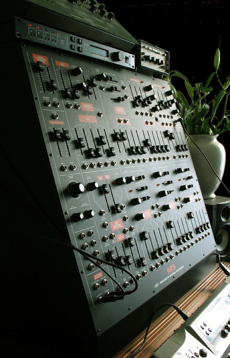
I use a lot of analog synthesizers in my music so I thought it was time to start posting some nice examples of musical instrument design. I have always been obsessed with vintage analog synthesizer interfaces and although the Macbeth M5 is a modern analog synthesizer, it adheres to the design ethics of and pays homage to the modular synthesizers of the 60’s and 70’s. The color scheme and layout is evocative of the classic Arp 2600. There is something so raw and utilitarian about the construction and layout of these that’s just beautiful. If you look at the interfaces of modern digital synthesizers it’s all plastic eye candy and blinking lights. I must admit, I have never played an M5, but it looks so good I think I can give it a pass sound unheard. Photo Via Macbeth. I will start posting some examples from my studio soon.
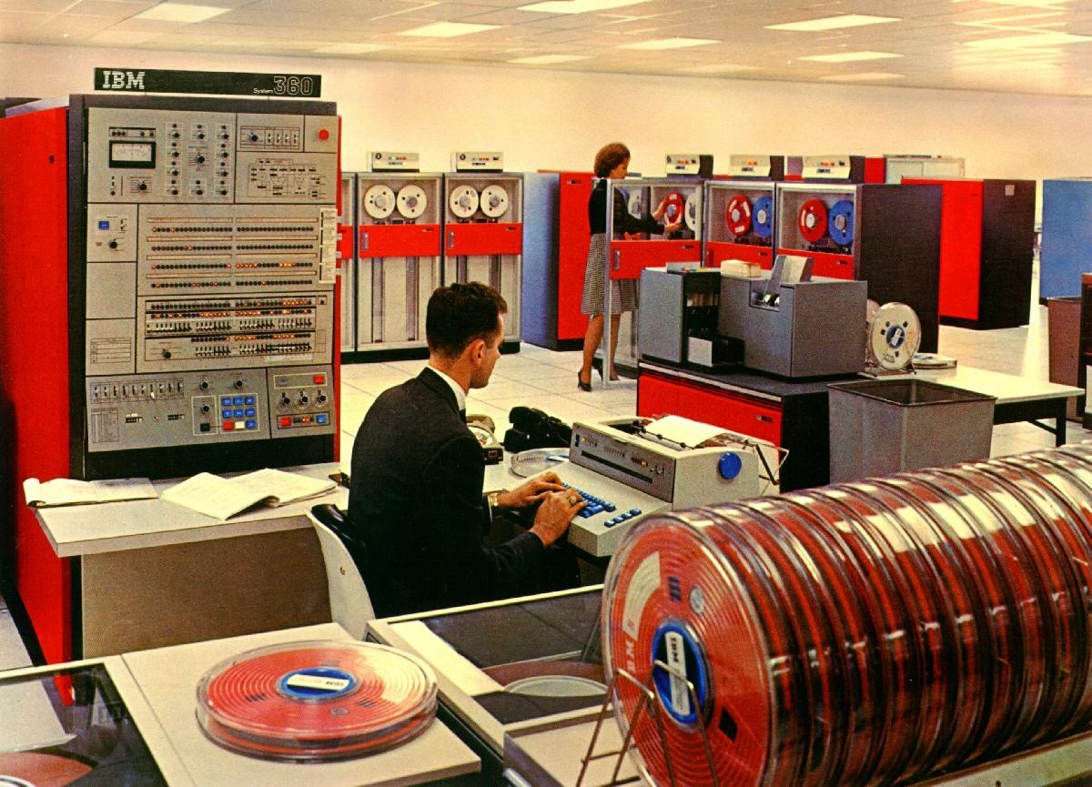
Some ye olde number crunching for a Monday morning. With all that color coordination going on you’d think those people would be required to wear matching jumpsuits. Via The-Adam
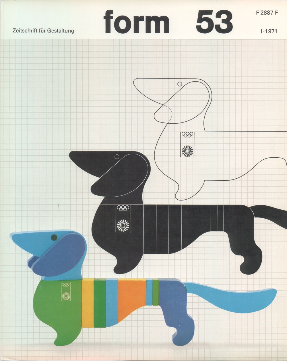
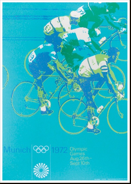
Another image by German Designer Otl Aicher who was responsible for the branding of the ’72 Munich Games. All of this stuff is amazing. I am not a huge fan of the Dachsund mascot, but this is about as good a treatment you could give to such a concept. Simply do a Flickr Search for "Otl Aicher" and your head will explode. Incredible stuff, some really nice shots of the London Aicher exhibition. I just can’t get over how contemporary these colors and forms are. None of it feels dated, could have been from a pitch for 2012, if the people who oversee those sorts of things still had any taste that is. Seems like all the stuff now days is targeted at the lowest common denominator. All of the recent stuff I have seen for 2012 is throw-away, middle of the road with compromise written all over it. Aicher’s campaign is thought provoking and timeless, obviously a good argument against the design by committee ethics I have to imagine produced this sort of output.
Part of a series of posters from ’72 Munich games by Otl Aicher. I’ll post some more examples in the coming weeks. These must have had a very modern feel when they came out, the colors certainly contrast the prevailing palettes of the time.
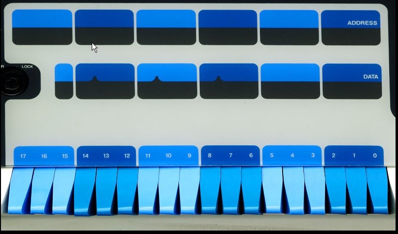
More Digital love….This time from the Core Memory book. That blue is on a whole new level, I need those switches all over the place, controlling all functions at all times.
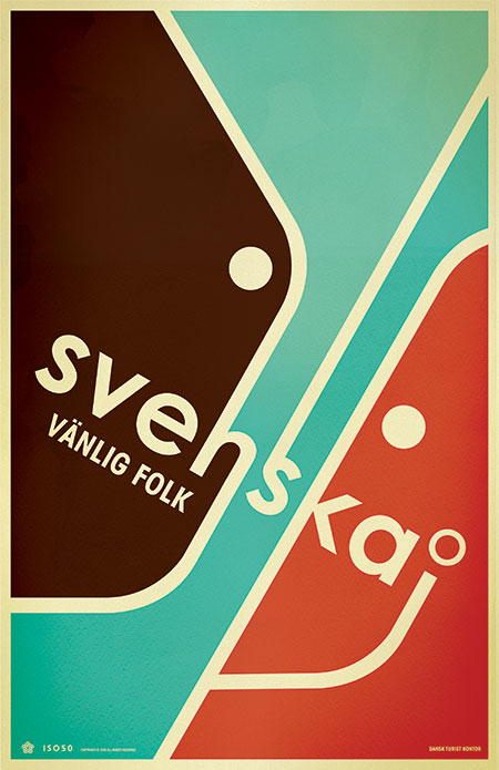
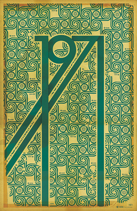
The 1971 Print has been reprinted and is now in stock at the ISO50 Shop.
A lot of people have asked me what the significance of the year 1971 is (no, it’s not the year I was born). Hunter S. Thompson’s “Fear and Loathing in Las Vegas” first appeared as a two part series in Rolling Stone magazine that year. Wikipedia sums up the main theme of the book which was based on these articles:
“It explores the idea that 1971 was a turning point in hippie and drug culture in America, when the countercultural movement no longer had momentum and its innocence and optimism of the late 1960s turned to cynicism.”
This print sort of juxtaposes the design ideals of the 60’s: the earth-tones and swirling, psychedelic, patterns; with the harsh, solid forms of the gothic lettering.
Oh, and also 1971 just looks badass all stretched out like that.
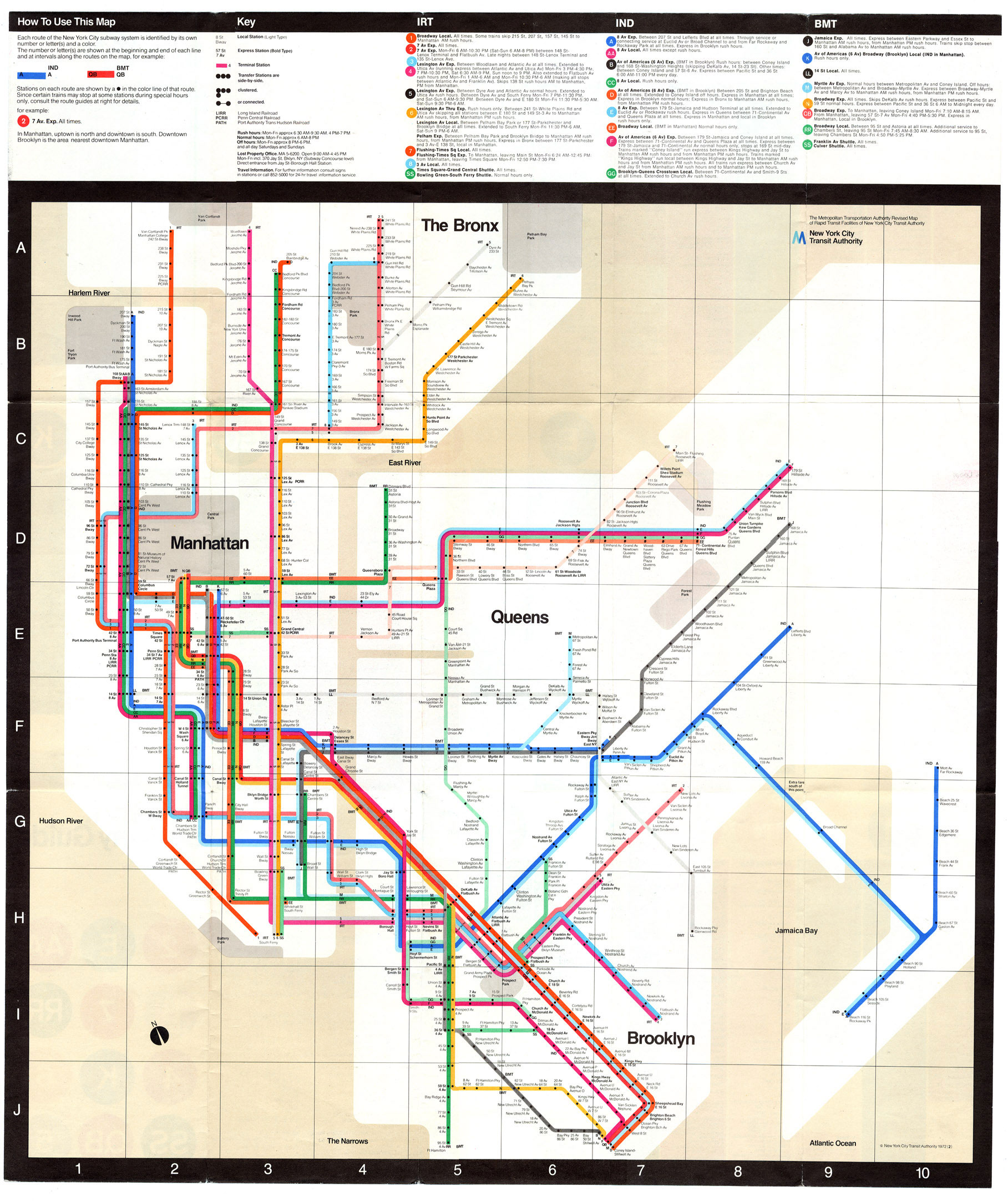
A 1972 map of the New York Subway system. Going to be using this a lot in a couple weeks so thought I would post it up. This is of course based on English graphic designer Harry Beck’s original topographic map of the London Underground (as Paul Mison pointed out in the comments, this is a later version of the map, not Beck’s original). This style of map was revolutionary at the time (1933) since it eschewed the geographically correct maps of the age for topographic representations of systems.
“A schematic diagram rather than a map, it represents not geography but relations. It considerably distorts the actual relative positions of stations, but accurately represents their sequential and connective relations with each other along the lines and their placement within fare zones.”
– From Wikipedia “Tube Map” Article
This must have been a very big logical departure for a lot of people and a lot of credit is due to Beck for having the intuition to draw the map in this new way. Of course all this is beside the fact that it’s just plain beautiful to look at and a great work of graphic art in it’s own right. To this day, Beck’s map still influences the way networked systems are represented, the above image being a great example. I don’t think many designers can claim such a revolutionary concept as their own.