This 2001 remix of Bomb The Bass & Lali Puna’s Clear Cut comes from the oft overlooked German IDM genius Uwe Zahn, better known as Arovane. If you haven’t heard of him, get Atol Scrap and enjoy the some of the finest electronic this side of the millennium.
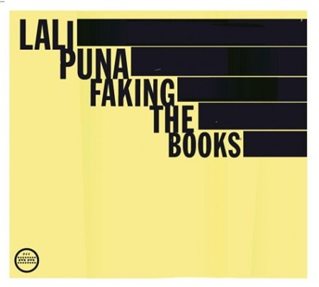
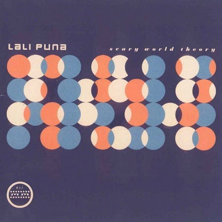
The album covers pictured above have absolutely nothing to do with the song other than the fact that they are Lali Puna albums and since I probably won’t ever post any Lali Puna music here I figured this was my only shot at getting these nice designs up.
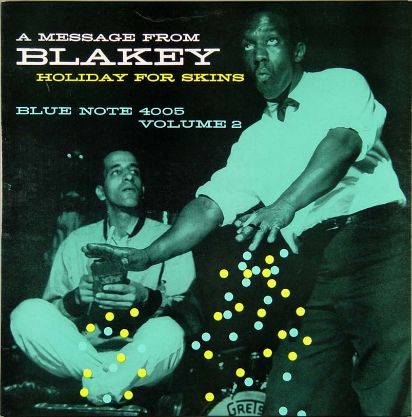
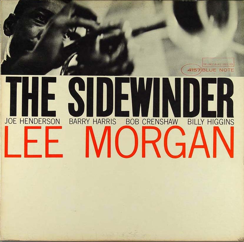
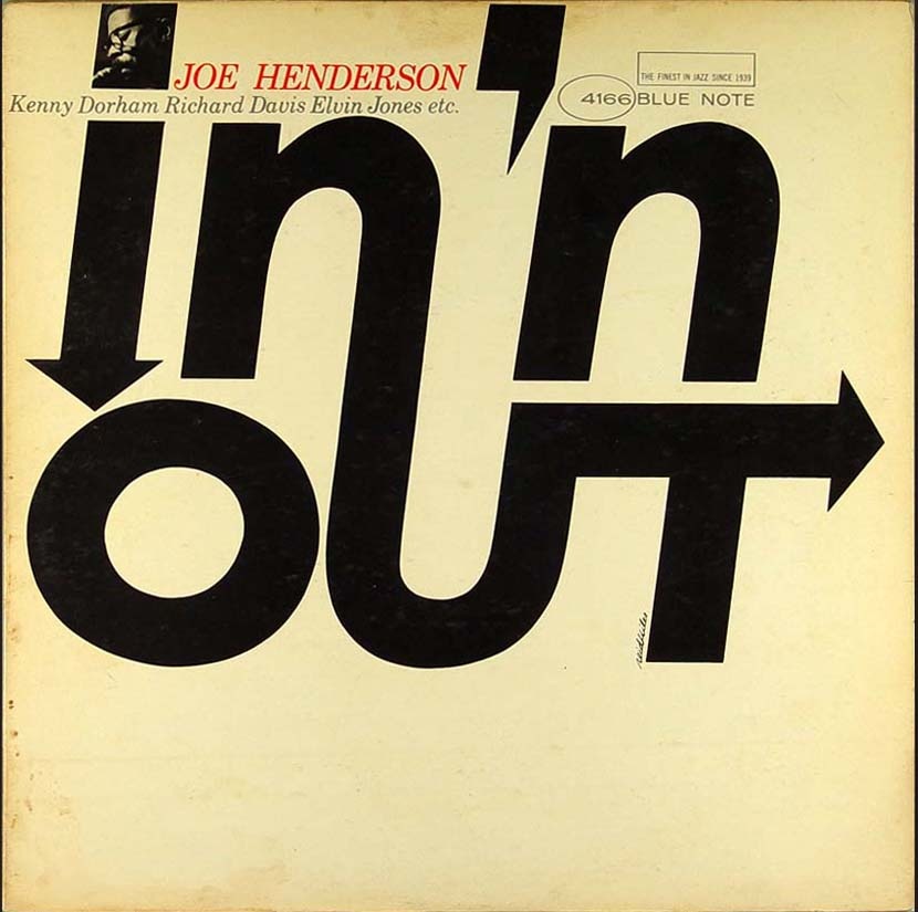
You see this typeface a lot in the concert poster world but it was also very popular with mid-century designers as illustrated by this Blue Note cover from the Vanguard Archive. Bonus: Name the modern day variants. Comment on this post
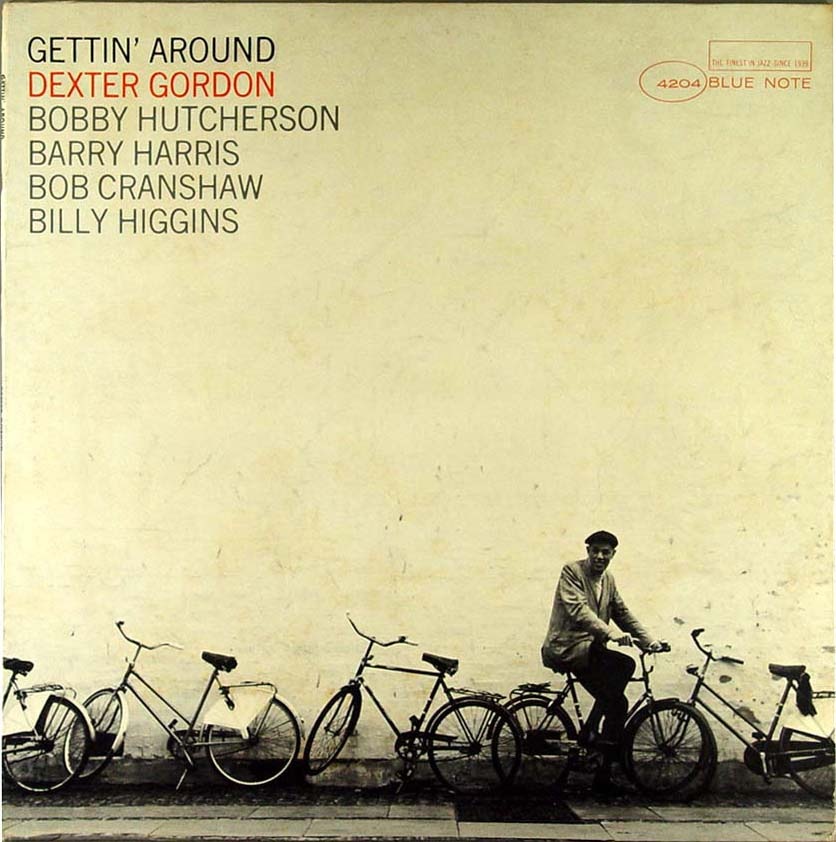
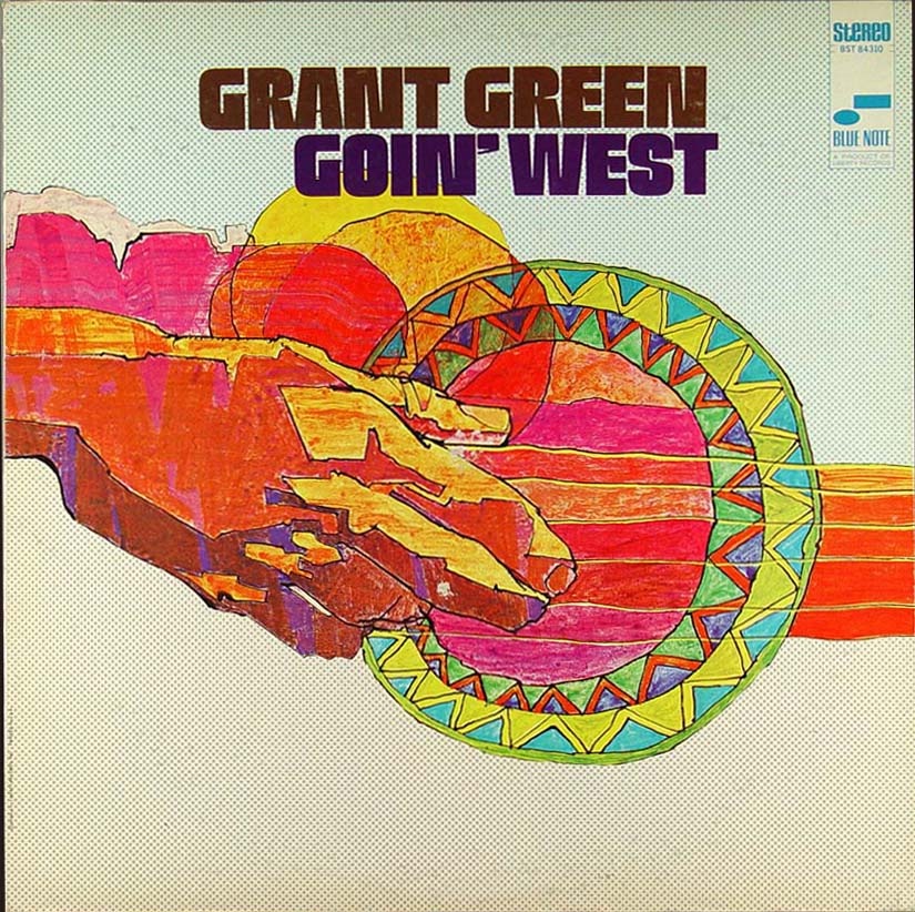
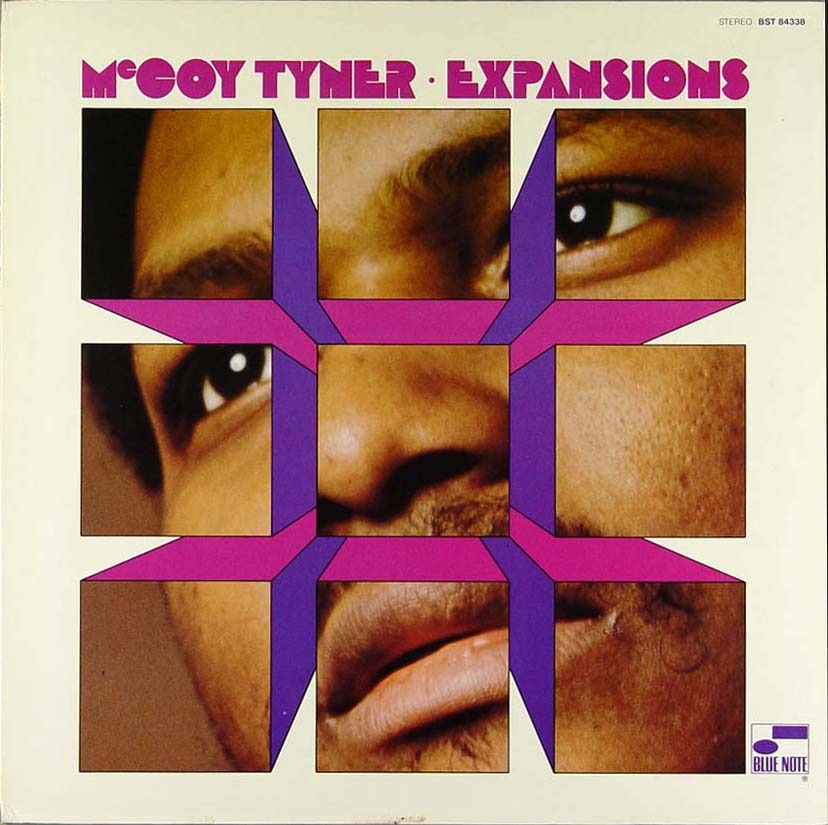
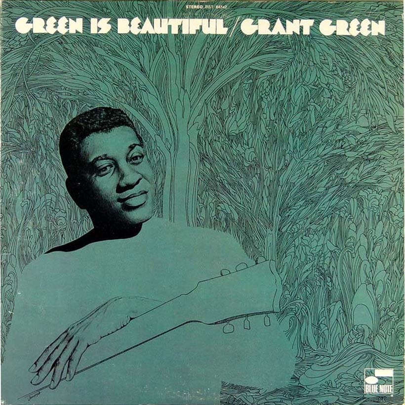
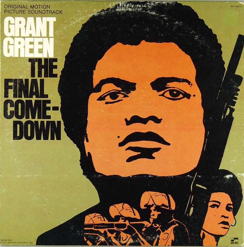
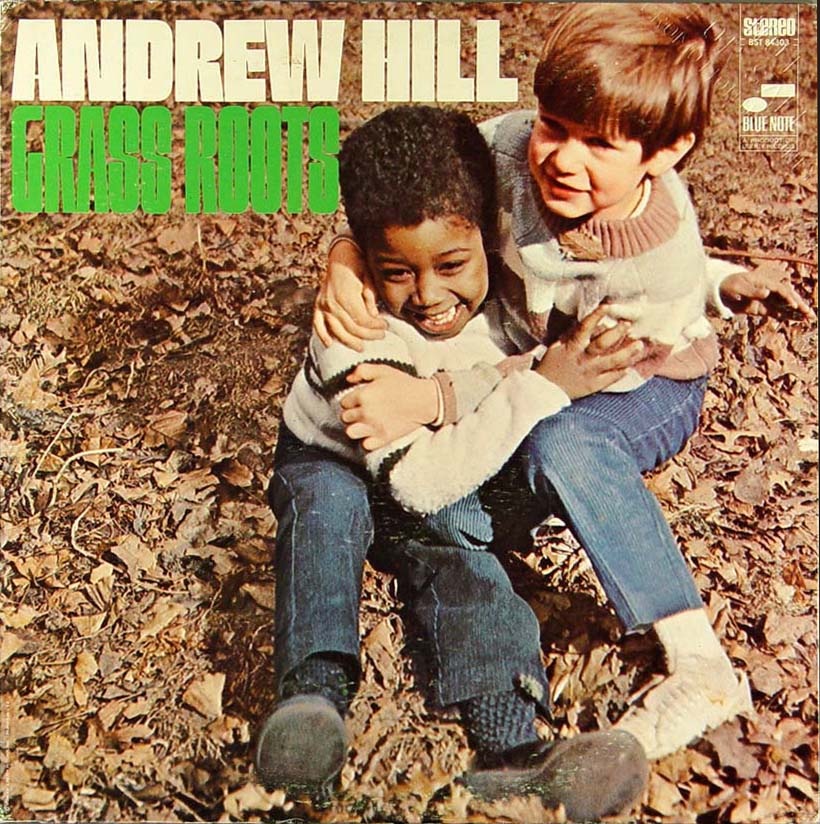
Here are some more covers from that great Blue Note Cover Archive that Amy Stoddard sent in a while back. Scanning through the archive you’ll find some periods of absolute greatness; these four were culled from the mid-60’s period when modernism was in full swing and someone over at the Blue Note design dept. seriously knew what they were doing. I selected these particular covers to illustrate the sort of continuity that seemed to pervade this period of releases. I really appreciate that from record labels, it’s not always the best policy, but there are times when I would sacrifice variety for a continuous visual message that flows through a series of records.
The other thing that really stands out to me about these is something that the original designer(s) probably didn’t intend: the lack of true white. Something about the off-white / cream in the place of white always makes an image feel more human to me, more tangible. That’s why white hasn’t been included in any of my design work since some of my earliest stuff from around 2001. I am not saying it doesn’t have it’s place in design or that it can’t be used effectively, I just don’t prefer it.
The minimalist color ethic in these pieces is employed successfully to such a degree that only a maximalist could truly appreciate. These images are literally exploding off the page, it almost hurts to look at them, yet they’re only two colors and relatively empty, full of negative space. True, a couple of them have leveraged photography to provide some depth, but try to imagine them without the photos; they would still stand on their own and that’s a testament to not only the designer but the power of typography itself. Note that aside from the oval and rectangle of the Blue Note logo the only shapes and lines are formed solely by type. To me that’s the ultimate expression of design, the information is the image, or, as a sort of anagram of Marshall McLuhan’s famous quote; the message is the medium.
What also strikes me about these is how timeless they are. This is not nostalgia, this is graphic design at its apex. If you compare these to the visually entertaining, yet decidedly dated, selections in my last Blue Note post, you might see how comparatively well these designs have stood up compared to say, this. The later Blue Note covers scream "late 60’s-70’s", the Carson stuff screams "1990’s", while these simply scream "DESIGN". Just as many have proclaimed Helvetica to be the purest expression of modernism through typography (which is an interesting concept in and of itself), I sometimes think that design as a whole reached some sort of zenith somewhere around the middle of the 20th century. That’s not to say there isn’t more to be done, new paths to be forged; but I feel like perhaps the perfect balance was struck during that era and all we can do now is explore all of the not-so-perfect alternatives. I know many will disagree with me, they’ll invoke Sagmeister and his ilk, but I’ve never been a fan of post-modernism, I think it is flawed. It is sometimes beautiful, thought provoking, and can be used to great effect, but at the end of the day it doesn’t go as far to accomplish the goals of communication and graphic design. True, graphic design is an ever-evolving form that mirrors the society it is employed to convey it’s message to, but the basic set of requirements that govern the neccessary function of that conveyance do not change…..That is, until we all mutate and read with thought waves and our eyes remain only as vestigial lumps mounted on the front of some sort of hyper-evolved super-brain. But that’s besides the point.
So that’s the long and the very long of it, my opinion only. As I’ve betrayed many times before, I am a lowly uneducated philistine so please set me straight, I would love to hear your opinions and the masochist in me eagerly anticipates the verbal thrashing I am sure to receive from the collective rebuttal superpower that is: The Innernette.
I love it when an album cover makes me jealous, usually this means that there was art direction on top of a great vision for the music. This self titled Engineers release came out in 2005 and got alil bit of love but was overshadowed by bigger names like Interpol, Phoenix, and The Editors. I think they sounded more like Telefon Tel Aviv or Air at times, definitely a great record to look for, i had to pick up a physical copy so i could have the art too.
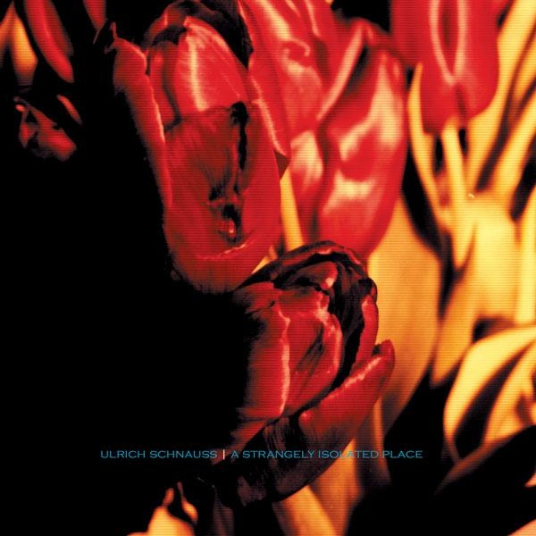
It always surprises me how few people have heard of the German musician Ulrich Schnauss. He’s one of my favorite electronic producers but whenever I mention him (to people I consider to be knowledgeable about music) they usually just shrug and ask who he is. I saw him open for M83 in San Francisco a few years back, it was pretty intense, but he just sort of pounded away on a Siel synthesizer the whole time, no visuals or anything. Was cool to see it live, but the stage presence was a little disappointing; I guess I was expecting a singer or something (he always has those sort of ethereal vocals woven through his mixes). At any rate, I’d have to say that A Strangely Isolated Place is his best album to date, and while it’s hard to pick a favorite track from such a solid release, this song certainly ranks up there.
Amy Stoddard sent in this amazing archive of vintage Blue Note album covers. Lot’s of great inspiration all over this page, be sure to hit the "Next" button, it just keeps going and going, almost too many to take in at once. Visit the archive here.
Since August 2006, i’ve been widdling away at one proper electronic compilation follow up to The Rorschach Suite. I wanted a release that was jam-packed full of diverse electronically made music so that people that we’re new to electronic music wouldn’t be scared off by experimentation or the dance end but mostly getting pulled in by a deal(20 tracks/80 mins of new music for cheap) and most importantly short melodic songs that make you wanna play the song again.
Today The Synchronicity Suite came out on iTunes (and got alil love under the What’s Hot section) and Ghostly International and Moodgadget wanted to exclusively share 5 songs from the compilation with the ISO50/Tycho crowd. I also wanted to point out that the artwork was done by PhilistineDSGN and mastering by Adam Hunt, gotta always give credit where credit is due.
Small Sails – Somnambulist
[audio:somnambulist.mp3]
The Reflecting Skin – Cavedweller (instrumental version)
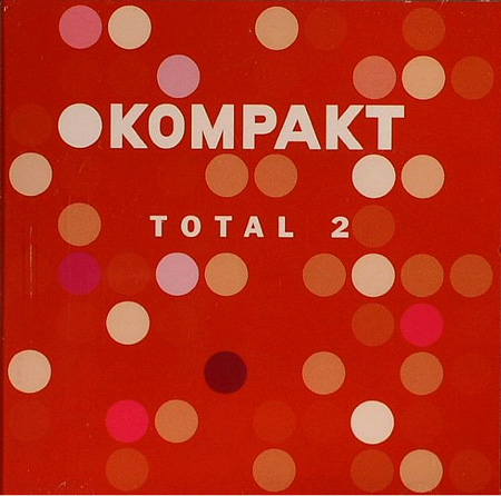
One of the most influential electronic labels since i started working in the industry has been Kompakt out of Cologne, Germany. Its owned by a favorite musician of mine Wolfgang Voigt aka Gas, who has some of the most unbelievable ambient records on Mille Plateaux in the mid 90’s. 1,2,3, No Gravity was always a great vinyl to throw on during the beginning of a dj set just because it had this feel to it that everybody might actually know it or wanna know it once the distant vocal came in. Also, The cover art is part of a compilation series that comes out every year, i think Kompakt is on Total 8 now, definitely worth looking into especially their other compilation series “Pop Ambient” which is also yearly. For the non techno fans, i promise to keep the techno to a minimum, if i post techno its mostly because of the melodies usually.