The New Propaganda
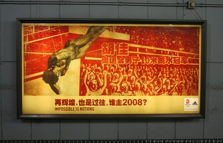
Very nice contemporary propaganda-esque Adidas billboard for the Beijing Games. Not sure who did this campaign, anyone got some info?
Photo via Ack-Online

Very nice contemporary propaganda-esque Adidas billboard for the Beijing Games. Not sure who did this campaign, anyone got some info?
Photo via Ack-Online
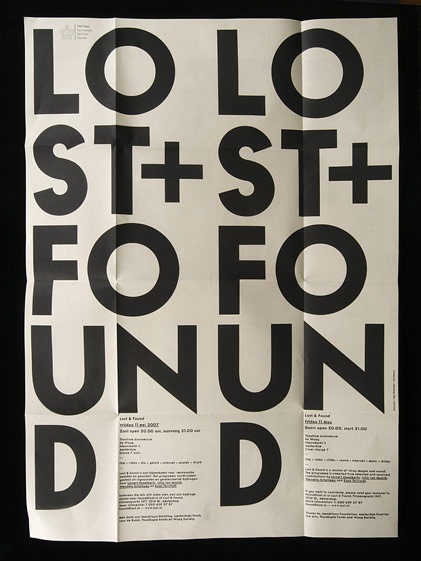
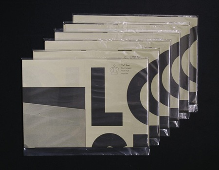
Another great example of some well used typography. I found this online a while back and forgot to to write down the source. If anyone knows where it’s from or anything about it please post in the comments. Also, name that font.
UPDATE via Sam Mallett in the comments:
"the piece was designed by Timo Hofmeijer / New Folder from Amsterdam and it was a collaboration with Ian Brown"
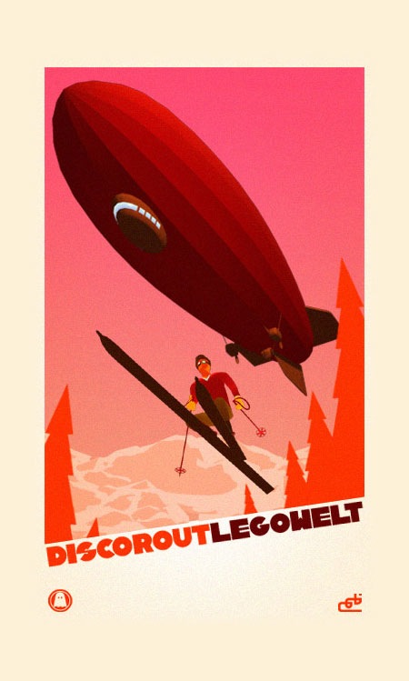
Nice promo poster for the Legowelt Disco Rout video.
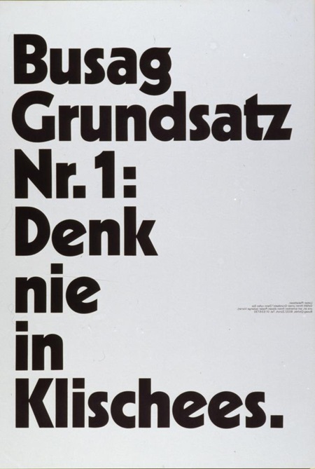
"Busag Clichés" [1973]
By: Diggelmann & Mennel Werbeagentur (Zürich)
Black and white at their finest from The Poster Library via Joyrex. I really like how this piece emphasizes extremes; dark / light, massive headline / miniscule copy. As a poster designer you dream of being able to keep the detail copy this small. Unfortunately, clients don’t always appreciate the finer points of minimalism.
Name that typeface in the Comments >
Update: Title translation via Jessie Rumble: "Never think in Clichés"

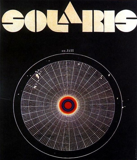
Movie poster for Soviet-Era Sci-Fi film based on the novel Solaris by Polish author Stanisław Lem. Solaris on Wikipedia
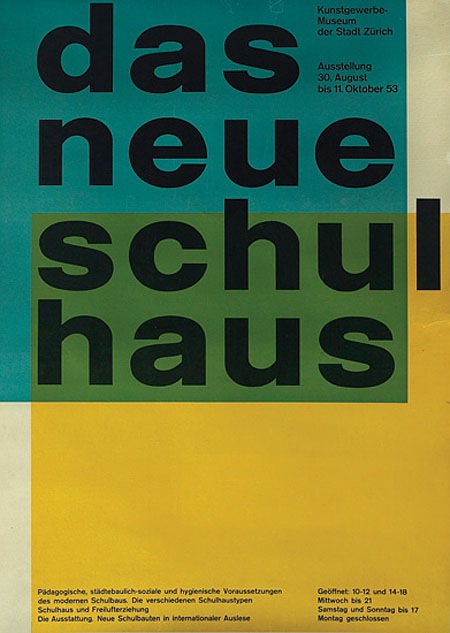
I’m pretty sure it doesn’t get any better than this. By Swiss Designer Carlo Vivarelli who also did the "Flums" Poster.
"997. 1953 poster, advertisement for The New School House, C.L. Vivarelli, Zurich Art Business Museum, marked Vivarelli, printed by Bollmann, dated 1953, linen backed, 36"x 50", 500-700"
Via the Treadway/Toomey Gallery
Seeing great design like this, by designers who are no longer with us, always makes me wonder what our generation’s legacy will be. in 60 years I wonder what artifacts young designers will look back on in awe. The pessimist in me wonders if we are doing anything quite as groundbreaking and forward thinking as this in the print medium. Print seems to have been relegated to a sort of suspended animation while mediums like video and interactive jump leaps and bounds every year. I don’t know if this is a function of the age of the print medium, i.e. everything new and innovative has been done, of if there just aren’t enough people pursuing print design as an art form anymore. Or perhaps I’m just stuck in the past and for some reason only design like this affects me in any meaningful way. Either way, there is no denying the greatness of this image.
Can any of you design scholars out there name the style or period that informed this design? I want to say Bauhaus, but I am sure someone can explain why that is wrong.
UPDATE: Via Eric in the comments:
"This design is definitely a product of the international typographic style developed in Basel switzerland, during the 1950s…This style is is clearly influenced by the bauhaus, but they took it to the next level. beautiful example."
Carsten also wrote a great comment explaining the "Reformed-School" in Germany and how it relates to this poster.
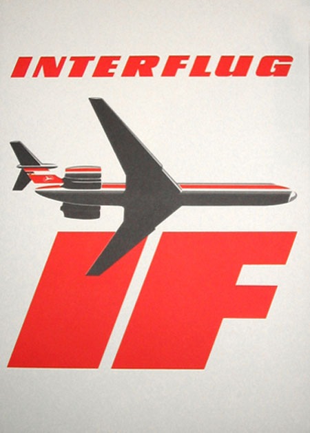
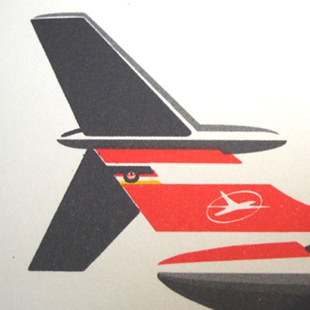
These images sent in by Anthony Mark.
"Interflug was the former state airline of the German Democratic Republic (GDR, "East Germany") from 1963 until 1991, when it ceased operations following German reunification." - Interflug on Wikipedia