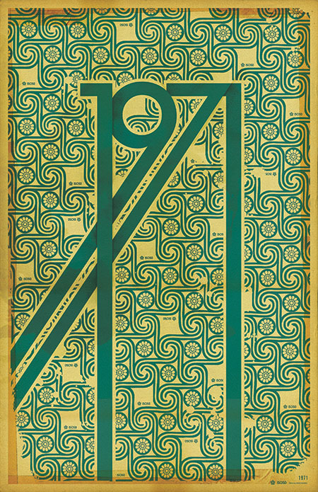
The 1971 Print has been reprinted and is now in stock at the ISO50 Shop.
A lot of people have asked me what the significance of the year 1971 is (no, it’s not the year I was born). Hunter S. Thompson’s “Fear and Loathing in Las Vegas” first appeared as a two part series in Rolling Stone magazine that year. Wikipedia sums up the main theme of the book which was based on these articles:
“It explores the idea that 1971 was a turning point in hippie and drug culture in America, when the countercultural movement no longer had momentum and its innocence and optimism of the late 1960s turned to cynicism.”
This print sort of juxtaposes the design ideals of the 60’s: the earth-tones and swirling, psychedelic, patterns; with the harsh, solid forms of the gothic lettering.
Oh, and also 1971 just looks badass all stretched out like that.
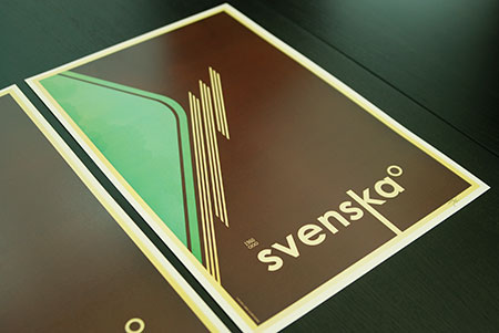
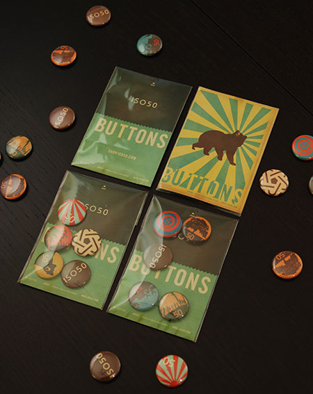
The October issue of the ISO50 Newsletter is out now and among other things, announces the release of the “Svenska 1B” print (pictured above). This third and final version in the Svenska series is available now at the ISO50 Shop.
The newsletter also covers details on the upcoming New York OFFF festival and the upcoming Tycho single release date. You can read the newsletter here or sign up here to get the latest delivered straight to your inbox monthly.
As stated in the previous post, I’ll be hosting a workshop entitled “ISO50: Blending Analogue and Digital” at this year’s OFFF festival in New York. The festival runs Nov. 2-4. The workshop will be held Saturday, November 3rd, 2007 at the BMCC Tribeca Performing Arts Center in “Theater 2”. Things will get started at 11:30am and it goes through to 1:30pm. I’ll be focusing mainly on process and theory, with specific examples and PSD deconstructions.
Space is limited to 230 people and entry will be first come, first served at the door. The workshop is included in with an OFFF pass, available here.
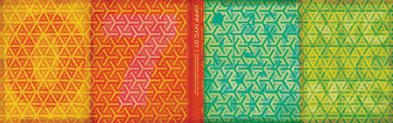
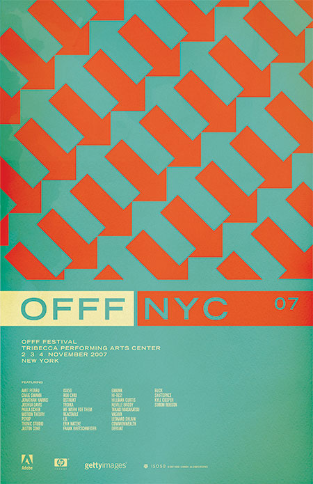
Just finished the cover for the NYC OFFF festival (New York – Nov. 2-4, 2007). This is the book that’s given out to all attendees and features work by many of the speakers and presenters at the festival (might have to squint a little to read the titles better). I’ll be hosting a workshop / lecture, all the details are here. It will be a similar workshop to the one I did in Barcelona this summer and will be focusing on technique with a lot of deconstructions and hands on examples of my process and theory. As with Barcelona, space is limited (230 people per workshop this time), but unlike Barcelona the workshop is included in the cost of the festival pass, there’s no additional registration required, it’s just first come, first serve. You can snag tickets to the Festival here, as of this posting they are nearly sold out so get on it! As stated in an earlier post, there will be an ISO50 booth for all three days of the festival with shirts, prints, and music. See you in New York!
I will be speaking / giving workshops at this year’s OFFF in New York, November 2-4. In case you aren’t familiar with OFFF, it is a festival focusing on the “post-digital creation culture”. Translation: A lot of great people and great designers in one place talking about the things they do and how they do them. There are all sorts of people who attend and present at the OFFF: interactive designers, print designers, ad agencies, experimental artists; it really is an incredible experience and every year I am amazed at the things I see there. I have been involved for the past couple years, both of which were in Barcelona. This will be the first year the OFFF has come to the states, held at the BMCC Tribecca Performing Arts Center in New York, NY. There will be an ISO50 booth at the event with prints, shirts, and music. Stop by and say hello. Tickets and information are here.
The poster (above) is based on a pattern I saw painted on an old, crumbling wall in Barcelona (the city where OFFF began). I always wanted to incorporate it into a print and thought this was the perfect time. I think they sort of play on the energy of New York, lot’s of people and things moving in different directions and they tie the concept back to the origin of the festival itself. I played with having the arrows running up and down (as the original painting I saw had) but the 45 degree angle seemed to translate the dynamic, energetic vibe I was going for a bit better. The colors are meant to confuse the eye a bit and enhance the double arrow effect going on. I chose classic, practical typography to balance the piece and hopefully give it a more timeless feel.
Incidentally, after posting this I was looking at it on the front page of the blog. I scrolled down and saw the recent post on the NFB and realized how similar the two images are. Perhaps a case of subliminal inspiration? Funny how things like that can happen as I definitely didn’t have that NFB poster on my mind as I was designing this, but the similarities and time frame seem to rule out coincidence. And on another aside; this is one of the, if not the first posters I’ve ever done without a border. As I look back at my collective works it’s sometimes surprising to see these common themes and elements crop up here and there. Some are intentional, but others, like the borders, just seem to be these dogmatic devices which aren’t always necessarily the best choice for the given project. Ha, I feel like going back and turning on and off the borders of all my older works to see which looks better.
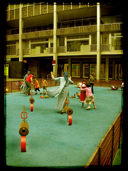
Just started to process all the photos from this summer’s Barcelona trip where I was speaking at the OFFF design conference. Unfortunately, my third Lomo LCA has broken so I lost half the shots (the film was not advancing properly half of the time). If you’re not familiar with the Lomo LCA, it’s a small Russian-made camera famous for it’s lofi vibe and heavy color saturation. It also has this really cool vignette effect that sort of pulls all the attention to the center of the photo. But as my three dead cameras will atest, they are very temperamental and prone to breakage. I treat all my equipment with almost obsessive care, yet these still fell victim to their own shoddy construction. This wouldn’t be such a big deal, they use to be only $99 a pop. But since they gained popularity and became a cult favorite around the turn of the century, Lomo has jacked up the price to $250 usd. In a side note, I owe my name in part to this camera and French designer Arnaud Mercier. Arnaud taught me a lot about photography and first suggested that I try the LCA with Fuji’s “ISO50” speed slide film, hence the moniker. After all that talk of the Lomo, I have to admit, the image above was not taken with it. This is a digital photo taken with a Nikon D80 or a CP8800 (can’t remember which I was carrying that day). Since I lost the film shots of this scene, I tried to make these digital shots appear as much like the output of the Lomo as possible. You can be the judge of how successful I was (Hint: Not very..). As I get these together and scan the remaining slides I will post them here and to my Flickr.