


While digging around for Omni covers for last week’s post, I came across blog reader Eric Carl’s Flickr and his downright incredible set of vintage sci-fi / fantasy paperback covers. These really are mind-blowingly good and positively dripping with inspiration. I’ve never seen any of these before but I feel I’ve been somehow influenced by them anyways. They encapsulate everything I love about this period in design; just look at that typography! The “Dark Universe” cover is just off the charts good. Thanks so much for posting these Eric! Quick question if you’re reading this Eric: Do you actually own these? How did you come across find such a nice collection? Link
HUUUUGE bonus: can anyone name the font used in “Dark universe”? Is that even a font or do you think it’s hand drawn? Let us know in the comments.
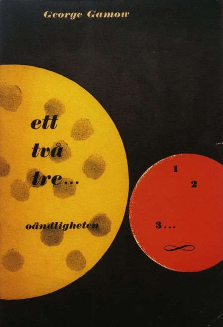
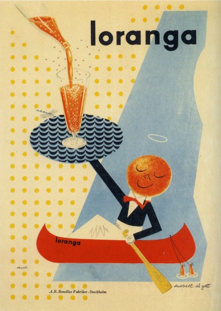
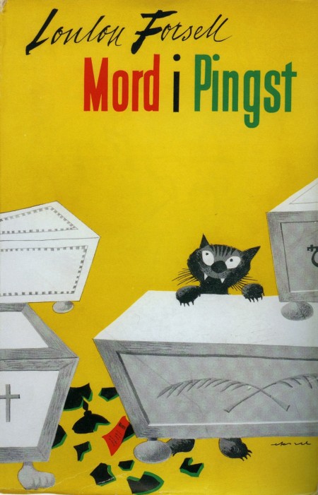
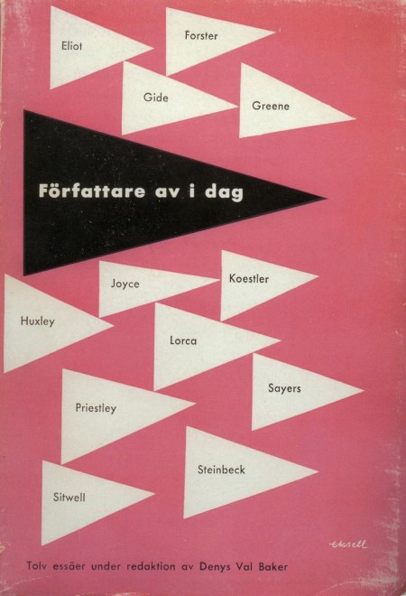
Assorted work by designer Olle Eksell to kick off your Tuesday right. What great typography! (It’s all late 40’s, early 50’s work.) All of the above are scanned from a book I picked up in Tokyo. I thought I had stumbled upon the secret of all secrets when I found it, but you can buy it on Amazon just as well.


Michelle McCormick recently posted Dave Cuzner’s Grain Edit on her Inspiration Resource blog. If you’ve been to Grain Edit before, you’ll know what a great collection of classic design artifacts Dave has. Above are just a few small glimpses into that collection. Dave is a vintage bookseller out of Oakland, CA who I first met at an ADAC event in Sacramento. He had a booth there and I was pretty blown away by the books he brought out. I later met him again here in San Francisco where he showed me part of an amazing Czech stamp collection which he is working on. All very inspirational stuff indeed! Link


Sébastien Hayez was kind enough to send me this Graphis Flickr set where you’ll find a lot of nice shots of various Graphis books. Link

I’ve always been a huge fan of books on modernism, but unless you’re Dave from Grain Edit, it’s pretty hard to get your hands on the good stuff. And so it was with great pleasure that I stumbled onto Modernism 101 booksellers. the site, featuring a vast collection of rare and out of print books on modern design and architecture, serves up cover images and very detailed information on a wide array of classic design texts. Many of the books featured are have sold, but they archive the pages so it’s a great resource for images and information on many books that you’ll probably not find elsewhere. I’ll be running a (hopefully) weekly feature aptly titled “Modernism 101” highlighting the best examples from their collection.
Today’s selection is a collection of Dutch printmaker H.N. Werkman’s work edited by Fridolin Müller. Enjoy!

H. N. WERKMAN
Fridolin Müller
Fridolin Müller (editor), Peter Althaus (introduction): H. N. WERKMAN. NYC: Hastings House, 1967. First edition. Tri-lingual edition in English, German and French. A near-fine hardcover book in decorated glazed paper boards issued without a Dust Jacket: trace of wear overall. Interior textblock in fine condition. Volume Two in a projected four-volume set called Documents in the Visual Arts. A nice copy of a scarce book.
8.5 x 9.75 hardcover book with 104 pages with 79 plates (14 in color) of Werkman’s avant-garde Dutch typography. H. N. WERKMAN presents the most extensive published collection of Werkman’s typography to date. My highest recommendation.
Beautifully designed and printed by Verlag Arthur Niggli in Switzerland with the plate engraving and printing setting a new standard for the reproduction of the presented artwork. Spot colors are used throughout for maximum color fidelity.
Dutch designer and printmaker Hendrik Werkman (1882 1945) is best known for his innovative printing techniques and avant-garde typography. As publisher of De Blauwe Schuitt, a series of underground booklets produced by Jewish dissident poets and writers during the Nazi occupation of Holland, Werkman was imprisoned by German secret police in 1945 and executed without trial just three days before the country¹s liberation.
out of stock
Via Modernism 101


My dad was a civil engineer so he would sometimes bring home project models and I loved to play around with them, but most were your basic hotel mock-ups and the like. It’s probably for the best though, if he had brought home anything like the examples above my head would have exploded. These are simply amazing. I want these under a plexi-glass bubble in the middle of my living room. Apparently they were taken from Taschen’s “Hundertwasser Architecture: For a more human architecture in harmony with nature” book. I found the pics on Doctor Casino’s flickr page where there are more details. Link
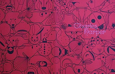
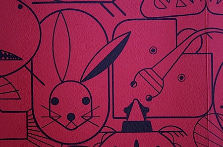
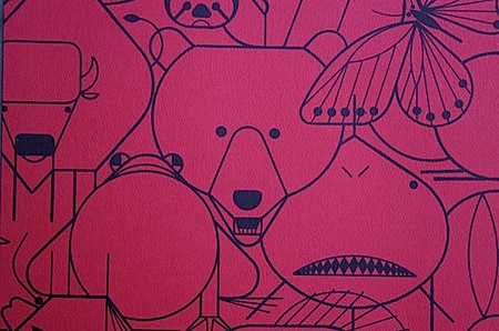
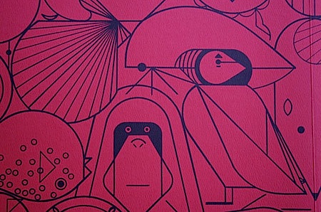
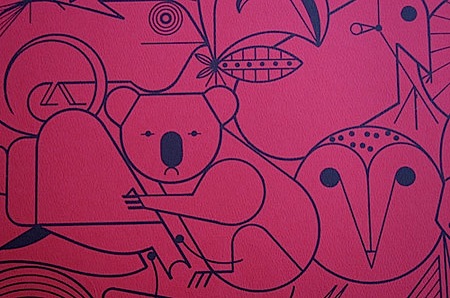
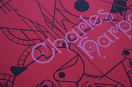
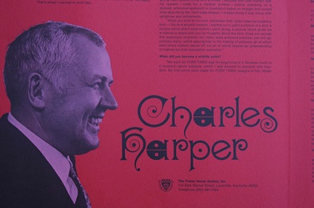 Crabstick has some nice shots of this amazing Charles Harper book up on flickr.
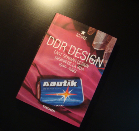
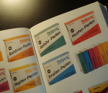
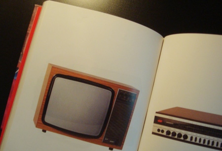
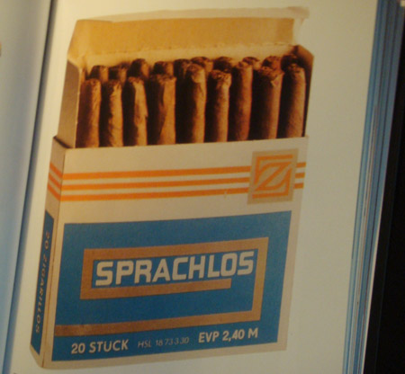
DDR Design – East German Design from 1949 – 1989.
Taschen most of the time never fails, I could probably close my eyes and grab a book by them at random and find something fascinating to look at. The products here are a showcase of consumer products from East Germany during this period in time. The simple shape and color schemes make today’s consumer product designs look like gimmick covered nonsense in my opinion.


