Selected Milton Glaser



A few classics from Milton Glaser.


A few classics from Milton Glaser.


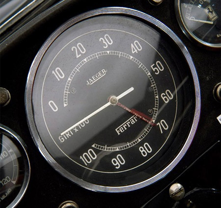
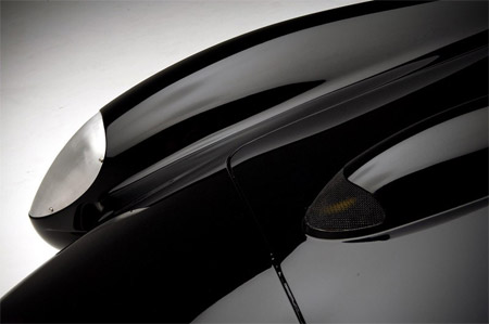

There’s no denying the ’57 Ferrari Testarossa was one of the sexiest cars ever designed. As a kid I was obsessed with this car and had no fewer than 5 die-cast models of it placed — for some reason — in strategic locations around my room. But I’ve never seen it presented quite so nicely as in this photo set on Luxist. Designed by Carrozzeria Scaglietti for Enzo Ferrari, the iconic car dominated Le Mans in the late 50’s and early 60’s. One of these sold last year for nearly $11M and this one — which is set for auction — is expected to exceed that. Now I don’t feel so bad about lusting after Herman Miller pieces.





I’ve been buried down in the studio working on this new album for so long I almost forgot how much I love design. But when I see work like this I can’t help but be reminded; Tavis Coburn’s style is very inspiring to say the least. It’s always nice to see an illustrator who has a good design sense, the combination can be quite powerful. And loving the way he uses that moire pattern effect.
Tavis Coburn via abuzeedo
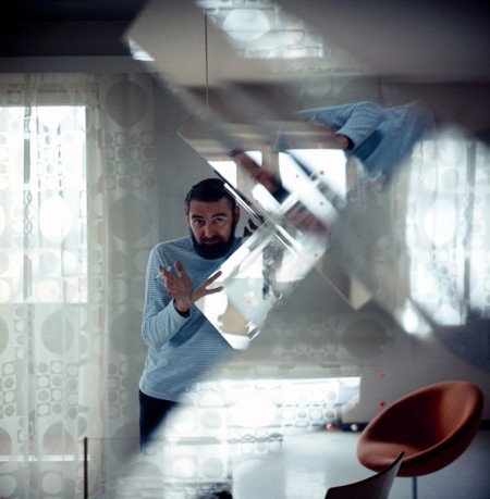
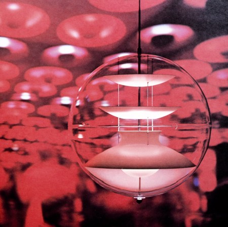

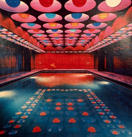
I’ve posted on him before, but today I saw some nice shots of Verner Panton’s work that I’d hadn’t yet seen posted up at the suberb “but does it float” blog. That green ceiling is looking very familiar…

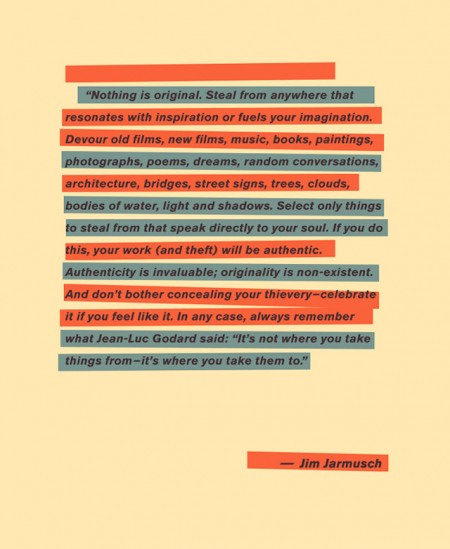
I saw this and thought it made a nice counterpoint to some of the views expressed in the AP Sues Shepard Fairey post. Make what you will of Jim Jarmusch’s suggestions, but in the year 2009 you pretty much have to agree with his initial assertion. Or do you?
via Today & Tomorow
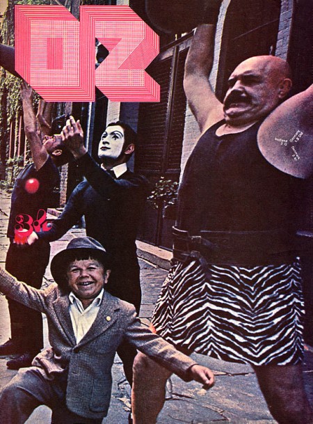


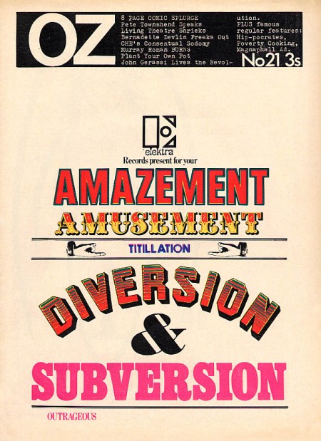
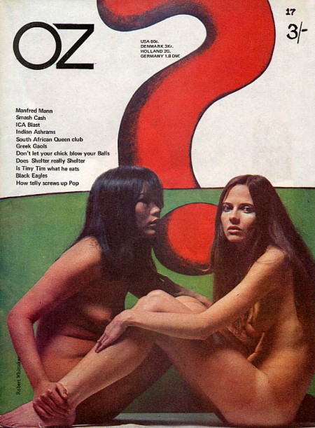
I love the 60’s because everyone was tripping balls all the time and then they would come out with crazy magazines to prove it. Case in point: OZ. These covers need no explanation, they are simply incredible. The overall idea of the magazine is definitely reminiscent of Avant Garde, but a lot of Herb Lubalin’s work seems somewhat tame and reserved compared with the over the top stuff (at least for the time) we see in OZ. My favorite cover is the one featuring The Doors “Strange Days” album photo with maybe the most awesome magazine logo ever slapped right on top of it. Also, the date and cover info are printed in the weight lifter’s armpit so that’s a bonus. It must have been nice back then when all you had to do to “freak out the establishment” was put some naked girls or a midget with circus people on your cover.
OZ started out as an Australian satirical humor magazine but then moved to the UK and began life anew as a “psychedelic hippy” magazine (I am sure the genre was overflowing at the time). Featuring art by Hapshash and the Coloured Coat and design direction by Martin Sharp, issues of OZ have become collectors items in the years since it’s demise [source].
You can browse cover scans of all the of UK issues of OZ here. On a side note, Google books features the some of the text of “Graphic Design: Reproduction & Representation Since 1800” which makes mention of OZ and Sharp.
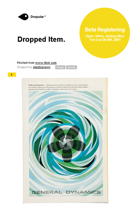
If you’re at all familiar with the excellent FFFFOUND and it’s ilk, you’ll no doubt recognize Dropular as yet another social bookmarking site. I’ve always enjoyed FFFFOUND and it’s clever grouping, it’s really easy to just keep digging and finding more and more good stuff over there. But I guess I missed their public sign up phase (if there ever was one) because I never got my own account and was never able to participate. So when I heard about this new site and last week’s beta I jumped at the chance. The good news is they have opened the beta up for another 24 hours which spans all of today (Monday, Feb. 9) so anyone can join in (just click “register”).
Dropular has a slick interface and an ever slicker bookmarking system which is absolutely seamless and dead simple (click for video demo). I am not sure if Dropular will suffer for it’s open registration model — I always felt the exclusivity of FFFFOUND served it well — but at the very least, Dropular is a great way to organize all the images and video you love. You can follow my Dropular stream here (there’s not much up yet but I’ll be adding every day).


Update: My opening serve is live here.
Today’s Layer Tennis match starts with my serve in 20 minutes (noon PST)…Don’t miss it! Layer Tennis: Around the World In 10 Layers