1976 Reprinted

It’s hot as hell but luckily the summer-friendly tri-blend edition 1976 Heather Blue shirt by ISO50 is back in stock! Get them while they last this time, it’s going to be a long summer… Link

It’s hot as hell but luckily the summer-friendly tri-blend edition 1976 Heather Blue shirt by ISO50 is back in stock! Get them while they last this time, it’s going to be a long summer… Link

Stephen Shirley — a family friend — has been battling Hodgkin’s disease for over 2 years now. The cancer has been unresponsive to chemo so Stephen and his family are trying a new treatment center in Houston, TX which has had great results with patients affected by his particularly difficult to treat form of Hodgkin’s. Some friends of Stephen recently launched a website to chronicle his struggle and to raise money for this prohibitively expensive form of treatment. I am sure most of you can relate as cancer is a disease that touches all of our lives in some way. You can check out Stephen’s site here: savingstephen.com
Thank You


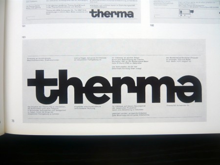

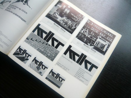
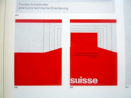

There’s a certain point at which you just have to give up on graphic design because the Swiss beat you to it like 30 years ago and you know it. AisleOne has managed to capture that exact point and wrap it up nicely into a flickr album. Enjoy: Graphic Design in Swiss Industry / Schweizer Industrie Grafik Pleasantly reminiscent of the World of Logotypes stuff.
Moby’s got a new album coming and this is the first single. Whether or not you think Moby’s still relevant, he’s probably the only electronic musician who can get David Lynch to direct his video. At any rate, much better than what I heard from him last year and the video is great.
The official music video for Moby’s “Shot in the Back of the Head” directed by David Lynch. From Moby’s forthcoming album “Wait for Me” (out June 30 on Mute).

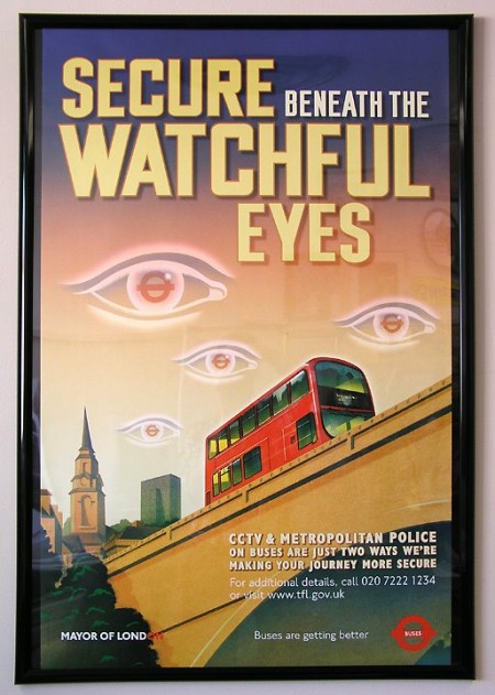
I just came across this recently and was convinced it was a hoax, but apparently this poster was actually posted around London bus routes around October, 2002 in the civil-liberties crushing wake of 9/11. The imagery is shocking to say the least; shocking mostly for the fact that someone, somewhere actually thought this was a good idea. I would love to have been in on the design discussion during the production of this Orwellian gem. Who actually creates this stuff? Did anyone see it when it was up? More info
Apparently we have our very own version of this stateside.
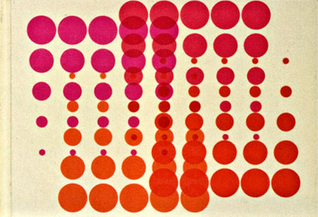


Swiss pharma company Geigy (now Novartis) cranked out tons of drugs and tons of great designs to sell them during their time. The images above are from the book “Corporate Diversity : Swiss Graphic Design and Advertising by Geigy 1940 – 1970” (amazon) which chronicles their best work during that period. There are more images and info over at Things To Look At and Grain Edit.
Images via Things To Look At
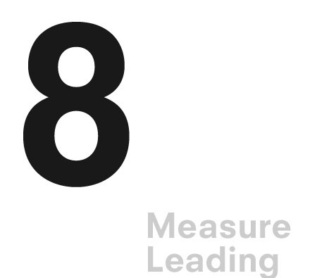
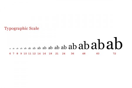
Antonio Carusone from the always excellent Aisle One Blog has written a great article covering the various problems we as designers face when setting type and how to best approach them. The article focuses on using web-based CSS solutions for type layout, but the concepts covered are universal to typography and can be applied to print layout as well. The hanging quotes part is great, but they’re missing the part about “hanging T’s”, I always have trouble with that one. Link

Sorry for the late notice, the hotel wifi is down so posting from my phone. Anyways, first 10 replies get a FREE pass to the F5 Festival in NYC tomorrow ($250 value!). Be sure to include your email in the comment email form field (will not be published). Good luck!