XP VS. OS X: Epilogue
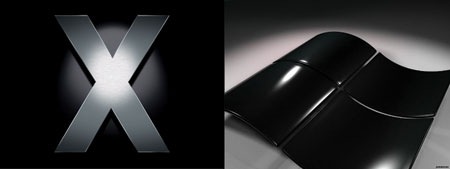
So I am knee-deep in my attempted switch from PC to OS X and after initially thinking it was a no-brainer, I am starting to have second thoughts. That is not to say I’m not totally in love with OS X, I am. There are just some realities that must be faced and some truths that must be accepted before I can truly take the plunge either way. But I really don’t think that will happen any time soon, as I’ll explain here. Please excuse the sort of random nature of this post, it’s somewhat stream-of-consciousness as I posted it in haste very late this morning. And if you visit this blog expecting to see interesting visuals and have been wondering why I keep obsessing over all this technical rubbish, sorry…You won’t be seeing much more of this I’d imagine, I think I’ve finally got it figured out (at least for the next couple years).
The reality is computers as a whole just don’t really work the way we want them too. OS X is very user friendly, but only by comparison. The way we interface with machines in general is sadly an archaic and inefficient affair. Given this fact we must choose the lesser of two evils. The two evils at this moment in time being XP and OS X.
It’s funny how we see them as these parallel universes who’s features are worlds away and differing so greatly. But if I were to try and see them both in a truly objective way it would be pretty clear that they were essentially the same, save for some minor differences. We use the same hardware to interface with both, most gestures are the same, and the core concepts which govern the user interactions with applications are essentially identical. All is based on the same archetype of human / machine interaction developed at Xerox Parc as far as I can tell.
All that said, here are my conclusions after working with both OS’s on the same hardware (thus having no hardware-based performance bias):
1. OS X is a visually superior experience. Things look solid and clean, and so the perceived experience is more enjoyable. Every time I use Windows now I feel disappointed; the beauty and simplicity of the OS X interface is an incredible achievement. The saying "it just works" may not be entirely true, but it sure feels true most of time… Things, for the most part, just work in OS X. And they just work the first time, not the second time after reading 30 posts on some arcane message board about cryptic Windows error codes.
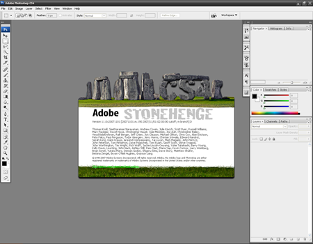
2. OS X is more stable when using Photoshop. This is simply the truth. Perhaps this is only the case with large files, as I almost exclusively deal with. A single night of working with PS in Windows is wrought with errors, bugs, crashes, and lost work. This is not an isolated experience with one machine…This is a constant across years and years of different hardware configurations with the only constant being the OS: Windows XP. In my experience with Photoshop on Mac OS X I have yet to encounter one crash, bug, or hiccup. One time Bridge crashed, but Bridge is a complete mess and everyone knows it, so I don’t expect much from it. And besides, Bridge can’t be considered much more than an Alpha build on Windows, it crashes almost every time I use it, it’s insane it’s actually a public release.
3. Windows XP has better raw performance than OS X. This is a fact. I have benchmarked both OS’s on the exact same hardware. XP wins every time, handily. I don’t know the reason behind this, perhaps OS X has a larger operating overhead, but it’s a reality and you must accept it. I have accepted it and moved on, I realize that the myriad superiorities of the OS X experience far outweigh any performance benefit you might realize within XP. The overall stability of OS X alone is enough to keep me coming back regardless of the speed.
4. It’s a tie. I hate to say that, but I now believe it to be true. This is a sad reality, I would love to know one was best and that it could fulfill all my needs, but this is simply not true. Both OS X and Windows XP have their strengths and weaknesses and both must be loved / loathed accordingly.
5. VISTA SUCKS. Not much more to say, Vista is a complete and utter disaster with no value beyond a stop-gap-eye-candy-hole-filler of an operating system clearly designed just to buy time until Windows inevitable decline as the dominant OS and / or Microsoft’s eventual decision to create a true evolution of XP, which was, at it’s zenith, a solid and quick OS. So here’s to patiently awaiting XP SP3, then probably being totally disappointed.
6. I am getting a Macbook Pro and this will be my default machine. I always have two computers: one tower which I use to create graphics and music (it is the workhorse which has enough power to crank through the big stuff) and a laptop which sits on my desk next to my monitors. I use the laptop for email, internet, chat, music listening, video etc. This machine goes everywhere with me and allows me to get some light work done on the road. This machine will now be a mac, and should have always been. Mac is far superior in this arena and delivers an experience that’s so far advanced compared to Windows, it’s seriously sad. I also use my laptop for playing live shows and for some reason, there seems to be a much better selection of live performance oriented music and video software for OS X. I am basically getting the MBP just to use Modul8 as I am pretty much fed up with Resolume.
7. Finally, I would have to add that OS X (and the Mac in general) has only recently come of age. Most of my friends who’ve worked with Mac’s for years agree that it has only recently become the grown up, stable OS that we enjoy today. All this while Windows is sliding off the face of the earth…The decision gets easier every day.
So that’s it, my 200 cents. Take it or leave it, your mileage may vary, etc…etc… I know this won’t put anything to rest for anyone, it’s simply the culmination of my experience with one machine and two operating systems.
