Benedict Redgrove: Bertone
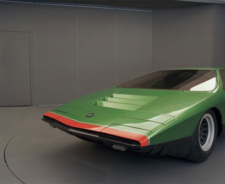
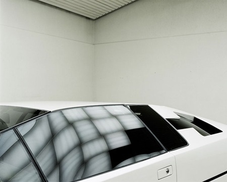
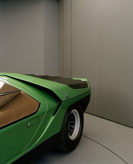
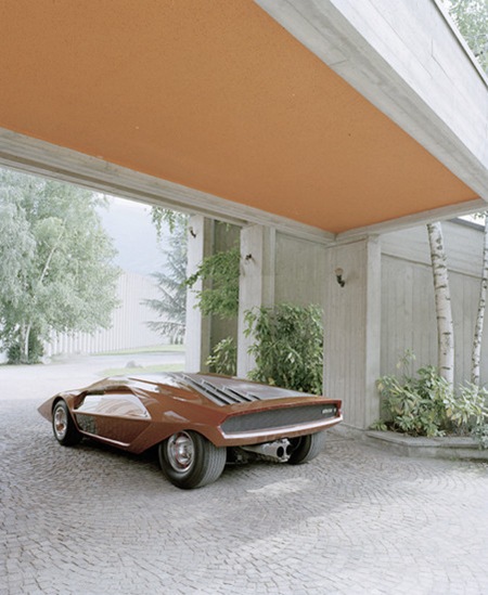
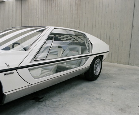
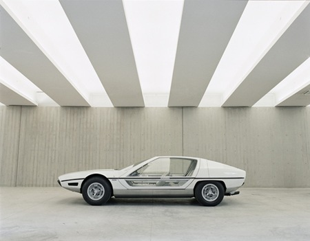
Some great shots from Benedict Redgrove for Italian car maker Bertone.
Via FFFFOUND


Some great shots from Benedict Redgrove for Italian car maker Bertone.
Via FFFFOUND
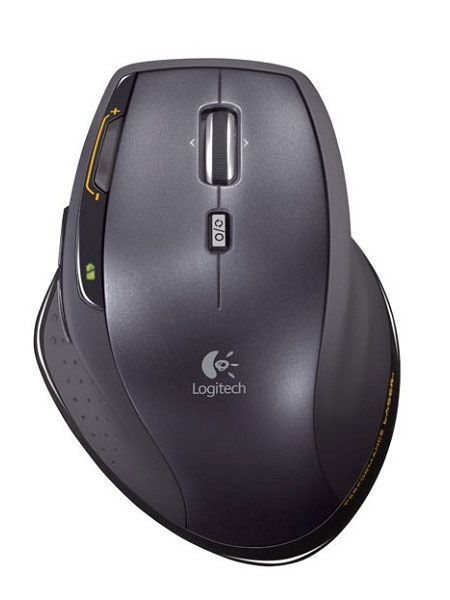
Logitech’s new MX1100 mouse has been getting some glowing reviews and I’m pretty excited to get my hands on one. I have been using an MX Revolution for a couple years now and the battery is failing, so this new model with replaceable batteries will be a welcome addition. The ergonomics on the Logitech mice are great, but the hyperscroll wheel is reason enough to switch (so handy when you’re way zoomed in on a PSD and want to move around quickly). I have tried to make the switch to Wacom pads before without much success. How about everyone else? Do you use a mouse or a tablet, or both? Do you find either is more conducive to design or is it just a simple issue of ergonomics? Let us know in the comments
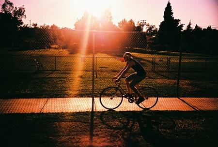
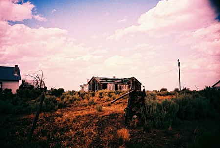
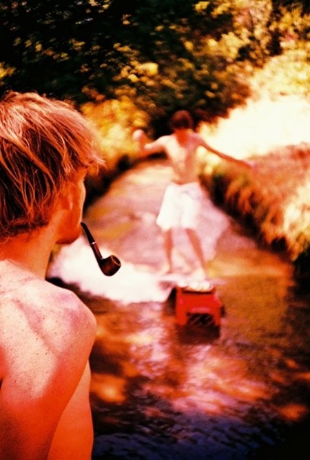
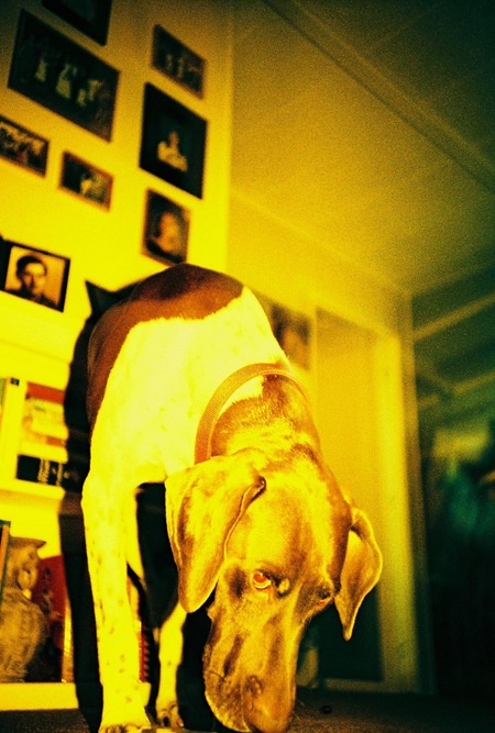
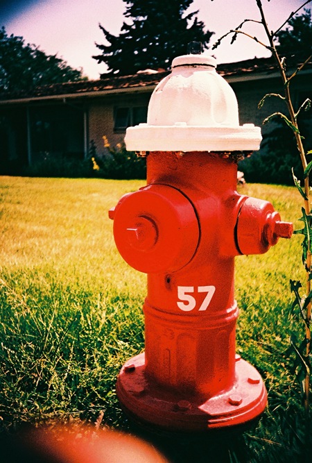
My brother Kirk is a sophomore at San Francisco State University. He’s planning to study design but has been experimenting with photography a lot over the past couple years. He showed me some of his recent stuff recently and it was really impressive so I thought I’d share. All of these shots were all taken with a Lomo LCA and cross-processed, bringing out all those nice colors. My favorite is the top one, it’s like a book about growing up in Sacramento boiled down into a single image. You can see more of his work at his Flickr page.
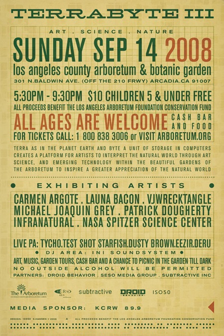
Above is the back side of the Terrabyte 3 poster from last week. Since this is only going to be on the small format hand flyer it was sort of a tight squeeze given all the info they wanted to include. I wanted to carry over the 60’s programming punch-card concept from the front, and considering the amount of text, I decided to use it as the central design element. Most of the type is set in Berthold Akzidenz Grotesk (at various weights) and is all grid aligned with a piece of graph paper I scanned in and set on Color Burn overlay mode.
Incidentally, a couple people had mentioned an alignment issue with the left arrow on the front side. Thanks for the heads up, it’s been fixed and the finalized version is now up on the original post. There’s also more info on Terrabyte 3 now available at the Arboretum site.

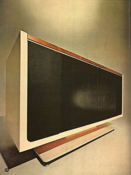
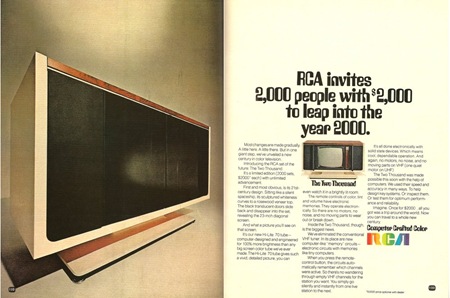
Caught this ad on Paleofuture. The RCA Two Thousand was a TV set released in 1969 with a price tag of $2000 (roughly $12,000 in today’s market). It leveraged then nascent computer technology to, among other things, store favorite channels electronically and automate tuning. The interesting thing to me is how much it resembled a modern flat panel when the cabinet was closed (top and bottom left). Unfortunately, those are just doors; when in it’s opened state the Two Thousand looks a lot like any other old tube set from the 70’s. At any rate, the top image is wonderful to look at and downright prophetic when you consider this was designed in the late 60’s. It seems ripe for some sort of Ive-esque re-purposing a’ la the Dieter Rams inspired iMac.
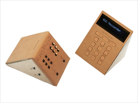
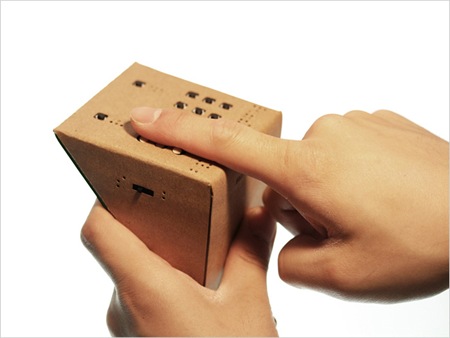
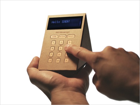
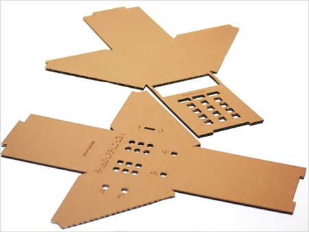
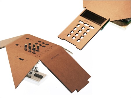
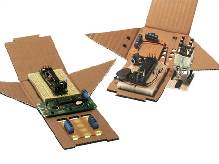 The Okada Noriaki-designed B&D Messenger is a device that helps blind and deaf people communicate via SMS text messaging. I love the design of this thing, the cardboard housing they used to bring costs down ends up providing a very nice looking surface while keeping it inexpensive. They’ve also made the unit much smaller than other Braille phone devices currently on the market. The system is based on a set of twelve points that raise and lower to create braille letters which are translated from SMS texts received by your computer (USB connection required). It’s great to see someone using technological innovation to make a device that benefits people more accessible. More info and pictures can be found at the B&D site.
Via Gizmodo
Update: Tickets & info are here
Update: Poster Image updated (see above) and back posted here
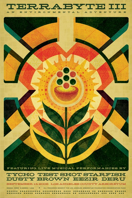
I just finished up the poster / flyer design for the third annual Terrabyte event (click the above image for a large version). This is the first work I’ve done since the Obama poster and it was a nice chance to get the wheels turning again. The spec was pretty open, just had to include the themes of Nature / Technology / Art. I went for a sort of 60’s modernist infographic approach, like a page from an old physics textbook maybe. This was also the first chance I got to use one of my favorite new fonts: Hellenic Wide. The face was really a pleasure to work with, it cuts a nice line and sort of acts as it’s own divider so there wasn’t much need for all sorts of lines and spacing. Time permitting, I’ll post a small "making of" on this in the coming months. The poster will be available for purchase online in the next couple months and I am hoping to have some early copies available at the show itself.
For those of you into nuclear physics, the imagery is supposed to represent a critical mass, as in everyone coming together and then and explosion (of the aural/visual kind, not atomic). Poster design aside, try to make it out to this event if you’re in the Southern California area, it’s sure to be a great evening of music and visuals, I’ll be playing a set as Tycho and doing some live video / visuals as well.
Terrabyte is officially described as a "unique celebration of nature, technology, and art". Translation: A great evening in the Los Angeles Arboretum out on the green listening to live electronic music and viewing visuals on huge screens. All ages are welcome; it’s a $10 donation to get in and all proceeds go to the Arboretum preservation fund. There’s a bar for those 21 and up and a lot of exhibits to check out. An architecture school builds this massive array of projection surfaces that stand about 30 ft. tall to fire the visuals on to; it’s a pretty amazing sight. Needless to say, it’s a great time and well worth the ticket price. If you missed the past 2 years, now’s the time to make it out, this will be the best one yet.
Here’s this year’s live lineup:
Tycho (+ISO50 Visuals)
Test Shot Starfish
Dusty Brown
Eezir
Deru
More info at the Arboretum’s site
Date: September 14, 2008
Location: L.A. County Arboretum & Botanical Gardens
Time: 5:30-9:30PM
Entry: $10 Donation
ALL AGES SHOW
See you out there!
Comment on this post
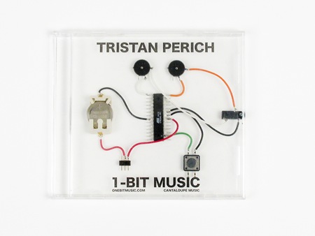
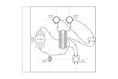
Tristan Perich is a visual artist and musician doing some very interesting work in both fields. His music project, called 1-Bit Music, is an actual circuit that plays back music at 1-bit. All you electronic musicians and engineers will know that 1-bit is the lowest possible representation of digital music, meaning that the resulting audio is quite stripped down from the analog form we know and love. You may recognize the sound as reminiscent of old console games from the ’80s many of which were at 8-bits. Although I wouldn’t be listening to this in my car, it’s interesting to hear someone pushing digital audio in the other direction while the rest of us record in 32-bit floating point. Listen below for Tristan’s version of Fischerspooner’s Just Let Go. Visit his site for more songs.
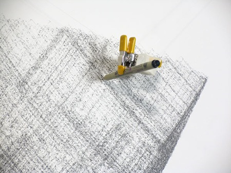
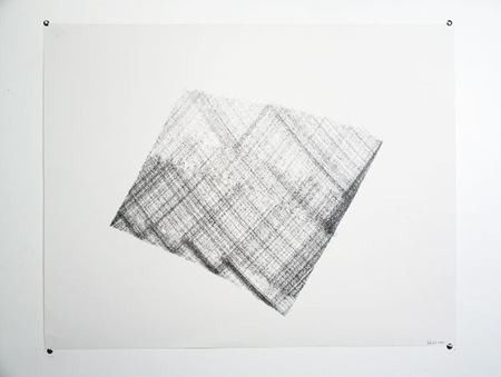
Perich also does machine drawings using a pen apparatus he designed. You can see some examples above or check out his site for more.
Via YDEK