Recta Film (Italy)
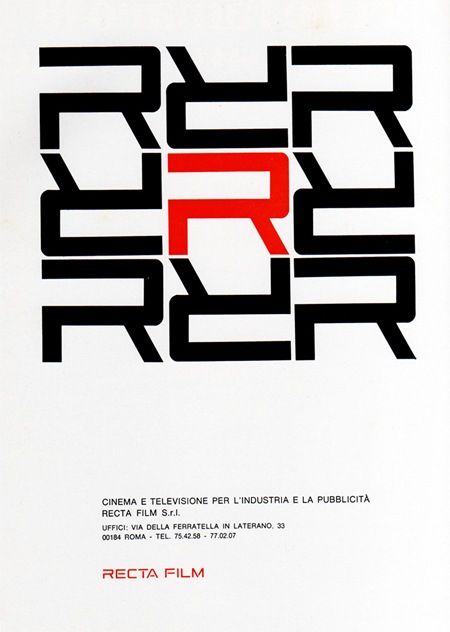
1969 Magazine Advertisement
Recta Film
"Cinema e televisione per l’industria e la pubblicitá"
Italy
Via Pink Ponk

1969 Magazine Advertisement
Recta Film
"Cinema e televisione per l’industria e la pubblicitá"
Italy
Via Pink Ponk
An interesting CG clip from Discovery’s Miracle Earth depicting our destruction via giant asteroid set to Pink Floyd’s Great Gig In The Sky. The song is apt for many reasons, not the least of which being that the vocalist sounds like she is actually being burned alive and/or crushed by a giant asteroid. But I’m a sucker for that 70’s bass sound so I can’t hate. It’s actually a pretty sad video to watch, and the final sentence of the titles is rather ominous. Although 6 events in 4.55 billion years isn’t really much to worry about considering the cosmic blink of an eye humanity has occupied in the universal timeline. Also, I am pretty sure you don’t really notice/care when you’re instantly vaporized, you just turn to vapor, and so does your Macbook Pro.

Etón’s Porsche-designed P’9120 clock radio is a must for any self respecting minimalist / design aficionado with a schedule to keep. I’m loving the knob / speaker combo, so efficient and a great interaction metaphor to boot. This thing could sit comfortably beside some the the jewels of Braun modernism and Porsche even kept it old school with the remote. My only gripe with the design is the sore thumb Etón logo that breaks up the clean lines of the face. It feels misplaced and cheapens the aesthetics; it also clashes badly with the wonderful typography of the Porsche Design logo. I guess that’s what Sharpies are for though. Now if DWR would just make a matching Herman Miller walnut pedestal I’d be set. Unfortunately, at $600 it’s prohibitively expensive; but then again, dedicated design geeks wouldn’t let half a grand stand between them and waking up to such a specimen of functional art.
Via Dvice

While digging up facts for the recent Saul Bass branding post, I came across an interesting analysis of the AT&T logo redesign on Speak Up today. As you probably know, a few years back AT&T axed their original, Bass-designed mark in favor of a new, more modern version. Check out the comments of the article for an earful of various opinions on the transition.

100,000 copies of Esquire’s October 75th anniversary issue will sport the "World’s First E Ink Cover". The video is pretty amazing; I’ve seen Kindles and other E Ink-equipped gadgetry before, but this is a pretty stunning application of the technology. Whether it is relevant and/or functional as a concept remains to be seen. There are already some people raising interesting questions as to this potential trend’s impact. Whatever the case may be, that cover is pretty damned cool looking.
Via Engadget
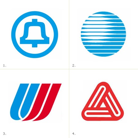

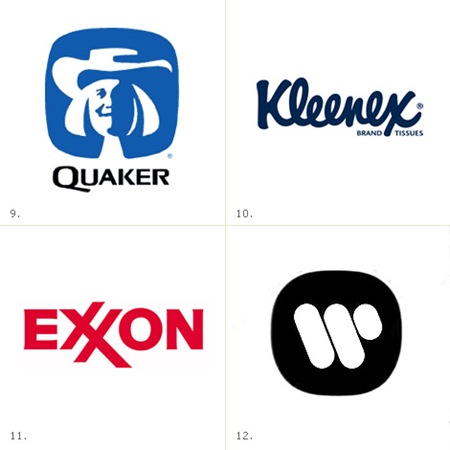
James White has posted a very nice collection of Saul Bass logos at his site, Signalnoise.com (also very nice). Going through this list, I am pretty amazed. I knew Bass did a few of them, but some of those are big surprises. Link
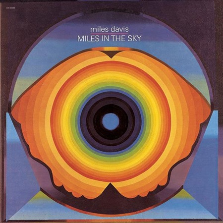
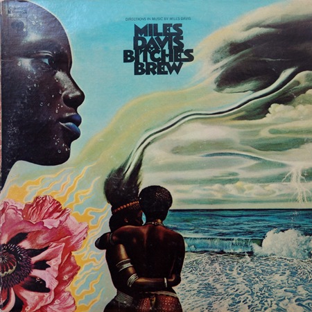
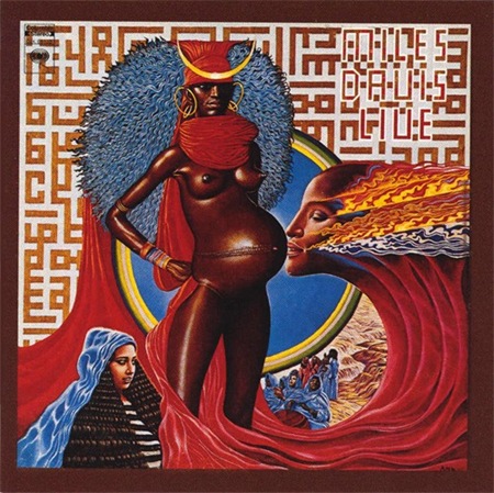
Beautiful images and beautiful music, they don’t make either like this anymore. Bitches Brew ranks up there as one of my all time favorite album covers.
Some images via Sleevery
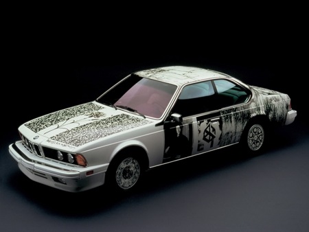
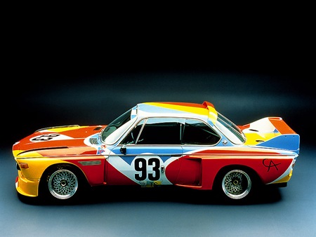
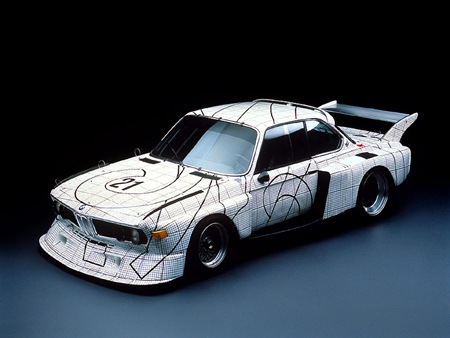
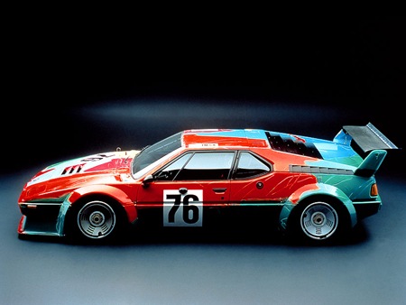
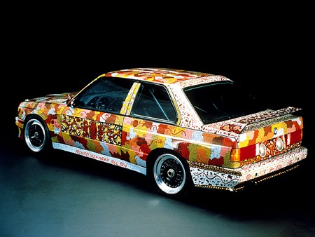
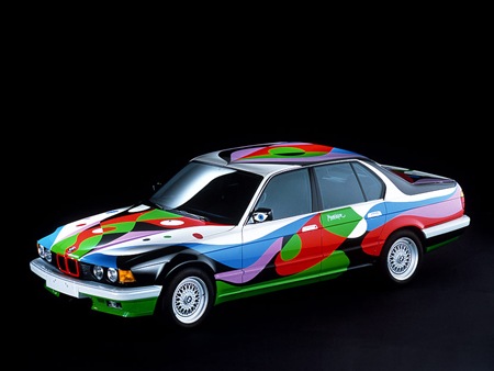
As Michael J. pointed out in the comments of the previous Sharpie Lamborghini post, Robert Rauschenberg was way ahead of the game on the whole "drawing all over badass cars" thing with his photo transfer 635 Csi way back in 1986 (first car pictured above). As it turns out, he wasn’t alone either. Among others, but perhaps most notably, Andy Warhol took a shot at the concept (see videos below) as part of the BMW Art Car program. More Info and pictures on all the Art Cars can be found at the US Auto Parts Art Car Site. You can also find some nice big wallpapers of the Rauschenberg car over here.
And no, this site isn’t switching format to an automotive blog; regardless of the recent spike in vehicle related posts. Thanks again for the heads-up on the Rauschenberg car Michael.