Marco Suarez
Posted by Alex


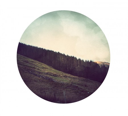
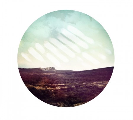
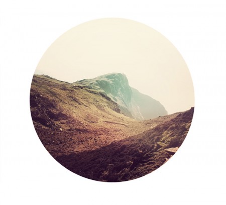
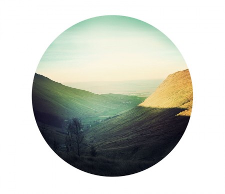
This is a cool series by South Carolinian designer Marco Suarez. Great colors and composition, and the circle canvas gives them that little something extra. It might ruin it, but I’d love to see a little bit of type sprinkled in the outskirts. Nothing crazy, maybe just some cool looking numbers.

21 Comments Leave A Comment
Sully says:
January 21, 2011 at 4:19 amI Agree Alex, defintely something small though. What I’d personally love to see is maybe more of a cream colour rather than a true white. But then again, maybe it’s the contrast between the pure white and the nostalgic feel and lushness of the pictures that makes it so striking.
NEOkeitaro says:
January 21, 2011 at 5:46 amI love the circle canvas, but it certainly looked better in google reader, where the white border wouldn’t really show. But since this is meant to be printed, I guess he had to put the white borders instead of making a transparent .png…
Nice find anyway :)
Kitacello says:
January 21, 2011 at 6:17 am^ no
jat says:
January 21, 2011 at 7:27 amI really like these. They remind me of the mid 1970’s ecology posters.
KatieB says:
January 21, 2011 at 8:38 amThis very much excites me. It’s awesome to see such cool work coming from a designer based in my hometown, Greenville, SC.
Chester says:
January 21, 2011 at 10:03 amNeeds more Helvetica.
captcha says:
January 21, 2011 at 10:14 am@Chester
http://s3.amazonaws.com/data.tumblr.com/tumblr_l439oit5z61qa1b8vo1_1280.jpg?AWSAccessKeyId=0RYTHV9YYQ4W5Q3HQMG2&Expires=1295698989&Signature=WLuuXT2CcsbiJEuAUHfkFZ7WtxY%3D
mature cheddar says:
January 21, 2011 at 11:34 amCAPTCHA
Amen to that
mature cheddar says:
January 21, 2011 at 11:38 amCAPTCHA
Amen to that…
CHESTER says:
January 21, 2011 at 12:25 pmHaha, sarcasm guys.
I do like these quite a bit though. Reminds me of Bob Ross whenever he used a circle canvas…”alright, today we’re gonna use something a little different…”
Tyler says:
January 21, 2011 at 1:25 pmI don’t know about the addition of type, if the goal is to show off the subject in an interesting viewport, what would type add to that? In my opinion, it would serve to further narrow the vocabulary associated with the picture, which is a very easy thing to do. Why does everything need to look as though it was part of a textbook or info-graphic or abstract? Can’t we disassociate the two and just appreciate the picture we’re looking at and the form in which it’s presented? Just my thoughts.
Bobby Chombo says:
January 21, 2011 at 5:28 pmThese pics would work really well as record-sleeves. In fact, I assumed they were on first glance…
John says:
January 21, 2011 at 5:31 pmreminds me of Cut Copy’s new album cover.
msader says:
January 21, 2011 at 7:01 pmYeah, I wouldn’t add type to this at all. I think it looks great the way it is. It would put it into the design realm, right… but maybe that’s not what this is supposed to be.
ernesto alonso says:
January 22, 2011 at 9:20 amI saw them on etsy the other day
http://www.etsy.com/shop/MarcoSuarez?section_id=7359491
Really nice series
Luis says:
January 23, 2011 at 6:02 pmIn all honesty to me these seems like your typical hipster nature-picture-that-looks-retro work that plagues tumblr (along with the equally boring cute-girl-with-an-animal-mask).
Luis says:
January 23, 2011 at 6:02 pmIn all honesty to me these seems like your typical hipster nature-picture-that-looks-retro work that plagues tumblr (along with the equally boring cute-girl-with-an-animal-mask).
Luis says:
January 23, 2011 at 6:04 pmSorry for the double comment.
Arno says:
January 24, 2011 at 5:53 amI love this . Gives me a very good feeling.:-)
Alex says:
January 24, 2011 at 2:03 pmwhat happened to raw photos. All this post-process takes away from the true elegance. Real life is elegant. Photo manipulation is hit or miss.
Looks like they were put through your standard camera phone stylizer.
Trip says:
January 25, 2011 at 7:30 amTypical hipster nonsense. All style, no substance.