New York Subway Map
Posted by Shelby White


I believe it’s pretty safe to say that a lot of folks including myself, are very affectionate about Vignelli’s subway map. Both he and Harry Beck established the design direction that came to be used for most of the current day subway maps including this version by the Triboro team.
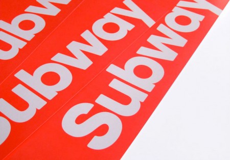
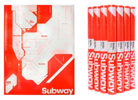
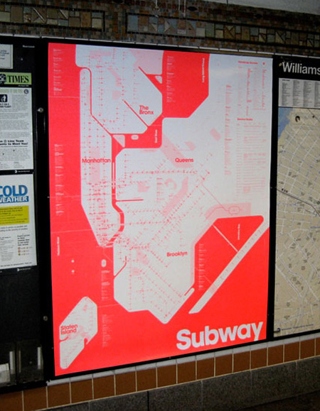
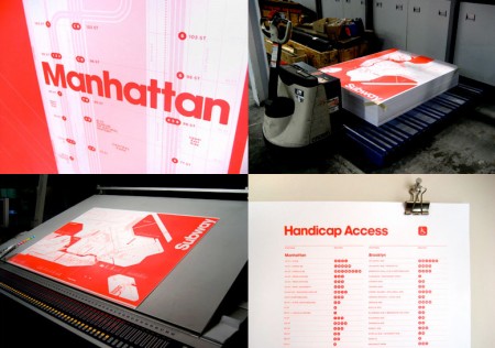
This map provides a radical take on how the Triboro team believe the New York subway system map could be treated. The poster is large format and printed in neon red. If you like the poster it is available for purchase here.

10 Comments Leave A Comment
JE says:
December 1, 2010 at 7:54 amWhat font is that?
Mikael says:
December 1, 2010 at 11:08 amPossibly, ITC Avant Garde Bold.
http://new.myfonts.com/fonts/bitstream/itc-avant-garde-gothic/itc-avant-garde-bold/
This here is a really helpful site if you’re trying to figure out a typeface.
Mikael says:
December 1, 2010 at 11:17 amBy “this here” I mean the following link, my fail:
http://new.myfonts.com/WhatTheFont/
FrankL says:
December 1, 2010 at 11:37 amyou can totally buy it.
Its for sale here.
http://www.thefutureperfect.com/detail.php?id=347
Shelby says:
December 1, 2010 at 11:42 amThanks for finding that link Frank!
CP says:
December 1, 2010 at 12:51 pmDidn’t Vignelli’s map have problems in terms of scale of the actual city and the distances between stops and islands?
Sure it looks great on our computer monitors, but did anyone use the subway system while Vignelli’s map was being used?
How many of you use the subway system now? What do you think? I think there is larger design issues with the subway than the map (using arial on the metrocard machines being one of them).
spoofendave says:
December 1, 2010 at 5:23 pmInteresting take by Triboro on the metromap, I like it a lot, certainly from an aesthetic perspective, but as CP says, the proof is in the practical use of the design. Not so sure about that…
Have to take issue with Shelby tho – while it may be true that Vignelli influenced many subsequent subway maps, you have to give some love to ol’ Harry Beck of the London tube who designed the now iconic tube map *in his spare time!* The original 1933 version –
http://www.probertencyclopaedia.com/photolib/maps/Map%20of%20London%20Underground%201933.jpg
-was revolutionary and, I think, beautiful.
This is an interesting demonstration of the progression as well-
http://www.evolve-research.com/blog/bid/34515/London-Usability-Tube-Tied
Shelby says:
December 1, 2010 at 5:33 pmSpoofendave—
I completely spaced out on Beck. Updated the post to reflect his influence. Appreciate you pointing that out.
Kevin Jessop says:
December 3, 2010 at 2:24 pmGreat post!
@spoofendave – thanks for linking to our blog post. I hope you guys found it interesting.
Kevin
Scott Lee says:
December 3, 2010 at 7:50 pm“For the large information we used a new variation on Avant Garde (originally
Lubalin/Carnase) redeveloped by Brooklyn based Kevin Dresser. We also
rounded the edges of the font. The smaller copy on the map is Gotham Rounded by Hoefler & Frere-Jones.” – Stefanie Weigler @ Triboro.